


Xgboost 应用
- xgboost 二分类
- 图形化方式分析训练结果
2. 图形化方式分析训练结果
前言
一般是模型训练完成后,以图形化的方式分析模型效果。
本文以下代码展示训练过程中的logloss、error损失值、验证集混淆矩阵confusion matrix、auc曲线、第1课决策树结构、特征权重。
加载数据和模型
from sklearn import datasets
from sklearn.model_selection import train_test_split
import pickle

dbunch = datasets.load_breast_cancer(as_frame=True)
df = dbunch.frame
n_valid = 50
train_df, valid_df = train_test_split(df, test_size=n_valid, random_state=42)

# 加载上一篇文章中训练好的模型
with open('breast_cancer_best_model.pkl', 'rb') as f:
    xgb_clf = pickle.load(f)

results = xgb_clf.evals_result()  # 训练过程中的验证过程
epochs = len(results['validation_0']['logloss'])
x_axis = range(0, epochs)
画logloss损失值曲线
代码如下:
import matplotlib.pyplot as plt
def plot_logloss(x_axis, results):
    fig, ax = plt.subplots(figsize=(9, 5))
    ax.plot(x_axis, results['validation_0']['logloss'], label='Train')
    ax.plot(x_axis, results['validation_1']['logloss'], label='Test')
    ax.legend()
    plt.ylabel('logloss')
    plt.title('XGBoost logloss')
    return ax
plot_logloss(x_axis, results)
plt.show()
曲线图如下:
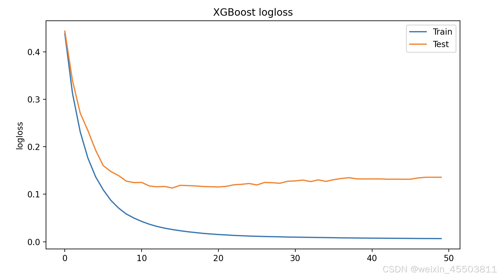
看以看出,在迭代14次左右后,在训练集上logss变化已经很小了,在验证集上的logloss反而有略微增大。在后续的文章中将介绍如何通过调整xgboost的超参数防止该情况的发生。
画error损失值曲线
代码如下:
def plot_error(x_axis, results):
    fig, ax = plt.subplots(figsize=(9, 5))
    ax.plot(x_axis, results['validation_0']['error'], label='Train')
    ax.plot(x_axis, results['validation_1']['error'], label='Test')
    ax.legend()
    plt.ylabel('error')
    plt.title('XGBoost error')
    return ax

plot_error(x_axis, results)
plt.show()
曲线图如下:
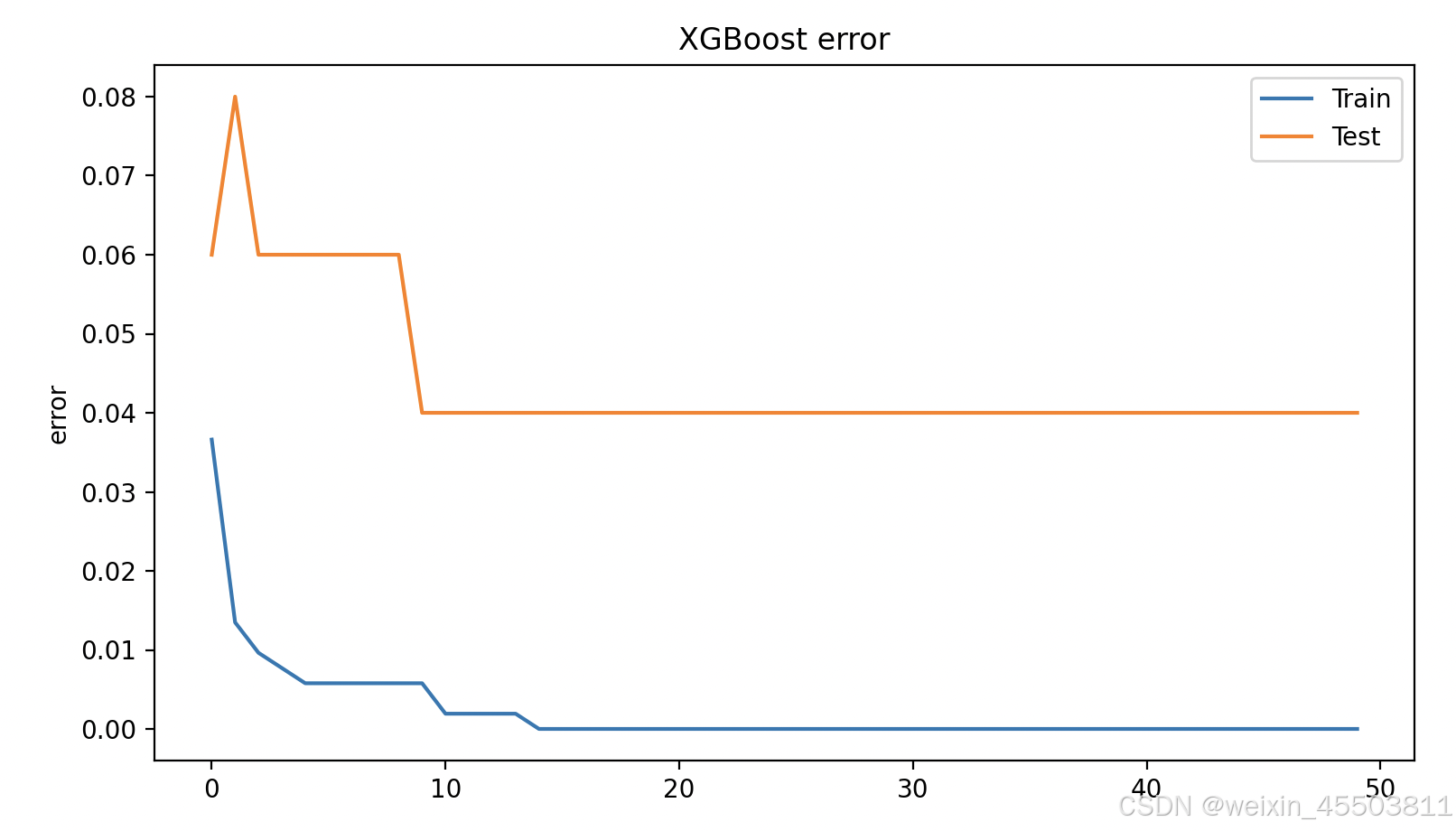
看以看出,在迭代14次左右后,训练集、验证集上的error值基本不变了。在后续的文章中将介绍如何通过调整xgboost的超参数防止该情况的发生。
画混淆举证图
代码如下:
def plot_cm(y_test, predictions, classNames):
    cm = confusion_matrix(y_test, predictions)

    fig, ax = plt.subplots(figsize=(9, 5))

    plt.imshow(cm, interpolation='nearest', cmap='RdBu')
    plt.ylabel('真实标签')
    plt.xlabel('预测标签')
    plt.title('confusion matrix')
    tick_marks = np.arange(len(classNames))
    plt.xticks(tick_marks, classNames, rotation=0)
    plt.yticks(tick_marks, classNames, rotation=45)
    s = [['真阴', '假阳'], ['假阴', '真阳']]
    total = cm.sum()

    for i in range(2):
        for j in range(2):
            plt.text(j, i, str(s[i][j]) + " = " + str(cm[i][j]) + f'\n{np.round(cm[i][j] / total * 100, 2)}%',
                     horizontalalignment='center', color='White')

    return ax


from sklearn.model_selection import train_test_split

train_df, valid_df = train_test_split(df, test_size=n_valid, random_state=42)
features = dbunch.feature_names
predict = xgb_clf.predict(valid_df[features])
plot_cm(valid_df['target'], predict, ['恶性', '良性'])
plt.show()
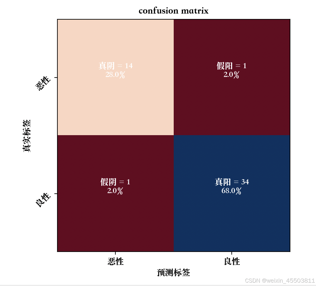
混淆矩阵如下:
画auc曲线图
代码如下:
from sklearn.metrics import precision_recall_curve, average_precision_score


def plot_aucprc(y_test, scores):
    fig, ax = plt.subplots(figsize=(9, 5))
    precision, recall, _ = precision_recall_curve(y_test, scores, pos_label=1)
    average_precision = average_precision_score(y_test, scores)

    plt.plot(recall, precision, label='area = %0.3f' % average_precision, color="green")
    plt.xlim([0.0, 1.0])
    plt.ylim([0.0, 1.05])
    plt.xlabel('Recall')
    plt.ylabel('Precision')
    plt.title('Precision Recall Curve')
    plt.legend(loc="best")
    return ax


scores = xgb_clf.predict_proba(valid_df[features])[:, 1]
plot_aucprc(valid_df['target'], scores)
plt.show()
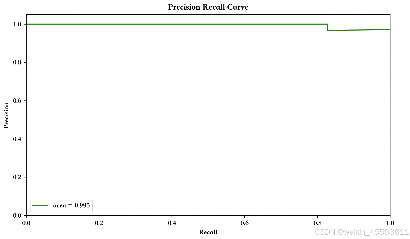
曲线图如下:
画决第1棵决策树结构和特征权重
代码如下:
import xgboost as xgb

xgb.plot_tree(xgb_clf, num_trees=0)
xgb.plot_importance(xgb_clf, importance_type='total_gain')
plt.show()
下一篇
在国内,模型训练好以后,画的树形图需要进一步和业务部门沟通交流,特征名称一般以中文展示,但是xgboost提供的api画的树形结构图对于中文不友好。在下一篇博客中,我将介绍如何在树形图、特征权重图上展示中文特征名称。


 9万+
9万+

 被折叠的 条评论
为什么被折叠?
被折叠的 条评论
为什么被折叠?
 到【灌水乐园】发言


