


微信小程序使用echarts组件实现饼状统计图功能
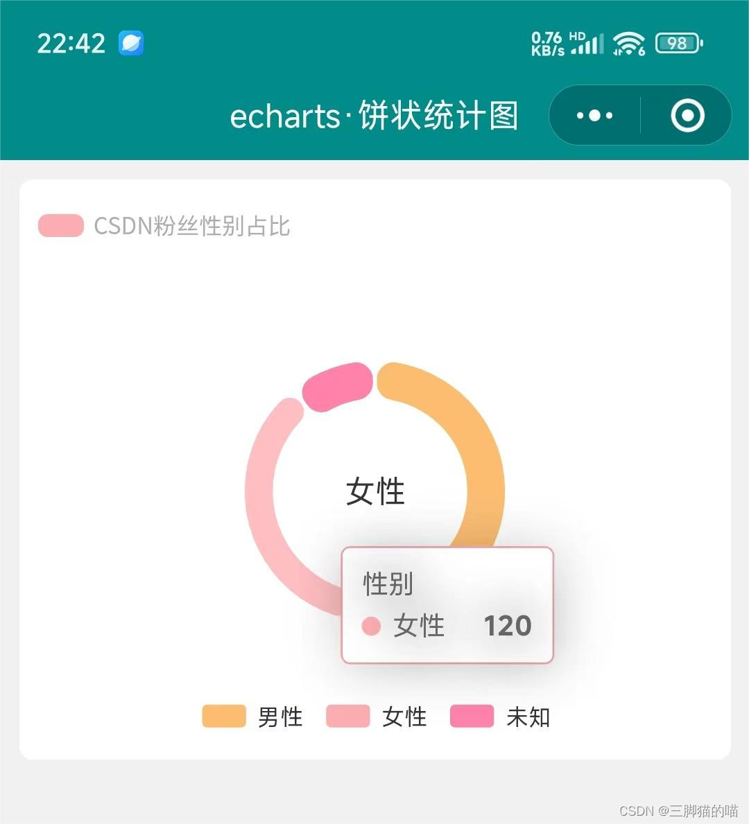
使用echarts实现在微信小程序中统计图的功能,具体的实现步骤思路可进我主页查看我的另一篇博文https://blog.youkuaiyun.com/weixin_45465881/article/details/138171153进行查看,本篇文章主要使用echarts组件实现饼状统计图功能,用性别作此示例,具体的实现结果截图如下:
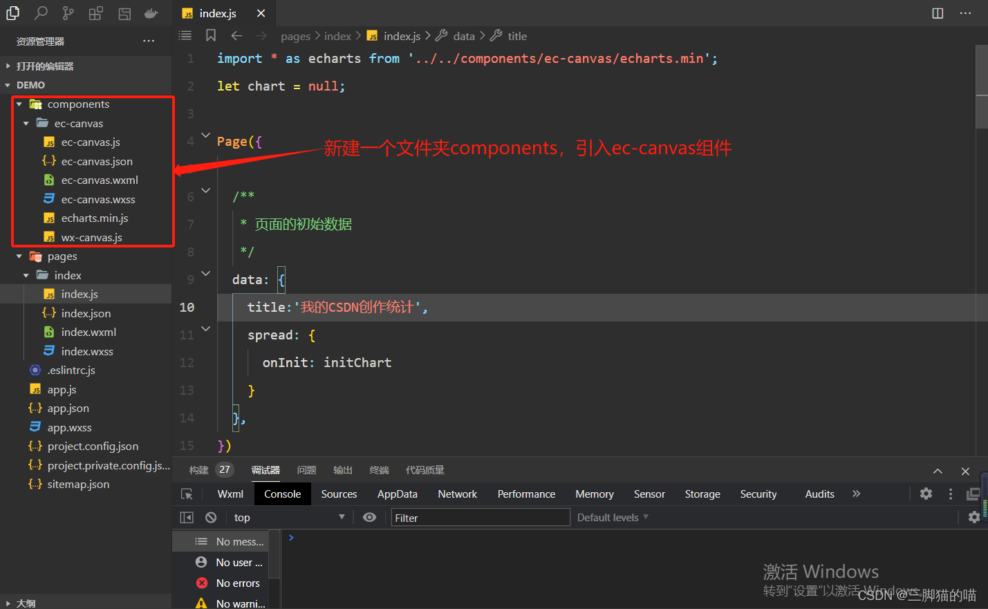
echarts组件代码较多,components文件夹的内容可在我主页的资源免费下载或者可前往echarts官网下载呦,引入的路径一定要正确。具体关于pages文件夹的代码如下:
1、wxml代码:
<view class="charts-box">
  <view class="charts-title">
    <view class="charts-pot"></view>
    <view>{{title}}</view>
  </view>
  <view style="height: 500rpx;">
    <ec-canvas canvas-id="mychart-bar" ec="{{sex}}"></ec-canvas>
  </view>
</view>
2、wxss代码:
page {
  background-color: #f1f1f1;
}

.charts-box {
  background-color: white;
  margin: 20rpx;
  border-radius: 15rpx;
  padding: 20rpx;
}

.charts-title {
  display: flex;
  flex-direction: row;
  font-size: 24rpx;
  align-items: center;
  justify-content: flex-start;
  color: rgb(173, 173, 173);
  margin-top: 10rpx;
}

.charts-pot {
  width: 46rpx;
  height: 24rpx;
  background-color: #fcadb0;
  margin-right: 10rpx;
  border-radius: 10rpx;
  margin-top: 2rpx;
}
3、js代码:
import * as echarts from '../../components/ec-canvas/echarts.min';
let chart = null;

Page({

  /**
   * 页面的初始数据
   */
  data: {
    title: '优快云粉丝性别占比',
    sex: {
      onInit: initChart
    }
  },
})

function initChart(canvas, width, height, dpr) {
  chart = echarts.init(canvas, null, {
    width: width,
    height: height,
    devicePixelRatio: dpr // new
  });
  canvas.setChart(chart);
  let attr = [
    {'value':175,'name':'男性'},
    {'value':120,'name':'女性'},
    {'value':36,'name':'未知'}
  ]
  let option = {
    tooltip: {
      trigger: 'item'
    },
    legend: {
      top: '90%',
      left: 'center'
    },
    color: ['#fcbd71', '#fcadb0', '#FF82AB'],
    series: [{
      name: '性别',
      type: 'pie',
      radius: ['52.87%', '36.25%','10.88%'],
      avoidLabelOverlap: false,
      itemStyle: {
        borderRadius: 10,
        borderColor: '#fff',
        borderWidth: 2
      },
      label: {
        show: false,
        position: 'center'
      },
      emphasis: {
        label: {
          show: true,
          fontSize: 16,
        }
      },
      labelLine: {
        show: false
      },
      data: attr
    }]
  };
  chart.setOption(option);
  return chart;
}
4、json代码:
{
  "component": true,
  "navigationBarTitleText": "echarts·饼状统计图",
  "navigationBarBackgroundColor": "#008B8B",
  "usingComponents": {
    "ec-canvas":"../../components/ec-canvas/ec-canvas"
  }
}
我这里简单绘制的饼状统计图,如需要其他的统计图,可自行学习或者进我主页,将分享更多内容呦~
小编创作不易,口干舌燥,可以的话,请我喝杯水吧!欢迎各位的批评指导呦~


 1万+
1万+

 被折叠的 条评论
为什么被折叠?
被折叠的 条评论
为什么被折叠?
 到【灌水乐园】发言


