


 本文介绍了如何使用Flex布局实现水平垂直居中、导航栏布局、圣杯布局和双飞翼布局。通过示例代码详细展示了Flex的justify-content、align-items属性以及其在复杂布局中的应用,帮助读者掌握网页布局的高级技巧。
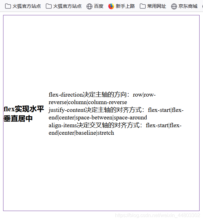
水平垂直居中
<style>
        .box{
            display: flex;
            justify-content: center;
            align-items: center;
            width: 500px;
            height: 500px;
            border: solid 1px rebeccapurple;
        }
    </style>
</head>
<body>
    <div class="box">
        <h3>flex实现水平垂直居中</h3>
        <p>flex-direction决定主轴的方向:row|row-reverse|column|column-reverse<br/>
            justify-content决定主轴的对齐方式:flex-start|flex-end|center|space-between|space-around<br/>
            align-items决定交叉轴的对齐方式:flex-start|flex-end|center|baseline|stretch
</p>
    </div>
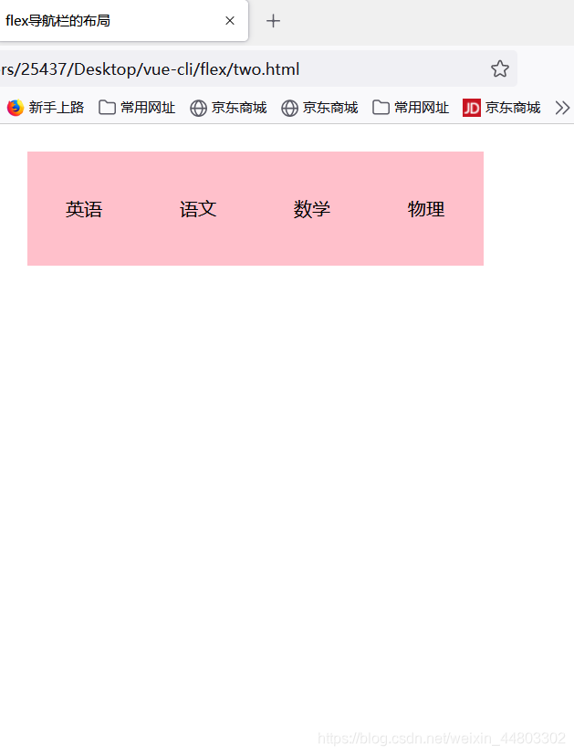
flex导航栏的布局
 <style>
        .box {
            display: flex;
            /* 居中 */
            justify-content: center;

        }
        .box p{
             background-color: pink;
             /* 文字居中 */
             text-align: center;
             line-height: 100px;
             width: 100px;
             height: 100px;
        }
    </style>

</head>

<body>
    <div class="box">
        <p>英语</p>
        <p>语文</p>
        <p>数学</p>
        <p>物理</p>
    </div>
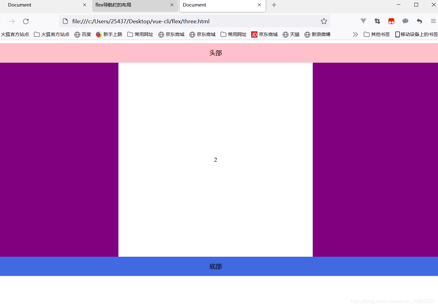
圣杯布局
圣杯布局指的是一种最常见的网站布局。页面从上到下,分成三部分:头部(header),躯干(body),尾部(footer)。
其中躯干又水平分成三栏:从左到右为:导航、主栏、副栏。
<style>
    body{

    }
    .demo{
        display: flex;
        flex-direction: column;
        align-items: center;
    }
    .heard{
        /* 文字居中 */
        text-align: center;
        line-height: 50px;
        width: 1200px;
        height: 50px;
        background-color: pink;
    }

    .body{
        display: flex;
        justify-content:space-between ;
        /* 文字居中 */
        text-align: center;
        line-height: 500px;
        width: 1200px;
        /* 不用定义高度等内容撑开 */
        background-color: purple;
    }
    .body .center{
        background-color: #fff;
        width: 500px;
    }
    .footer{
        /* 文字居中 */
        text-align: center;
        line-height: 50px;
          width: 1200px;
          height: 50px;
          background-color: royalblue;
    }
</style>

</head>
<body>
    <div class="demo">
   <div class="heard">头部</div>
   <div class="body">
       <div class="left">1</div>
       <div class="center">2</div>
       <div class="right">3</div>
   </div>
   <div class="footer">底部</div>


    </div>
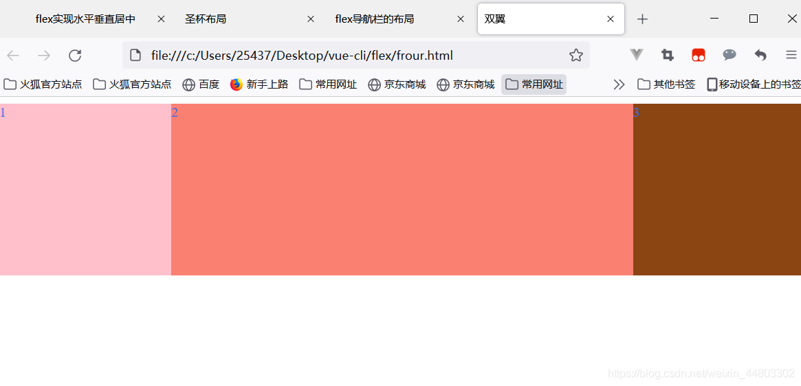
双飞翼布局
双飞翼布局,就是两端固定宽高,中间自适应的三栏布局。
  <title>双飞翼布局</title>
    <style>
        .demo{
            display: flex;
        }
        .coumen{
            height: 200px;
            color: royalblue;
        }
        .left{
            flex-basis: 200px;
            background-color: pink;
        }
        .center{
            flex-grow: 1;
            background-color: salmon;
        }
        .rigtht{
            flex-basis: 200px;
            background-color: saddlebrown;
        }
    </style>
</head>
<body>
    <div class="demo">
        <div class="left  coumen">1</div>
        <div class="center coumen" >2</div>
        <div class="rigtht coumen">3</div>

    </div>


 扫一扫
扫一扫


 962
962

 被折叠的 条评论
为什么被折叠?
被折叠的 条评论
为什么被折叠?
 到【灌水乐园】发言


