


一、Flex 布局:让网页布局更「弹性」
1. 什么是 Flex 布局?
Flex 是 Flexible Box(弹性盒子) 的缩写,是 CSS 中一种强大的布局模型,专门用来解决「元素在容器内的动态排列」问题。
核心优势:
- 自动适应不同屏幕尺寸(手机、平板、PC)
- 轻松实现垂直 / 水平居中、元素自动换行、空间分配等效果
- 子元素的
floatclearvertical-align属性会失效(专注 Flex 自身规则)
2. 如何启用 Flex 布局?
/* 块级容器(如 div) */
.flex-container {
  display: flex; /* 开启 Flex 布局 */
}

/* 行内容器(如 span) */
.inline-flex-container {
  display: inline-flex; /* 不独占一行的弹性容器 */
}
二、Flex 布局核心概念:两根轴 + 两个角色
1. 角色划分:容器 vs 项目
- Flex 容器(父元素):设置
display: flex的元素,决定子元素的排列规则。 - Flex 项目(子元素):容器的直接子元素,自动成为弹性项目(嵌套的子元素同样适用)。
2. 两根关键轴:主轴 vs 交叉轴
- 主轴:默认是水平方向(从左到右),由
flex-direction属性决定方向。 - 交叉轴:默认是垂直方向(从上到下),与主轴垂直。
- 关键术语:
main start(主轴起点)、main end(主轴终点)cross start(交叉轴起点)、cross end(交叉轴终点)
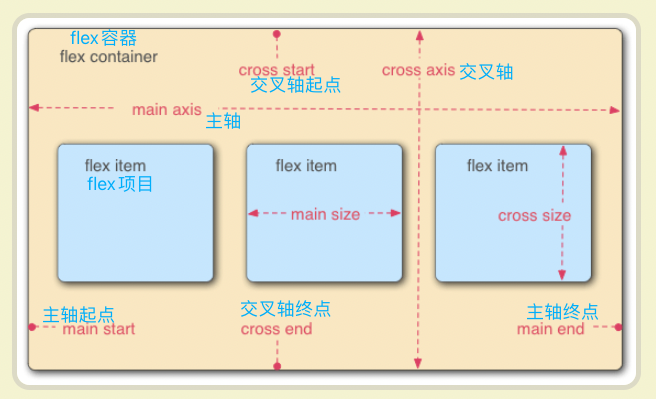
水平主轴,垂直交叉轴,项目沿主轴排列
三、容器属性:控制项目的「排列规则」
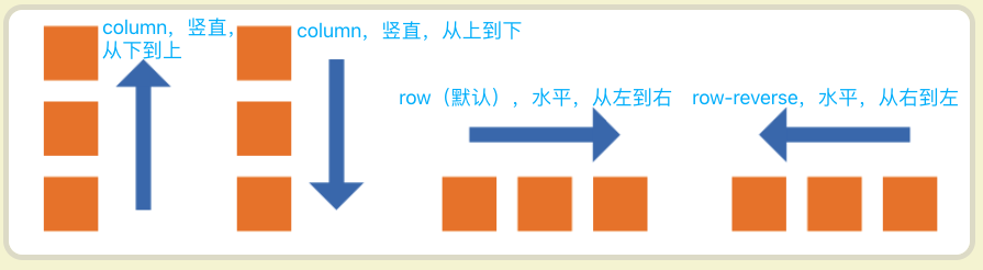
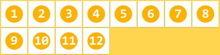
1. flex-direction:决定主轴方向(项目排列方向)
.flex-container {
  flex-direction: row;
  flex-direction: row-reverse;
  flex-direction: column;
  flex-direction: column-reverse;
}row(默认):水平排列,起点在左端(左→右)。row-reverse:水平排列,起点在右端(右→左)。column:垂直排列,起点在上沿(上→下)。column-reverse:垂直排列,起点在下沿(下→上)。
示例:
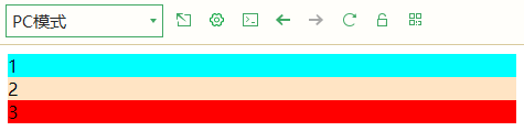
<div class="flex-container" style="flex-direction: column;">
	<div class="item" style="background-color: aqua;">1</div>
    <div class="item" style="background-color: bisque;">2</div>
	<div class="item" style="background-color: red;">3</div>
</div>
效果:项目垂直排列(从上到下)。
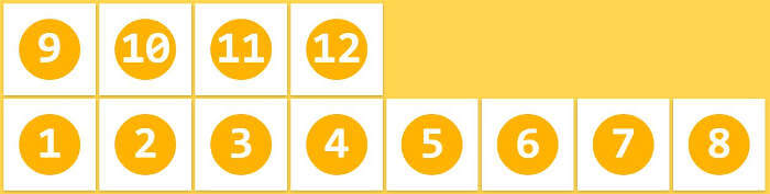
2. flex-wrap:控制项目是否换行
.flex-container {
  flex-wrap: nowrap;
  flex-wrap: wrap;
  flex-wrap: wrap-reverse;
}nowrap(默认):不换行,项目挤压或拉伸以适应容器宽度。
wrap:换行,第一行在上方,后续行依次向下排列。
wrap-reverse:换行,第一行在下方,后续行依次向上排列。
3. flex-flow:flex-direction + flex-wrap 的简写
.flex-container {
  flex-flow: [flex-direction] [flex-wrap]; /* 例如:row wrap */
}默认值:row nowrap(水平不换行)。
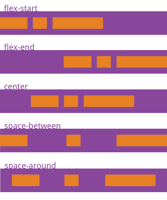
4. justify-content:主轴上的对齐方式
.flex-container {
  justify-content: flex-start;
  justify-content: flex-end;
  justify-content: center;
  justify-content: space-between;
  justify-content: space-around;
}flex-start(默认):项目靠主轴起点排列(左对齐)。flex-end:项目靠主轴终点排列(右对齐)。center:项目居中排列。space-between:项目两端对齐,中间间隔相等(左右不留白)。space-around:项目两侧间隔相等(左右留白是中间间隔的一半)。
示例代码:
<div style="justify-content: space-between;">
  <div class="item">1</div>
  <div class="item">2</div>
  <div class="item">3</div>
</div>
效果:1 靠左,3 靠右,1-2 和 2-3 间距相等。
5. align-items:交叉轴上的对齐方式
.flex-container {
  align-items: flex-start;
  align-items: flex-end;
  align-items: center;
  align-items: baseline;
  align-items: stretch;
}flex-start:项目靠交叉轴起点对齐(顶部对齐)。flex-end:项目靠交叉轴终点对齐(底部对齐)。center:项目居中对齐(垂直居中)。baseline:项目第一行文字的基线对齐(文本基线对齐)。stretch(默认):项目未设置高度时,撑满容器高度。
经典场景:垂直居中元素
.center-container {
  display: flex;
  height: 200px; /* 容器高度 */
  align-items: center; /* 垂直居中 */
  justify-content: center; /* 水平居中 */
}
四、项目属性:单个元素的「个性化控制」
1. order:调整项目排列顺序
.item {
  order: <整数>; /* 数值越小,排列越靠前,默认 0 */
}示例:
<div class="flex-container">
  <div class="item">1</div>
  <div class="item" style="order: -1;">2</div> <!-- 排最前 -->
  <div class="item" style="order: 2;">3</div>
</div>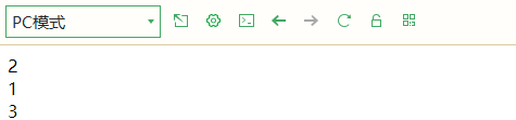
效果:排列顺序为 2 → 1 → 3(原顺序 1 → 2 → 3)。
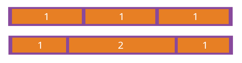
2. flex-grow:放大比例(分配剩余空间)
.item {
  flex-grow: <数字>; /* 默认 0(不放大) */
}- 所有项目
flex-grow: 1时,等分剩余空间。 - 若一个项目
flex-grow: 2,其他为 1,则它分得的空间是其他项目的 2 倍。
场景:三列布局,右侧列自适应宽
.columns {
  display: flex;
}
.left { width: 200px; } /* 固定宽 */
.right { flex-grow: 1; } /* 剩余空间全部分配给右侧 */
3. flex-shrink:缩小比例(空间不足时收缩)
.item {
  flex-shrink: <数字>; /* 默认 1(会缩小),0 表示不缩小 */
}
- 数值越大,收缩比例越高(负值无效)。
- 示例:禁止某个项目缩小
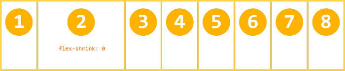
.no-shrink {
  flex-shrink: 0; /* 空间不足时不缩小 */
}
4. flex-basis:项目在主轴上的基础宽度
.item {
  flex-basis: <长度> | auto; /* 默认 auto(按自身大小计算) */
}
- 若设置
flex-basis: 100px,项目先占据 100px 空间,再参与剩余空间分配。 - 优先级高于
width(主轴为水平时)或height(主轴为垂直时)。
5. flex:三合一简写属性
.item {
  flex: [flex-grow] [flex-shrink] [flex-basis]; /* 推荐使用简写 */
}
- 默认值:
0 1 auto(不放大,会缩小,基础宽度自动)。 - 快捷值:
flex: auto→1 1 auto(可放大可缩小)flex: none→0 0 auto(固定大小,不放大不缩小)flex: 1→1 1 0%(常用:等分剩余空间)
6. align-self:单个项目的交叉轴对齐(覆盖容器规则)
.item {
  align-self: auto | flex-start | flex-end | center | baseline | stretch;
}
auto(默认):继承容器的align-items规则。- 示例:让某个项目底部对齐(其他项目居中)
<div class="flex-container" style="align-items: center;">
  <div class="item">居中</div>
  <div class="item" style="align-self: flex-end;">底部对齐</div>
</div>
五、实战案例:3 个经典布局场景
1. 水平居中 + 垂直居中(万能居中法)
<div style="display: flex; width: 100%; height: 100vh; justify-content: center;
 align-items: center;">
  <div class="box">我是居中的盒子</div>
</div>
效果:无论内容多少,始终在容器中心。
2. 响应式导航栏(自动换行)
.nav {
  display: flex;
  flex-wrap: wrap; /* 小屏幕时自动换行 */
  justify-content: center; /* 居中排列 */
  gap: 10px; /* 项目间距(现代浏览器支持) */
}
.nav-item {
  padding: 8px 16px;
  background: #f0f0f0;
}
场景:屏幕缩小时,导航项自动换行,保持间距。
3. 圣杯布局(两侧固定,中间自适应)
<div class="container" style="display: flex; height: 100vh;">
  <div class="left" style="width: 200px;">左侧栏</div>
  <div class="main" style="flex: 1; overflow: auto;">中间内容(可滚动)</div>
  <div class="right" style="width: 150px;">右侧栏</div>
</div>
核心:中间 flex: 1 占据剩余空间,两侧固定宽度。
六、总结:Flex 布局为什么值得学?
- 简单高效:几行代码搞定复杂对齐和响应式需求。
- 兼容性强:现代浏览器全支持,旧版 Safari 只需加前缀。
- 场景通用:从导航栏、表单到复杂页面布局,几乎无所不能。


 扫一扫
扫一扫


 被折叠的 条评论
为什么被折叠?
被折叠的 条评论
为什么被折叠?
 到【灌水乐园】发言


