


 本文详细探讨了前端开发中的滚动距离与高度(页面偏移量)、浏览器的兼容模式(标准模式与怪异模式)以及可视尺寸和整个页面尺寸的计算方法,包括Element.getBoundingClientRect()、元素距离浏览器边框的距离获取和操作滚动条的技巧,内容覆盖了兼容性写法和各种浏览器的差异。
五、滚动距离与高度、兼容模式、可视尺寸
一、滚动距离与高度(页面偏移量)
滚动距离与高度:实际上是页面移动的距离,而不是滚动条移动的距离。
查看滚动条的距离:
常规方法:
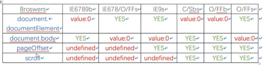
window.pageXOffset/pageYOffsetIE9某一些版本/IE8及以下没有常规方法,有自己的方法
document.body.scrollLeft/scrollTop
document.documentElement.scrollLeft/scrollTop为什么有两个方法:不同的浏览器中它俩的值总是一个是0,另一个正常
不常见的方法:
window.scrollX/scrollY
企业中滚动距离与高度兼容性写法:
function getScrollOffset(){
    if(window.pageXOffset){
        return {
            left: window.pageXOffset,
            top: window.pageYOffset
        }
    }else{
        return {
            width: document.body.scrollLeft
                   + document.documentElement.scrollLeft,
            top: document.body.scrollTop
                 + document.documentElement.scrollTop
        }
    }
}
二、兼容模式
浏览器有标准模式(CSS1Compat)和怪异模式(BackCompat)。
标准模式是在页面代码首行加上:
<!DOCTYPE html>
指定网页在浏览器当中进行渲染时要兼容W3C规范。
三、可视尺寸与整个页面尺寸
3.1 可视尺寸
浏览器的可视区域的尺寸(窗口的宽高)
常规:
window.innerWidth/innerHeightIE9/IE8及以下:
标准模式:
document.documentElement.clientWidth/clientHeight怪异模式:
document.body.clientWidth/clientHeight包括整个浏览器可视区域包括滚动条侧边栏等:
window.outerHeight/outerWidth
返回浏览器模式方法:document.compatMode
可视尺寸兼容性写法:
function getViewportSize(){
    if(window.innerWidth){
        return {
            width: window.innerWidth,
            height: window.innerHeight
        }
    }else{
        if(document.compatMode === 'BackCompat'){
            return {
                width: document.body.clientWidth,
                height: document.body.clientHeight
            }
        }else{
            return {
                width: document.documentElement.clientWidth,
                height: document.documentElement.clientHeight
            }
        }
    }
}
对于:document.documentElement.clientHeight不包括下面滚动条的长度,竖向滚动条到底就代表页面到底,没有太大的关系。
3.2 整个HTML页面尺寸
整个html文档尺寸
常规写法:
document.body.scrollWidth/scrollHeight其他方法:
document.documentElement.scrollWidth/scrollHeighthtml文档宽度 = 可视区域+滚动距离(页面偏移量)
document.body.scrollWidth = window.innerWidth + window.pageXOffset
整个html文档尺寸兼容性写法:
function getScrollSize(){
    if(document.body.scrollWidth){
        return {
            width: document.body.scrollWidth,
            height: document.body.scrollHeight
        }
    }else{
        return {
            width: document.documentElement.scrollWidth,
            height: document.documentElement.scrollHeight
        }
    }
}
3.3 Element.getBoundingClientRect()
Element.getBoundingClientRect() 方法返回元素的大小及其相对于视口的位置。
如果是标准盒子模型,元素的尺寸等于width/height + padding + border-width的总和。如果box-sizing: border-box,元素的的尺寸等于 width/height。
<style>
    body {
      margin: 0;
    }
    .box {
      position: absolute;
      top: 100px;
      left: 100px;
      width: 200px;
      height: 200px;
      background-color: skyblue;
    }
</style>

<body>
  <div class="box"></div>
  <script>
    var box = document.getElementsByClassName('box')[0];
    console.log(box.getBoundingClientRect());
  </script>
</body>
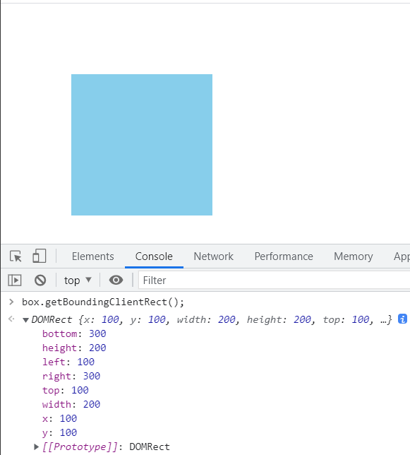
IE浏览器中使用这个方法不显示宽高,通过bottom-y = height,right-x = width;(x=left、y=top)。
缺点:不实时
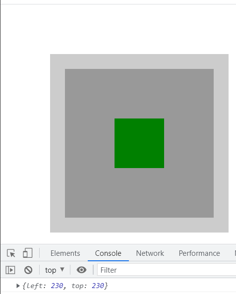
3.4 元素离浏览器边框的距离获取,封装函数
HTMLElement.offsetTop为只读属性,它返回当前元素相对于其offsetParent元素的顶部内边距的距离。
HTMLElement.offsetLeft是一个只读属性,返回当前元素左上角相对于HTMLElement.offsetParent节点的左边界偏移的像素值。
HTMLElement.offsetParent 是一个只读属性,返回一个指向最近的包含该元素的定位元素或者最近的 table,td,th,body元素。
核心总结:
offsetParent返回离自己最近的具有定位的祖先级元素offsetTop返回自己元素离offsetParent的元素顶端内边距的距离。offsetLeft返回自己元素离offsetParent的元素左端内边距的距离。
得到一个元素距离html文档的距离封装:
<style>
    body{
      margin: 0;
    }
    .grandPa{
      position: absolute;
      top: 100px;
      left: 100px;
      width: 360px;
      height: 360px;
      background-color: #ccc;
    }

    .parent{
      position: absolute;
      top: 30px;
      left: 30px;
      width: 300px;
      height: 300px;
      background-color: #999;
    }
    .son{
      position: absolute;
      top: 100px;
      left: 100px;
      width: 100px;
      height: 100px;
      background-color: green;
    }
</style>
<body>
  <div class="grandPa">
    <div class="parent">
      <div class="son"></div>
    </div>
  </div>
<body>
var son = document.getElementsByClassName('son')[0];
// 距离文档的宽度的和高度
function getEleDocPosition(el){
    // 设置父级元素,以及此刻距离父级元素的距离
    var parent = el.offsetParent,
        offsetLeft = el.offsetLeft,
        offsetTop = el.offsetTop;
    // 如果父级元素存在
    while(parent){
        // 加上父级元素距离它父级的距离
        offsetTop += parent.offsetTop;
        offsetLeft += parent.offsetLeft;

        parent = parent.offsetParent;
    }

    return {
        left: offsetLeft,
        top: offsetTop
    }
}

console.log(getEleDocPosition(son));
3.5 操作滚动条
window.scroll(x,y)与window.scrollTo(x,y)滚动窗口至文档中的特定位置。
window.srollBy(x,y)在窗口中按指定的偏移量滚动文档。


 扫一扫
扫一扫


 3436
3436

 被折叠的 条评论
为什么被折叠?
被折叠的 条评论
为什么被折叠?
 到【灌水乐园】发言


