


 本文介绍了如何使用Css中的伪类创建各种有趣的效果,包括字体变色、颜色及箭头变化、下拉页面弹出和元素放大等。通过灵活运用伪类,可以简化代码并增强用户体验,尤其在商品官网中常见。作者鼓励读者发挥创造力,探索更多伪类的潜力。
##灵活运用Css中的 伪类 做有趣的效果
(作者:唐华深 ,撰写时间:2019年1月17日)
版权声明:此文章为博主本人原创文章。如转载,请标明来处。 https://blog.youkuaiyun.com/weixin_44547126/article/details/86517752
Css中的 伪类 能做出各种各样神奇的、好玩的、有趣的功能效果,灵活运用伪类不仅能把页面打扮的漂漂亮亮的,还能把一些需要用到复杂代码 实现的效果实现出来,省下了不少时间与精力!
那么现在就让我们看看Css中的 伪类 能做些什么有趣的效果吧!
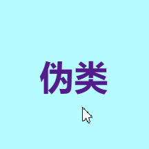
1. 鼠标移入字体变色效果(可以根据自己喜欢的颜色来调整颜色哦 ! )


参考代码:
<div class="box">
		<ul>
			<li>
				<div class="w">
					<h1><a href="#">伪类</a></h1>
				</div>
			</li>
	</ul>
</div>
<style>
li{
	list-style: none;
}
a{
	text-decoration: none;
}
.box .w h1{
	font-size: 40px;
}
.box .w h1 a:hover{
	color:red;
	font-size: 40px;
}
</style>
2.鼠标移入字体变色效果(2)

参考代码:
<div class="box">
	<ul>
		<li class="R">
			<h1><a href="#">伪类</a></h1>
		</li>
	</ul>
</div>
<style>
li{
	list-style: none;
}
a{
	text-decoration: none;
}
.box .R a{
	font-size: 40px;
	position: relative;
}
.box .R:hover a{
	color: red;
	position: relative;
}

.box .R a:hover:before {
    content: "";
    height: 3px;
    width: 100%;
    display: block;
    background: red;
    position: absolute;
    bottom: -5px;
}
</style>
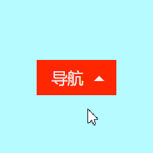
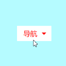
3.鼠标移入颜色及箭头变化效果
参考代码:
<div class="box">
	<ul>
		<li>
			<div class="DH">
				<div class="D">
					<a href="#" class="dh">导航</a>
				</div>
			</div>
		</li>
	</ul>
</div>
<style>
li{
	list-style: none;
}
a{
	text-decoration: none;
}
.box .DH{
	width: 90px;
}
.box .DH .D{
	position: relative;
	width: 90px;
    height: 40px;
	background: #FF2700;
    line-height: 40px;
}
.box .DH .D a{
	background: #FF2700;
	color: #F0F0F0;
	font-size: 18px;
}
.box .DH .dh:before{
    content: "";
    display: block;
    width: 0px;
    height: 0px;
    border-bottom: 6px solid #F0F0F0;
    border-left: 6px solid transparent;
    border-right: 6px solid transparent;
    position: absolute;
    top: 18px;
    right: 13px;
}
.box .DH .D a{
	padding-left:17px;
}
.box .DH:hover .dh:before{
    border-top: 6px solid red;
    border-bottom: 0;
}
.box .DH:hover .D{
	background: #FFF;
	color: red;

}
.box .DH:hover .D a{
	background: #FFF;
	color: red;
}
</style>
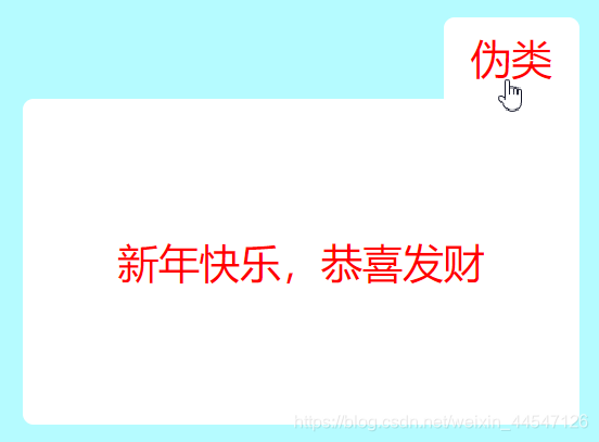
4.鼠标移入弹出下拉页面效果(这效果用js也可以做,但个人觉得比较麻烦,此效果多用于购物车等)
参考代码:
<div class="box">
		<ul>
			<li>
				<div class="WL">
					<div class="W">
						<a href="#">伪类</a>
					</div>
				<div class="wl">
					<div class="L">
						<p>新年快乐,恭喜发财</p>
					</div>
				</div>
			</div>
		</li>
	</ul>
</div>
<style>
li{
	list-style: none;
}
a{
	text-decoration: none;
}
.box .WL{
	position: relative;
	width: 90px;
}
.box .WL .W{
	width: 100px;
    height: 60px;
    background: #FF2700;
    text-align: center;
    line-height: 60px;
	border-radius: 8px;
}
.box .WL .W a{
	background: #FF2700;
	color: #F0F0F0;
	font-size: 28px;
    font-weight: 500;
}
.box .WL:hover .W{
	border-radius: 8px 8px 0 0;
	background: #FFF;
}
.box .WL:hover .W a{
	background: rgba(255,255,255,0.00);
	color: red;
	font-size: 30px;
    font-weight: 500;
}
.box .WL .wl{
	position: absolute;
	right: -10px;
}
.box .WL .wl .L p{
	background: #FFF;
	color: red;
	font-size: 30px;
    font-weight: 500;
}
.box .WL .wl{
	display: none;
    width: 270px;
    background: #FFF;
    text-align: center;
    padding: 70px;
    border-radius: 8px 0 8px 8px;
}
.box .WL:hover .wl{
	display: block;
}
</style>
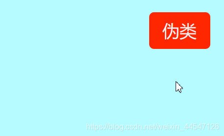
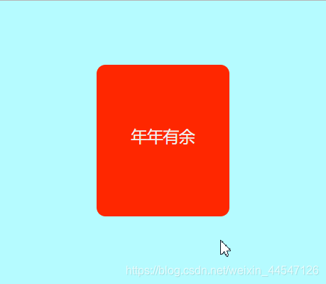
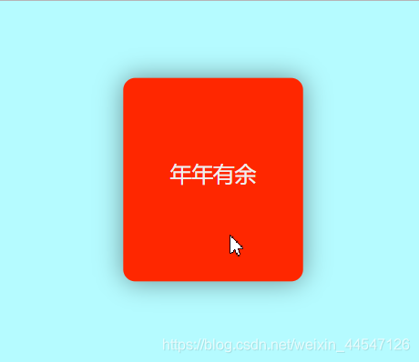
5.鼠标移入放大效果(配合动画、阴影效果等,可以做得非常好看,在一些商品官网就有这些功能哦)
<div class="box">
	<ul>
		<li>
			<div class="T">
				<a href="#">
					年年有余
				</a>
			</div>
		</li>
	</ul>
</div>
<style>
li{
	list-style: none;
}
a{
	text-decoration: none;
}
.box .T{
	background: #FF2700;
	width: 150px;
	height: 170px;
	text-align: center;
	line-height: 160px;
	transition: all .3s linear 0s;
	border-radius: 10px;
}
.box .T a{
	background: #FF2700;
	color: #F0F0F0;
	font-size: 18px;
    font-weight: 500;
}
.box .T:hover{
	transform: scale(1.05);
    box-shadow: 0 0 36px rgba(0,0,0,0.4);
}
</style>
代码直接复制到body里面即可使用,可自行修改内容做出自己喜欢的效果~
还有更多 伪类 制作效果欢迎互相探讨哦,在这就不一一展示啦,动动你们聪明的大脑做出更多有趣好玩的 伪类 效果吧。
小弟我在这里提前祝大家新春快乐、大吉大利、万事如意!!!


 扫一扫
扫一扫


 1013
1013

 被折叠的 条评论
为什么被折叠?
被折叠的 条评论
为什么被折叠?
 到【灌水乐园】发言


