


炫酷光影加载效果
在前面一节中,我们实现了一个页面 loading 的效果 – 3D水波浪球体动画效果,这次我们继续来实现一个更酷炫的页面 loading 效果 – 炫酷光影加载效果,我们还是先来看一下最终实现的效果,如图:
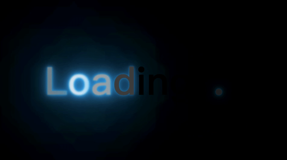
这个效果比起前面一节的 3D水波浪球体动画效果 看起来会更加的酷炫一些,当然它的实现相对来说也复杂一点。首先我们还是先来实现一下相关的 html 代码,如下:
<!DOCTYPE html>
<html lang="en">
<head><meta charset="UTF-8"><meta http-equiv="X-UA-Compatible" content="IE=edge"><meta name="viewport" content="width=device-width, initial-scale=1.0"><title>CSS3 - 炫酷光影加载效果</title>
</head>
<body><h1><span>L</span><span>o</span><span>a</span><span>d</span><span>i</span><span>n</span><span>g</span><span>.</span><span>.</span><span>.</span></h1>
</body>
</html>
页面中的 html 元素主要包含我们要在页面中展示的 loading 文字,当然使用中文也是可以的,html 不是重点,重点是 css ,让我们一起来看一下 css 的实现,代码如下:
*{ margin: 0;padding: 0;list-style: none;font-style: normal;}
html, body {width: 100%; height: 100%;}

body {display: flex;justify-content: center;align-items: center;font-family: consolas;background-color: #000;h1 {color: #000;font-size: 8em;display: flex;span {animation: animate 1s linear infinite;&:nth-child(1) {animation-delay: 0;}&:nth-child(2) {animation-delay: 0.1s;}&:nth-child(3) {animation-delay: 0.2s;}&:nth-child(4) {animation-delay: 0.3s;}&:nth-child(5) {animation-delay: 0.4s;}&:nth-child(6) {animation-delay: 0.5s;}&:nth-child(7) {animation-delay: 0.6s;}&:nth-child(8) {animation-delay: 0.7s;}&:nth-child(9) {animation-delay: 0.8s;}&:nth-child(10) {animation-delay: 0.9s;}}}
}

@keyframes animate {0%, 100% {color: #fff;filter: blur(3px);text-shadow: 0 0 10px #00b3ff,  0 0 20px #00b3ff, 0 0 40px #00b3ff, 0 0 80px #00b3ff, 0 0 120px #00b3ff, 0 0 240px #00b3ff, 0 0 320px #00b3ff, 0 0 480px #00b3ff, 0 0 600px #00b3ff, 0 0 720px #00b3ff;}25%, 75% {color: #000;filter: blur(0);text-shadow: none;}
}
这个效果主要运用了 CSS3 中的 animation,通过给每个 SPAN 元素单独设置延迟执行时间,不断改变元素的模糊度,从而实现了一个光影加载的效果,注意外层需要通过黑色覆盖起来,内层的白色不断变换即可。最终的代码实现跨越在这里进行查看
扁平预加载动画
在上面我们通过 CSS3 中的 animation 配合延时和遮罩完成了一个炫酷的 光影加载效果,接下来我们继续来实现一个页面中的 loading 效果 – 扁平预加载动画 效果。我们还是先来看最终的实现效果图,如下:
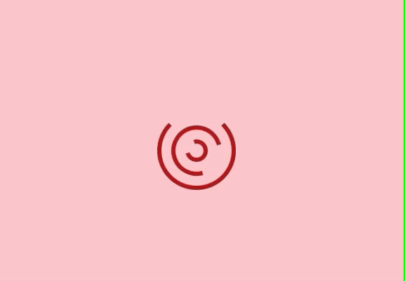
这个效果比起上面的炫影效果看起来要更顺滑一些,同样也可以作为页面的加载动画。老规矩,我们还是先来实现一下相关的 html 代码,具体如下:
<!DOCTYPE html>
<html lang="en">
<head><meta charset="UTF-8"><meta http-equiv="X-UA-Compatible" content="IE=edge"><meta name="viewport" content="width=device-width, initial-scale=1.0"><title>CSS3 - 扁平预加载动画</title>
</head>
<body><div class="container"><span></span><span></span><span></span></div>
</body>
</html>
通过上面的 html 结构就可以看出,我们在页面中实现的三个圆弧就是通过内层的三个 SPAN 标签完成的。然后通过 CSS 添加相应的动画让它们旋转起来,具体的 CSS 代码如下:
*{ margin: 0;padding: 0;list-style: none;font-style: normal;}
html, body {width: 100%; height: 100%;}

body {display: grid;justify-content: center;align-content: center;background-color: #ffcdd2;.container {position: relative;span {position: absolute;left: 50%;top: 50%;transform: translate(-50%, -50%);transform-origin: center center;border: 6px solid #b71c1c;border-radius: 50%;animation: animate 1.5s linear infinite;&:nth-child(1) {width: 100px;height: 100px;border-bottom: 6px solid transparent;animation: animate2 2s linear infinite;}&:nth-child(2) {width: 60px;height: 60px;border-top: 6px solid transparent;}&:nth-child(3) {width: 20px;height: 20px;border-bottom: 6px solid transparent;}}}
}

@keyframes animate {0% {transform: translate(-50%, -50%) rotateZ(0);}100% {transform: translate(-50%, -50%) rotateZ(360deg);}
}

@keyframes animate2 {0% {transform: translate(-50%, -50%) rotateZ(0);}100% {transform: translate(-50%, -50%) rotateZ(-360deg);}
}
这个效果的实现也很简单,只需要注意最外层的圆弧和最内层的圆弧的口是相对的,并且最外层圆弧的动画和里面两层圆弧的动画是相反的。通过前面学习的 animation 属性就可以完成这个效果了,最终的实现代码可以在这里进行查看
上面的两个效果很简单吧! 快快动手实现一下吧!
最后
整理了一套《前端大厂面试宝典》,包含了HTML、CSS、JavaScript、HTTP、TCP协议、浏览器、VUE、React、数据结构和算法,一共201道面试题,并对每个问题作出了回答和解析。

有需要的小伙伴,可以点击文末卡片领取这份文档,无偿分享
部分文档展示:


文章篇幅有限,后面的内容就不一一展示了
有需要的小伙伴,可以点下方卡片免费领取


 扫一扫
扫一扫


 1975
1975

 被折叠的 条评论
为什么被折叠?
被折叠的 条评论
为什么被折叠?
 到【灌水乐园】发言


