


 本文介绍了使用HTML和CSS3创建弹幕效果的两种方法。一种是利用<marquee>标签快速实现文字滚动,另一种是通过CSS3动画实现动态元素循环播放。这两种方法均可使元素在页面上无限循环显示。
学习了一个比较新鲜的代码,虽然只是一个标签,但是以前总是好奇那些弹幕是怎么搞出来的,现在总算知道了
- 一起来看一下无聊时做的一个页面
HTML部分
<!doctype html>
<html>
<head>
<meta charset="utf-8">
<title>xinnian</title>
</head>
<body>
<marquee behavior="" direction="" class="wp">炮竹一声除新年,常回家看看,搬个凳子坐在楼顶看烟花漫天灿烂~~~~~~</marquee>
<marquee behavior="" direction="" class="lsq">凳前水杯闪,疑似烟花亮,抬头看烟花,低头捧茶杯~~~~~~</marquee>
</body>
</html>
就是这么简单,然后就可以实现弹幕效果。
效果图:
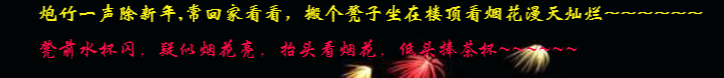
这个弹幕它可以自己无限循环播放。
还有一个css3代码可以实现循环播放的
HTML部分
<!doctype html>
<html>
<head>
   <meta charset="utf-8">
   <title>xinnian</title>
   <link rel="stylesheet" href="css/program.css">
</head>

<body>
<div class="start">
    <div class="second" id="second">
		<div class="HT1"></div>
		<div class="HT1 HT2"></div>
		<div class="HT1 HT3"></div>
		<div class="HT1 HT4"></div>
		<div class="HT1 HT5"></div>
		<div class="HT1 HT6"></div>
		<div class="HT1 HT7"></div>
    </div>
</div>
</body>
</html>
Css部分
@charset "utf-8";
/* CSS Document */
* {
	margin: 0;
	padding: 0;
}
.HT1{
	float:right;
	width: 35px;
	height: 10px;
	background: #FF8585;
	margin-right:10px;
	animation: HT 3s infinite alternate;
}
.HT2{
	background:#F709A4;
	animation-delay: 1s;
}
.HT3{
	background:#F9082E;
	animation-delay: 1.2s;
}
.HT4{
	background:#01F1D0;
	animation-delay: 1.5s;
}
.HT5{
	background:#1AF871;
	animation-delay: 0.8s;
}
.HT6{
	background:#F0F704;
	animation-delay: 0.5s;
}
.HT7{
	background:#F77A00;
	animation-delay: 1.7s;
}
@keyframes HT{
	0%{
		height: 10px;
	}
	25%{
		height: 85px;
	}
	50%{
		height: 180px;
	}
	75%{
		height: 100px;
	}
	100%{
		height: 25px;
	}
}
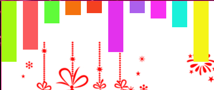
放图,但是这截图没有动态效果
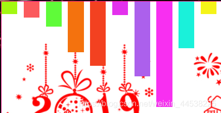
设置了时间并且无限循环,所以图片的效果不一样


 扫一扫
扫一扫


 3050
3050

 被折叠的 条评论
为什么被折叠?
被折叠的 条评论
为什么被折叠?
 到【灌水乐园】发言


