


stamp软件由于只有下图三种方法去检验,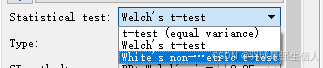
而我们平时用的最多的是Wilcoxon rank-sum test,可惜他没有,我借鉴了刘永鑫老师和 王哲_UJN_MGG_AI博客的文章,进行了代码修改,最终呈现图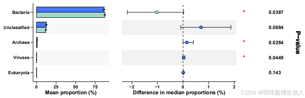
怎么画呢,我们需要两个表格:
data_summarized.txt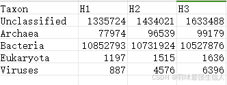
GROUP.txt(分组文件 )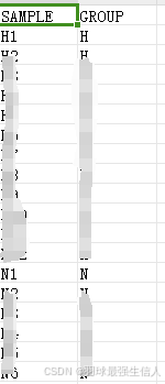
data <- read.table("data_summarized.txt",header = TRUE,row.names = 1,sep = "\t")

group <- read.table("Group.txt",header = TRUE,row.names = 1,sep = "\t")
library(tidyverse)
library(tidyverse)
library(boot)


# 将每个元素除以其所在列的总和
data <- sweep(data, 2, colSums(data), FUN = "/")
data <- data*100
# 对于每一列(样本),找到丰度最高的前5个OTU
otu_abundance <- rowSums(data)

# 对丰度进行排序,选择丰度最高的前5个OTU
top5_otus <- names(sort(otu_abundance, decreasing = TRUE)[1:5])

# 筛选出这前5个OTU的丰度数据
data <- data[top5_otus, ]

data <- t(data)
data1 <- data.frame(data,group$GROUP)
colnames(data1) <- c(colnames(data),"Group")
data1$Group <- as.factor(data1$Group)


diff <- data1 %>%
  select_if(is.numeric) %>% #选择所有的数值型列
  map_df(~ broom::tidy(wilcox.test(. ~ Group,data = data1)), .id = 'var') #执行Wilcoxon秩和检验
# 定义一个函数来计算中位数差异
median_diff <- function(data, indices) {
  d <- data[indices, ]  # 从数据中抽样
  diff <- median(d[d$Group == levels(d$Group)[1], 'value']) - #计算两组的中位数差异
    median(d[d$Group == levels(d$Group)[2], 'value']) #计算得到的两个中位数之差(第一组中位数减去第二组中位数)
  return(diff) #返回中位数差异
}

# 为每个变量应用bootstrap
results <- list() #创建一个空列表
for (var in colnames(data1[, sapply(data1, is.numeric)])) { #遍历所有数值型列的名称
  # 将数据框准备为boot函数所需的格式
  boot_data <- data1[, c(var, 'Group'), drop = FALSE] #个变量创建一个新的数据框
  colnames(boot_data) <- c('value', 'Group') #设置列名

  # 应用bootstrap方法
  boot_res <- boot(data = boot_data, statistic = median_diff, R = 1000) #执行bootstrap分析,进行1000次重采样

  # 计算置信区间
  conf_int <- boot.ci(boot_res, type = "perc") #计算bootstrap结果的百分位数置信区间

  # 存储结果
  results[[var]] <- list(estimate = boot_res$t0, conf.low = conf_int$percent[4], conf.high = conf_int$percent[5])}


# 在循环之前初始化列
diff$estimate <- NA  # 初始化estimate列为NA
diff$conf.low <- NA  # 初始化conf.low列为NA
diff$conf.high <- NA  # 初始化conf.high列为NA

# 现在遍历results列表,提取结果并合并到diff中
for (var in names(results)) {
  # 获取当前变量的bootstrap结果
  boot_res <- results[[var]]

  # 在diff中找到对应的变量行,并添加bootstrap估计和置信区间
  diff$estimate[diff$var == var] <- boot_res$estimate
  diff$conf.low[diff$var == var] <- boot_res$conf.low
  diff$conf.high[diff$var == var] <- boot_res$conf.high
  #通过这个循环,每个变量的bootstrap分析结果(中位数差异估计值和置信区间)被添加到diff数据框中,对应于原先通过Wilcoxon秩和检验得到的结果。
  #这样,diff数据框现在包含了完整的分析结果,既有原始的Wilcoxon秩和检验结果,也有通过bootstrap方法估计的中位数差异及其置信区间。
}
# 重新计算 abun.bar,添加标准误
abun.bar <- data1[, c(diff$var, "Group")] %>%
  gather(variable, value, -Group) %>%
  group_by(variable, Group) %>%
  summarise(Mean = mean(value),
            STD = sd(value))  # 计算标准差

# 调整 Group 水平顺序,确保 "H" 在 "N" 之上
abun.bar$Group <- factor(abun.bar$Group, levels = c("N", "H"))


# 右侧散点图
diff.mean <- diff[,c("var","estimate","conf.low","conf.high","p.value")] #提取数据
diff.mean$Group <- c(ifelse(diff.mean$estimate >0,levels(data1$Group)[1],
                            levels(data1$Group)[2])) #分配组别,果estimate大于0,表示第一组的中位数高于第二组,变量则被分配到data1$Group的第一级别;否则,分配到第二级别。
diff.mean <- diff.mean[order(diff.mean$estimate,decreasing = TRUE),] #根据estimate值重新排序
#Adjust Group factor levels
# 确保变量顺序与diff.mean一致
abun.bar$variable <- factor(abun.bar$variable, levels = rev(top5_otus))
# Define colors with explicit group mapping
cbbPalette <- c("H" = "royalblue1", "N" = "#A2D9CE")
# 绘制图表
p1 <- ggplot(abun.bar, aes(x = variable, y = Mean, fill = Group)) +
  scale_x_discrete(limits = rev(top5_otus)) +  # 确保顺序为自上而下
  coord_flip() +
  xlab("") +
  ylab("Mean proportion (%)") +
  theme(
    panel.background = element_rect(fill = 'transparent'),
    panel.grid = element_blank(),
    axis.ticks.length = unit(0.4, "lines"),
    axis.ticks = element_line(color = 'black'),
    axis.line = element_line(colour = "black"),
    axis.title.x = element_text(colour = 'black', size=12, face = "bold"),
    axis.text = element_text(colour = 'black', size=10, face = "bold"),
    legend.title = element_blank(),
    legend.text = element_text(size=12, face = "bold", colour = "black",
                               margin = margin(r = 20)),
    legend.position = "top",
    legend.direction = "horizontal",
    legend.key.width = unit(0.8, "cm"),
    legend.key.height = unit(0.5, "cm")
  )

# Add alternating background color blocks
for (i in 1:(nrow(diff.mean) - 1)) {
  p1 <- p1 + annotate('rect', xmin = i + 0.5, xmax = i + 1.5, ymin = -Inf, ymax = Inf,
                      fill = ifelse(i %% 2 == 0, 'white', 'gray95'), alpha = 0.5)
}

# Add bars and error bars with specified group order
p1 <- p1 +
  geom_bar(stat = "identity", position = position_dodge(width = 0.7),
           width = 0.7, colour = "black") +
  geom_errorbar(aes(ymin = Mean - STD, ymax = Mean + STD),
                width = 0.2, position = position_dodge(width = 0.7)) +
  scale_fill_manual(values = cbbPalette, breaks = c("H", "N"))

# Display the plot
p1


# 右侧散点图
diff.mean$var <- factor(diff.mean$var,levels = rev(top5_otus))
diff.mean$p.value <- signif(diff.mean$p.value,3)
diff.mean$p.value <- as.character(diff.mean$p.value)
p2 <- ggplot(diff.mean,aes(var,estimate,fill = Group)) +
  theme(panel.background = element_rect(fill = 'transparent'),
        panel.grid = element_blank(),
        axis.ticks.length = unit(0.4,"lines"),
        axis.ticks = element_line(color='black'),
        axis.line = element_line(colour = "black"),
        axis.title.x=element_text(colour='black', size=12,face = "bold"),
        axis.text=element_text(colour='black',size=10,face = "bold"),
        axis.text.y = element_blank(),
        legend.position = "none",
        axis.line.y = element_blank(),
        axis.ticks.y = element_blank(),
        plot.title = element_text(size = 15,face = "bold",colour = "black",hjust = 0.5)) +
  scale_x_discrete(limits = rev(top5_otus)) +
  coord_flip() +
  xlab("") +
  ylab("Difference in median proportions (%)") +
  labs(title="95% confidence intervals")

for (i in 1:(nrow(diff.mean) - 1))
  p2 <- p2 + annotate('rect', xmin = i+0.5, xmax = i+1.5, ymin = -Inf, ymax = Inf,
                      fill = ifelse(i %% 2 == 0, 'white', 'gray95'))

p2 <- p2 +
  geom_errorbar(aes(ymin = conf.low, ymax = conf.high),
                position = position_dodge(0.8), width = 0.3, size = 0.5) +
  geom_point(shape = 21,size = 3) +
  scale_fill_manual(values=cbbPalette) +
  geom_hline(aes(yintercept = 0), linetype = 'dashed', color = 'black')

# 将p.value列从字符型转换为数值型
diff.mean$p.value <- as.numeric(diff.mean$p.value)
# 创建一个新列'significance',基于p值的大小转换为星号表示
diff.mean$significance <- ifelse(diff.mean$p.value < 0.001, '***',
                                 ifelse(diff.mean$p.value < 0.01, '**',
                                        ifelse(diff.mean$p.value < 0.05, '*', '')))

# 更新p3图表代码,用'significance'代替p值
p3 <- ggplot(diff.mean, aes(var, estimate, fill = Group)) +
  geom_text(aes(y = 0, x = var), label = diff.mean$significance,
            hjust = 0, fontface = "bold", inherit.aes = FALSE, size = 5, color = "red") +
  geom_text(aes(x = nrow(diff.mean)/2 + 0.5, y = 0.85), label = "",
            srt = 90, fontface = "bold", size = 5, color = "red") +
  coord_flip() +
  ylim(c(0,1)) +
  theme(panel.background = element_blank(),
        panel.grid = element_blank(),
        axis.line = element_blank(),
        axis.ticks = element_blank(),
        axis.text = element_blank(),
        axis.title = element_blank())


p4 <- ggplot(diff.mean, aes(var, estimate, fill = Group)) +
  geom_text(aes(y = 0, x = var), label = diff.mean$p.value,
            hjust = 0, fontface = "bold", inherit.aes = FALSE, size = 4) +
  geom_text(aes(x = nrow(diff.mean)/2 + 0.5, y = 0.85), label = "P-value",
            angle = -90, fontface = "bold", size = 5) +
  coord_flip() +
  ylim(c(0, 1)) +
  theme(panel.background = element_blank(),
        panel.grid = element_blank(),
        axis.line = element_blank(),
        axis.ticks = element_blank(),
        axis.text = element_blank(),
        axis.title = element_blank())


# 图像拼接
library(patchwork)

p <- p1 + p2 + p3 + p4+plot_layout(widths = c(4,6,1,2))

pdf("p_value_plot_界.pdf", width =10, height = 4)

# 绘制图形
print(p)

# 关闭设备,完成保存
dev.off()


# 加载openxlsx包
library(openxlsx)

# 创建一个新的Workbook
wb <- createWorkbook()

# 添加第一个Sheet
addWorksheet(wb, "diff.mean")
writeData(wb, sheet = "diff.mean", diff.mean)

# 添加第二个Sheet
addWorksheet(wb, "abun.bar")
writeData(wb, sheet = "abun.bar", abun.bar)

# 保存文件
saveWorkbook(wb, file = "界.xlsx", overwrite = TRUE)
最后还会生成一个 界.xlsx文件,里面有图里的具体参数。
学费了吗,亲


 1406
1406

 被折叠的 条评论
为什么被折叠?
被折叠的 条评论
为什么被折叠?
 到【灌水乐园】发言


