


 本文深入讲解React中的List组件,涵盖其基本功能、使用案例、API介绍及源代码解析,适合前端开发者阅读。
React 组件封装之 List 列表
一、List 列表
组件说明:
List 列表主要实现底部下划线和左右留空。
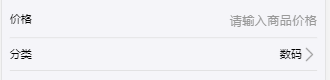
效果展示:
List 通常与其他组件结合使用,以下是 List+Input 和 List+Select 的使用效果。
二、使用案例
import {List,Select} from 'share';
import React from 'react';
export default class Example extends React.Component {
    constructor(props) {
        super(props);
    }
    render(){
      return <List>
                    <Select
                         options={this.state.typeList}
                         babel="分类"
                         onChange={this.changeType.bind(this)}
                    />
                </List>
    }
}
三、API 使用指南
| 属性 | 说明 | 类型 | 默认值 |
|---|---|---|---|
| onClick | 某一行的点击事件 | Function | 空函数 |
四、源代码
index.js
import React from 'react';
import Item from './ListItem';
import {defaultProps} from './defaultProps';
import './index.css';
export default class List extends React.Component {
    static defaultProps = defaultProps;
    render(){
        let {onClick,prefixCls} = this.props;
        return(
            <div className={prefixCls} onClick={()=>onClick()}>
                {this.props.children}
        </div>
        )
    }
}
List.Item = Item;
index.less
@import '../default';
@prefixCls: s-list;

/* 默认搜索bar */
.@{prefixCls} {
  //display: flex;
  padding: @size-10 0;
  border-bottom:1px solid @border-c-base;
  .@{prefixCls}-item{
    display: flex;
    justify-content: space-between;
    width: 100%;
    .@{prefixCls}-item-left{
      display: flex;
      align-items: center;
      .@{prefixCls}-item-title{
        color: @c-333;
      }
    }
    .@{prefixCls}-item-right{
      display: flex;
      align-items: center;
      color: @c-999;
    }
    .@{prefixCls}-item-left-icon{
      width: @size-20;
      height: @size-20;
      margin-right: @size-10;
    }
    .@{prefixCls}-item-icon{
      width: @size-20;
      height: @size-20;
    }
  }
}
ListItem.js
import React from 'react';
import right from '../images/list/right.png';
import {defaultProps} from './defaultProps';
export default class ListItem extends React.Component {
    static defaultProps = defaultProps;
    render(){
        const {prefixCls,leftIcon,leftTitle,rightTitle,rightIcon,isNotRightIcon} = this.props;
        return(
            <div className={prefixCls+"-item"}>
                <div className={prefixCls+"-item-left"}>
                    {leftIcon?<img src={leftIcon} alt="" className={prefixCls+"-item-left-icon"}/>:null}
                    <span className={prefixCls+"-item-title"}>{leftTitle}</span>
                </div>
                <div className={prefixCls+"-item-right"}><span className="cm-c-999">{rightTitle}</span>
                    {isNotRightIcon?null:
                        rightIcon?<img src={rightIcon} alt="" className={prefixCls+"-item-icon"}/>:<img src={right} alt="" className={prefixCls+"-item-icon"}/>
                    }
                </div>
            </div>
        )
    }
}
defaultProps.js
function noop() {}
export const defaultProps = {
    prefixCls: 's-list',
    onClick: noop,
};


 扫一扫
扫一扫


 被折叠的 条评论
为什么被折叠?
被折叠的 条评论
为什么被折叠?
 到【灌水乐园】发言


