


一、背景
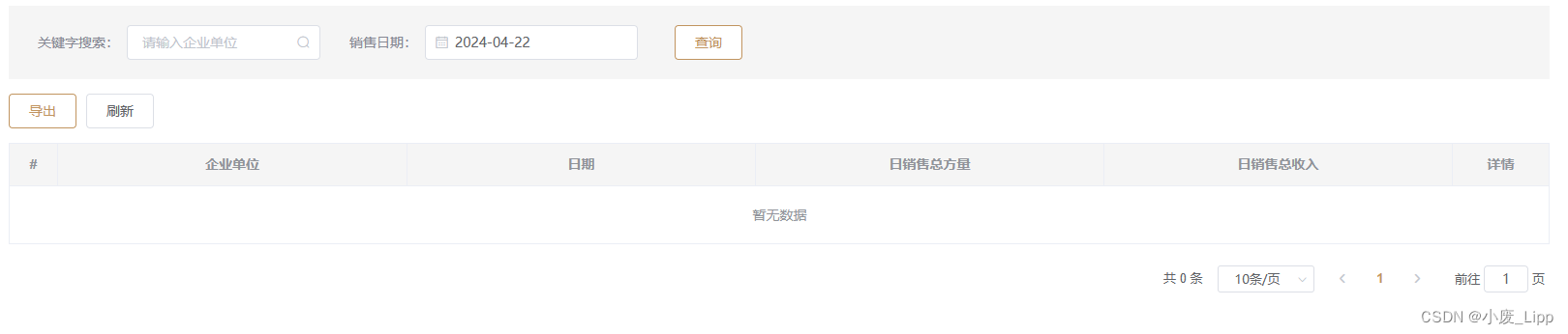
在管理系统的开发当中,页面顶部是一个表单筛选,中间是一个表格展示数据,页面底部是一个分页器,这种页面结构出现的频率很高。如图:
二、组件封装(vue2)
<template>
<div>
   <div v-if="isShow">
      <slot name="filterForm"></slot>// 表单筛选插槽
    </div>
    <div v-if="isShow">
      <slot name="middleButtons"></slot>//如图上所示的 导出、刷新按钮插槽
    </div>
    <el-table :data="operateList"  border ref="table" v-loading="loading">//表格
      <el-table-column type="index" label="#" align="center" width="60px" />
      <template v-for="(item, index) in tableList">
          <el-table-column :prop="item.prop" :label="item.label" align="center" :width="item?.width || '100px'">
      </template>
       <el-table-column label="操作"  align="center" v-if="operation" :width="operateWidth" fixed="right">
            <template slot-scope="scope">
              <slot :row="scope.row"></slot> //表格操作栏按钮插槽
            </template>
       </el-table-column>
    </el-table>
    <div v-if="isShowPagination">//分页
      <el-pagination @size-change="handleSizeChange" @current-change="handleCurrentChange" :current-page="currPage"
       :page-size="pageSize" layout="total, sizes, prev, pager, next, jumper" :total="total">
      </el-pagination>
    </div>
</div>
</template>
<script>
export default {
  data() {
    return {
      currPage: 1,
      pageSize: 10,
    }
  },

  props: {
    isShow: {// 是否使用筛选
      type: Boolean,
      default: true
    },
    loading: {    // loading效果
      type: Boolean,
      default: false
    },
    operateList: {  // 数据源
      type: Array,
      default: () => []
    },
    tableList: { // label和prop
      type: Array,
      default: () => []
    },
    operation: {// 是否需要没有展开行的右侧操作栏
      type: Boolean,
      default: false
    },
    total: {// 总表格条数
      type: Number,
      default: 0
    },
    isShowPagination: {//  是否需要分页
      type: Boolean,
      default: true
    },
    pageSizes: { //分页每页显示条数
      type: Array,
      default: () => [10, 25, 50, 100, 300]
    },
    operateWidth: {  //操作栏宽度大小
      type: Number,
      default: 252
    },
    tableCurrent: {   //分页当前页
      type: Number,
      default: 1
    },
    tablePageSize: {   //分页一页显示条数
      type: Number,
      default: 10
    },
  },
  methods: {
    handleSizeChange(v) {
      this.pageSize = v
      this.currPage = 1
      this.$emit('getTableList', {
        currPage: this.currPage,
        pageSize: this.pageSize
      })
    },
    handleCurrentChange(v) {
      this.currPage = v
      this.$emit('getTableList', {
        currPage: this.currPage,
        pageSize: this.pageSize
      })
    },
  },
  watch: {},
  mounted() {
    this.currPage = this.tableCurrent
    this.pageSize = this.tablePageSize
  }
}
</script>
使用举例
<template>
  <my-table operateList="tableData" :loading="tableLoading" :tableList="tableList" :operation="true" :total="total"     :isShow="false" @getTableList="getTableList">
    <el-table-column label="操作">
         <template slot-scope="scope">
           <el-button type="info">详情</el-button>
        </ template >
 </my-table>
</template>
<script>
import MyTable from './MyTable .vue';
export default {
  data() {
    return {
       tableList: [
         {
          prop: 'name',
          label: '名称',
          width: '150'
        },
       ],
       tableData:[],
       tableLoading:false,
       total:10,
    },
    methods:{
    getTableList(){ // 获取tableData }
    }
   }
 }
</script>
扩展
在此基础上,可以增加单选多选( type=“selection”)、展开行(extend)等等…
三、组件优化: 对要特殊处理的表格列进行优化,简化组件中使用的参数
<template>
  <div class="table">
    <el-table ref="table" :data="tableData" v-loading="tableLoading" border element-loading-text="获取数据中..."
      empty-text="暂无数据">
      <template v-for="(col, index) in tableColumn" :key="index">
        <!-- 序号 -->
        <el-table-column type="index" v-if="col.type === 'index'" :width="col.width" :label="col.label"  align="center" />
          <!-- 多选 -->
        <el-table-column type="selection" v-else-if="col.type === 'selection'" :width="col.width" align="center"/>
        <!-- 扩展插槽 -->
        <el-table-column type="expand" v-if="col.type === 'expand'" :width="col.width" :label="col.label">
          <template #default="{ row, $index }">
            <slot :row="row" :name="col.slot" :index="$index"></slot>
          </template>
        </el-table-column>
        <!-- 渲染插槽 -->
        <el-table-column :prop="col.prop" :label="col.label" align="center" v-else
          :show-overflow-tooltip="col.showOverflowTooltip" :min-width="col?.width || 100" :fixed="col.fixed">
          <template #default="{ row, $index }">
            <div class="colCell">
              <slot v-if="col.slot" :name="col.slot" :row="row" :index="$index" />
              <span v-else>{{ row[col.prop] }}</span>
            </div>
          </template>
        </el-table-column>
      </template>
    </el-table>
  </div>
  <div class="bottomPagination">
    <el-pagination @size-change="handleSizeChange" @current-change="handleCurrentChange" :current-page="currPage"
      v-if="isPagination" :page-size="pageSize" layout="total, sizes, prev, pager, next, jumper" :total="total"
      :page-sizes="pageSizes">
    </el-pagination>
  </div>
</template>
<script setup>
import { ref, defineProps, defineEmits } from "vue";
const currPage = ref(1);
const pageSize = ref(10);
const multipleSelection = ref([]);
const funcEmit = defineEmits(['getTableData']);
defineProps({
  tableLoading: {
    type: Boolean,
    default: false
  },
  tableData: { //数据源
    type: Array,
    default: () => []
  },
  tableColumn: {//表格列
    type: Array,
    default: () => []
  },
  total: { //总表格条数,在需要分页时使用并必传
    type: Number,
    default: 0
  },
  isPagination: { //是否需要分页
    type: Boolean,
    default: false
  },
  pageSizes: { //分页每页显示条数
    type: Array,
    default: () => [10, 25, 50, 100, 300]
  },
})
// 分页器
const handleSizeChange = (val) => {
  pageSize.value = val;
  funcEmit('getTableData', {
    currPage: currPage.value,
    pageSize: val
  })
}
const handleCurrentChange = (val) => {
  currPage.value = val;
  funcEmit('getTableData', {
    currPage: val,
    pageSize: pageSize.value
  })
}
// 多选
const handleSelectionChange = (val) => {
  multipleSelection.value = val
}
</script>
组件使用
<template>
 <Table :tableColumn="tableColumn" :tableData="tableData">
      <template #date="{ row }">
        <span>{{ row.date}}</span>//根据需求调整日期格式
      </template>
      <template #expand="{ row }">
        <span>{{ row.address }}</span>
      </template>
      <template #action="{ row, index }">
        <el-button type="success">添加</el-button>
        <el-button type="warning">删除</el-button>
      </template>
  </Table>
</template>
<script setup>
import Table from '@/components/VTable/index.vue'
const tableData = [
  {
    date: 1660737564000,
    name: '佘太君',
    address: '上海市普陀区金沙江路 1516 弄'
  },
  {
    date: 1462291200000,
    name: '王小虎',
    address: '上海市普陀区金沙江路 1517 弄'
  },
  {
    date: 1462032000000,
    name: '王小帅',
    address: '上海市普陀区金沙江路 1519 弄'
  },
  {
    date: 1462204800000,
    name: '王小呆',
    address: '上海市普陀区金沙江路 1516 弄'
  }
]
const tableColumn = [
  { type: 'index', label: 'NO.', width: '80'},
  { type: 'selection', width: '60'},
  { prop: 'name', label: '名字' },
  { prop: 'date', label: '日期', slot: 'date' },
  { prop: 'address', label: '地址', showOverflowTooltip: true },
  { type: 'expand', label: '详情', slot: 'expand', width: '80' },
  { prop: 'action', label: '操作', slot: 'action', fixed: 'right' },
]
</script>


 扫一扫
扫一扫


 4549
4549

 被折叠的 条评论
为什么被折叠?
被折叠的 条评论
为什么被折叠?
 到【灌水乐园】发言


