


Author:龙箬
Data Science and Big Data Technology
Change the world with data!
优快云@weixin_43975035
每朵云都下落不明,每盏月亮都不知所终。
机器学习案例1----良恶性乳腺癌肿瘤预测
本实验使用到的数据集如下: breast-cancer-data.
提取码:girm
参考代码如下:
import pandas as pd
import matplotlib.pyplot as plt
import numpy as np
#注意修改路径
df_train=pd.read_csv('C:\\Users\\lenovo\\Desktop\\PYTHON机器学习及实践\\breast-cancer-train.csv')
df_test=pd.read_csv('C:\\Users\\lenovo\\Desktop\\PYTHON机器学习及实践\\breast-cancer-test.csv')
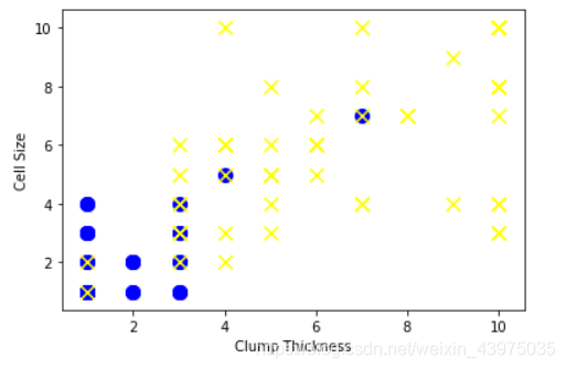
#选取'Clump Thickness'与'Cell Size'作为特征,构建测试集中的正负分类样本
df_test_negative=df_test.loc[df_test['Type']==0][['Clump Thickness','Cell Size']]
df_test_positive=df_test.loc[df_test['Type']==1][['Clump Thickness','Cell Size']]
# matplotlib.pyplot.scatter(x, y, s=None, c=None, marker=None, cmap=None, norm=None, vmin=None, vmax=None, alpha=None, linewidths=None, verts=None, edgecolors=None, *, data=None, **kwargs)
# x,y——设置点的位置
# s——点的大小
# c——点的颜色
# marker——点的形状
# cmap——可以用来控制颜色渐变,具体用法,见例子http://blog.sina.com.cn/s/blog_c39df0460102xifx.html
# norm——亮度
# vmin,vmax——标准化亮度
# alpha——点的透明度,透明度设置的好能够使图好看
# linewidths,verts,edgcolors——点边缘线宽,(x,y)的序列,边缘线颜色
# **kwargs——以字典方式输入参数
plt.scatter(df_test_negative['Clump Thickness'],df_test_negative['Cell Size'],s=100,c='blue',marker='o')
plt.scatter(df_test_positive['Clump Thickness'],df_test_positive['Cell Size'],s=100,c='yellow',marker='x')

plt.xlabel('Clump Thickness')
plt.ylabel('Cell Size')
plt.show()
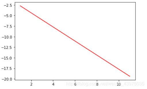
#利用numpy中的random函数随机采样直线的截距和系数
intercept=np.random.random([1])
coef=np.random.random([2])
lx=np.arange(1,12)
ly=(-intercept -lx*coef[0])/coef[1]
plt.plot(lx,ly,c='red')
from sklearn.linear_model import LogisticRegression
lr =LogisticRegression()
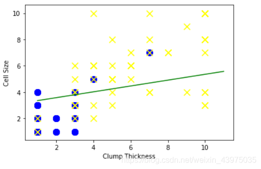
#使用前10条训练样本学习直线的系数和截距
lr.fit(df_train[['Clump Thickness','Cell Size']][:10],df_train['Type'][:10])
print('Testing accuracy (10 training samples):',lr.score(df_test[['Clump Thickness','Cell Size']],df_test['Type']))
Testing accuracy (10 training samples): 0.8685714285714285
intercept=lr.intercept_
coef=lr.coef_[0,:]
#原本这个分类面应该是lx*coef[0]+ly*coef[1]+intercept=0
ly=(-intercept -lx*coef[0])/coef[1]
plt.plot(lx,ly,c='green')
plt.scatter(df_test_negative['Clump Thickness'],df_test_negative['Cell Size'],s=100,c='blue',marker='o')
plt.scatter(df_test_positive['Clump Thickness'],df_test_positive['Cell Size'],s=100,c='yellow',marker='x')

plt.xlabel('Clump Thickness')
plt.ylabel('Cell Size')
plt.show()
#使用所有训练样本学习直线的系数和结局
lr.fit(df_train[['Clump Thickness','Cell Size']],df_train['Type'])
print('Testing accuracy (all training samples):',lr.score(df_test[['Clump Thickness','Cell Size']],df_test['Type']))
Testing accuracy (all training samples): 0.9371428571428572
intercept=lr.intercept_
coef=lr.coef_[0,:]
#原本这个分类面应该是lx*coef[0]+ly*coef[1]+intercept=0
ly=(-intercept -lx*coef[0])/coef[1]
plt.plot(lx,ly,c='green')
plt.scatter(df_test_negative['Clump Thickness'],df_test_negative['Cell Size'],s=100,c='blue',marker='o')
plt.scatter(df_test_positive['Clump Thickness'],df_test_positive['Cell Size'],s=100,c='yellow',marker='x')

plt.xlabel('Clump Thickness')
plt.ylabel('Cell Size')
plt.show()
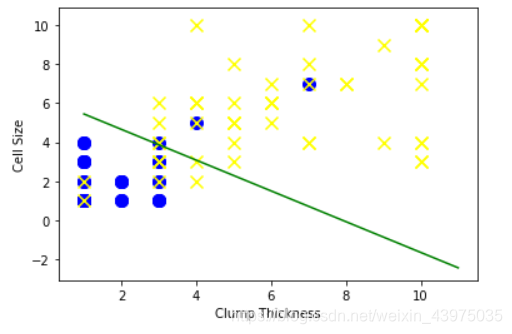
可以看出对于本实验,当使用全部训练样本进行训练时比使用前10条训练样本得分高出7%
参考致谢:
范淼,李超.Python机器学习及实践——从零开始通往Kaggle竞赛之路
如有侵权,请联系侵删
需要本实验源数据及代码的小伙伴请联系QQ:2225872659


 被折叠的 条评论
为什么被折叠?
被折叠的 条评论
为什么被折叠?
 到【灌水乐园】发言


