


 本文介绍了圣杯布局和双飞翼布局这两种常见的三栏布局方式,它们都实现两侧宽度固定,中间宽度自适应的效果。圣杯布局通过定位实现,而双飞翼布局则更简洁,避免了变形问题,但会增加DOM节点。两种布局各有优缺点,适用于不同的场景。
圣杯布局和双飞翼布局
圣杯布局和双飞翼布局是常用的两种布局方式,其共同的效果是实现一个两侧宽度固定,中间宽度自适应的三栏布局。它们都遵循以下原则:
- 两侧宽度固定,中间宽度自适应
- 中间部分在DOM结构上优先,以便先行渲染
- 允许三列中的任意一列成为最高列
- 只需要使用一个额外的
<div>标签
圣杯布局的实现:
1.container包裹着三部分center,left,right,其中center放在最前面。假设左侧的固定宽度为200px,右侧的固定宽度为200px,这时container需要预留一些位置:
#container {
	padding-left: 200px;
	padding-right: 200px;
	background: #ff0000;
}
#center{
    width:100%;
}
#left{
    width:200px;
}
#right{
    width:200px;
}
2.根据浮动的特性,由于center的宽度为100%,即占据了第一行的所有空间,这时将left放到之前预留的位置上(负外边距),同时利用position进行定位,而right也得移动到相对应的位置上(margin-right):
#left {
	 width: 200px;
	 margin-left: -100%;
	 background: lightpink;
	 position: relative;
	 right: 200px;
	 height: 300px;
}
#right {
	 width: 200px;
	 background: greenyellow;
	 margin-right: -200px;
	 height: 300px;
}
3.因为左右两侧的宽度是固定的,所以需要给页面一个最小的宽度:min-width=左边固定宽度+右边固定宽度+左边预留的宽度(即是200px+200px+200px=600px):
body {
	min-width: 600px;
}
圣杯布局的完整代码:
<!DOCTYPE html>
<html>
<head>
<meta charset="utf-8">
<title>圣杯布局</title>
</head>
<style>
body {
min-width: 600px;
}
#header{
height: 30px;
background:gray;
font-size: 20px;
text-align: center;
padding-top: 10px;
}
#container {
padding-left: 200px;
padding-right: 200px;
background: #ff0000;
font-size: 20px;
text-align: center;
}
#container .column {
float: left;
}
#center {
width: 100%;
background: skyblue;
height: 300px;
}
#left {
width: 200px;
margin-left: -100%;
background: lightpink;
position: relative;
right: 200px;
height: 300px;
}
#right {
width: 200px;
background: greenyellow;
margin-right: -200px;
height: 300px;
}
#footer {
clear: both;
height: 30px;
background:gray;
font-size: 20px;
text-align: center;
padding-top: 10px;
}
</style>
<body>
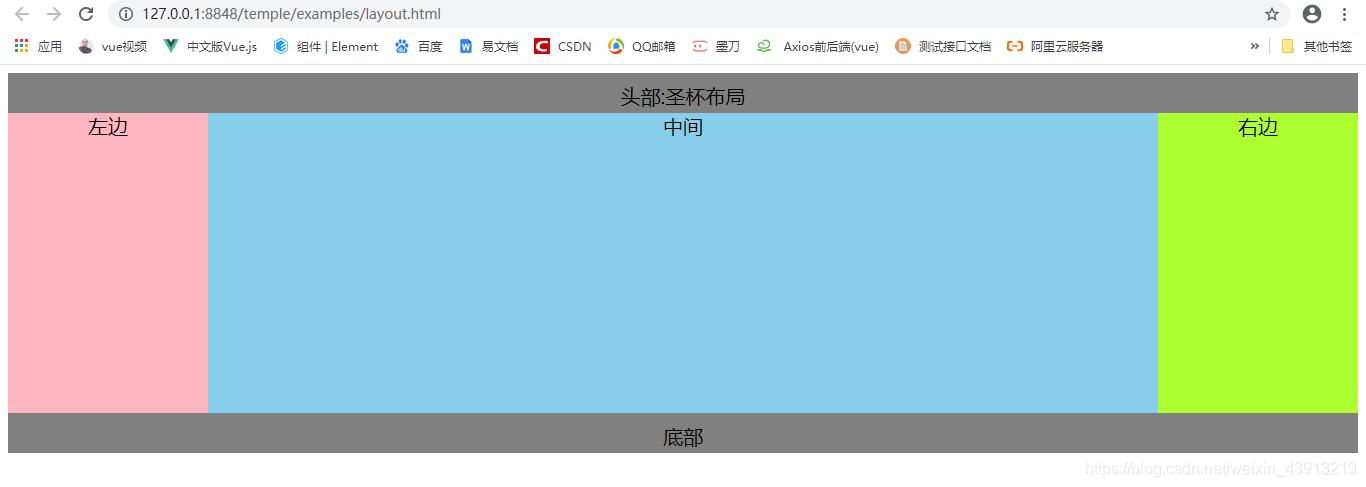
<div id="header">头部:圣杯布局</div>
<div id="container">
<div id="center" class="column">中间</div>
<div id="left" class="column">左边</div>
<div id="right" class="column">右边</div>
</div>
<div id="footer">底部</div>
</body>
</html>
圣杯布局的实现效果图:
双飞翼布局的实现:
双飞翼布局最大的区别是container仅包裹住center,另外将.column类从center移至container上。首先先设置列的宽度与浮动,并为左右两列预留位置:
#container {
	width: 100%;
}
.column {
	float: left;
}
#center {
     margin-left: 200px;
	 margin-right: 150px;
}
#left {
	width: 200px;
}
#right {
	width: 150px;
}
2.在container内部,center由于没有设置浮动,所以其宽度默认为container的100%宽度,通过对其设置margin-left和margin-right为左右两列预留出了空间,将left,right放置到预留位置:
#left {
  width: 200px;
  margin-left: -100%;
}
#right {
  width: 150px;
  margin-left: -150px;
}
3.计算最小页面宽度:由于双飞翼布局没有用到position:relative进行定位,所以最小页面宽度应该为左边宽度+右边宽度(350px)。但是当页面宽度缩小到350px附近时,会挤占中间栏的宽度,使得其内容被右侧栏覆盖,所以应该适当增加一些宽度以供中间栏使用。最小宽度=左边宽度+右边宽度+适当增加的宽度。
body {
  min-width: 500px;
}
双飞翼布局的完整代码:
<!DOCTYPE html>
<html>
<head>
<meta charset="utf-8">
<title>双飞翼布局</title>
</head>
<style>
#header {
height: 40px;
text-align: center;
font-size: 25px;
background: grey;
color: white;
}
body {
min-width: 500px;
}
#container {
width: 100%;
}
.column {
float: left;
}
#center {
margin-left: 200px;
margin-right: 150px;
background: #FFB6C1;
height: 300px;
}
#left {
width: 200px;
margin-left: -100%;
background: #87CEEB;
height: 300px;
}
#right {
width: 150px;
margin-left: -150px;
background: plum;
height: 300px;
}
#footer {
clear: both;
height: 40px;
text-align: center;
font-size: 25px;
background: grey;
color: white;
}
</style>
<body>
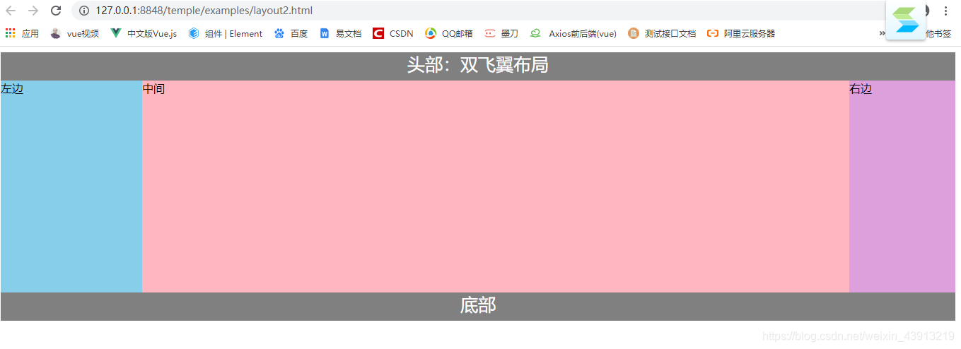
<div id="header">头部:双飞翼布局</div>
<div id="container" class="column">
<div id="center">中间</div>
</div>
<div id="left" class="column">左边</div>
<div id="right" class="column">右边</div>
<div id="footer">底部</div>
</body>
</html>
双飞翼布局实现效果图:
- 圣杯布局不需要添加dom节点,但是当middle宽度过大时会变形;
- 双飞翼布局在实现上由于不需要使用定位,所以更加简洁,且允许的页面最小宽度通常比圣杯布局更小,不会像圣杯布局那样变形,但是会多了一层dom节点。
圣杯布局和双飞翼布局的区别
圣杯布局:为了让中间div内容不被遮挡,将中间div设置了左右padding-left和padding-right后,将左右两个div用相对布局position: relative并分别配合right和left属性,以便左右两栏div移动后不遮挡中间div。
双飞翼布局:为了让中间div内容不被遮挡,直接在中间div内部创建子div用于放置内容,在该div里用margin-left和margin-right为左右两栏div留出位置。


 扫一扫
扫一扫


 1455
1455

 被折叠的 条评论
为什么被折叠?
被折叠的 条评论
为什么被折叠?
 到【灌水乐园】发言


