


目录
一、概述
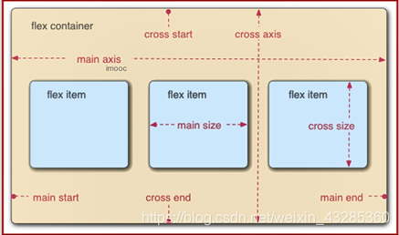
1.1 什么是 flex 布局?
Flex 是 Flexible Box 的缩写,意为"灵活的盒子"或"弹性的盒子",所以 flex 布局一般也叫作"弹性布局"
什么是 flex 容器(flex container)?
采用 flex 布局的元素,称为 flex 容器
什么是 flex 项目(flex item)?
flex 容器的所有子元素自动成为容器成员,称为 flex 项目
二、容器属性
2.1 display
决定是否使用flex布局
display: flex | inline-flex;
flex:将对象作为弹性伸缩盒显示,对其他兄弟元素来说,它依然是一个普通的块级标签,对里面的子元素(弹性项目)来说,这个盒子是它们的弹性容器
inline-flex:将对象作为内联块级弹性伸缩盒显示,对其他兄弟标签来说,它是一个普通的行内块级元素,对里面的子元素来说,它是弹性容器。
特点:
-
弹性容器里面的子元素(弹性项目)可以同行显示,默认排列不下时,按比例将子元素进行压缩
-
弹性容器只对于直接子元素有效
-
弹性容器对自己的兄弟标签没有任何影响
-
对于弹性容器来说,高度是自适应的,无需设置高度(需要固定高度时才设置)
注意:
-
弹性容器外面和弹性项目内都是正常渲染的,弹性盒子只控制弹性项目如何在弹性容器里面显示。
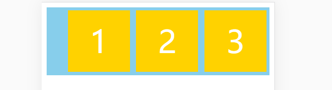
2.2 flex-direction
控制弹性项目的排列方式,同时确定弹性容器的主轴
默认是水平方向为主轴,侧轴是与主轴垂直的轴为侧轴
flex-direction: row | row-reverse | column | column-reverse;
row(默认值):主轴为水平方向,起点在左端
row-reverse:主轴为水平方向,起点在右端
column:主轴为垂直方向,起点在上沿
column-reverse:主轴为垂直方向,起点在下沿
示例:
 .box {
            /*设置flex布局*/
            display: flex;
            background-color: white;
            margin: 0 0 55px;
        }

        .box-1 {
            /* 决定主轴的方向(即项目的排列方向) */
            flex-direction: row-reverse;
        }

        .box-item {
            width: 200px;
            height: 100px;
            line-height: 100px;
            /* vertical-align:设置元素的垂直对齐方式 */
            vertical-align: middle;
            margin: 5px;
            background-color: #ffd200;
            font-size: 50px;
            color: white;
            text-align: center;
        }
<div class="box box-1">
<div class="box-item">1</div>
<div class="box-item">2</div>
<div class="box-item">3</div>
<div class="box-item">4</div>
</div>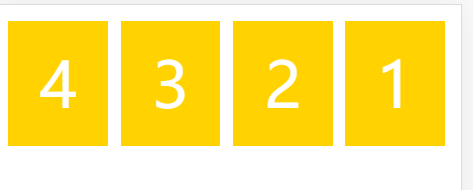
2.3 flex-wrap
控制弹性项目是否换行 ,默认情况下,项目都排在一条线(又称"轴线")上
flex-wrap: nowrap | wrap | wrap-reverse;
nowrap(默认):不换行
wrap:换行,第一行在上方
wrap-reverse:换行,第一行在下方
示例:
 .box {
            /*设置flex布局*/
            display: flex;
            background-color: skyblue;
            margin: 0 0 55px;
        }

        .box-1 {
            /* 决定主轴的方向(即项目的排列方向) */
            flex-direction: row;
            /* 超出的部分换行显示 */
            flex-wrap: wrap;
        }

        .box-item {
            width: 100px;
            height: 100px;
            line-height: 100px;
            /* vertical-align:设置元素的垂直对齐方式 */
            vertical-align: middle;
            margin: 5px;
            background-color: #ffd200;
            font-size: 50px;
            color: white;
            text-align: center;
        }
<div class="box box-1">
<div class="box-item">1</div>
<div class="box-item">2</div>
<div class="box-item">3</div>
<div class="box-item">4</div>
<div class="box-item">5</div>
<div class="box-item">6</div>
<div class="box-item">7</div>
</div>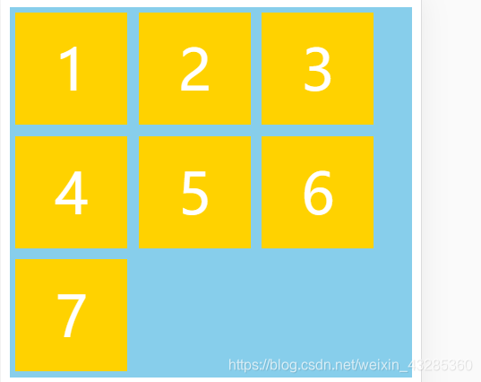
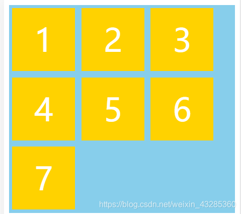
2.4 flex-flow
flex-flow 属性是 flex-direction 属性和 flex-wrap 属性的简写形式,默认值为 row nowrap
示例:
 <div class="box box-1">
        <div class="box-item">1</div>
        <div class="box-item">2</div>
        <div class="box-item">3</div>
        <div class="box-item">4</div>
        <div class="box-item">5</div>
        <div class="box-item">6</div>
        <div class="box-item">7</div>
</div> .box {
/*设置flex布局*/
display: flex;
background-color: skyblue;
margin: 0 0 55px;
}
.box-1 {
flex-flow: row wrap;
}
.box-item {
width: 100px;
height: 100px;
line-height: 100px;
/* vertical-align:设置元素的垂直对齐方式 */
vertical-align: middle;
margin: 5px;
background-color: #ffd200;
font-size: 50px;
color: white;
text-align: center;
}
2.5 justify-content
定义了项目在主轴上的对齐方式
justify-content: flex-start | flex-end | center | space-between | space-around;
- flex-start(默认值):默认值,将主轴方向的富裕空间分配在弹性项目的最后(左对齐)
- flex-end:将富裕空间分配在主轴的弹性项目最前面(右对齐)
- center: 居中
- space-between:两端对齐,项目之间的间隔都相等
- space-around:每个项目两侧的间隔相等。所以,项目之间的间隔比项目与边框的间隔大一倍
- space-evenly:每个弹性项目之间的距离相同,包含第一个和最后一个和弹性容器的距离
示例:
<div class="box box-1">
        <div class="box-item">1</div>
        <div class="box-item">2</div>
        <div class="box-item">3</div>
</div>
.box {
/*设置flex布局*/
display: flex;
background-color: skyblue;
margin: 0 0 55px;
}
.box-1 {
flex-flow: row wrap;
/* 整体右对齐 */
justify-content: flex-end;
}
.box-item {
width: 100px;
height: 100px;
line-height: 100px;
/* vertical-align:设置元素的垂直对齐方式 */
vertical-align: middle;
margin: 5px;
background-color: #ffd200;
font-size: 50px;
color: white;
text-align: center;
}
2.6 align-items
定义项目在交叉轴上如何对齐,针对每一行
align-items: flex-start | flex-end | center | baseline | stretch;
- flex-start:交叉轴的起点对齐
- flex-end:交叉轴的终点对齐
- center:交叉轴的中点对齐
- baseline: 项目的第一行文字的基线对齐
- stretch(默认值):如果项目未设置高度或设为auto,将占满整个容器的高度
示例:
  .box {
            /*设置flex布局*/
            display: flex;
            background-color: skyblue;
            margin: 0 0 55px;
        }

        .box-1 {
            flex-flow: row wrap;
            /* 整体右对齐 */
            justify-content: flex-end;
            /* 交叉轴如何对齐 */
            /* 交叉轴的终点对齐 */
            align-items: flex-end;
        }

        .box-item {
            width: 100px;
            height: 100px;
            line-height: 100px;
            /* vertical-align:设置元素的垂直对齐方式 */
            vertical-align: middle;
            margin: 5px;
            background-color: #ffd200;
            font-size: 50px;
            color: white;
            text-align: center;
        }

        .box-item-i {
            height: 200px;
        }
<div class="box box-1">
<div class="box-item">1</div>
<div class="box-item box-item-i">2</div>
<div class="box-item">3</div>
</div>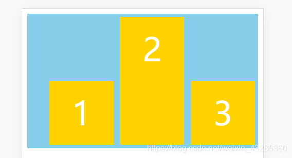
2.7 align-content
定义了多根轴线(多行)在交叉轴上的对齐方式
如果项目只有一根轴线(一行)即不折行的情况下,该属性不起作用
align-content: flex-start | flex-end | center | space-between | space-around | stretch | space-evenly;
- flex-start:交叉轴的起点对齐
- flex-end:与交叉轴的终点对齐
- center:与交叉轴的中点对齐
- space-between:与交叉轴两端对齐,轴线之间的间隔平均分布
- space-around:每根轴线两侧的间隔都相等,所以,轴线之间的间隔比轴线与边框的间隔大一倍
- stretch(默认值):轴线占满整个交叉轴
- space-evenly
示例:
 .box {
            /*设置flex布局*/
            display: flex;
            background-color: skyblue;
            margin: 0 0 55px;
            height: 300px;
        }

        .box-1 {
            flex-flow: row wrap;
            align-content: stretch;
        }

        .box-item {
            width: 70px;
            height: 70px;
            line-height: 70px;
            /* vertical-align:设置元素的垂直对齐方式 */
            vertical-align: middle;
            margin: 5px;
            background-color: #ffd200;
            font-size: 50px;
            color: white;
            text-align: center;
        }

        .box-item {
            height: auto;
        }
<div class="box box-1">
<div class="box-item">1</div>
<div class="box-item">2</div>
<div class="box-item">3</div>
<div class="box-item">4</div>
<div class="box-item">5</div>
<div class="box-item">6</div>
<div class="box-item">7</div>
<div class="box-item">8</div>
<div class="box-item">9</div>
</div>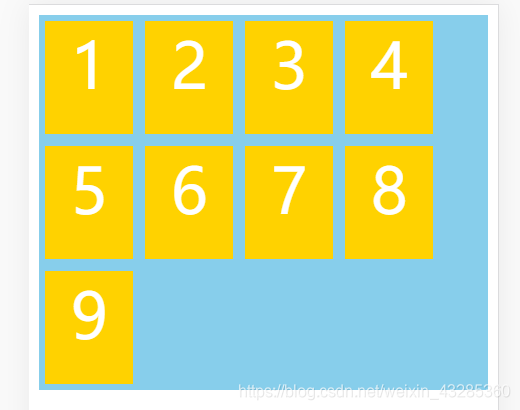
三、项目属性(子元素)
3.1 order
- 定义了项目的排列顺序
- 数值越小,排列越靠前,默认为0
- 语法:order: <integer>;
应用场景:
-
不改变代码结构的前提下,可以调整盒子之间的位置
-
后期可以实现盒子拖拽功能
示例:
    .box {
            display: flex;
        }

        .box-8 .order {
            order: -1;
        }

        .box .box-item {
            width: 80px;
            height: 80px;
            line-height: 80px;
            color: #fff;
            font-size: 38px;
            text-align: center;
            background-color: #f0b300;
            margin: 5px;
        }

        .box .box-item div {
            background-color: #f40;
            color: #000;
            font-size: 14px;
            /* position: relative; */
            top: -150px;
        }
<div class="box box-8">
<div class="box-item">1</div>
<div class="box-item">2</div>
<div class="box-item">3</div>
<div class="box-item order">4
<div>(order:-1)</div>
</div>
</div>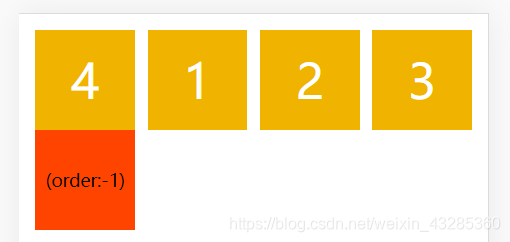
3.2 flex-grow
定义项目的放大比例,默认为0,即如果存在剩余空间,也不放大
- 如果所有项目的 flex-grow 属性都为1,则它们将等分剩余空间(如果有的话)
- 如果一个项目的 flex-grow 属性为2,其他项目都为1,则前者占据的剩余空间将比其他项多一倍
- flex-grow: number; default 0
-
原理:弹性项目会将弹性容器里面多余的空间(富裕空间)分成等量的份数,然后按照每个弹性项目的比例分配给弹性项目里面,弹性项目去消化。
-
弹性因子越大,分配的弹性空间越大,盒子的宽度越大。
示例:
     .box {
            display: flex;
        }

        .box .box-item {
            width: 80px;
            height: 80px;
            line-height: 80px;
            color: #fff;
            font-size: 38px;
            text-align: center;
            background-color: #f0b300;
            margin: 5px;
            /* 定义项目的放大比例 */
            flex-grow: 1;
        }

        .box .grow-2 {
            flex-grow: 2;
        }
<div class="box box-9-1">
<div class="box-item">1
<div>flex-grow: 1</div>
</div>
<div class="box-item grow-2">2
<div>flex-grow: 2</div>
</div>
<div class="box-item">3
<div>flex-grow: 1</div>
</div>
</div>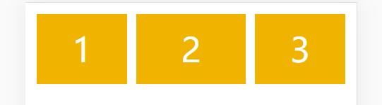
如果有的项目有 flex-grow 属性,有的项目有 width 属性,有 flex-grow 属性的项目将等分剩余空间
示例:
        .box {
            display: flex;
        }

        .box .box-item {
            width: 80px;
            height: 80px;
            line-height: 80px;
            color: #fff;
            font-size: 38px;
            text-align: center;
            background-color: #f0b300;
            margin: 5px;
        }

        .box .box-item div {
            font-size: 10px;
            color: #000;
            position: relative;
            top: -50px;
        }

        .box-9-2 .grow {
            /* 定义项目的放大比例 */
            flex-grow: 2;
        }
<div class="box box-9-2">
<div class="box-item grow">1
<div>flex-grow: 1</div>
</div>
<div class="box-item">2
<div>width: 200px</div>
</div>
<div class="box-item grow">3
<div>flex-grow: 1</div>
</div>
</div>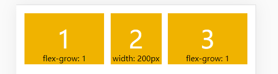
3.3 flex-shrink
- 同一行弹性项目宽度相加之后,超出弹性容器的空间
- 数字越大,压缩空间越大,盒子反而越小
- 定义了项目的缩小比例,默认为1,即如果空间不足,该项目将缩小
- 如果所有项目的 flex-shrink 属性都为1,当空间不足时,都将等比例缩小
- 如果一个项目的 flex-shrink 属性为0,其他项目都为1,则空间不足时,前者不缩小
- 负值对该属性无效。
- flex-shrink: number; default 1
前提:
弹性容器宽度不够时,并且不换行,而且弹性项目的总宽度要大于弹性容器的宽度,才能有效
原理:
当弹性容器宽度容不下当前这行弹性项目时,就会按照flex-shrink来收缩弹性项目以达到不换行的目的。这个属性会按照设置的值将要收缩的宽度等量划分,减少弹性项目的的尺寸
示例:
         .box {
            display: flex;
        }

        .box .box-item {
            width: 80px;
            height: 80px;
            line-height: 80px;
            color: #fff;
            font-size: 38px;
            text-align: center;
            background-color: #f0b300;
            margin: 5px;
        }

        .box .box-item div {
            font-size: 10px;
            color: #000;
            position: relative;
            top: -50px;
        }

        .box-10 .box-item {
            flex-shrink: 0;
        }
<div class="box box-10">
<div class="box-item shrink">1
<div>flex-shrink: 0</div>
</div>
<div class="box-item">2</div>
<div class="box-item">3</div>
<div class="box-item">4</div>
<div class="box-item">5</div>
</div>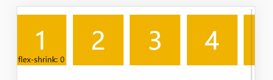
3.4 flex-basis
定义了在分配多余空间之前,项目占据的主轴空间(main size)(设置弹性项目的 默认宽度,其优先级大于width )
浏览器根据这个属性,计算主轴是否有多余空间
它的默认值为auto,即项目的本来大小
flex-basis: length;
语法:
flex-basis:300px;
width:400px;
优先级:flex-basis > width > 由内容撑开的宽度
示例:
        .box {
            display: flex;
        }

        .box .box-item {
            width: 80px;
            height: 80px;
            line-height: 80px;
            color: #fff;
            font-size: 38px;
            text-align: center;
            background-color: #f0b300;
            margin: 5px;
        }

        .box-11 .box-item {
            width: 80px;
            flex-basis: 200px;
        }
<div class="box box-11">
<div class="box-item">1</div>
<div class="box-item">2</div>
<div class="box-item">3</div>
</div>
3.5 flex
flex 属性是 flex-grow, flex-shrink 和 flex-basis 的简写,默认值为0 1 auto 后两个属性可选
该属性有两个快捷值:auto (1 1 auto) 和 none (0 0 auto)
flex: none | [ flex-grow flex-shrink || flex-basis ];
注意:
flex:1;是flex:1 1 0%;的缩写
示例:
        .box {
            display: flex;
        }

        .box .box-item {
            width: 80px;
            height: 80px;
            line-height: 80px;
            color: #fff;
            font-size: 38px;
            text-align: center;
            background-color: #f0b300;
            margin: 5px;
        }

        .box-12 .box-item {
            flex: none;
        }
<div class="box box-12">
<div class="box-item">1</div>
<div class="box-item">2</div>
<div class="box-item">3</div>
<div class="box-item">4</div>
<div class="box-item">5</div>
<div class="box-item">6</div>
</div>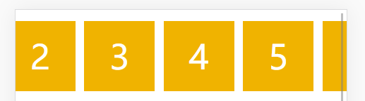
3.6 align-self
- 弹性项目私有align-items的属性,可覆盖align-items属性,即单独给某个弹性项目(子元素)设置侧轴方向上的富裕空间分配。
- 默认值为auto,表示继承父元素的align-items属性,如果没有父元素,则等同于stretch
- align-self: auto | flex-start | flex-end | center | baseline | stretch;
示例:
        .box {
            display: flex;
        }

        .box .box-item {
            width: 80px;
            height: 80px;
            line-height: 80px;
            color: #fff;
            font-size: 38px;
            text-align: center;
            background-color: #f0b300;
            margin: 5px;
        }

        .box .box-item div {
            font-size: 10px;
            color: #000;
            position: relative;
            top: -50px;
        }

        .box-13 {
            align-items: center;
            height: 200px;
        }

        .box-13 .start {
            align-self: flex-start;
        }

        .box-13 .end {
            align-self: flex-end;
        }
<div class="box box-13">
<div class="box-item start">1</div>
<div class="box-item">2</div>
<div class="box-item end">3
<div>flex-end</div>
</div>
<div class="box-item">4</div>
</div>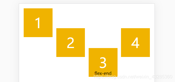
3.7 案例
案例一:
      * {
            margin: 0;
            padding: 0;
        }

        ul,
        li {
            list-style: none;
        }

        header {
            display: flex;
            flex-flow: row nowrap;
            /*定义项目在主轴上的对齐方式*/
            justify-content: space-around;
            color: #fff;
            font-size: 14px;
            font-weight: 900;
            height: 60px;
            line-height: 60px;
            background-color: #000;
        }

        header img {
            height: 60px;
            width: 120px;
        }

        header .nav {
            display: flex;
            flex-flow: row nowrap;
            /*定义项目在主轴上的对齐方式*/
            justify-content: space-between;
        }

        header .nav li {
            margin: 0 5px;
        }

        header .login input {
            color: #fff;
            background-color: orange;
            border: none;
            border-radius: 2px;
        }
<header>
<div class="logo">
<img src="http://climg.mukewang.com/59feb59700019dab01910057.png" alt="">
</div>
<ul class="nav">
<li>课程</li>
<li>路径</li>
<li>问答</li>
<li>手记</li>
</ul>
<div class="login">
<input type="button" value="登录">
<input type="button" value="注册">
</div>
</header>
案例二:
 * {
            margin: 0;
            padding: 0;
        }

        ul,
        li {
            list-style: none;
        }

        ul {
            list-style: none;
            background-color: orange;
            margin: 0;
            padding: 0;
            height: 150px;
            width: 390px;
            display: flex;
            flex-flow: row wrap;
            /* 定义项目在主轴上的对齐方式 */
            justify-content: space-between;
            /* 定义项目在交叉轴上如何对齐 */
            align-items: center;
        }

        li {
            font-size: 24px;
            width: 100px;
            background-color: pink;
        }
<ul>
<li>第一个li</li>
<li>第二个li</li>
<li>第三个li</li>
<li>第四个li</li>
<li>第五个li</li>
<li>第六个li</li>
</ul>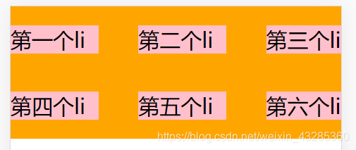
案例三:
 * {
            box-sizing: border-box;
            padding: 0;
            margin: 0;
        }

        html {
            height: 100%;
        }

        body {
            background-color: #e2e2e2;
            color: #595B66;
        }

        a {
            font-size: 12px;
            color: #686868;
            text-decoration: none;
        }

        li {
            list-style: none;
        }

        body {
            display: flex;
            /* 将主轴改为垂直排列 */
            flex-direction: column;
            min-height: 100%;
        }

        .header {
            width: 100%;
            height: 50px;
            background-color: rgba(222, 24, 27, 0.9);
            color: #fff;
            display: flex;
            /* 定义了项目在主轴上的对齐方式 */
            justify-content: center;
            /* 定义项目在交叉轴上如何对齐 */
            align-items: center;
        }

        .main {
            flex: 1;
            color: #fff;
            display: flex;
        }

        .main-content {
            flex: 1;
            background-color: green;
            display: flex;
            /* 定义了项目在主轴上的对齐方式 */
            justify-content: center;
            /* 定义项目在交叉轴上如何对齐 */
            align-items: center;
        }

        .main-sidebar {
            order: -1;
            width: 150px;
            background-color: pink;
            display: flex;
            /* 定义了项目在主轴上的对齐方式 */
            justify-content: center;
            /* 定义项目在交叉轴上如何对齐 */
            align-items: center;
        }

        .tabbar-container {
            width: 100%;
            height: 50px;
            background-color: #fff;
        }

        .tabbar {
            display: flex;
            height: 100%;
        }

        .tabbar-item {
            flex: 1;
            /*background-color: yellow;*/
        }

        .tabbar-link {
            display: flex;
            flex-direction: column;
            /* 定义了项目在主轴上的对齐方式 */
            justify-content: center;
            /* 定义项目在交叉轴上如何对齐 */
            align-items: center;
            height: 100%;
        }

        .tabbar-link .iconfont {
            font-size: 24px;
        }

        .tabbar-item-active .tabbar-link {
            color: #de181b;
        }
<header class="header">header</header>
<div class="main">
<div class="main-content">content</div>
<div class="main-sidebar">sidebar</div>
</div>
<footer class="tabbar-container">
<ul class="tabbar">
<li class="tabbar-item tabbar-item-active">
<a href="###" class="tabbar-link">
<i class="iconfont icon-home"></i>
<span>首页</span>
</a>
</li>
<li class="tabbar-item">
<a href="###" class="tabbar-link">
<i class="iconfont icon-category"></i>
<span>分类页</span>
</a>
</li>
<li class="tabbar-item">
<a href="###" class="tabbar-link">
<i class="iconfont icon-cart"></i>
<span>购物车</span>
</a>
</li>
<li class="tabbar-item">
<a href="###" class="tabbar-link">
<i class="iconfont icon-personal"></i>
<span>个人中心</span>
</a>
</li>
</ul>
</footer>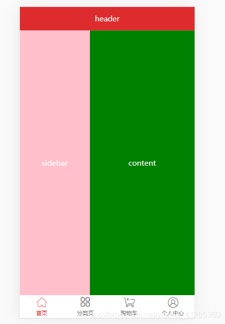
案例四:
         * {
            margin: 0;
            padding: 0;
        }

        ul,
        li {
            list-style: none;
        }

        html {
            width: 100%;
        }

        header {
            display: flex;
            flex-flow: row nowrap;
            /*定义项目在主轴上的对齐方式*/
            justify-content: space-around;
            color: #fff;
            font-size: 14px;
            font-weight: 900;
            height: 60px;
            line-height: 60px;
            background-color: #000;
        }

        header img {
            height: 60px;
            width: 120px;
        }

        header .nav {
            display: flex;
            flex-flow: row nowrap;
            /*定义项目在主轴上的对齐方式*/
            justify-content: space-between;
        }

        header .nav li {
            margin: 0 5px;
        }

        header .login input {
            color: #fff;
            background-color: orange;
            border: none;
            border-radius: 2px;
        }

        section {
            display: flex;
            flex-flow: row wrap;
            font-size: 12px;
        }

        section .section {
            display: flex;
            background-color: #abd6e4;
            margin: 5px 15px;
            padding: 5px 16px;
            border-radius: 5px;
        }

        section .shopping {
            align-self: center;
            width: 60px;
            height: 15px;
            line-height: 15px;
            background-color: orange;
            padding: 3px;
            margin: 0 0 0 12px;
            text-align: center;
            color: #fff;
            font-weight: 900;
            border-radius: 2px;
        }

        section .box p,
        section .box div {
            padding: 5px;
        }
<header>
<div class="logo">
<img src="http://climg.mukewang.com/59feb59700019dab01910057.png" alt="">
</div>
<ul class="nav">
<li>课程</li>
<li>路径</li>
<li>问答</li>
<li>手记</li>
</ul>
<div class="login">
<input type="button" value="登录">
<input type="button" value="注册">
</div>
</header>
<!-- 主体内容 -->
<section>
<div class="section">
<div class="box">
<p>《前端小白入门手册》</p>
<div>适用人群:零基础的小白</div>
<div>费用:¥499</div>
</div>
<div class="shopping">
<div class="btn">加入购物车</div>
</div>
</div>
<div class="section">
<div class="box">
<p>《前端小白入门手册》</p>
<div>适用人群:零基础的小白</div>
<div>费用:¥499</div>
</div>
<div class="shopping">
<div class="btn">加入购物车</div>
</div>
</div>
<div class="section">
<div class="box">
<p>《前端小白入门手册》</p>
<div>适用人群:零基础的小白</div>
<div>费用:¥499</div>
</div>
<div class="shopping">
<div class="btn">加入购物车</div>
</div>
</div>
<div class="section">
<div class="box">
<p>《前端小白入门手册》</p>
<div>适用人群:零基础的小白</div>
<div>费用:¥499</div>
</div>
<div class="shopping">
<div class="btn">加入购物车</div>
</div>
</div>
</section>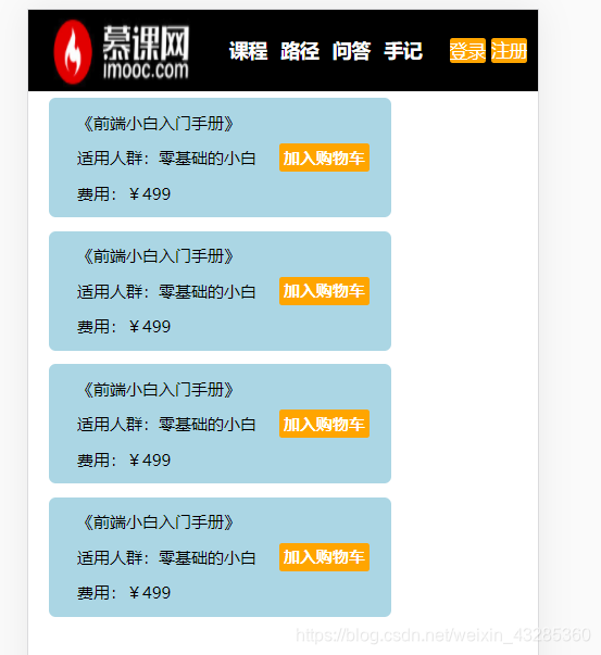


 扫一扫
扫一扫


 165
165

 被折叠的 条评论
为什么被折叠?
被折叠的 条评论
为什么被折叠?
 到【灌水乐园】发言


