


日常项目中我们经常需要给元素添加水平垂直居中的样式。这里有三种方式实现。
第一种方式:
<style>
    .div1 {
        background: red;
        width: 500px;
        height: 500px;
        line-height: 500px;
        text-align: center;
    }

    .div2 {
        background: blue;
        height: 100px;
        width: 100px;
        display: inline-block;
    }
</style>

<body>
    <div class="div1">
        <div class="div2"></div>

    </div>
</body>
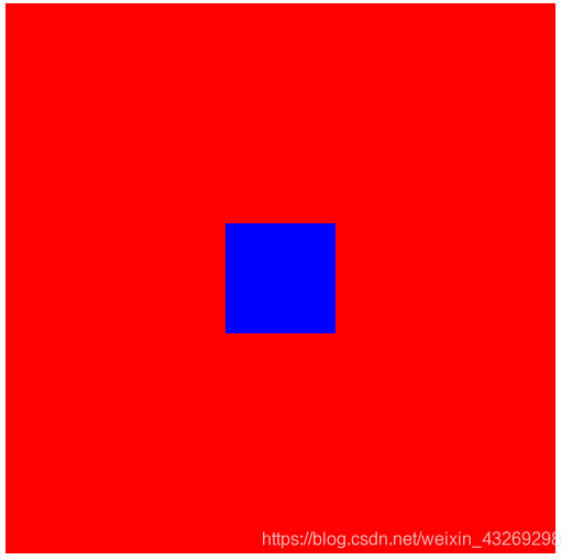
实现效果如图

但这种方式需要注意的是,这种方式采用的是文本对齐的方式,只适合于一行文本的对齐方式。且在图片中我们可以看到。蓝色方块的中心点并没有对齐到红色方块的中心点。
第二种方式
<style>
    .div1 {
        background: red;
        width: 500px;
        height: 500px;
        position: relative;
    }

    .div2 {
        background: blue;
        height: 100px;
        width: 100px;
        position: absolute;
        top: 50%;
        left: 50%;
        transform: translate(-50%, -50%);
    }
</style>

<body>
    <div class="div1">
        <div class="div2"></div>

    </div>
</body>
效果图如下

这种方式成功的实现了子元素位于父元素的中心点。这种方式先让子元素定位到父元素相对于自己左方向和上方向一半的位置也就是文字下方图片的位置,再让子元素移动至中心点即可。
 )
)
第三种方式
<style>
    .div1 {
        background: red;
        width: 500px;
        height: 500px;
        display: flex;
        align-items: center;
        justify-content: center;
    }

    .div2 {
        background: blue;
        height: 100px;
        width: 100px;
    }
</style>

<body>
    <div class="div1">
        <div class="div2"></div>

    </div>
</body>
效果图如下
第三种方式用的是flex布局。对于flex熟悉的朋友来说,使用flex实现水平垂直居中是再简单不过的了。关于flex布局。你可以戳这里(菜鸟教程)


 扫一扫
扫一扫


 2509
2509

 被折叠的 条评论
为什么被折叠?
被折叠的 条评论
为什么被折叠?
 到【灌水乐园】发言


