


我们先来看一个正常的flex布局。
flex:1的意思就是flex:1 1 0,两个子元素的宽度权重为0就平分父元素的宽度了

<!DOCTYPE html>
<html>
<head>
  <title>学习CSS</title>
  <style>
.flex{
  display: flex;
  height: 100px;
  width: 400px;
}
.child1{
  flex:1;
  background-color: aqua;
  /* overflow: auto; */
}
.child2{
  flex:1;
  background-color: red;
}
/* .grandson{
background-color:tomato;
width:300px;
height:50px;
} */
  </style>
</head>
<body>
<div class="flex">
  <div class="child1">
    <!-- <div class="grandson"></div> -->
  </div>
  <div class="child2"></div>
</div>
</body>
</html>
现在我们加一个橙色的孙元素。
可以看见孙元素的宽度为300px,把子元素的宽度撑大了。

.grandson{
background-color:tomato;
width:300px;
height:50px;
}
如果我们把孙元素的宽度设为600px大于父元素的400px,
现在子元素的宽度就超出了父元素,这种情况怎么办呢?

.grandson{
background-color:tomato;
width:600px;
height:50px;
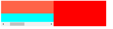
}我们可以在子元素加一个overflow:auto
这样孙元素超出子元素的部分就被隐藏,用滚动条显示了。
此时子元素的宽度权重又变得和最初一样,和另一个子元素平分父元素的宽度了。
.child1{
  flex:1;
  background-color: aqua;
  overflow: auto;
}


 扫一扫
扫一扫


 1696
1696

 被折叠的 条评论
为什么被折叠?
被折叠的 条评论
为什么被折叠?
 到【灌水乐园】发言


