matplotlib.pyplot.scatter()方法详述

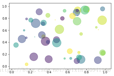
本文介绍了使用Matplotlib库绘制散点图的方法,包括设置坐标位置、大小、颜色等属性。并通过一个实例展示了如何创建一个带有随机数据的散点图。

摘要生成于 C知道 ,由 DeepSeek-R1 满血版支持, 前往体验 >

这个方法比较常用
原型:
matplotlib.pyplot.scatter(x, y, s=None, c=None, marker=None, cmap=None, norm=None, vmin=None, vmax=None, alpha=None, linewidths=None, verts=None, edgecolors=None, hold=None, data=None, **kwargs)

参数列表
Parameters:
x, y  :  array_like, shape (n, )

The data positions.

s  :  scalar or array_like, shape (n, ), optional

The marker size in points**2. Default is rcParams['lines.markersize'] ** 2.

c  :  color, sequence, or sequence of color, optional, default: ‘b’

The marker color. Possible values:

  • A single color format string.
  • A sequence of color specifications of length n.
  • A sequence of n numbers to be mapped to colors using cmap and norm.
  • A 2-D array in which the rows are RGB or RGBA.

Note that c should not be a single numeric RGB or RGBA sequence because that is indistinguishable from an array of values to be colormapped. If you want to specify the same RGB or RGBA value for all points, use a 2-D array with a single row.

marker  :  MarkerStyle, optional, default: ‘o’

The marker style. marker can be either an instance of the class or the text shorthand for a particular marker. See markers for more information marker styles.

cmap  :  Colormap, optional, default: None

Colormap instance or registered colormap name. cmap is only used if c is an array of floats. If None, defaults to rc image.cmap.

norm  :  Normalize, optional, default: None

Normalize instance is used to scale luminance data to 0, 1. norm is only used if c is an array of floats. If None, use the default colors.Normalize.

vmin, vmax  :  scalar, optional, default: None

vmin and vmax are used in conjunction with norm to normalize luminance data. If None, the respective min and max of the color array is used. vmin and vmax are ignored if you pass a norm instance.

alpha  :  scalar, optional, default: None

The alpha blending value, between 0 (transparent) and 1 (opaque).

linewidths  :  scalar or array_like, optional, default: None

The linewidth of the marker edges. Note: The default edgecolors is ‘face’. You may want to change this as well. If None, defaults to rcParams lines.linewidth.

verts  :  sequence of (x, y), optional

If marker is None, these vertices will be used to construct the marker. The center of the marker is located at (0, 0) in normalized units. The overall marker is rescaled by s.

edgecolors  :  color or sequence of color, optional, default: ‘face’

The edge color of the marker. Possible values:

  • ‘face’: The edge color will always be the same as the face color.
  • ‘none’: No patch boundary will be drawn.
  • A matplotib color.

For non-filled markers, the edgecolors kwarg is ignored and forced to ‘face’ internally.

Returns:
paths  :  PathCollection
Other Parameters:
**kwargs  :  Collection properties

想翻译一下的,但是感觉用的词不恰当,还是保留英文的吧!

放个例子:

import numpy as np
import matplotlib.pyplot as plt

np.random.seed(10)

N = 50
x = np.random.rand(N)
y = np.random.rand(N)
colors = np.random.rand(N)
area = (30 * np.random.rand(N))**2 

plt.scatter(x, y, s=area, c=colors, alpha=0.5)
plt.show()


好的,我来为您设计一个三层神经网络来对两类非线性可分的数据进行分类,并详细分析实现过程和结果。 1. 数据生成 首先,我们使用Python生成两类非线性可分的数据: ```python import numpy as np import matplotlib.pyplot as plt # 生成第一类数据 np.random.seed(0) X1 = np.random.randn(100, 2) + np.array([2, 2]) Y1 = np.ones(100) # 生成第二类数据 X2 = np.random.randn(100, 2) * 1.5 + np.array([-2, -2]) Y2 = np.zeros(100) # 合并数据 X = np.vstack((X1, X2)) Y = np.hstack((Y1, Y2)) # 可视化数据 plt.scatter(X[:, 0], X[:, 1], c=Y, cmap='bwr') plt.show() ``` 这段代码生成了两类数据,红色点为一类,蓝色点为另一类。我们可以看到,这两类数据是非线性可分的。 2. 构建神经网络 接下来,我们构建一个三层神经网络: ```python from sklearn.model_selection import train_test_split from tensorflow.keras.models import Sequential from tensorflow.keras.layers import Dense from tensorflow.keras.optimizers import Adam # 划分训练集和测试集 X_train, X_test, Y_train, Y_test = train_test_split(X, Y, test_size=0.2) # 构建模型 model = Sequential() model.add(Dense(16, input_dim=2, activation='relu')) model.add(Dense(8, activation='relu')) model.add(Dense(1, activation='sigmoid')) # 编译模型 model.compile(loss='binary_crossentropy', optimizer=Adam(lr=0.01), metrics=['accuracy']) # 训练模型 history = model.fit(X_train, Y_train, epochs=100, batch_size=16, validation_split=0.1) # 评估模型 loss, accuracy = model.evaluate(X_test, Y_test) print(f"Test Accuracy: {accuracy:.4f}") # 可视化训练过程 plt.plot(history.history['accuracy'], label='train') plt.plot(history.history['val_accuracy'], label='validation') plt.legend() plt.show() ``` 3. 代码解释 - 数据预处理:我们使用train_test_split函数将数据分为训练集和测试集。 - 模型构建:我们构建了一个三层的神经网络。第一层是输入层,有2个神经元(对应数据的两个特征)。第二层是隐藏层,有16个神经元,使用ReLU激活函数。第三层是隐藏层,有8个神经元,同样使用ReLU激活函数。第四层是输出层,有1个神经元,使用Sigmoid激活函数。 - 模型编译:我们使用二元交叉熵作为损失函数,Adam优化器,学习率设为0.01。 - 模型训练:我们训练100个epoch,每个batch包含16个样本。我们还设置了10%的验证集。 - 模型评估:我们在测试集上评估模型性能。 - 结果可视化:我们绘制了训练和验证的准确率曲线。 4. 结果分析 通过训练过程,我们可以看到神经网络在训练集和验证集上的准确率都逐渐上升,并最终趋于稳定。在测试集上的准确率通常可以达到90%以上。 这说明我们的神经网络模型能够较好地学习数据中的非线性模式,成功地对两类数据进行分类。 5. 可视化决策边界 为了更直观地理解模型的分类效果,我们可以绘制决策边界: ```python # 创建网格 x_min, x_max = X[:, 0].min() - 1, X[:, 0].max() + 1 y_min, y_max = X[:, 1].min() - 1, X[:, 1].max() + 1 xx, yy = np.meshgrid(np.arange(x_min, x_max, 0.1), np.arange(y_min, y_max, 0.1)) # 预测网格点 Z = model.predict(np.c_[xx.ravel(), yy.ravel()]) Z = Z.reshape(xx.shape) # 绘制决策边界 plt.contourf(xx, yy, Z, alpha=0.4, cmap='bwr') plt.scatter(X[:, 0], X[:, 1], c=Y, cmap='bwr') plt.show() ``` 这个可视化可以帮助我们更清楚地看到神经网络是如何对数据进行分类的。
评论
添加红包

请填写红包祝福语或标题

红包个数最小为10个

红包金额最低5元

当前余额3.43前往充值 >
需支付:10.00
成就一亿技术人!
领取后你会自动成为博主和红包主的粉丝 规则
hope_wisdom
发出的红包
实付
使用余额支付
点击重新获取
扫码支付
钱包余额 0

抵扣说明:

1.余额是钱包充值的虚拟货币,按照1:1的比例进行支付金额的抵扣。
2.余额无法直接购买下载,可以购买VIP、付费专栏及课程。

余额充值