


 本文介绍了一种使用SARIMA模型进行气温预测的方法。通过分析历史气温数据并应用时间序列分析技术,实现了对未来气温的有效预测。文中详细展示了如何处理数据、检查序列平稳性及模型评估等关键步骤。
数据来源
https://download.youkuaiyun.com/download/weixin_39777626/11800834
到入库&&函数定义
import numpy as np
import pandas as pd
import matplotlib.pyplot as plt
import seaborn as sns
import statsmodels.api as sm
from statsmodels.tsa.stattools import adfuller
from statsmodels.graphics.tsaplots import plot_acf, plot_pacf
from sklearn.metrics import mean_squared_error
from math import sqrt
import warnings
warnings.filterwarnings('ignore')
%matplotlib inline
cities = pd.read_csv('F:\paper\dataset\csv\GlobalLandTemperaturesByCity.csv')
countrys = pd.read_csv('F:\paper\dataset\csv\GlobalLandTemperaturesByCountry.csv')
def measure_rmse(y_true, y_pred):
return sqrt(mean_squared_error(y_true,y_pred))
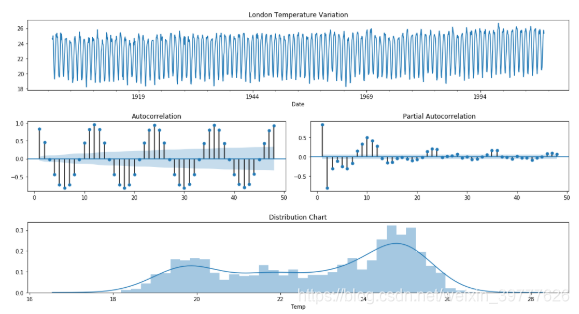
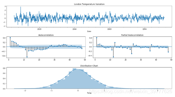
def check_stationarity(y, lags_plots=48, figsize=(22,8)):
"Use Series as parameter"
# Creating plots of the DF
y = pd.Series(y)
fig = plt.figure()
ax1 = plt.subplot2grid((3, 3), (0, 0), colspan=2)
ax2 = plt.subplot2grid((3, 3), (1, 0))
ax3 = plt.subplot2grid((3, 3), (1, 1))
ax4 = plt.subplot2grid((3, 3), (2, 0), colspan=2)
y.plot(ax=ax1, figsize=figsize)
ax1.set_title('{} Temperature Variation'.format(name))
plot_acf(y, lags=lags_plots, zero=False, ax=ax2);
plot_pacf(y, lags=lags_plots, zero=False, ax=ax3);
sns.distplot(y, bins=int(sqrt(len(y))), ax=ax4)
ax4.set_title('Distribution Chart')
plt.tight_layout()
print('Results of Dickey-Fuller Test:')
adfinput = adfuller(y)
adftest = pd.Series(adfinput[0:4], index=['Test Statistic','p-value','Lags Used','Number of Observations Used'])
adftest = round(adftest,4)
for key, value in adfinput[4].items():
adftest["Critical Value (%s)"%key] = value.round(4)
print(adftest)
if adftest[0].round(2) < adftest[5].round(2):
print('\nThe Test Statistics is lower than the Critical Value of 5%.\nThe serie seems to be stationary')
else:
print("\nThe Test Statistics is higher than the Critical Value of 5%.\nThe serie isn't stationary")
def walk_forward(training_set, validation_set, params):
'''
Params: it's a tuple where you put together the following SARIMA parameters: ((pdq), (PDQS), trend)
'''
history = [x for x in training_set.values]
prediction = list()
# Using the SARIMA parameters and fitting the data
pdq, PDQS, trend = params
#Forecasting one period ahead in the validation set
for week in range(len(validation_set)):
model = sm.tsa.statespace.SARIMAX(history, order=pdq, seasonal_order=PDQS, trend=trend)
result = model.fit(disp=False)
yhat = result.predict(start=len(history), end=len(history))
prediction.append(yhat[0])
history.append(validation_set[week])
return prediction
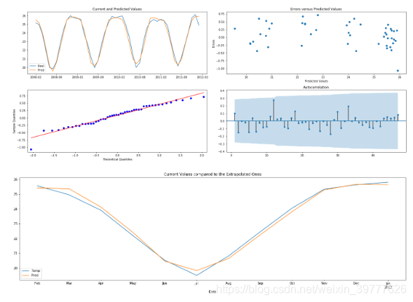
def plot_error(data, figsize=(20,8)):
'''
There must have 3 columns following this order: Temperature, Prediction, Error
'''
plt.figure(figsize=figsize)
ax1 = plt.subplot2grid((2,2), (0,0))
ax2 = plt.subplot2grid((2,2), (0,1))
ax3 = plt.subplot2grid((2,2), (1,0))
ax4 = plt.subplot2grid((2,2), (1,1))
#Plotting the Current and Predicted values
ax1.plot(data.iloc[:,0:2])
ax1.legend(['Real','Pred'])
ax1.set_title('Current and Predicted Values')
# Residual vs Predicted values
ax2.scatter(data.iloc[:,1], data.iloc[:,2])
ax2.set_xlabel('Predicted Values')
ax2.set_ylabel('Errors')
ax2.set_title('Errors versus Predicted Values')
## QQ Plot of the residual
sm.graphics.qqplot(data.iloc[:,2], line='r', ax=ax3)
# Autocorrelation plot of the residual
plot_acf(data.iloc[:,2], lags=(len(data.iloc[:,2])-1),zero=False, ax=ax4)
plt.tight_layout()
plt.show()
tropic=['Madagascar','Bamako','Cairo','Bangkok']
subtropic=['Rome','Xiamen','Argentina','Iraq']
temperate=['London','Peking','New York','Lanzhou']
subfrigid=['Novosibirsk']
frigid=['Greenland','Anchorage']
plateau=['Xining']
climate=[tropic,subtropic,temperate,subfrigid,frigid,plateau]
def sarima(i):
name=i
try:
area=cities.groupby('City').get_group('%s'%i)
data = cities.loc[cities['City'] == name, ['dt','AverageTemperature']]
except:
try:
area=countrys.groupby('Country').get_group('%s'%i)
data = countrys.loc[countrys['Country'] == name, ['dt','AverageTemperature']]
except:
area=cities.groupby('Country').get_group('%s'%i)
data = cities.loc[cities['Country'] == name, ['dt','AverageTemperature']]
data.columns = ['Date','Temp']
data['Date'] = pd.to_datetime(data['Date'])
data.reset_index(drop=True, inplace=True)
data.set_index('Date', inplace=True)
#I'm going to consider the temperature just from 1900 until the end of 2012
data = data.loc['1900':'2013-01-01']
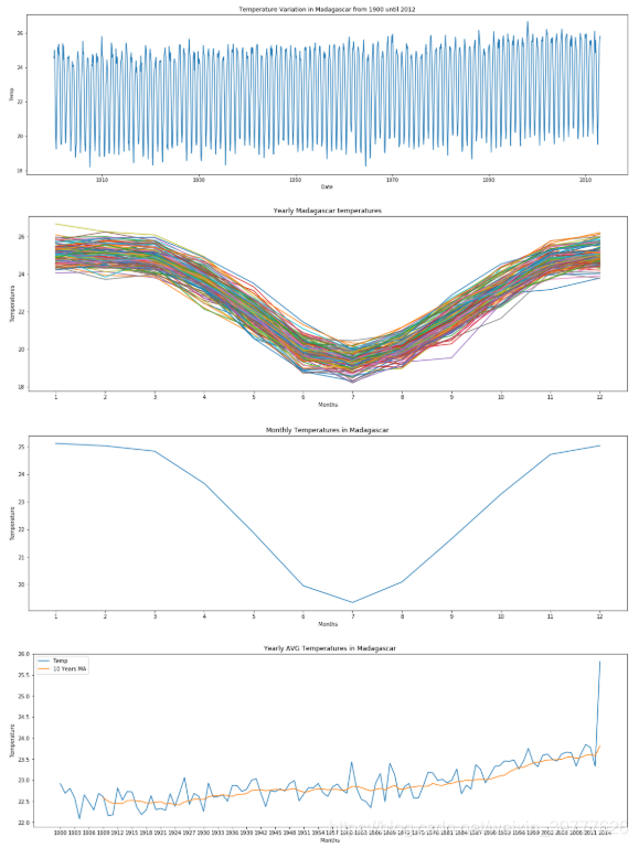
plt.figure(figsize=(22,6))
sns.lineplot(x=data.index, y=data['Temp'])
plt.title('Temperature Variation in {} from 1900 until 2012'.format(name))
plt.show()
data['month'] = data.index.month
data['year'] = data.index.year
pivot = pd.pivot_table(data, values='Temp', index='month', columns='year', aggfunc='mean')
pivot.plot(figsize=(20,6))
plt.title('Yearly {} temperatures'.format(name))
plt.xlabel('Months')
plt.ylabel('Temperatures')
plt.xticks([x for x in range(1,13)])
plt.legend().remove()
plt.show()
monthly_seasonality = pivot.mean(axis=1)
monthly_seasonality.plot(figsize=(20,6))
plt.title('Monthly Temperatures in {}'.format(name))
plt.xlabel('Months')
plt.ylabel('Temperature')
plt.xticks([x for x in range(1,13)])
plt.show()
year_avg = pd.pivot_table(data, values='Temp', index='year', aggfunc='mean')
year_avg['10 Years MA'] = year_avg['Temp'].rolling(10).mean()
year_avg[['Temp','10 Years MA']].plot(figsize=(20,6))
plt.title('Yearly AVG Temperatures in {}'.format(name))
plt.xlabel('Months')
plt.ylabel('Temperature')
plt.xticks([x for x in range(1900,2017,3)])
plt.show()
train = data[:-60].copy()
val = data[-60:-12].copy()
test = data[-12:].copy()
# Excluding the first line, as it has NaN values
baseline = val['Temp'].shift()
baseline.dropna(inplace=True)
rmse_base = measure_rmse(val.iloc[1:,0],baseline)
print(f'The RMSE of the baseline that we will try to diminish is {round(rmse_base,4)} celsius degrees')
check_stationarity(train['Temp'])
check_stationarity(train['Temp'].diff(12).dropna())
if name=='Madagascar' or name=='Bamako' or name=='Bangkok' or name=='Xining':
val['Pred'] = walk_forward(train['Temp'], val['Temp'], ((2,0,0),(0,1,1,12),'c'))
else:
val['Pred'] = walk_forward(train['Temp'], val['Temp'], ((3,0,0),(0,1,1,12),'c'))
rmse_pred = measure_rmse(val['Temp'], val['Pred'])
print(f"The RMSE of the SARIMA(3,0,0),(0,1,1,12),'c' model was {round(rmse_pred,4)} celsius degrees")
print(f"It's a decrease of {round((rmse_pred/rmse_base-1)*100,2)}% in the RMSE")
val['Error'] = val['Temp'] - val['Pred']
val.drop(['month','year'], axis=1, inplace=True)
plot_error(val)
future = pd.concat([train['Temp'], val['Temp']])
model = sm.tsa.statespace.SARIMAX(future, order=(3,0,0), seasonal_order=(0,1,1,12), trend='c')
result = model.fit(disp=False)
test['Pred'] = result.predict(start=(len(future)), end=(len(future)+13))
test[['Temp', 'Pred']].plot(figsize=(22,6))
plt.title('Current Values compared to the Extrapolated Ones')
plt.show()
test_baseline = test['Temp'].shift()
test_baseline[0] = test['Temp'][0]
rmse_test_base = measure_rmse(test['Temp'],test_baseline)
rmse_test_extrap = measure_rmse(test['Temp'], test['Pred'])
print(f'The baseline RMSE for the test baseline was {round(rmse_test_base,2)} celsius degrees')
print(f'The baseline RMSE for the test extrapolation was {round(rmse_test_extrap,2)} celsius degrees')
print(f'That is an improvement of {-round((rmse_test_extrap/rmse_test_base-1)*100,2)}%')
print('--------------------------{}--------------------------------'.format(name))
调用函数(输入城市、国家名称)
sarima('Madagascar')
部分结果展示
详细分析。。。。以后有空再说吧。。
The RMSE of the baseline that we will try to diminish is 1.2276 celsius degrees
Results of Dickey-Fuller Test:
Test Statistic -2.2666
p-value 0.1830
Lags Used 23.0000
Number of Observations Used 1273.0000
Critical Value (1%) -3.4355
Critical Value (5%) -2.8638
Critical Value (10%) -2.5680
dtype: float64
The Test Statistics is higher than the Critical Value of 5%.
The serie isn’t stationary
Results of Dickey-Fuller Test:
Test Statistic -14.0939
p-value 0.0000
Lags Used 23.0000
Number of Observations Used 1261.0000
Critical Value (1%) -3.4355
Critical Value (5%) -2.8638
Critical Value (10%) -2.5680
dtype: float64
The Test Statistics is lower than the Critical Value of 5%.
The serie seems to be stationary
The RMSE of the SARIMA(3,0,0),(0,1,1,12),‘c’ model was 0.3652 celsius degrees
It’s a decrease of -70.25% in the RMSE
The baseline RMSE for the test baseline was 1.19 celsius degrees
The baseline RMSE for the test extrapolation was 0.21 celsius degrees
That is an improvement of 82.04%
--------------------------Madagascar--------------------------------


 678
678

 被折叠的 条评论
为什么被折叠?
被折叠的 条评论
为什么被折叠?
 到【灌水乐园】发言


