


 本文深入探讨了matplotlib库在数据可视化中的应用,包括时间序列图、带直方图的散点图、带标注的函数图像和热力图。重点介绍了如何在图表中基于需要对xticks进行旋转,以优化图形的可读性。同时,讲解了Figure、Axes和Axis的概念,并提供了实战案例来展示如何创建和定制图形。
本文转载于 SegmentFault 社区
作者:mhxin
引言
首先来看几个简单的图表, 下面 4 段不同的 matplotlib 绘图代码最终的结果是一样的,绘制的图形如下图所示。 a = np.linspace(-5, 5, 100)
b = np.sin(a)
c = np.cos(a)
# -------------------------------------- #
# ---------------First way-------------- #
fig, ax = plt.subplots()
ax.set_title('Sin-Cos')
ax.set_xlabel('X')
ax.set_ylabel('Y')
ax.plot(a, b, c='r')
ax.plot(a, c, c='g')
ax.legend(['a', 'b'])
fig.show()
# -------------------------------------- #
# ---------------Second way-------------- #
fig = plt.figure()
ax = fig.add_subplot(111)
ax.set_title('Sin-Cos')
ax.set_xlabel('X')
ax.set_ylabel('Y')
ax.plot(a, b, c='r')
ax.plot(a, c, c='g')
ax.legend(['a', 'b'])
fig.show()
# -------------------------------------- #
# ---------------Third way-------------- #
plt.figure()
plt.title('Sin-Cos')
plt.xlabel('X')
plt.ylabel('Y')
plt.plot(a, b, c='r')
plt.plot(a, c, c='g')
plt.legend(['a', 'b'])
plt.show()
# -------------------------------------- #
# ---------------Fourth way------------- #
plt.subplot(111)
plt.title('Sin-Cos')
plt.xlabel('X')
plt.ylabel('Y')
plt.plot(a, b, c='r')
plt.plot(a, c, c='g')
plt.legend(['a', 'b'])
plt.show()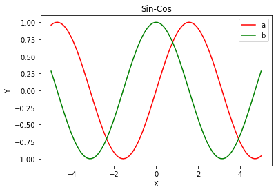 在以上的 4 种实现方式中,可能大多数都会使用后面两种,即直接使用 plt.plot() 进行绘制,我刚开始也一样,它看起来简单,用起来也很方便。但当你逐渐习惯使用默认的方式来进行绘图时,慢慢会出现各种的问题,尤其是当你需要对图表使用很多自定义的设置的时候。默认接口隐藏了绘图过程中的很多细节,因为不了解其内部细节,所以在绘图过程中,对一些图表的设置方法全靠记忆。
Matplotlib 中的部件
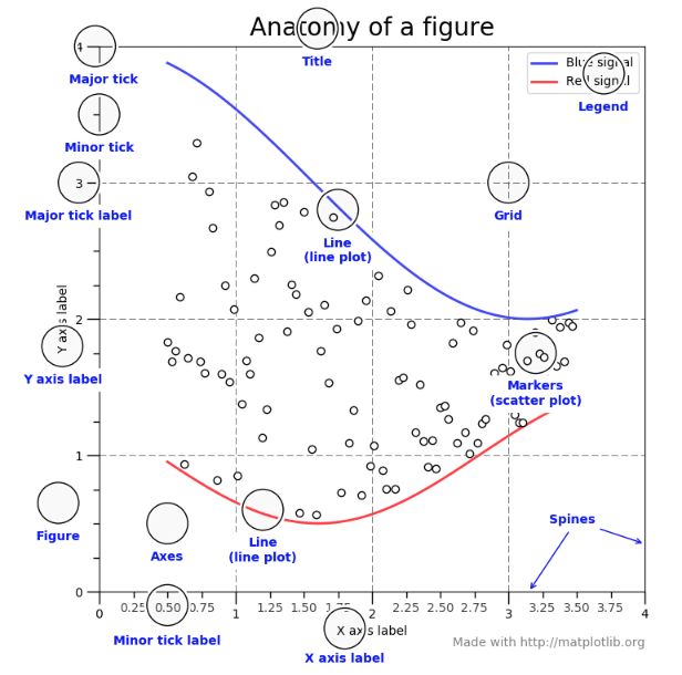
好了,说了这么多,我们先来了解 matplotlib 绘图过程中几个主要的名称,如下图所示: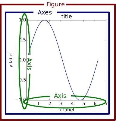
- Figure 可以理解为画板,使用 fig = plt.figure() 会创建一个画板。
- Axes可以理解为画板上的各种图形,一个图形就是一个 axes,利用 axes 可以对图形的各个部分进行设置。比如使用 fig.add_subplot() 会在 fig 上创建一个 axes。
- Axis 表示一个 Axes 的坐标轴,比如 x 轴,y 轴以及 z 轴等。
 以上图中的所有部件,都可以通过 axes 来实现精确的控制,比如需要设置 x 轴主刻度标签, 即可使用 axes.xaxis.set_ticklabels(['', '']),这种面向对象的控制方式,很容易理解和实现。
实战
基于上面的介绍,我们来绘制一些图形。时间序列图
直接上代码:# 导入FontProperties类,该类用于定义字体,包括字体,大小等
from matplotlib.font_manager import FontProperties
# 定义标签字体,字体为Time New Roman
# 也可以通过指定fname(字体文件的路径)来定义字体
label_font = FontProperties(family='Times New Roman', size=18, weight='bold', style='normal')
# 定义标题字体
title_font = FontProperties(family='Times New Roman', size=20, weight='bold', style='normal')
# 定义坐标轴刻度字体
ticks_font = FontProperties(family='Times New Roman', size=12, weight='bold', style='normal')
# 定义legend字体
legend_font = FontProperties(family='Times New Roman', size=18, weight='bold', style='normal')
 最低0.47元/天 解锁文章


 1490
1490

 被折叠的 条评论
为什么被折叠?
被折叠的 条评论
为什么被折叠?
 到【灌水乐园】发言


