


 本文介绍了使用matplotlib进行基础绘图的方法,包括画多个子图、对DataFrame数据进行绘图以及设置图像基本对象。在画多个子图时,可以针对一条x或一个序列操作;对DataFrame画图时,能直接生成多系列图表。此外,还讲解了设置坐标轴名称、图标题、坐标轴范围、图表类型、图例位置以及标注文本等细节,提供了一套完整的matplotlib绘图实践指导。
一 画多个子图
画子图主要针对一条x,一条y,或者一个序列画,如果子图针对df画,那么就会画到新的画布上。
生成数据
import pandas as pd
import numpy as np
from matplotlib import pyplot as plt
%matplotlib inline

df=pd.DataFrame(np.random.randn(1000,3)+1,columns=list('abc'))
df.describe([.05,.25,.5,.75,.95])

a	b	c
count	1000.000000	1000.000000	1000.000000
mean	0.972768	0.962918	0.978372
std	1.026377	0.975196	1.032846
min	-2.860135	-1.950653	-2.056951
5%	-0.708528	-0.609859	-0.726750
25%	0.300097	0.289349	0.282289
50%	0.986061	0.929492	0.960810
75%	1.671665	1.621048	1.622402
95%	2.634893	2.641255	2.723783
max	3.897037	3.915171	4.248954

df['d']=pd.Series(abs(np.random.randn(1000))*100)
df['b']=df['b'].astype(int)+10
df['e']=pd.date_range('2015-01-01',periods=1000,freq='D')
df.info()
<class 'pandas.core.frame.DataFrame'>
RangeIndex: 1000 entries, 0 to 999
Data columns (total 5 columns):
a    1000 non-null float64
b    1000 non-null int32
c    1000 non-null float64
d    1000 non-null float64
e    1000 non-null datetime64[ns]
dtypes: datetime64[ns](1), float64(3), int32(1)
memory usage: 35.2 KB
开始画图
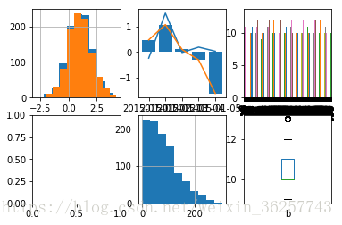
plt.subplot(231)
# df.hist()     df.plot.hist,和df.hist还是有区别。这里用plot.hist就错了。
#画多个子图时候,用plt.plot或者series.plot,别用df.plot,不展示。
df.a.hist()
df.c.hist()
#多次画图实现叠加
plt.subplot(232)
plt.plot(df.e.values[:5],df.a.values[:5])
#这里用x=df.e.values,y=df.a.values,就错了。
#日期刻度看不清
plt.plot(df.e.values[:5],df.c.values[:5])
plt.bar(df.e.values[:5],df.c.values[:5])
#多次画图实现叠加,不同类型图也可以叠加
plt.subplot(233)
df['b'].plot.bar()
#x轴刻度太多看不清。
plt.subplot(234)
# df.loc[:5,['a','b']].plot.bar(stacked=True)  #这里不是stack=True
#不展示,plt.bar不支持参数是二维数组,所以没法堆积
plt.subplot(235)
df['d'].hist()
plt.subplot(236)
df['b'].plot.box()   #画多个子图时候,用plt.plot或者series.plot,别用df.plot,不展示。
二 对df画图
一个x多个y的时候,可以直接对df画图,直接产生多系列数据产生的图。
主要用plot(),plot.bar(),plot.hist,hist等函数,参见pandas文档。
参数有本身的参数,还可设置一些通用参数,比如color,中文字体显示rcParams,双轴显示secondary_y,label= 数据系列名称,linewidth,lengend图例显示
plt.xlabel=
plt.xlim=
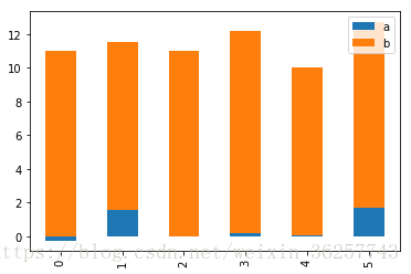
df.loc[:5,['a','b']].plot.bar(stacked=True)
<matplotlib.axes._subplots.AxesSubplot at 0x20ec9ec4f28>
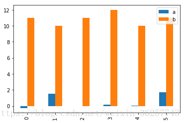
df.loc[:5,['a','b']].plot.bar()
df.loc[:5,['a','b']].plot.bar()
<matplotlib.axes._subplots.AxesSubplot at 0x20ecf4e70b8>
df.loc[:5,['a','b']].plot.barh()
<matplotlib.axes._subplots.AxesSubplot at 0x20ecf5ebbe0>
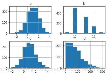
df.hist()
array([[<matplotlib.axes._subplots.AxesSubplot object at 0x0000020ECC3C1E80>,
<matplotlib.axes._subplots.AxesSubplot object at 0x0000020ECC3639E8>],
[<matplotlib.axes._subplots.AxesSubplot object at 0x0000020ECC38EFD0>,
<matplotlib.axes._subplots.AxesSubplot object at 0x0000020ECC06F6A0>]],
dtype=object)
df.iloc[:,:3].plot.hist(alpha=0.5,color='grb')
<matplotlib.axes._subplots.AxesSubplot at 0x20ecc4cff98>
df.iloc[:,:3].plot()
<matplotlib.axes._subplots.AxesSubplot at 0x20ecc4bd9b0>
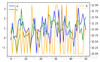
df.loc[:50,['a','c']].plot(color='bg')
df.loc[:50,'b'].plot(secondary_y=True,color='orange')
plt.legend()
<matplotlib.legend.Legend at 0x20ecdf510f0>
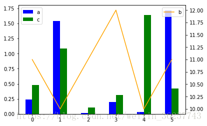
df.loc[:5,['a','c']].abs().plot.bar(color='bg')
df.loc[:5,'b'].abs().plot(secondary_y=True,color='orange')
plt.legend()
<matplotlib.legend.Legend at 0x20ecf548048>
df.iloc[:,:3].plot.box() #所有图只对数值
<matplotlib.axes._subplots.AxesSubplot at 0x20bd60a2e10>
df.iloc[:,:3].boxplot()
<matplotlib.axes._subplots.AxesSubplot at 0x20bd5d74be0>
三设置图像基本对象
3.2 ?
df.set_index(‘e’).loc[:,[‘a’,‘c’]].plot()
确定一个图像的部分
#设置显示中文和负号
plt.rcParams[‘font.sans-serif’] = ‘SimHei’
plt.rcParams[‘axes.unicode_minus’]=False
#设置正常显示字符
plt.rcParams[‘axes.unicode_minus’] = False
#设置画布大小
#设置坐标轴名称和图标题
plt.xlabel、plt.ylabel 设置坐标轴名称
plt.title(‘logit’) 设置标题
plt.figure(figsize=(15,5)) 长15宽5
ax.set_title()
ax.set_xlabel()
ax.set()
#设置坐标轴刻度、标签、旋转
plt.xticks(np.arange(0,50,2),np.arange(1969,2019,2),rotation=60,fontsize=12)
ax.set_xticks([0,250,500,750,1000])
ax.set_xticklabels([“one”,“two”,“three”,“four”,“five”],rotation=30,fontsize=“small”)
ax.xaxis.set_major_formatter(FormatStrFormatter(’%5.1f’) )设置x轴标签文本的格式
ax.xaxis.set_major_locator(ticker.MultipleLocator(5)) 将x主刻度标签设置为5的倍数
#设置次坐标轴#
plt.plot(secondary_y=[’’]) #在一个画布中设置的方式
ax2 = ax1.twinx() #在子图中设置的方式
#设置横纵坐标轴范围
plt.xlim(1,2)
#设置图表类型
plt.bar/hist/plot/scatter
ax.plot()
#确定图例位置和是否显示
plt.legend()
#在指定位置处标注
plt.annotate(‘local max’, xy=(2, 1), xytext=(3, 1.5),
arrowprops=dict(facecolor=‘black’, shrink=0.05),
)
#创建带坐标的画布/子图
plt.subplot(224)
fig, ax = plt.subplots(2,3)
ax3 = fig.add_axes([left, bottom, width, height])
ax=fig.add_subplot(5,4,i)
#子图之间调节位置
plt.subplots_adjust(top=0.92, bottom=0.08, left=0.10, right=0.95, hspace=0.25,
wspace=0.35)
更复杂
https://www.jb51.net/article/164187.htm
多个图叠加显示
plt.scatter(x=dff[dff[‘label’]==0][‘Age’],y=dff[dff[‘label’]==0][‘income’],c=‘b’)
plt.scatter(x=dff[dff[‘label’]==1][‘Age’],y=dff[dff[‘label’]==1][‘income’],c=‘r’)
plt.scatter(x=dff[dff[‘label’]==2][‘Age’],y=dff[dff[‘label’]==2][‘income’],c=‘y’)


 441
441

 被折叠的 条评论
为什么被折叠?
被折叠的 条评论
为什么被折叠?
 到【灌水乐园】发言


