


 本文介绍了使用 Android 中的 Drawable 资源实现多种按钮样式的方法,包括圆角按钮、带边框的圆角按钮、渐变按钮等,并展示了如何通过 XML 定义这些样式。
Drawable 分为两种,一种是普通的图片资源,另一种是 xml 形式的 Drawable 资源,这里针对第二种形式的 Drawable 资源展示其几种表现效果
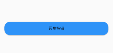
一、圆角按钮
<?xml version="1.0" encoding="utf-8"?>
<shape xmlns:android="http://schemas.android.com/apk/res/android">
    <solid android:color="#f42791fa" />
    <corners android:radius="20dp" />
</shape>
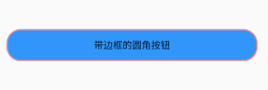
二、带边框的圆角按钮
<?xml version="1.0" encoding="utf-8"?>
<shape xmlns:android="http://schemas.android.com/apk/res/android">
    <solid android:color="#f42791fa" />
    <corners android:radius="20dp" />
    <stroke
        android:width="2dp"
        android:color="#ec8989" />
</shape>
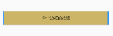
三、单个边框的按钮
<?xml version="1.0" encoding="utf-8"?>
<layer-list xmlns:android="http://schemas.android.com/apk/res/android">
    <item>
        <shape>
            <solid android:color="#f42791fa" />
        </shape>
    </item>
    <item
        android:left="4dp"
        android:right="4dp">
        <shape>
            <solid android:color="#cef1bd45" />
        </shape>
    </item>
</layer-list>
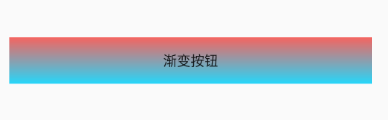
四、渐变按钮
<?xml version="1.0" encoding="utf-8"?>
<shape xmlns:android="http://schemas.android.com/apk/res/android">
    <gradient
        android:angle="90"
        android:endColor="#f4f55d58"
        android:gradientRadius="45"
        android:startColor="#ee13d6fc"
        android:type="linear"/>
</shape>
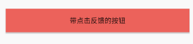
五、带点击反馈的按钮
<?xml version="1.0" encoding="utf-8"?>
<selector xmlns:android="http://schemas.android.com/apk/res/android">
    <item android:state_pressed="true">
        <shape>
            <solid android:color="#61aaf4" />
        </shape>
    </item>
    <item android:state_pressed="false">
        <shape>
            <solid android:color="#ed635c" />
        </shape>
    </item>
</selector>
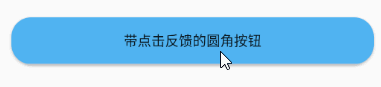
六、带点击反馈的圆角按钮
<?xml version="1.0" encoding="utf-8"?>
<selector xmlns:android="http://schemas.android.com/apk/res/android">

    <item android:state_pressed="true">
        <shape>
            <solid android:color="#f8ec6141"/>
            <corners android:radius="20dp"/>
        </shape>
    </item>

    <item android:state_pressed="false">
        <shape>
            <solid android:color="#50b4f2"/>
            <corners android:radius="20dp"/>
        </shape>
    </item>

</selector>
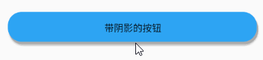
七、带阴影的按钮
<?xml version="1.0" encoding="utf-8"?>
<layer-list xmlns:android="http://schemas.android.com/apk/res/android">
    <item
        android:left="2dp"
        android:top="4dp">
        <shape>
            <solid android:color="@android:color/darker_gray"/>
            <corners android:radius="20dp"/>
        </shape>
    </item>
    <item
        android:bottom="4dp"
        android:right="2dp">
        <shape>
            <solid android:color="#f92aa4f5"/>
            <corners android:radius="20dp"/>
        </shape>
    </item>
</layer-list>
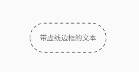
八、带虚线边框的文本
<?xml version="1.0" encoding="utf-8"?>
<shape xmlns:android="http://schemas.android.com/apk/res/android"
    android:shape="rectangle">
    <solid android:color="#00ffffff" />
    <stroke
        android:width="1dp"
        android:color="#272133"
        android:dashGap="5dp"
        android:dashWidth="6dp" />
    <size android:height="1dp" />
    <corners android:radius="36dp" />
</shape>
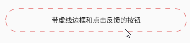
九、带虚线边框和点击反馈的按钮
<?xml version="1.0" encoding="utf-8"?>
<selector xmlns:android="http://schemas.android.com/apk/res/android">

    <item android:state_pressed="true">
        <shape android:shape="rectangle">
            <solid android:color="#00ffffff" />
            <!--每条线的宽度是:dashWidth 线之间的宽度是:dashGap-->
            <stroke android:width="1dp" android:color="#272133" android:dashGap="10dp" android:dashWidth="10dp" />
            <size android:height="1dp" />
            <corners android:radius="30dp" />
        </shape>
    </item>

    <item android:state_pressed="false">
        <shape android:shape="rectangle">
            <solid android:color="#00ffffff" />
            <!--每条线的宽度是:dashWidth 线之间的宽度是:dashGap-->
            <stroke android:width="1dp" android:color="#e45d5d" android:dashGap="10dp" android:dashWidth="10dp" />
            <size android:height="1dp" />
            <corners android:radius="30dp" />
        </shape>
    </item>

</selector>
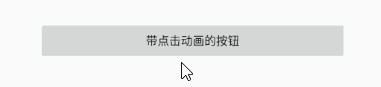
十、带点击动画的按钮
<?xml version="1.0" encoding="utf-8"?>
<selector xmlns:android="http://schemas.android.com/apk/res/android">

    <item android:state_pressed="true">
        <set>
            <objectAnimator
                android:duration="600"
                android:interpolator="@android:anim/accelerate_interpolator"
                android:propertyName="scaleX"
                android:repeatCount="1"
                android:valueFrom="1"
                android:valueTo="0.85"
                android:valueType="floatType" />
            <objectAnimator
                android:duration="600"
                android:interpolator="@android:anim/accelerate_interpolator"
                android:propertyName="scaleY"
                android:valueFrom="1"
                android:valueTo="0.85"
                android:valueType="floatType" />
        </set>
    </item>

    <item android:state_pressed="false">
        <set>
            <objectAnimator
                android:duration="200"
                android:interpolator="@android:anim/accelerate_interpolator"
                android:propertyName="scaleX"
                android:valueFrom="1"
                android:valueTo="0.85"
                android:valueType="floatType" />
            <objectAnimator
                android:duration="200"
                android:interpolator="@android:anim/accelerate_interpolator"
                android:propertyName="scaleY"
                android:valueFrom="1"
                android:valueTo="0.85"
                android:valueType="floatType" />
        </set>
    </item>

</selector>
十一、着色
将以下图片渲染为红色

<?xml version="1.0" encoding="utf-8"?>
<bitmap xmlns:android="http://schemas.android.com/apk/res/android"
        android:src="@drawable/image3"
        android:tint="#f9552c"/>
十二、图片渐变切换
<?xml version="1.0" encoding="utf-8"?>
<transition xmlns:android="http://schemas.android.com/apk/res/android">
    <item android:drawable="@drawable/image1"/>
    <item android:drawable="@drawable/image2"/>
</transition>
将以上 drawable 设为 ImageView 的背景,再用代码控制图片渐变切换
        final ImageView imageView = findViewById(R.id.image);
        imageView.setOnClickListener(new View.OnClickListener() {
            @Override
            public void onClick(View v) {
                TransitionDrawable drawable = (TransitionDrawable) imageView.getBackground();
                drawable.startTransition(3000);
            }
        });

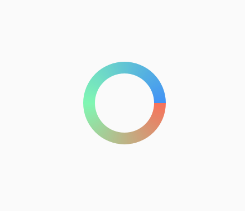
十三、圆环
<?xml version="1.0" encoding="utf-8"?>
<shape xmlns:android="http://schemas.android.com/apk/res/android"
    android:innerRadius="20dp"
    android:shape="ring"
    android:thickness="8dp"
    android:useLevel="false">

    <gradient
        android:angle="0"
        android:centerColor="#9f36f588"
        android:endColor="#4192f5"
        android:startColor="#d8f7583c"
        android:type="sweep"
        android:useLevel="false"/>
</shape>
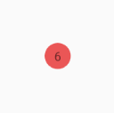
十四、红色圆点
<?xml version="1.0" encoding="utf-8"?>
<shape xmlns:android="http://schemas.android.com/apk/res/android"
    android:shape="oval">
    <solid android:color="#ea5656"/>
    <size
        android:width="10dp"
        android:height="10dp"/>
</shape>


 扫一扫
扫一扫


 2258
2258

 被折叠的 条评论
为什么被折叠?
被折叠的 条评论
为什么被折叠?
 到【灌水乐园】发言


