


 本文分享了一个WPF项目中使用的简单TabItem样式代码,实现了顶部标签的自定义外观,包括选中状态下的背景颜色变化及路径指示器。
分享一个以前项目中用到的简单的TabItem样式。
效果图如下: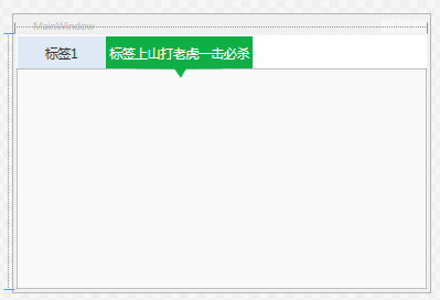
        <SolidColorBrush x:Key="TabItemDisabledBackground" Color="#F4F4F4"/>
        <SolidColorBrush x:Key="TabItemDisabledBorderBrush" Color="#FFC9C7BA"/>

        <Style  TargetType="{x:Type TabItem}">
            <!--<Setter Property="FocusVisualStyle" Value="{x:null}"/>-->
            <Setter Property="Foreground" Value="#333333"/>
            <Setter Property="FontSize" Value="16"/>
            <Setter Property="BorderBrush" Value="{StaticResource TabControlNormalBorderBrush}"/>
            <Setter Property="Background" Value="{StaticResource ButtonNormalBackground}"/>
            <Setter Property="HorizontalContentAlignment" Value="Stretch"/>
            <Setter Property="VerticalContentAlignment" Value="Stretch"/>
            <Setter Property="Template">
                <Setter.Value>
                    <ControlTemplate TargetType="{x:Type TabItem}">
                        <Grid SnapsToDevicePixels="true" Height="40" MinWidth="110">
                            <Path Margin="0 0 0 -12" x:Name="PATH" Visibility="Collapsed" Data="M0.5,0.5 L109.5,0.5 109.5,39.5 64,40 57,51 49,40 0.5,39.5 z" Fill="#FF0FAF46"  Height="51.5"  Stretch="Fill" Stroke="Transparent"  Width="110"/>
                            <Border x:Name="Bd" Background="#dfe9f6">
                                <ContentPresenter Margin="5 0 5 0" x:Name="Content" ContentSource="Header" HorizontalAlignment="{Binding HorizontalContentAlignment, RelativeSource={RelativeSource AncestorType={x:Type ItemsControl}}}" RecognizesAccessKey="True" SnapsToDevicePixels="{TemplateBinding SnapsToDevicePixels}" VerticalAlignment="{Binding VerticalContentAlignment, RelativeSource={RelativeSource AncestorType={x:Type ItemsControl}}}"/>
                            </Border>
                        </Grid>
                        <ControlTemplate.Triggers>
                            <MultiTrigger>
                                <MultiTrigger.Conditions>
                                    <Condition Property="IsSelected" Value="true"/>
                                    <Condition Property="TabStripPlacement" Value="Top"/>
                                </MultiTrigger.Conditions>
                                <Setter Property="Visibility" Value="visible" TargetName="PATH"/>
                                <Setter Property="Foreground" Value="White"></Setter>
                                <Setter Property="Background" Value="#FF0FAF46" TargetName="Bd"/>
                            </MultiTrigger>
                            <Trigger Property="IsEnabled" Value="false">
                                <Setter Property="Background" TargetName="Bd" Value="{StaticResource TabItemDisabledBackground}"/>
                                <Setter Property="BorderBrush" TargetName="Bd" Value="{StaticResource TabItemDisabledBorderBrush}"/>
                                <Setter Property="Foreground" Value="{DynamicResource {x:Static SystemColors.GrayTextBrushKey}}"/>
                            </Trigger>
                        </ControlTemplate.Triggers>
                    </ControlTemplate>
                </Setter.Value>
            </Setter>
        </Style>
这里只实现了标签方向在Top的实现,其它动画或者显示效果都是可以随意增加的!


 扫一扫
扫一扫


 2030
2030

 被折叠的 条评论
为什么被折叠?
被折叠的 条评论
为什么被折叠?
 到【灌水乐园】发言


