


 本文探讨了模型评估中AUC指标存在的问题,指出其可能带来的误导性,并引用了一篇来源于Medium的文章进行深入讨论。
模型auc指标
by John Elder, Ph.D., Founder & Chairman, Elder Research
作者:John Elder,博士,Elder Research创始人兼董事长
The blog Recidivism, and the Failure of AUC published on Statistics.com showed how the use of “Area Under the Curve” (AUC) concealed bias against African-Americans defendants in a model predicting recidivism, that is, which defendants would re-offend. There, a model varied greatly in its performance characteristics depending on whether the defendant was white or black. Though both situations resulted in virtually identical AUC measures, they led to very different false alarm vs. false dismissal rates. So, AUC failed the analysts relying on it, as it quantified the wrong property of the models and thus missed their vital real-world implications.
在Statistics.com上发布的博客“ 累犯”和AUC的失败表明,“曲线下区域”(AUC)的使用如何在预测累犯的模型中掩盖了针对非裔美国人被告的偏见,也就是说,被告会再次犯罪。 在那里,根据被告是白人还是黑人,模型的性能特征差异很大。 尽管这两种情况实际上导致了完全相同的AUC度量,但它们导致的误报率与误解率却大不相同。 因此,AUC未能使分析人员依赖它,因为它量化了模型的错误属性,因此错过了它们对现实世界的重要影响。
In the Statistics.com blog AUC’s problem was explained as being akin to treating all errors alike. Actually, AUC’s fatal flaw is deeper than that, to the point that the metric should, in fact, never be used! Though it may be intuitively appealing AUC actually is mathematically incoherent in its error treatment, as shown by David Hand in a 2009 KDD keynote talk.
在Statistics.com博客中,AUC的问题被解释为类似于对待所有错误。 实际上,AUC的致命缺陷远不止于此,以至于该度量标准实际上不应该使用! 尽管从直观上讲可能吸引人,但AUC实际上在错误处理上在数学上是不一致的 ,如David Hand在2009年KDD主题演讲中所展示的 。
To understand the flaw of AUC and what should replace it we’ll go through the whole process in a brief example. First, note that the curve under which one calculates the area (e.g., ROC or “receiver operating characteristic” curve) illustrates the performance tradeoffs (e.g., sensitivity vs. specificity) of a single classification model as one varies its decision threshold. The threshold is the model output level at which a record is predicted to be a 0 or 1. Thus every different model threshold is a different point on the ROC curve, and the model at that point has its own confusion matrix (or contingency table) of results, summarizing predicted vs. actual 0s vs. 1s.
为了了解AUC的缺陷以及应该用什么替代,我们将在一个简短的示例中介绍整个过程。 首先,请注意,根据该曲线计算面积的曲线(例如,ROC或“接收器工作特性”曲线)说明了随着一个分类模型改变其决策阈值而进行的性能折衷(例如,灵敏度与特异性)。 阈值是模型输出水平,在该水平上记录预计为0或1。因此,每个不同的模型阈值都是ROC曲线上的不同点,并且该点上的模型具有其自己的混淆矩阵(或列联表)结果,总结预测与实际0s与1s。
ROC曲线和升力曲线 (ROC Curve and Lift Curve)
There are actually two kinds of curves analysts use to assess classifier performance and they seem different in their descriptions but are very similar in appearance and utility. The version mentioned in the Statistics.com blog is the ROC curve which is a plot of two rates — originally, true positive rate vs. false positive rate, but sometimes sensitivity vs. specificity, or recall vs. precision, etc. The second, which I use most often, is called a Lift Chart or more accurately but less artfully, a Cumulative Response Chart. It plots two proportions: The Y-axis is the proportion of result obtained (such as sales made or fraud found) and the X-axis is proportion of the population treated so far. Importantly, the data is first sorted by model score, so the highest-scoring (most interesting) record is leftmost on the X-axis (is 0) and the lowest (least interesting) record is rightmost on the X-axis (is 1).
分析人员用来评估分类器性能的曲线实际上有两种,它们的描述似乎不同,但外观和实用性却非常相似。 Statistics.com博客中提到的版本是ROC曲线,它是两个比率的图 -最初是真实阳性率vs假阳性率,但有时是敏感性vs.特异性,或者是召回率与精确度等。第二个是我最常使用的图表称为“提升图表”,或更准确但不太巧妙的是“累积响应图表”。 它绘制了两个比例 :Y轴是所获得的结果(例如进行的销售或发现欺诈)的比例,X轴是到目前为止所治疗的人群的比例。 重要的是,数据首先按模型得分排序,因此得分最高(最有趣)的记录在X轴上最左(是0),最低得分(最有趣)的记录在X轴上是最右(是1) )。
Figure 1 is the Lift (Cumulative Response) chart for a model built to predict which home equity loans which will go bad (default). The data had been concentrated (winnowed of many fine loans) to bring the level of defaults up to 20% to make modeling easier for some methods which have a hard time with imbalances in class probabilities. The dark black line is the Lift curve depicting the performance of the model, the blue dashed line shows how the perfect model would perform, and the dotted black line is the expected performance of a random model, which should find 50% of the fraud, for example, after auditing a random 50% of the records. The model in Figure 1 is a classification model, trained on a binary target variable labeled either 0 (for a good loan) or 1 (for bad). “Regression” is in the title as the type of the model was ordinary linear regression.
图1是模型的提升(累积响应)图,用于预测哪些房屋抵押贷款将变坏(默认)。 数据已被集中(不包括许多优质贷款),以使违约率提高至20%,从而使某些方法的建模更容易,而这些方法很难解决,且课堂概率不平衡。 深黑色线是描述模型性能的提升曲线,蓝色虚线表示完美模型的性能,黑色虚线是随机模型的预期性能,可以发现50%的欺诈行为,例如,在审核了随机记录的50%之后。 图1中的模型是分类模型,在标记为0(对于良好贷款)或1(对于不良贷款)的二进制目标变量上进行训练。 标题中有“回归”,因为模型的类型是普通的线性回归。
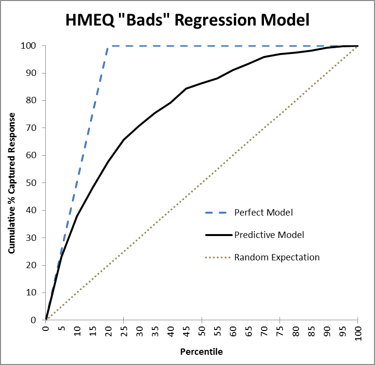
As an aside, notice that for Lift charts the perfect model doesn’t go straight up; in Figure 1’s example, it takes at least 20% of the cases to get all the bad ones. Unlike the ROC chart, where the perfect model’s AUC can reach 1.0, a Lift chart’s AUC can never reach 1.0; in fact, the maximum possible AUC of a Lift chart will vary according to the problem. (This minor flaw of the AUC metric though is trivial compared to its fatal flaw.)
顺便说一句,请注意,对于Lift图表,完美模型并不会直线上升。 在图1的示例中,至少需要20%的情况才能解决所有不良情况。 与ROC图不同的是,理想模型的AUC可以达到1.0,而提升图的AUC则永远不会达到1.0; 实际上,提升图表的最大可能AUC会根据问题而有所不同。 (尽管与致命错误相比,AUC度量标准的这一微小缺陷微不足道。)
In Figure 1, the model performs perfectly at first, for high thresholds, and tracks the blue dashed line. But then, as it goes deeper in the list, past the top ~5% of records, it starts to make mistakes and falls off in performance. Still, it does much better than a random ordering of records (the dotted line), by any measure. One could see why AUC might appeal as a way to reduce this curve to a single number. But let’s be smarter than that.
在图1中,该模型首先在高阈值下表现理想,并跟踪蓝色虚线。 但是,随着它在列表中的位置越来越深,超过记录的前5%,它开始犯错并降低性能。 无论如何,它比记录的随机排序(虚线)要好得多。 可以看到为什么AUC可能会吸引人们,因为它可以将此曲线缩小到一个单一的数字。 但是让我们比这更聪明。
Another different model would create a second solid line. If that line were completely below the existing black line we could confidently throw away the second model for being dominated by the first in every way. But what if it crossed over and was, say, lower earlier but higher in the middle region? We could compare area, yes, but for what reason? Since each point on the curve corresponds to a different error tradeoff, it actually matters more where a line dominates.
另一个不同的模型将创建第二条实线。 如果那条线完全低于现有的黑线,我们可以放心地抛弃第二种模型,因为它在各方面都被第一种模型支配。 但是,如果它越过并在中部地区早些时候下降但又要高些呢? 我们可以比较面积,是的,但是出于什么原因呢? 由于曲线上的每个点都对应于不同的误差折衷,因此实际上,在直线占主导地位的地方 ,它的重要性更大。
Each Point on a Lift Curve corresponds to a Confusion Matrix
提升曲线上的每个点都对应一个混淆矩阵
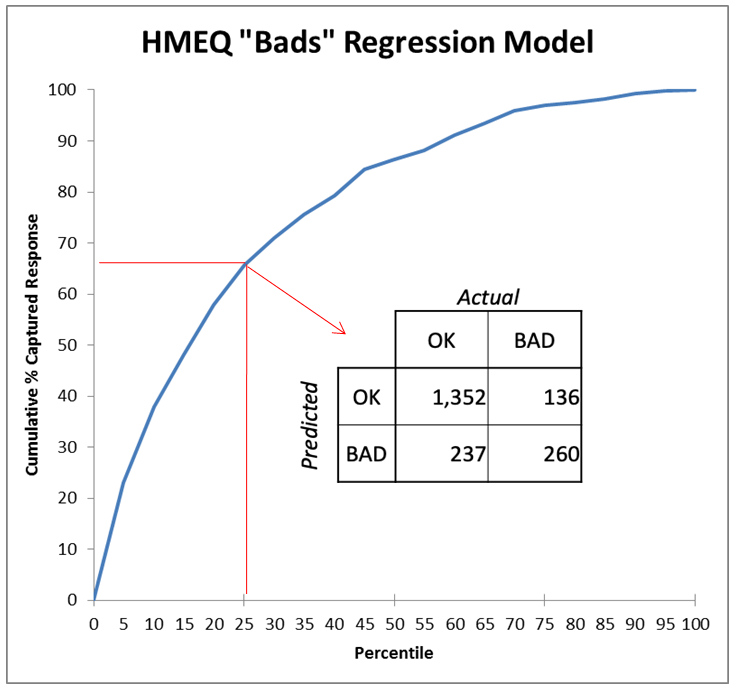
Figure 2 highlights a single point on the curve of Figure 1, 25% deep in the list sorted by the model. At that cutoff threshold[1], the classifier has found 260/396 or 66% of the “bads” (defaulters), which proportion is plotted on the Y-axis. Selecting randomly, we would have found only 25% of the “bads.” The model’s “Lift” at that point is thus 66%/25% = 2.64, so it is doing 2.64 times better than the random model. At a higher threshold where the model was still perfect, at X=5%, we can see its lift would be ~4.0. The lift ratio naturally diminishes from there to 1.0 at the end as we go deeper in the list and move up the curve.
图2突出显示了图1曲线上的单个点,该点在按模型排序的列表中的深度为25%。 在该临界值[1]时,分类器发现260/396或66%的“不良”(默认值),其比例绘制在Y轴上。 随机选择,我们只会发现25%的“不良”。 因此,模型在那时的“提升”为66%/ 25%= 2.64,因此它比随机模型要好2.64倍。 在模型仍然完美的较高阈值处(X = 5%),我们可以看到其提升为〜4.0。 随着我们在列表中的更深处和曲线的上移,升力比最终自然地从那里减小到1.0。
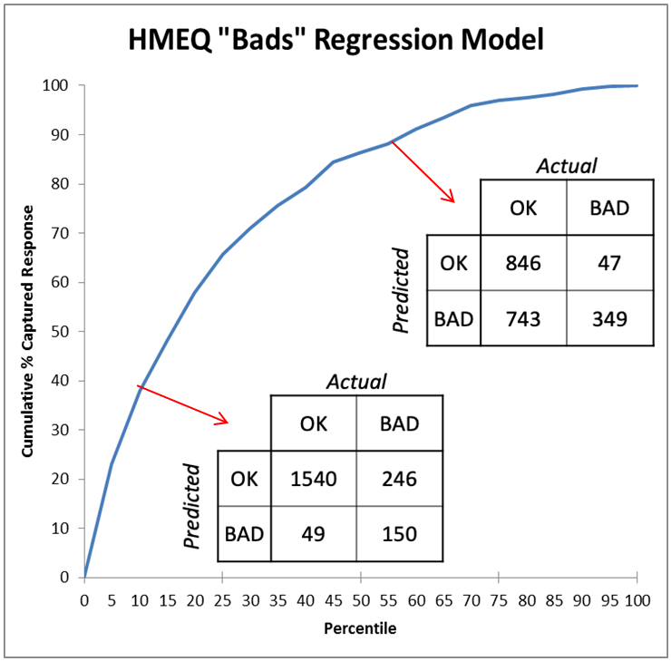
Figure 3 compares two points on the chart (two thresholds for the model) and shows how different their two resulting confusion matrices (contingency charts) are. A model that “cherry picks” cases it calls bad — that is, uses a high threshold — will be a point on the curve near the lower left of the chart, so will be low in both true positive rate and false positive rate. It will have errors of high false dismissal but low false alarm. (In Figure 3, the model 10% deep in the list is right 3/4 of the time when predicting “bad” (150/(150+49)) but misses 5/8 of the bad cases (246/(246+150)).) It is best to choose a high threshold for your model if your problem is one where the cost of a false alarm is much higher than a false dismissal. An example would be an internet search where it’s very important for the top results to be “on topic” and it’s fine to fetch only a fraction of such results.
图3比较了图表上的两个点(模型的两个阈值),并显示了两个结果混淆矩阵(权变图)之间的差异。 “樱桃挑选”其认为不好的情况(即使用较高的阈值)的模型将成为曲线图上左下角附近的一个点,因此真阳性率和假阳性率均较低。 它将具有误解率高但误报率低的错误。 (在图3中,列表中深10%的模型在预测“不良”时的正确时间是3/4(150 /(150 + 49)),但错过了5/8的不良情况(246 /(246+ 150)。)如果您的问题是错误警报的成本远高于错误解雇的问题,则最好为模型选择较高的阈值。 互联网搜索就是一个例子,在互联网搜索中,最重要的结果要“在主题上”是非常重要的,并且只获取其中一部分是很好的。
A low threshold for the decision boundary would place the model on the other end of the curve near the upper right corner, where its errors would reflect rates of low false dismissals but high false alarms. (In Figure 3, the model that calls most cases “bad” finds 7/8 of the bad cases (349/(349+47)) but is wrong 2/3 of the time when it calls one bad (743/(743+349)).) It is best to choose a low threshold for your model if your problem is one where a false alarm’s cost pales in comparison to that of a false dismissal, such as a warning system for an earthquake or tsunami. (As long as the false alarms are not so numerous as the system is completely ignored!)
决策边界的低阈值会将模型放置在曲线的另一端靠近右上角的位置,该模型的错误将反映低误解率和高误报警率。 (在图3中,将大多数情况称为“不良”的模型发现了7/8的不良情况(349 /(349 + 47)),但在错误的情况下,有2/3的时间却是错误的(743 /(743 +349)。)如果您的问题是虚假警报的成本比虚假解除的成本(例如地震或海啸预警系统)低的问题,则最好为模型选择一个较低的阈值。 (只要错误警报没有那么多,只要系统被完全忽略!)
A real problem will occupy a very narrow part of the ROC or Lift chart space, once it is even partially understood. For instance, in credit scoring, it takes the profit from 5–7 good customers to cover the losses a bank will incur from one defaulting customer. So, it is appropriate to tune a decision system, when predicting credit risk, to have a threshold in a range reflecting that tradeoff. The bank would be very unwise to use a criterion, like AUC, which instead combines information from all over the ROC curve — even parts where a defaulting customer is less important than a normal customer! — to make its decision.
一旦真正理解了一个问题,它将在ROC或Lift图表空间中占据非常狭窄的一部分。 例如,在信用评分中,它需要5-7个良好客户的利润来弥补银行将因一名违约客户而蒙受的损失。 因此,在预测信用风险时,调整决策系统以使其反映折衷的范围内的阈值是适当的。 银行使用诸如AUC之类的标准是非常不明智的,它会结合整个ROC曲线中的信息-即使是违约客户比普通客户重要性低的部分! -做出决定。
In short, AUC should never be used. It is never the best criterion. It may be “correlated with goodness” in that it rewards good qualities of an ROC curve. But it is always better to examine the problem you are working on to understand its actual relative costs (false alarms vs. false dismissals) or benefits (true positives vs. true negatives) to tune a criterion that makes clear business sense. That will lead to a better solution that more directly meets your goal of minimizing costs or maximizing benefits.
简而言之, 永远不要使用AUC 。 这绝不是最好的标准。 它可能与“良好度相关”,因为它可以奖励ROC曲线的良好品质。 但是,最好检查您正在研究的问题,以了解其实际相对成本(错误警报与错误解雇)或收益(真实肯定与否定否决),以调整具有明确业务意义的标准。 这将导致更好的解决方案,更直接地满足您最小化成本或最大化收益的目标。
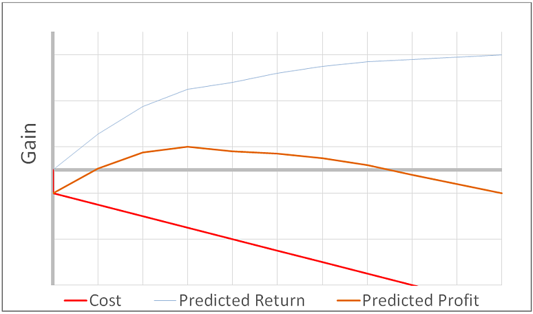
收益图 (Gains Chart)
I recommend using a Gains chart, as depicted in Figure 4. There, the model of Figure 1 has been translated into the language of management ($) for the Y-axis. The output — sales or defaults caught — has been turned into dollars earned or recovered. Also, costs are depicted (the red line); with a fixed cost occurring immediately (setup cost) and a variable cost depending on how deep one goes into the list (“per record” cost). In this example (with high incremental costs), the optimal profit is obtained by investigating only the top 30% of cases as scored by the model.
我建议使用如图4所示的增益图表。在那里,图1的模型已转换为Y轴的管理语言($)。 输出(捕获的销售或违约)已变成赚取或回收的美元。 此外,还标出了成本(红线); 固定成本立即发生(设置成本),可变成本取决于进入列表的深度(“每条记录”成本)。 在此示例中(具有较高的增量成本),通过仅调查模型评分的前30%案例,可以获得最佳利润。
最后,关于约束的注释 (Lastly, a Note about Constraints)
The discussion so far has assumed that you can operate anywhere on the curve. With a marketing application, for example, that is possible; it is just a matter of cost. But with a fraud investigation, on the other hand, each case requires hard work from expert investigators so is also constrained by time and the availability of trained staff. You may only be able to go so deep in the list, no matter how promising the expected payoff. Still, this type of analysis can show what is possible if more resources can be made available — say, new staff hired, or existing staff reassigned and trained. That utility for planning, along with its clarity (and again, speaking the language of management) is why this type of analysis is enthusiastically adopted by leaders and analysts once it is understood.
到目前为止的讨论假定您可以在曲线上的任何位置进行操作。 例如,通过营销应用程序,这是可能的; 这只是成本问题。 但是另一方面,在进行欺诈调查的情况下,每个案件都需要专家调查员的辛勤工作,因此也受到时间和训练有素的工作人员的限制。 无论预期的回报多么有希望,您可能只能进入列表的深层。 尽管如此,这种类型的分析仍可以表明,如果可以提供更多的资源,例如聘用新员工,或者重新分配和培训现有员工,那将是可行的。 计划的效用及其清晰性(再说一遍管理语言),就是为什么一旦被理解,领导者和分析师就会热情地采用这种类型的分析。
If the challenge you are dealing with is constrained in its solution approach then you have yet another reason to ignore AUC and do better: compare the performance of models only in the operating region in which you are going to use them.
如果您要解决的挑战受限于其解决方案方法,那么您还有另一个理由忽略AUC并做得更好:仅在要使用模型的操作区域中比较模型的性能。
[ 1 ] I did not record it but it would be lower than the 0.75 one might expect since only 20% of the training data was 1 and modeling shrinks estimates toward the mean. Assume for discussion it was 0.58
[1]我没有记录它,但是它会低于人们可能期望的0.75,因为只有20%的训练数据是1,并且建模使估计值趋于均值。 假设进行讨论是0.58
Originally published at https://www.elderresearch.com.
最初在 https://www.elderresearch.com上 发布 。
翻译自: https://medium.com/@ElderResearch/auc-a-fatally-flawed-model-metric-60e79329733e
模型auc指标


 4515
4515

 被折叠的 条评论
为什么被折叠?
被折叠的 条评论
为什么被折叠?
 到【灌水乐园】发言


