


Yes, we’ve all heard of this at some point in our life, be it at school during math class or possibly at work when projecting company’s revenue. We’re definitely familiar with the phrase that goes “line of best fit” which basically what linear regression is. It tries to fit the best possible trend line to your set of data which conforms to the linear equation to express the relationship between your dependent and independent variable. In other words, to create a linear model with the minimum sum of squares of the residuals (errors).
是的,我们都曾在人生的某个时刻听说过这一点,无论是在上数学课的学校还是在预测公司的收入时都在工作。 我们绝对熟悉“最佳拟合线”这一短语,它基本上是线性回归。 它试图使最佳趋势线适合您的数据集,该数据集符合线性方程式,以表达因变量和自变量之间的关系。 换句话说,创建具有最小残差(误差)平方和的线性模型。
Regression model can also be extended to include n-th number of independent variables. It’s known to us as multiple linear regression or multivariate linear regression.
回归模型也可以扩展为包括第n个自变量。 我们将其称为多元线性回归或多元线性回归。
The independent variables can be number of things. For example, if we’re trying to predict the price of a car (dependent variable), we’re indefinitely going to consider the year it’s manufacture, the brand, mileage, etc (independent variables). In other words, the factors that would influence how the car is priced.
自变量可以是许多事物。 例如,如果我们试图预测汽车的价格(因变量),那么我们将无限期地考虑其制造年份,品牌,行驶里程等(因变量)。 换句话说,将影响汽车定价的因素。
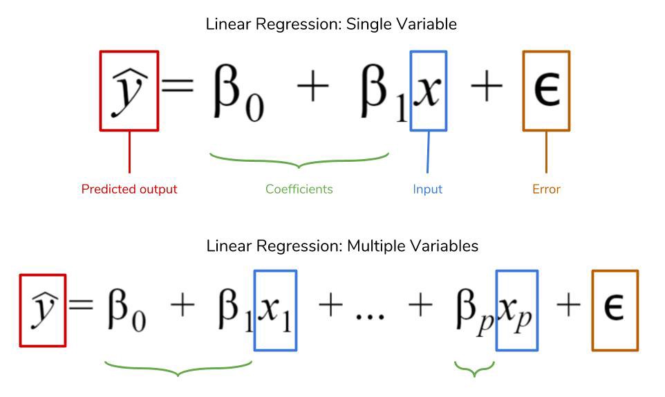
Mathematically, linear regression is expressed as per shown by the image below.
在数学上,线性回归表示为下图所示。
There are few key assumptions in linear regression that we must be aware of:
我们必须了解的线性回归中的几个关键假设是:
1) Linear relationship between the dependent and independent variables.
1)因变量和自变量之间的线性关系。
2) Little or no correlation between independent variables — multicollinearity
2)自变量之间几乎没有相关性—多重共线性
3) Homoscedasticity — the variance is constant
3)同方差—方差恒定
4) Normal distribution
4)正态分布
In machine learning, linear regression falls under the category of supervised learning. You can find simple and intuitive explanation of those two here.
在机器学习中,线性回归属于监督学习的范畴。 您可以在此处找到这两个的简单直观的解释。
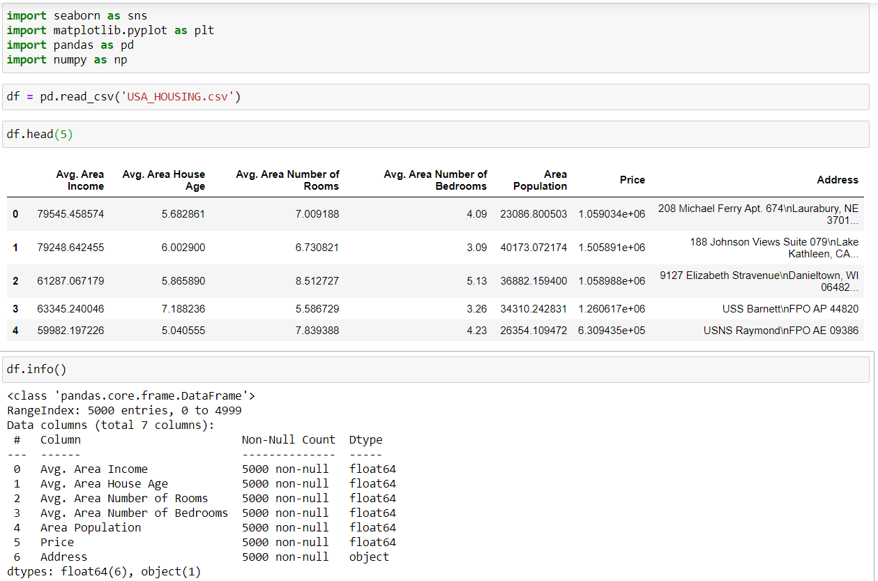
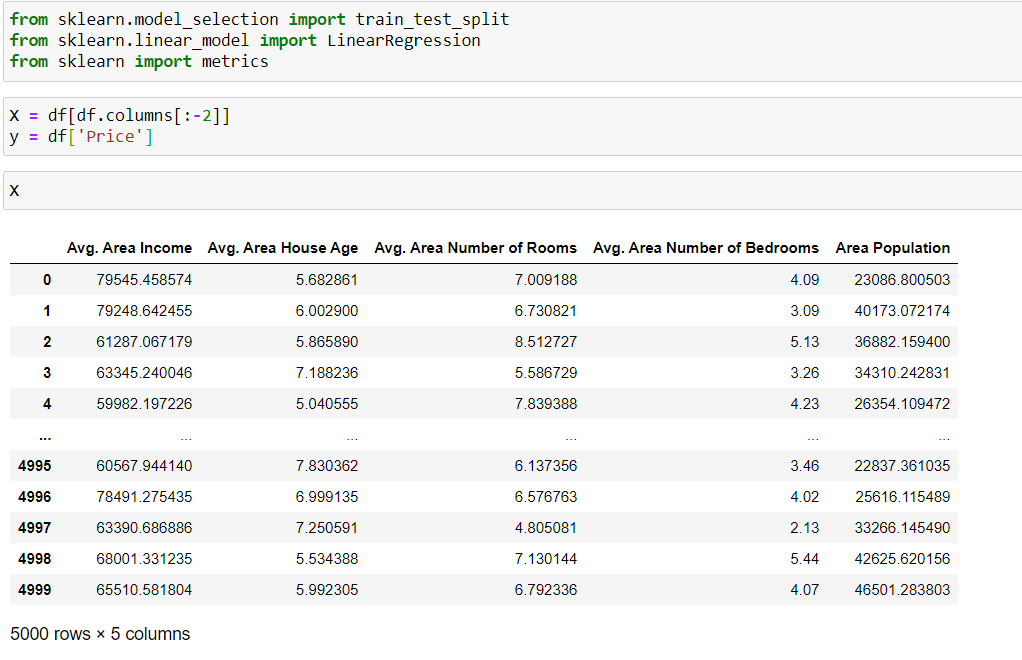
Now, let’s dive into the main agenda of this article, that is python implementation of linear regression with Scikit-learn package. Data set used for demonstration will be USA Housing and can be found in this link. The reason as to why this data set was chosen is because, it’s already been cleaned as in every entries were already filled. So that essentially reduces extra work from us.
现在,让我们深入研究本文的主要议程,即使用Scikit-learn包的线性回归的python实现。 用于演示的数据集将是“美国住房”,可以在此链接中找到。 之所以选择该数据集,是因为它已经被清除,因为每个条目都已被填充。 因此,这实质上减少了我们的工作量。
So, as always we’ll import the necessary libraries for our analysis. The data contains 5000 rows and 7 columns. Upon initial observation, we see all column entries are numerical except for the last one, it’s a string (object). To be able to run linear regression model, all data should be numeric. We’ve got 2 choices in this instance, first we can simply drop the address column or we could do some form of operation, maybe label encoding of the string. For simplicity, dropping the column seems reasonable enough.
因此,一如既往,我们将导入必要的库以进行分析。 数据包含5000行和7列。 初步观察,我们看到所有列条目都是数字的,最后一个除外,它是一个字符串(对象)。 为了能够运行线性回归模型,所有数据均应为数字。 在这种情况下,我们有2个选择,首先我们可以简单地删除address列,或者可以执行某种形式的操作,也许是字符串的标签编码。 为简单起见,删除该列似乎很合理。
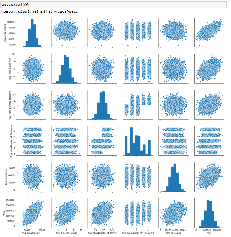
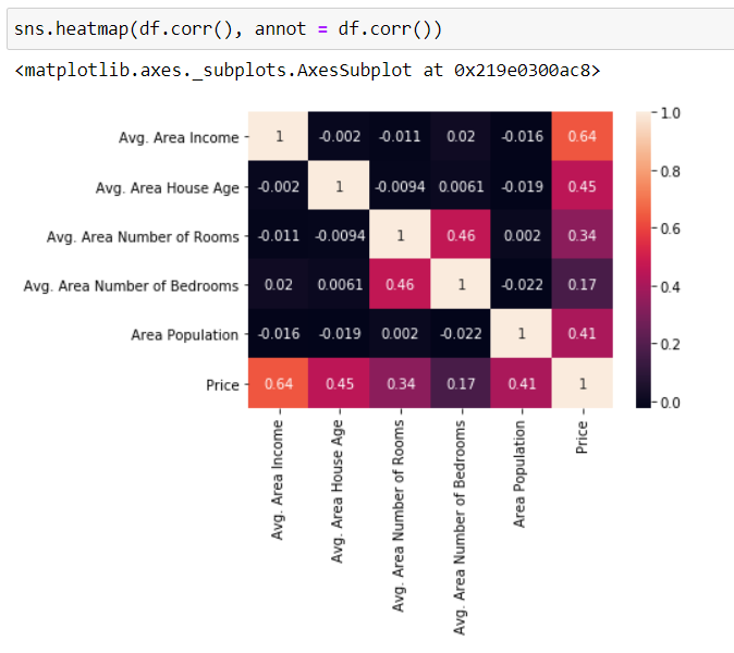
Let’s turn our attention into visualizing the relationships in our dataset. Fastest way of doing this is by calling seaborn pairplot. Plots in the diagonal direction shows the distribution between itself. Now, we’re interested with the price since that’s what we’re trying to model and it appears that the distribution is normal. Plus, the scatter plot also suggest that there’s strong correlation between price and avg. area income and the rest are mildly correlated. To confirm this finding, we’ll do heatmap plot.
让我们将注意力转向可视化数据集中的关系。 最快的方法是调用seaborn pairplot。 对角线方向的图显示了它们之间的分布。 现在,我们对价格感兴趣,因为这就是我们要建模的东西,而且似乎分布是正态的。 此外,散点图还表明价格和平ASP格之间存在很强的相关性。 地区收入与其余地区之间存在轻度相关。 为了确认这一发现,我们将进行热图绘制。
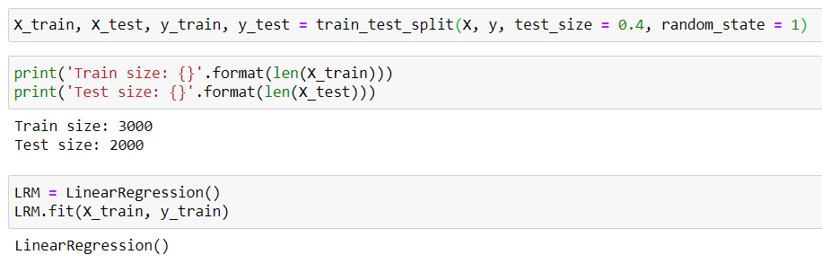
Modelling linear regression in python is relatively easy. In fact, the work flow is very much the same. The columns are first divided into label (dependent) and feature (independent) variables which in our case, price is the label since it’s the thing that we’re predicting meanwhile the rest are simply features. Then the dataset is split into train and testing set so that the model can generalize well to new data. Finally, we can instantiate the Linear Regression and train the model based on the training set.
在python中建模线性回归相对容易。 实际上,工作流程几乎相同。 这些列首先分为标签(相关)变量和功能(独立)变量,在我们的案例中,价格是标签,因为这是我们要预测的东西,而其余只是功能。 然后将数据集分为训练集和测试集,以便模型可以很好地推广到新数据。 最后,我们可以实例化线性回归并根据训练集训练模型。
Note that value holds by random state is arbitrary, it can be any number. It’s purpose is mainly to initialize our split data set so that it contains the same entries everytime we run the model. For example, if random_state wasn’t called, our data entries for test and train sets would shuffle everytime we run the code.
注意,随机状态下的值是任意的,可以是任意数字。 目的主要是初始化拆分数据集,以便每次运行模型时都包含相同的条目。 例如,如果未调用random_state,则每次运行代码时,用于测试集和训练集的数据条目都会洗牌。
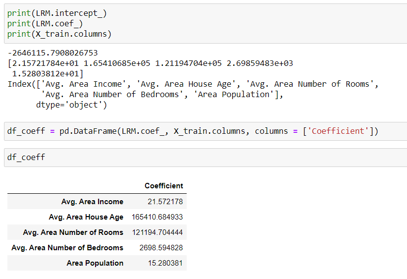
The model intercept and coefficient can be called and visualize in the form of dataframe for easier interpretation. What we can interpret from the first row (Avg. Area Income) is that if all other features are fixed except the one that we’re observing, will have an increase of 21.57 dollars per unit increase of Avg. Area income. Similarly, the rest of the columns hold the same narrative.
可以以数据框的形式调用模型截距和系数并将其可视化,以便于解释。 我们可以从第一行(平均区域收入)中解释的是,如果除我们观察到的所有其他功能均固定不变,平均每增加一个单位,将增加21.57美元。 区域收入。 同样,其余各列具有相同的叙述。
You probably wonder so what? Well, first the coefficient essentially describes increment or decrement between your independent and and dependent variable. So, if the value is positive then the independent variable should also increase and consequently increases the dependent variable.
您可能想知道呢? 好吧,首先,该系数本质上描述了自变量和因变量之间的增量或减量。 因此,如果该值为正,则自变量也应增加,并因此增加因变量。
Consider this example for your understanding, assuming we’re trying to predict the weight (label) of a person with height (feature). Mathematically, the relationship can be expressed as follow (only hypothetical, plus we’re ignoring the y-intercept term for simplicity):
假设我们正在尝试预测身高(特征)的人的体重(标签),请考虑以下示例以供您理解。 在数学上,该关系可以表示为以下形式(仅是假设性的,为简单起见,我们忽略了y截距项):
weight = 70*Height
体重= 70 *身高
What we can interpret from here is that, a unit (1 meter) increase in height is associated with increase of 70 kg of weights. Makes much more sense right? So that’s what the coefficient is trying to tell.
从这里我们可以解释的是,每增加一个单位(1米),就会增加70公斤的重量。 更有意义吧? 这就是系数要说明的内容。
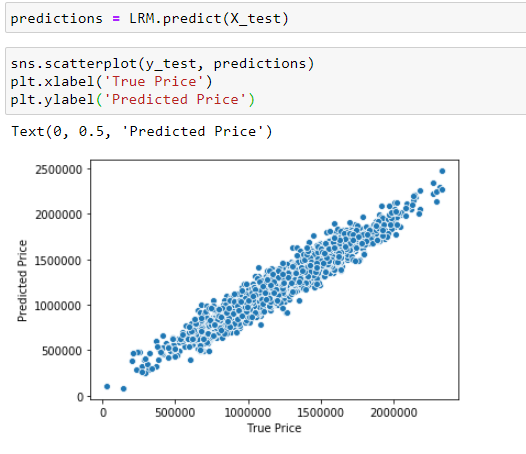
Next, we’re ready to fit the test data into our model so that it can predict the price. The real price can be used to compare against the predicted price to see how well our model performs.
接下来,我们准备将测试数据拟合到我们的模型中,以便可以预测价格。 可以使用实际价格与预测价格进行比较,以查看我们的模型的效果如何。
Visually, the model performance looks decent since the scatter plot shows almost linear relationship. If the model had perfect predictions, we would see perfect straight line.
在视觉上,由于散点图几乎显示出线性关系,因此模型的性能看起来不错。 如果模型具有完美的预测,我们将看到完美的直线。
指标 (Metrics)
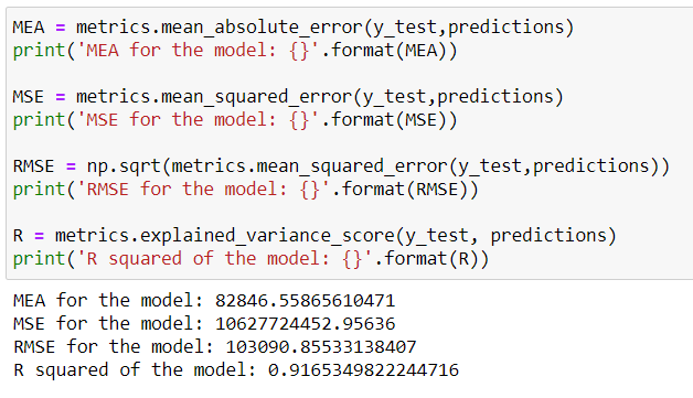
Typically, one would evaluate the performance of the model with these 4 metrics: MEA, MSE, RMSE and R squared. You can find the mathematical expressions and explanation on these metrics from this post here
通常,可以使用以下4个指标评估模型的性能:MEA,MSE,RMSE和R平方。 您可以在此处找到有关这些指标的数学表达式和解释
In general, one would be very interested with R squared as it describes how well your model fits the data. The marking scale goes from 0 -100% with 100% being perfect fit and 0% worse fit.
通常,人们会对R平方非常感兴趣,因为R平方可以描述模型对数据的拟合程度。 标记比例从0 -100%变为100%完美匹配,0%较差。
Our model has got a score of 91% which is very good. However, it’s also worth noting at this point that high R squared score isn’t necessarily good because remember, not all dataset works with linear regression and this brings us to the next sub topic >>> Residual Plot
我们的模型得分为91%,非常好。 但是,在这一点上还值得注意的是,较高的R平方得分不一定很好,因为请记住,并非所有数据集都可以进行线性回归,这将我们带入下一个子主题>>>残差图
模型有效性(Model validity)
Previously, we’ve seen that our model has got decent curve fit into the data and even pretty high R squared score. However, one then should ask is it appropriate? Does linear regression works best with this set of data? If so, how can we validate this?
以前,我们已经看到我们的模型在数据中拟合得不错,甚至R平方得分也很高。 但是,然后应该问是否合适? 线性回归是否最适合此数据集? 如果是这样,我们如何验证呢?
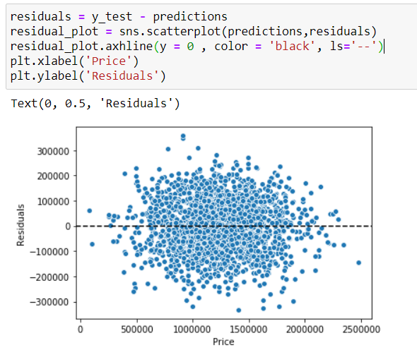
This is now the point where we introduce Residual plots to our whole conversation. Residual, mathematically can be found with the equation. It takes the difference between the observed and fitted values. Then, the residual is plotted against the fitted variable which typically if the model is valid will form scatter plot with constant variability and no apparent systematic curvature.
现在,我们在整个对话中引入残差图。 在数学上可以通过公式找到残差。 它采用观测值与拟合值之差。 然后,针对拟合变量绘制残差,通常,如果模型有效,则将形成具有恒定可变性且无明显系统曲率的散点图。
Main purpose of residual plot is to check our regression model or should I say, check if the assumptions for the linear regression are met. In general, what we’re looking for in residual plot is random dispersion of data along the horizontal axis. Not all set of data can fit with linear regression and if that’s the case you probably want to use different regression method such as polynomial or apply transformation (logarithmic scale) to the data.
残差图的主要目的是检查我们的回归模型,或者应该说,检查是否满足线性回归的假设。 通常,我们在残差图中寻找的是沿水平轴的数据随机分散。 并非所有数据集都适合线性回归,并且在这种情况下,您可能想使用其他回归方法(例如多项式)或对数据应用变换(对数标度)。
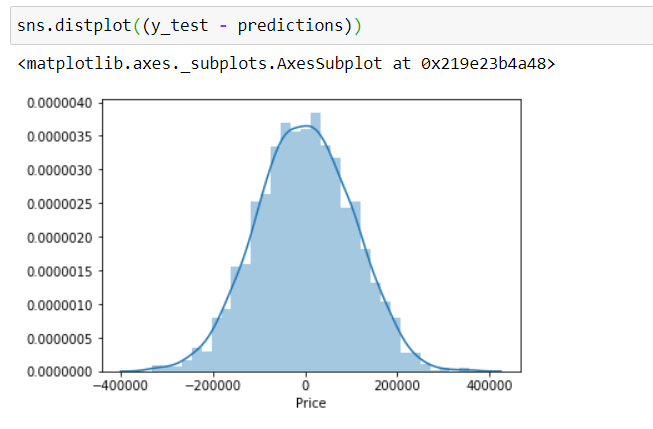
As per our case, the scatter plot doesn’t appear to have non-random distribution around zero (like a pattern/ trend), the distribution looks approximately normally distributed. Even our histogram of residuals look normally distributed, so we’re good.
根据我们的情况,散点图似乎没有零附近的非随机分布(如模式/趋势),该分布看起来近似于正态分布。 即使我们的残差直方图看起来也呈正态分布,所以我们很好。
结论 (Conclusion)
We’ve discussed and explored about linear regression and how we can model it in python. In general, the work flow is relatively the same with what I like to call a D-S-T approach . Divide data into features and label, split into train and test set and then train. Measuring R squared will evaluate if the model is a good fit or not however, that’s not the end of the story as the model should be validated with residual plot since linear regression were based on the assumptions mentioned earlier in this read.
我们已经讨论并探讨了线性回归以及如何在python中对其建模。 通常,工作流程与我所谓的DST方法相对相同。 将数据分为特征和标签,分为训练和测试集,然后训练。 测量R平方将评估模型是否合适,但这还不是全部,因为线性回归是基于本文前面提到的假设,因此应该使用残差图验证模型。
That’s it for now and Thank you!
就是这样,谢谢!
翻译自: https://medium.com/python-in-plain-english/modelling-linear-regression-with-python-3611bca2ad97


 2052
2052

 被折叠的 条评论
为什么被折叠?
被折叠的 条评论
为什么被折叠?
 到【灌水乐园】发言


