


效果如下,可以勾选表头进行隐藏,也可以对表头进行拖动排序
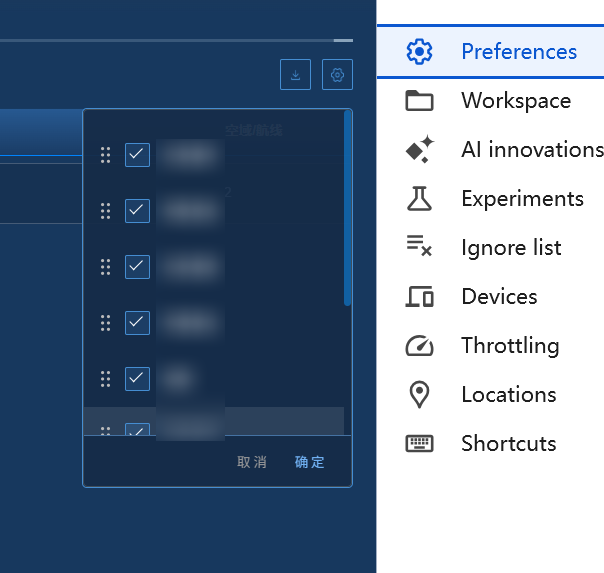
index主界面
<script>
let tempHead = [];
const showFilter = ref<boolean>(false);
let tableHeadList = ref<TableHeadItem[]>([
  { prop: "displayId", label: "编号", visible: true, sortable: true, isVis: true },
  { prop: "status", label: "1", visible: true, sortable: false, isVis: true },
  // { prop: 'approveOpnion', label: '审批意见', visible: false },
  { prop: "playType", label: "2", visible: true, sortable: false, isVis: true },
  { prop: "ownerRoleId", label: "3", visible: true, sortable: true, isVis: true },
  { prop: "approvalName", label: "4", visible: true, sortable: true, isVis: true },
  { prop: "startTime", label: "5", visible: true, sortable: true, isPx: 350, isVis: true },
  { prop: "airCraftName", label: "6", visible: true, sortable: false, isPx: 300, isVis: true },
  { prop: "airspaceInfos", label: "7", visible: true, sortable: false, isVis: true },
  { prop: "createTime", label: "8", visible: true, sortable: true, isPx: 200, isVis: true },
]);

const openFilter = () => {
  let tbLists = JSON.parse(localStorage.getItem("taskTableHead") || "[]");
  if (tbLists.length !== 0) {
    tableHeadList.value = tbLists;
    tempHead = tbLists;
  } else {
    tempHead = tableHeadList.value;
  }
  showFilter.value = !showFilter.value;
};
const updateColumns = (val) => {
  localStorage.setItem("taskTableHead", JSON.stringify(val));
  nextTick(() => {
    tableHeadList.value = val;
    showFilter.value = false;
  });
};

watchEffect(() => {
  let tbLists = JSON.parse(localStorage.getItem("taskTableHead") || "[]");
  tempHead = tableHeadList.value;
  if (tbLists.length !== 0) {
    tableHeadList.value = tbLists;
    tempHead = tbLists;
  } else {
    tempHead = tableHeadList.value;
  }
});
// 关闭表头筛选组件
const cancelFilter = () => {
  showFilter.value = false;
};
const changeVisable = (val, item) => {
  tempList.value = tempList.value.map(i => {
    if (i.label === item.label) {
      return { ...i, visible: val }
    }
    return i
  })
}
</script>


<template>
 <div class="searchRight">
          <el-form-item class="newbtn">
            <div class="iconBtn" @click="handleExport">
              <img src="@/assets/imgs/planMonitor/download.png" alt="" />
            </div>
            <div class="iconBtn filterBtn" @click="openFilter">
              <img src="@/assets/imgs/planMonitor/set_up.png" alt="" />
            </div>
            <!-- 表头筛选组件 -->
          </el-form-item>
          <div class="filter" v-if="showFilter">
            <filterTable :tableHeadList="tempHead" @update-columns="updateColumns" @cancel-filter="cancelFilter" />
          </div>
        </div>
</template>
filterTable.vue组件
<script setup lang="ts">
import draggable from 'vuedraggable'
defineOptions({ name: 'FilterTable' })
interface TableHeadItem {
  id?: number | string
  visible: boolean
  label: string
  prop: string
  sortable?: boolean
  width?: number | string
  isPx?: number
}
const props = defineProps({
  tableHeadList: {
    type: Array as () => TableHeadItem[],
    default: () => []
  }
})
const nameList = ref<TableHeadItem[]>([])
const tempList = ref<TableHeadItem[]>([])
watch(() => props.tableHeadList, (val) => {
  if(val.length !== 0) {
    nameList.value = val.map(item => ({ ...item }))
    tempList.value = val.map(item => ({ ...item }))
  }
}, { immediate: true })

const emit = defineEmits(['updateColumns', 'cancelFilter'])
const changeVisable = (val, item) => {
  tempList.value = tempList.value.map(i => {
    if (i.label === item.label) {
      return { ...i, visible: val }
    }
    return i
  })
}

const confirmFn = () => {
  nameList.value = tempList.value.map(item => ({ ...item }))
  emit('updateColumns', nameList.value)
}

const cacelFn = () => {
  emit('cancelFilter')
}

</script>
<template>
  <div class="filterContainer">
    <div class="filterWrap">
      <draggable v-model="tempList" handle=".icon" animation="200" item-key="id">
        <template #item="{ element }">
          <div class="opreatItem" v-if="element.isVis">
            <div class="icon"></div>
            <el-checkbox :label="element.label" :value="element.visible" :checked="element.visible" @change="changeVisable($event, element)" />
          </div>
        </template>
      </draggable>
    </div>
    <div class="btnBox">
      <el-button class="cancel" link @click="cacelFn">取 消</el-button>
      <el-button class="confirm" link @click="confirmFn">确 定</el-button>
    </div>
  </div>
</template>
<style lang="scss" scoped>
.filterContainer {
  width: px(280);
  height: px(394);
  border-radius: px(5);
  border: px(1) solid #404d59;

  .filterWrap {
    height: px(338);
    overflow: auto;
    padding: px(18) 0;
  }

  .opreatItem {
    display: flex;
    align-items: center;
    padding: 0 px(18);
  }
  .opreatItem:hover {
    background: rgba(247, 247, 247, 0.1);
  }
  .icon {
    width: px(10);
    height: px(16);
    background-image: url('@/assets/imgs/planMonitor/checked.png');
    background-size: 100% 100%;
    cursor: crosshair;
    margin-right: px(15);
  }
  :deep(.el-checkbox__label) {
    width: px(84);
    height: px(20);
    font-family:
      PingFangSC,
      PingFang SC;
    font-weight: 400;
    font-size: px(14);
    color: #ffffff;
    line-height: px(20);
    text-align: left;
    font-style: normal;
  }
  .btnBox {
    height: px(55);
    display: flex;
    justify-content: flex-end;
    padding: 0 px(24);
    border-top: px(1) solid rgba(117, 183, 251, 0.5);

    .confirm {
      width: px(38);
      font-family:
        PingFangSC,
        PingFang SC;
      font-weight: 400;
      font-size: px(14);
      color: #75b7fb;
      line-height: px(20);
      text-align: left;
      font-style: normal;
    }

    .cancel {
      width: px(38);
      font-family:
        PingFangSC,
        PingFang SC;
      font-weight: 400;
      font-size: px(14);
      color: #999999;
      line-height: px(20);
      text-align: right;
      font-style: normal;
    }
  }
}
</style>
draggable.vue组件
VueDraggable 是一个 Vue 组件库,它基于强大的 JavaScript 库 Sortable.js 实现了拖拽排序功能,并将其封装为易于在 Vue 项目中使用的组件。通过 VueDraggable,开发者可以在 Vue 应用中轻松添加拖拽排序的功能,而不需要从头编写复杂的拖拽逻辑。
vue3npm下载
npm install vuedraggable@next
<template>
  <el-text type="info" size="small"> 拖动左上角的小圆点可对其排序 </el-text>
  <VueDraggable
    :list="formData"
    :force-fallback="true"
    :animation="200"
    handle=".drag-icon"
    class="m-t-8px"
    item-key="index"
  >
    <template #item="{ element, index }">
      <div
        class="mb-4px flex flex-col gap-4px border border-gray-2 border-rounded rounded border-solid p-8px"
      >
        <!-- 操作按钮区 -->
        <div
          class="m--8px m-b-4px flex flex-row items-center justify-between p-8px"
          style="background-color: var(--app-content-bg-color)"
        >
          <el-tooltip content="拖动排序">
            <Icon
              icon="ic:round-drag-indicator"
              class="drag-icon cursor-move"
              style="color: #8a909c"
            />
          </el-tooltip>
          <el-tooltip content="删除">
            <Icon
              icon="ep:delete"
              class="cursor-pointer text-red-5"
              v-if="formData.length > 1"
              @click="handleDelete(index)"
            />
          </el-tooltip>
        </div>
        <!-- 内容区 -->
        <slot :element="element" :index="index"></slot>
      </div>
    </template>
  </VueDraggable>
  <el-tooltip :disabled="limit < 1" :content="`最多添加${limit}个`">
    <el-button
      type="primary"
      plain
      class="m-t-4px w-full"
      :disabled="limit > 0 && formData.length >= limit"
      @click="handleAdd"
    >
      <Icon icon="ep:plus" /><span>添加</span>
    </el-button>
  </el-tooltip>
</template>

<script setup lang="ts">
// 拖拽组件
import VueDraggable from 'vuedraggable'
import { usePropertyForm } from '@/components/DiyEditor/util'
import { any, array } from 'vue-types'
import { propTypes } from '@/utils/propTypes'
import { cloneDeep } from 'lodash-es'

// 拖拽组件封装
defineOptions({ name: 'Draggable' })

// 定义属性
const props = defineProps({
  // 绑定值
  modelValue: array<any>().isRequired,
  // 空的元素:点击添加按钮时,创建元素并添加到列表;默认为空对象
  emptyItem: any<unknown>().def({}),
  // 数量限制:默认为0,表示不限制
  limit: propTypes.number.def(0)
})
// 定义事件
const emit = defineEmits(['update:modelValue'])
const { formData } = usePropertyForm(props.modelValue, emit)

// 处理添加
const handleAdd = () => formData.value.push(cloneDeep(props.emptyItem || {}))
// 处理删除
const handleDelete = (index: number) => formData.value.splice(index, 1)
</script>

<style scoped lang="scss"></style>


 扫一扫
扫一扫


 842
842

 被折叠的 条评论
为什么被折叠?
被折叠的 条评论
为什么被折叠?
 到【灌水乐园】发言


