


0,基础部分
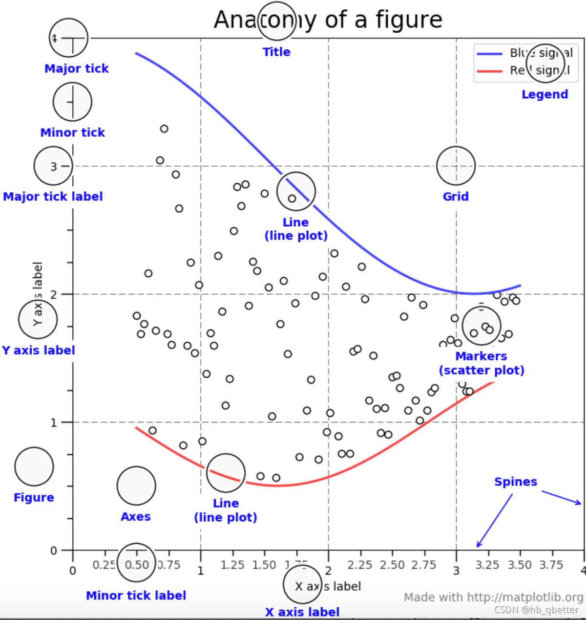
一个figure可以有多个坐标。
pyplot.subplots创建一个独立的坐标轴,来线上数据。plot函数将数据绘制到坐标轴上。两种风格的画图方式(OO-style和pyplot-style)
#OO-style
fig, ax = plt.subplots()  # Create a figure containing a single axes.
ax.plot([1, 2, 3, 4], [1, 4, 2, 3])  # Plot some data on the axes.

#pyplot-style
plt.plot([1, 2, 3, 4], [1, 4, 2, 3])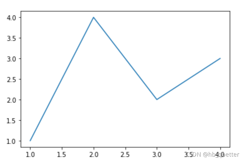
#创建不同的figure以及坐标轴
fig = plt.figure()  # an empty figure with no Axes
fig, ax = plt.subplots()  # a figure with a single Axes
fig, axs = plt.subplots(2, 3)  # a figure with a 2x2 grid of Axes
x = np.linspace(0, 2, 100)
# Note that even in the OO-style, we use `.pyplot.figure` to create the figure.
fig, ax = plt.subplots()  # 创建一个figure和axes
ax.plot(x, x, label='linear')  # 绘制数据信息到axes
ax.plot(x, x**2, label='quadratic')  # 绘制另外的信息到axes上
ax.plot(x, x**3, label='cubic')  # ... and some more.
ax.set_xlabel('x label')  # 设置x坐标轴的名字
ax.set_ylabel('y label')  # 设置y坐标轴的名字.
ax.set_title("Simple Plot")  # 设置整个坐标轴的title.
ax.legend()  # 增加左上角的铭文,.
x = np.linspace(0, 2, 100)
plt.plot(x, x, label='linear')  # Plot some data on the (implicit) axes.
plt.plot(x, x**2, label='quadratic')  # etc.
plt.plot(x, x**3, label='cubic')
plt.xlabel('x label')
plt.ylabel('y label')
plt.title("Simple Plot")
plt.legend()
给图像添加marker标志以及颜色
def my_plotter(ax, data1, data2, param_dict):
    out = ax.plot(data1, data2, **param_dict)
    return out

data1, data2, data3, data4 = np.random.randn(4, 100)
fig, ax = plt.subplots(1, 1)
my_plotter(ax, data1, data2, {'marker': 'x'}) 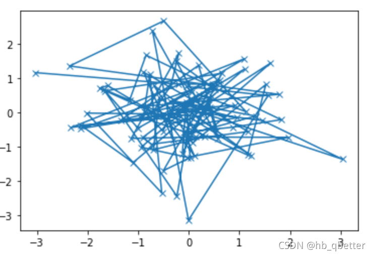
fig, (ax1, ax2) = plt.subplots(1, 2)  #创建两个坐标轴
my_plotter(ax1, data1, data2, {'marker': 'x'})
my_plotter(ax2, data3, data4, {'marker': 'o'})
data1, data2, data3, data4 = np.random.randn(4, 100)
type(data1)
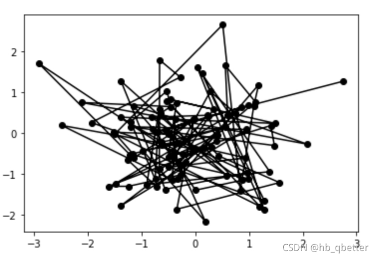
fig, ax1 = plt.subplots(1,1)
ax1.plot(data1, data2,color='k',marker='o') #color表示不同的颜色
对照表如下所示:
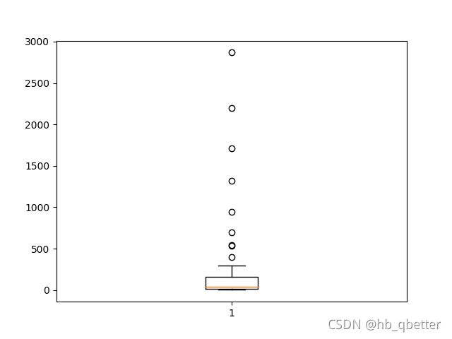
1,小提琴图,琴箱图
import matplotlib.pyplot as plt
#读入数据
show_origin_df = pd.read_csv(show_file)
#得到特定列的数据
show_num_series = show_origin_df['show_num']
#绘图,并保存
fig, ax = plt.subplots()
ax.boxplot(show_origin_df['show_num'].values)
fig.savefig("show_qinxiangtu.png")
保存的图如下所示:
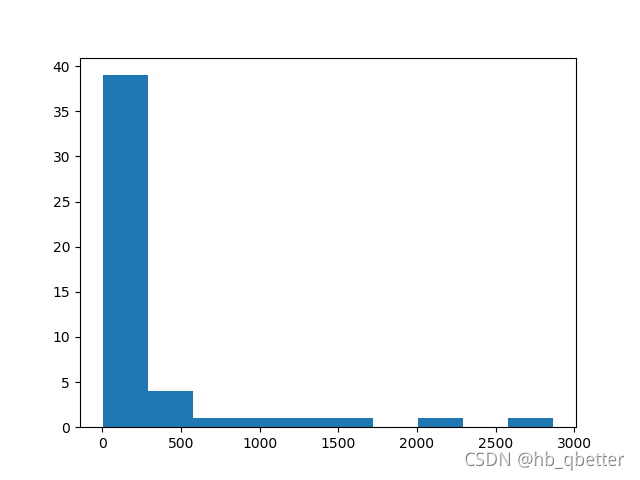
2,柱状图
ax.hist(show_origin_df['show_num'].values,bins = 10)
fig.savefig("show_hist_picture.png")
柱状图显示如下
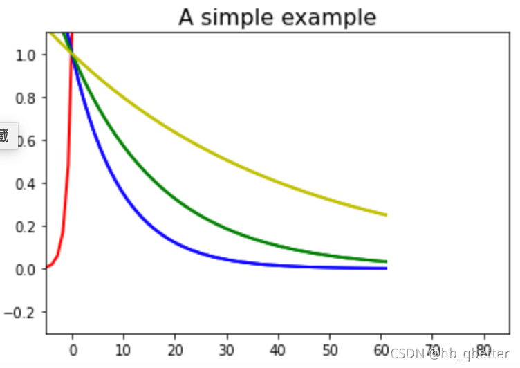
3,画出某函数的图像
不同幂函数曲线的展示
x = numpy.linspace(-10,61,70)
f1 = numpy.power(math.e,x)
f2 = numpy.power(1.1,x)
f3 = numpy.power(math.e,-0.056*x)
f4 = numpy.power(1.5,-0.056*x)
f2 = numpy.power(1.5,-0.26*x)
plt.plot(x,f1,'r',x,f2,'b',x,f3,'g',x,f4,'y',linewidth=2)
#plt.plot(x,f2,'b',x,f3,'g',x,f4,'y',linewidth=2)
#plt.axis决定了x,y轴的显示范围
plt.axis([-5,85,-0.3,1.1])
plt.title('A simple example',fontsize=16)
plt.show()


 1万+
1万+

 被折叠的 条评论
为什么被折叠?
被折叠的 条评论
为什么被折叠?
 到【灌水乐园】发言


