


🌈据说,看我文章时 关注、点赞、收藏 的 帅哥美女们 心情都会不自觉的好起来。
前言:
🧡作者简介:大家好我是 user_from_future ,意思是 “ 来自未来的用户 ” ,寓意着未来的自己一定很棒~
✨个人主页:点我直达,在这里肯定能找到你想要的~
👍专栏介绍:Html+Css+JS / jQuery小型网页综合实战 ,一个专注于分享网页制作实例的专栏~
专栏文章直链:
【网页制作】jQuery模拟提交表单生成卡片
【网页制作】制作静态钟表
【网页制作】jQuery控制页面侧边栏的收缩与展开
【网页制作】制作百度网盘登录页
【网页制作】注册表单页
【网页制作】jQuery操作css实现设置箭头图片

制作要求
这一次终于不是因为要帮助别人才做了,而是因为,觉得之前那个钟表丑,而且还不动,这不,悠闲的我就单独整个动态钟表,这不比那静态钟表好嘛~
制作效果图
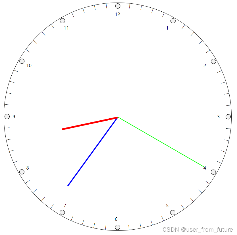
参考源代码
目录结构
└──网页文件夹
	├──num_clock_study1.html
	├──num_clock_study2.html
	├──num_clock_study3.html
	└──num_clock_study4.html
依旧是分布教学(实际上是一开始准备教学她,但实际上她最后要求的图形和我这不一样所以改成自由发挥了)。
num_clock_study1.html
这里面body里可以通过输入 ul#clock>li#scale+li#seconds+li#minutes+li#hours 然后敲个 Tab 键就可以生成那六行了。
<!DOCTYPE html>
<html>
	<head>
		<meta charset="utf-8">
		<title>数字时钟_num_clock_study1_画居中圆</title>
		<style>
			* {
				margin: 0;
				padding: 0;
			}

			ul {
				width: 100%;
				height: 100%;
				list-style: none;
				position: relative;
			}

			#clock {
				width: 800px;
				height: 800px;
				margin: 60px auto;
				border-radius: 50%;
				border: 1px solid #000;
				background-color: #FFF;
			}
		</style>
	</head>
	<body>
		<!-- ul#clock>li#scale+li#seconds+li#minutes+li#hours -->
		<ul id="clock">
			<li id="scale"></li>
			<li id="seconds"></li>
			<li id="minutes"></li>
			<li id="hours"></li>
		</ul>
	</body>
</html>
看着代码不多也不少,整出来了个啥?
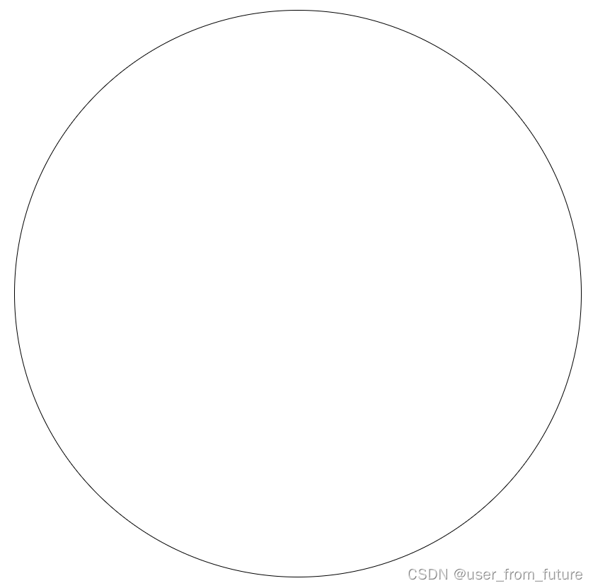
居然才整出了个圆?不,这是一个带有分布预算的圆~ 因为接下来哪部分放哪边已经规划好了~
num_clock_study2.html
<!DOCTYPE html>
<html>
	<head>
		<meta charset="utf-8">
		<title>数字时钟_num_clock_study2_画指针</title>
		<style>
			* {
				margin: 0;
				padding: 0;
			}

			ul {
				width: 100%;
				height: 100%;
				list-style: none;
				position: relative;
			}

			#clock {
				width: 800px;
				height: 800px;
				margin: 60px auto;
				border-radius: 50%;
				border: 1px solid #000;
				background-color: #FFF;
			}

			#seconds {
				left: 400px;
				top: 400px;
				height: 2px;
				width: 350px;
				position: absolute;
				background-color: #0F0;
				transform-origin: 0 50%;
				transform: rotateZ(-90deg);
			}

			#minutes {
				left: 400px;
				top: 400px;
				height: 4px;
				width: 300px;
				position: absolute;
				background-color: #00F;
				transform-origin: 0 50%;
				transform: rotateZ(-60deg);
			}

			#hours {
				left: 400px;
				top: 400px;
				height: 6px;
				width: 200px;
				position: absolute;
				background-color: #F00;
				transform-origin: 0 50%;
				transform: rotateZ(-30deg);
			}
		</style>
	</head>
	<body>
		<!-- ul#clock>li#scale+li#seconds+li#minutes+li#hours -->
		<ul id="clock">
			<li id="scale"></li>
			<li id="seconds"></li>
			<li id="minutes"></li>
			<li id="hours"></li>
		</ul>
	</body>
</html>
增加了30多行,画了三个指针:

num_clock_study3.html
<!DOCTYPE html>
<html>
	<head>
		<meta charset="utf-8">
		<title>数字时钟_num_clock_study3_使用jquery画刻度</title>
		<style>
			* {
				margin: 0;
				padding: 0;
			}

			ul {
				width: 100%;
				height: 100%;
				list-style: none;
				position: relative;
			}

			#clock {
				width: 800px;
				height: 800px;
				margin: 60px auto;
				border-radius: 50%;
				border: 1px solid #000;
				background-color: #FFF;
			}

			#seconds {
				left: 400px;
				top: 400px;
				height: 2px;
				width: 350px;
				position: absolute;
				background-color: #0F0;
				transform-origin: 0 50%;
				transform: rotateZ(-90deg);
			}

			#minutes {
				left: 400px;
				top: 400px;
				height: 4px;
				width: 300px;
				position: absolute;
				background-color: #00F;
				transform-origin: 0 50%;
				transform: rotateZ(-60deg);
			}

			#hours {
				left: 400px;
				top: 400px;
				height: 6px;
				width: 200px;
				position: absolute;
				background-color: #F00;
				transform-origin: 0 50%;
				transform: rotateZ(-30deg);
			}

			#scale {
				width: 800px;
				height: 800px;
				position: relative;
				transform: rotateZ(90deg);
				transform-origin: 50% 50%;
			}

			#scale>div {
				top: 380px;
				width: 800px;
				height: 40px;
				line-height: 40px;
				text-align: right;
				position: absolute;
			}

			#scale>div>div {
				float: left;
				width: 20px;
				margin: 0 30px;
				text-align: left;
			}
		</style>
	</head>
	<body>
		<!-- ul#clock>li#scale+li#seconds+li#minutes+li#hours -->
		<ul id="clock">
			<li id="scale"></li>
			<li id="seconds"></li>
			<li id="minutes"></li>
			<li id="hours"></li>
		</ul>
		<script src="jquery-3.4.1.min.js"></script>
		<script>
			// 创建表盘刻度
			for (let index = 1; index <= 60; index++) {
				if (index % 5) {
					$('#scale').append('<div style="transform: rotateZ(' + index * 6 + 'deg)">—</div>');
				} else {
					$('#scale').append('<div style="transform: rotateZ(' + index * 6 + 'deg)"><div style="transform: rotate(' +
						(270 - index * 6) + 'deg)">' + (index / 5) + '</div>⚪</div>');
				}
			}
		</script>
	</body>
</html>
这次用 jQuery 加了刻度,不会像之前一样,巴拉拉一堆代码,简单一个 for 循环和一个条件判断就能生成:

num_clock_study4.html
不动起来不是我的风格,再加一小段 jQuery 代码:
<!DOCTYPE html>
<html>
	<head>
		<meta charset="utf-8">
		<title>数字时钟_num_clock_study4_使用jquery让时钟动起来</title>
		<style>
			* {
				margin: 0;
				padding: 0;
			}

			ul {
				width: 100%;
				height: 100%;
				list-style: none;
				position: relative;
			}

			#clock {
				width: 800px;
				height: 800px;
				margin: 60px auto;
				border-radius: 50%;
				border: 1px solid #000;
				background-color: #FFF;
			}

			#seconds {
				left: 400px;
				top: 400px;
				height: 2px;
				width: 350px;
				position: absolute;
				background-color: #0F0;
				transform-origin: 0 50%;
				transform: rotateZ(-90deg);
			}

			#minutes {
				left: 400px;
				top: 400px;
				height: 4px;
				width: 300px;
				position: absolute;
				background-color: #00F;
				transform-origin: 0 50%;
				transform: rotateZ(-90deg);
			}

			#hours {
				left: 400px;
				top: 400px;
				height: 6px;
				width: 200px;
				position: absolute;
				background-color: #F00;
				transform-origin: 0 50%;
				transform: rotateZ(-90deg);
			}

			#scale {
				width: 800px;
				height: 800px;
				position: relative;
				transform: rotateZ(90deg);
				transform-origin: 50% 50%;
			}

			#scale>div {
				top: 380px;
				width: 800px;
				height: 40px;
				line-height: 40px;
				text-align: right;
				position: absolute;
			}

			#scale>div>div {
				float: left;
				width: 20px;
				margin: 0 30px;
				text-align: left;
			}
		</style>
	</head>
	<body>
		<!-- ul#clock>li#scale+li#seconds+li#minutes+li#hours -->
		<ul id="clock">
			<li id="scale"></li>
			<li id="seconds"></li>
			<li id="minutes"></li>
			<li id="hours"></li>
		</ul>
		<script src="jquery-3.4.1.min.js"></script>
		<script>
			// 创建表盘刻度
			for (let index = 1; index <= 60; index++) {
				if (index % 5) {
					$('#scale').append('<div style="transform: rotateZ(' + index * 6 + 'deg)">—</div>');
				} else {
					$('#scale').append('<div style="transform: rotateZ(' + index * 6 + 'deg)"><div style="transform: rotate(' +
						(270 - index * 6) + 'deg)">' + (index / 5) + '</div>⚪</div>');
				}
			}
			// 初始化日期、更新时间
			function datetime_init() {
				time = new Date();
				time = {
					'#hours': time.getHours(), // 0-23
					'#minutes': time.getMinutes(), // 0-59
					'#seconds': time.getSeconds() // 0-59
				};
				for (let item in time) {
					$(item).css('transform', "rotateZ(" + ((item === "#hours" ? (time[item] % 12 * 30 +
						time['#minutes'] / 2) : time[item] * 6) - 90) + "deg)");
					if (time["seconds"] === 59) {
						$('#seconds').css('transform', "rotateZ(-6deg)");
						if (time["minutes"] === 59) {
							$('#minutes').css('transform', "rotateZ(-6deg)");
							if (time["hours"] === 23) {
								$('#hours').css('transform', "rotateZ(-6deg)");
								time = new Date();
							}
						}
					}
				}
			}
			setInterval(datetime_init, 1000);
		</script>
	</body>
</html>
加个定时器,每秒动一下~

 1890


 扫一扫


 被折叠的 条评论
为什么被折叠?
 到【灌水乐园】发言


