


目录
前言
在Qt Quick应用开发中,创建直观的导航界面是构建现代应用程序的重要环节。本文将深入探讨QML中两个关键的导航控件:TabBar 和 TabButton,通过代码示例和最佳实践助您快速掌握它们的用法。
1. 控件概述

1.1 TabBar
TabBar 是一个带有图标或文字的条形控件,允许用户在不同的子任务、视图或模式之间切换。核心特性:
- 自动布局按钮
- 支持键盘导航(←/→方向键)
- 与StackLayout无缝集成
- 响应式设计适配不同屏幕
1.2 TabButton
TabButton 是一种适用于 TabBar 控件的布局的按钮。关键功能:
- 支持文本/图标组合
- 自动checked状态管理
- 可定制的点击反馈动画
- 完善的辅助功能支持
2. 基础用法示例
2.1 示例
import QtQuick
import QtQuick.Controls
import QtQuick.Layouts

Window {
    width: 640
    height: 480
    visible: true
    title: qsTr("Hello World")

    ColumnLayout {
        anchors.fill: parent

        TabBar {
            id: tabBar
            Layout.fillWidth: true

            TabButton { text: "Page1" }
            TabButton { text: "Page2" }
            TabButton { text: "Page3" }
        }

        StackLayout {
            Layout.fillWidth: true
            Layout.fillHeight: true
            currentIndex: tabBar.currentIndex

            Page{ Text{ anchors.centerIn: parent; text: "This is page1" } }
            Page{ Text{ anchors.centerIn: parent; text: "This is page2" } }
            Page{ Text{ anchors.centerIn: parent; text: "This is page3" } }
        }
    }
}
2.2 代码说明
这段代码创建了一个窗口,其中包含一个垂直布局(ColumnLayout),用于组织界面元素。布局中包含一个 TabBar 和一个 StackLayout:
- TabBar:包含三个 TabButton,分别显示“Page1”、“Page2”和“Page3”,用于切换不同的页面。
- StackLayout:包含三个 Page,每个页面中显示不同的文本内容。StackLayout 的 currentIndex 属性与 TabBar 的 currentIndex 绑定,实现点击 TabBar 中的按钮切换对应页面的功能。
整体功能是通过标签栏切换不同的页面内容。
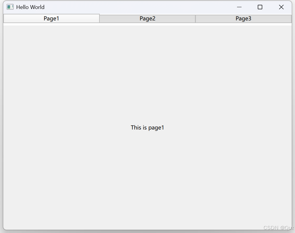
2.3 运行效果
3. TabBar、TabButton关键属性
TabBar关键属性
| 属性 | 类型 | 说明 |
|---|---|---|
| currentIndex | int | 当前选中项的索引(双向绑定) |
| position | enum | 定位方式(Header/Footer) |
| contentHeight | real | 内容区域高度自动调整 |
TabButton关键属性
| 属性 | 说明 |
|---|---|
| icon.source | 图标资源路径 |
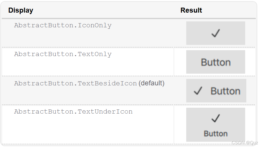
| display | 图标显示方式(IconOnly/TextOnly等) |
Display属性
4. 高级功能实现
4.1 响应索引变化
import QtQuick
import QtQuick.Controls
import QtQuick.Layouts

Window {
    width: 640
    height: 480
    visible: true
    title: qsTr("Hello World")

    TabBar {
        id: dynamicTabBar

        TabButton { text: "Page1" }
        TabButton { text: "Page2" }
        TabButton { text: "Page3" }

        onCurrentIndexChanged: {
            print("currentIndex changed to ", currentIndex)
        }
    }
}
这段代码创建了一个简单的窗口,包含一个动态的 TabBar 控件,用于显示和切换标签页。以下是代码的简单说明:
- 在窗口中定义了一个 TabBar 控件,其 ID 为 dynamicTabBar。
- TabBar 中包含三个 TabButton,分别显示“Page1”、“Page2”和“Page3”,用于表示不同的标签页。
事件处理:
onCurrentIndexChanged 是一个事件处理器,当 TabBar 的当前索引(即选中的标签页)发生变化时,会触发该事件,并通过 print 函数输出当前索引值。
4.2 动态管理选项卡
import QtQuick
import QtQuick.Controls
import QtQuick.Layouts

Window {
    width: 640
    height: 480
    visible: true
    title: qsTr("Hello World")

    TabBar {
        id: dynamicTabBar
        anchors.fill: parent
        Repeater {
            model: ["最新", "热门", "收藏"]
            TabButton { text: modelData }
        }
    }
}
这段代码定义了一个窗口,其中包含一个 TabBar,通过 Repeater 动态生成三个标签按钮,其文本分别为“最新”、“热门”和“收藏”。Repeater 使用数组作为数据模型,为每个数组项创建一个 TabButton,并将其 text 属性绑定到模型数据。
总结
TabBar 是 Qt Quick 中管理横向导航的核心容器,支持自动布局、键盘操作,常用于构建多页签界面。TabButton 作为其子项,提供文本/图标组合、状态管理及点击交互功能。
TabBar支持与手势导航组件的互动,
相关阅读: QML 导航控件:SwipeView之滑动手势导航
通过合理运用TabBar和TabButton,开发者可以快速构建出符合现代UI标准的导航系统。


 扫一扫
扫一扫


 1万+
1万+

 被折叠的 条评论
为什么被折叠?
被折叠的 条评论
为什么被折叠?
 到【灌水乐园】发言


