


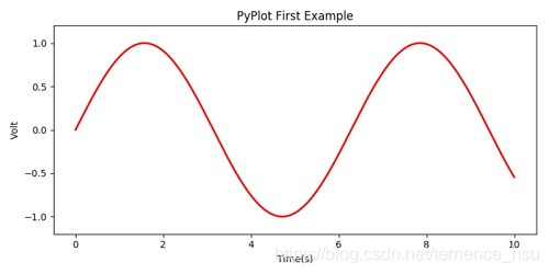
通过 matplotlib 模块, 绘制数据的曲线图
import numpy as np
import matplotlib.pyplot as plt

x = np.linspace(0, 10, 1000)
y = np.sin(x)
plt.figure(figsize=(8, 4))
plt.plot(x, y, label="$sin(x)$", color="red", linewidth=2)
plt.xlabel("Time(s)")
plt.ylabel("Volt")
plt.title("PyPlot First Example")
plt.ylim(-1.2, 1.2)
plt.show()
输入结果:


 1720
1720

 被折叠的 条评论
为什么被折叠?
被折叠的 条评论
为什么被折叠?
 到【灌水乐园】发言


