


 本文介绍了多种CSS布局解决方案,包括水平和垂直居中、多列布局、等分布局及全屏布局等,通过实例展示了如何使用inline-block、margin、absolute、transform、flex等方法实现各种布局效果,并探讨了它们的优缺点和兼容性问题。
看到了一篇比较好的CSS布局解决方案的文章。
https://segmentfault.com/a/1190000013565024
然后自己做一点延伸,再把代码敲出来,加深下印象。
水平居中:inline-block + text-align
CSS:
 <style>
        .child1 {
            display: inline-block;
            background: khaki;

        }

        .child2 {
            display: inline-block;
            background: hotpink;
        }

        .parent {
            text-align: center;
            background: lightgreen
        }
    </style>
html:
<div class="parent">
        <div class="child1">demo</div>
        <div class="child2">demo2</div>
    </div>
浏览器显示:

优点:兼容性好。缺点:.child1,2里面的字也会居中,这时候需要用text-align:left 来放到左边,请看例子。
看,如果给.child1,2一个宽度,连text都居中了:

我们再延伸一下,如果.child1里面再有一个.grandchild的话,如果它是inline-block的话,那么它也会居中,也就是说只要你父元素设置了text-align:center,里面所有的子子孙孙节点都会继承这个居中。
请看:
CSS:
<style>
        .child1 {
            display: inline-block;
            background: khaki;
            width:20%

        }

        .child2 {
            display: inline-block;
            background: hotpink;
            width:20%
        }
        .grandchild {
            display: inline-block;
            background:mediumspringgreen;
            width:50%
        }

        .parent {
            text-align: center;
            background: lightgreen
        }
    </style>
html:
  <div class="parent">
        <div class="child1">
            <div class="grandchild">demo</div>
        </div>
        <div class="child2">demo2</div>
    </div>
浏览器显示:

如果不想文字居中的话那么给.child, 或者是 .grandchild设置text-align:left即可
这里删掉了.grandchild, .child1中直接添加文本demo1这样看得更加清晰点:

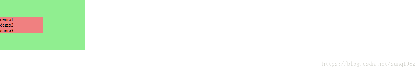
水平居中:margin + table
这种方法其实就是css把html里面的table标签借过来用,里面需要包含table, table-row, table-header-group, table-cell等。
下面是个简单的例子:
CSS:
 <style>
        .child1 {
            display: table-cell;
            background: rebeccapurple;
            width: 20%;

        }

        .child2 {
            display: table-cell;
            background: darkgoldenrod;
            width: 20%;

        }

        .child3 {
            display: table-cell;
            background: cyan;
            width: 20%;
        }

        .parent {
            display: table;
            margin: 0 auto;
            background: blue

        }

        .brother {
            display: table-row;
            text-align: center;
        }

    </style>
html:
<div class="parent">
        <div class='brother'>
            <div class="child1">demo1</div>
            <div class="child2">demo2</div>
            <div class="child3">demo3</div>
        </div>

    </div>
浏览器显示:

优点:兼容性还行。缺点:需要三层才能布局,而且.parent,和.brother的宽度取决于table-cell的宽度,所以设置不了background-color
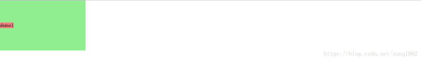
水平居中:absolute + transform
CSS:
<style>
        .child1 {
            position: absolute;
            left: 50%;
            background: lightcoral;
            transform: translateX(-50%);
        }

        .parent {
            position: relative;
        }
    </style>
html:
<div class="parent">
        <div class="child1">demo1</div>
    </div>
浏览器显示:

优点:因为设置了absolute所以子元素位置固定,不会影响到兄弟元素。 在定位方面,有的时候我们需要以元素的中心点来定位而不是元素的左侧,这是个很好的方法。 确定:因为用到了CSS3的transform,所以有兼容性问题。 而且不能用此方法设置多元素的居中排列。
看下面一个例子,就是进行元素的等分排列。
如果有N个元素那么
left = (100%/N*2) + (100%/N) *n ( n = 0, 1, 2, … N-1);
请看CSS:
 <style>
        .child1 {
            position: absolute;
            left: 10%;
            background: lightcoral;
            transform: translateX(-50%);
        }

         .child2 {
            position: absolute;
            left: 30%;
            background: lightcoral;
            transform: translateX(-50%);
        }

         .child3 {
            position: absolute;
            left: 50%;
            background: lightcoral;
            transform: translateX(-50%);
        }

         .child4 {
            position: absolute;
            left: 70%;
            background: lightcoral;
            transform: translateX(-50%);
        }

         .child5 {
            position: absolute;
            left: 90%;
            background: lightcoral;
            transform: translateX(-50%);
        }

        .parent {
            position: relative;
        }
    </style>
html:
<div class="parent">
        <div class="child1">demo1</div>
        <div class="child2">demo2</div>
        <div class="child3">demo3</div>
        <div class="child4">demo4</div>
        <div class="child5">demo5</div>
    </div>
浏览器显示:

水平居中:margin + …
这里有几种用margin: 0 auto来居中的方法:
- 设置宽度
<style>
        .child1 {
           width: 10%;
           margin: 0 auto;
           text-align: center;
        }
</style><div class="child1">demo1</div>只要你设置了宽度就可以用margin: 0 auto来居中,不需要父元素。
2 . 用 display:table
<style>
        .child1 {
            display: table;
            margin: 0 auto;
            background:lightcoral;
        }
</style><div class="child1">demo1</div>以上两种方法只要设置居中元素本身就好。
3 . 用 display:flex
 <style>
        .child1 {
            margin: 0 auto;
            background:lightcoral;
        }

        .parent {
            display:flex;
        }
</style><div class="parent">
<div class="child1">demo1</div>
</div>这种方法需要在父级元素设置display:flex, 因为用到了 CSS3的flex所以有可能有兼容性问题。
想延伸一下,用 margin: 0 auto, 同样可以实现多个子元素的垂直居中。
<style>
* {
padding: 0;
margin: 0;
}
html,
body {
height: 100%;
font-size: 16px
}
</style>
<style>
.child1,
.child2,
.child3 {
width: 10%;
margin: 0 auto;
background: lightcoral;
}
.parent {
position: relative;
width: 30%;
height: 3.4rem;
background: lightgreen
}
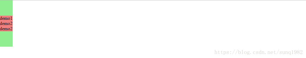
</style> <div class="parent">
<div class="child1">demo1</div>
<div class="child2">demo2</div>
<div class="child3">demo2</div>
</div>浏览器显示:

这里父元素的height用了rem,好处是可以很好的贴合3个子元素的高度。
水平居中:flex+justify-content
CSS:
<style>
html,
body {
height: 100%;
font-size: 16px
}
.child1,
.child2,
.child3 {
background: lightcoral;
margin: 1rem
}
.parent {
display:flex;
justify-content: center;
height:3rem;
background: lightgreen
}
</style>html:
<div class="parent">
<div class="child1">demo1</div>
<div class="child2">demo2</div>
<div class="child3">demo3</div>
</div>浏览器显示:

这里值得注意的是, 如果你修改父元素的高度,子元素的高度也会一起变化,以满足子元素在父元素内总是居中:
如果改动父元素的height: 5rem
得到如下显示结果:

垂直居中:table-cell+vertical-align
css:
<style>
html,
body {
height: 100%;
font-size: 16px
}
.child1, .child2, .child3{
background: lightcoral;
}
.parent {
display: table-cell;
vertical-align: middle;
background: lightgreen;
height:10rem;
}
</style>html:
<div class="parent">
<div class="child1">demo1</div>
<div class="child2">demo2</div>
<div class="child3">demo2</div>
</div>浏览器显示:
兼容性很好,没什么缺点。
垂直居中:table-cell+vertical-align
CSS:
<style>
html,
body {
height: 100%;
font-size: 16px
}
.child1{
position: absolute;
background: lightcoral;
top:50%;
transform: translateY(-50%)
}
.parent {
position: relative;
width:20%;
background: lightgreen;
height:10rem;
}
</style>html:
<div class="parent">
        <div class="child1">demo1</div>
</div>浏览器显示:
因为用到了css3所以可能有兼容性问题,对于多列的垂直居中,参考水平居中的absolute + transform 公式就好。
垂直居中:flex + flex-direction + justify-content
CSS:
<style>
html,
body {
height: 100%;
font-size: 16px
}
.child1{
background: lightcoral;
width:50%
}
.parent {
display: flex;
flex-direction: column;
justify-content: center;
background: lightgreen;
width:20%;
height:10rem;
}
</style>html:
<div class="parent">
<div class="child1">demo1</div>
<div class="child1">demo2</div>
<div class="child1">demo3</div>
</div>浏览器显示:
优点是只需要设置父元素,缺点是CSS3兼容性问题。
垂直居中:flex + align+items
CSS:
.parent {
position:flex;
align-items:center;
background: lightgreen;
width:20%;
height:10rem;
}html:
<div class="parent">
      <div class="child1">demo1</div>
</div>优点是只需要设置父元素,缺点是CSS3兼容性问题,以及只能设置一个子元素。
水平垂直居中:absolute+transform
CSS:
<style>
html,
body {
height: 100%;
font-size: 16px
}
.child1{
position: absolute;
left:50%;
top:50%;
transform: translate(-50%, -50%);
background: lightcoral;
}
.parent {
position: relative;
background: lightgreen;
width:20%;
height:10rem;
}
</style>html:
<div class="parent">
      <div class="child1">demo1</div>
</div>浏览器显示:
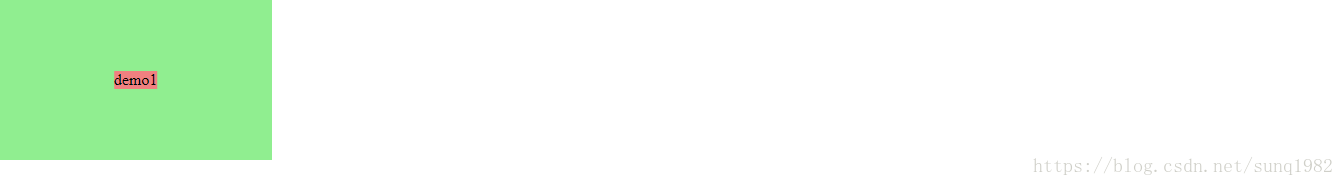
优缺点相信不用赘述了。 这种方法只能设一个子元素。
水平垂直居中:(inline-block+text-align)+(table-cell+vertical-align)
这其实很好理解 inline-block+text-align 是水平居中用的,able-cell+vertical-align 是垂直居中用的。
对于单个元素的演示过于简单,就不赘述了,下面展示下多个元素的水平垂直居中:
CSS:
  <style>
        html,
        body {
            height: 100%;
            font-size: 16px
        }

        .child1 {
            display: inline-block;
            background: lightcoral;
        }

        .parent {
            display: table-cell;
            vertical-align: middle;
            background: lightgreen;
            text-align: center;
            width: 50rem;
            height: 10rem;
        }
    </style>
html:
<div class="parent">
        <div class="row">
            <div class="child1">demo1</div>
            <div class="child1">demo2</div>
            <div class="child1">demo3</div>
        </div>
        <div class="row">
            <div class="child1">demo1</div>
            <div class="child1">demo2</div>
            <div class="child1">demo3</div>
        </div>
        <div class="row">
            <div class="child1">demo1</div>
            <div class="child1">demo2</div>
            <div class="child1">demo3</div>
        </div>
    </div>
浏览器显示:
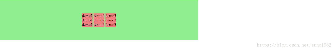
这里有几点需要注意的:
1. .row这个元素只是起到换行的作用。
2. 当.parent 设置成 display:table-cell的时候,width进行百分比设置是没有用的。 所以用rem, 当然直接设px也是可以的。
3. 可以看到同一行的.child1中间是有空白的,可以通过对.child1设置margin:0 -0.11rem 来清除,具体数值是调整出来的。
调整以后效果如下:
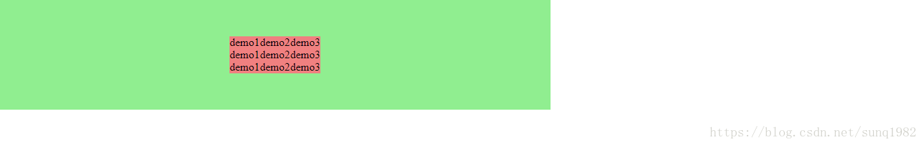
优点是兼容性好,缺点就是需要设置负的margin值来抵消子元素之间的空白部分。
水平垂直居中:flex+flex-direction+justify-content+align-items
如果我们只需要单个元素水平垂直居中的话,下面这样就可以了:
<style>
        html,
        body {
            height: 100%;
            font-size: 16px
        }
        .parent {
            display: flex;
            justify-content: center;
            align-items: center;
            background: lightgreen;
            width: 50%;
            height: 10rem;
        }
</style>这个很简单,参照之前flex的水平居中和垂直居中就好了。
假如我们有多个子元素进行二维排列呢。请看下面:
CSS:
  <style>
        html,
        body {
            height: 100%;
            font-size: 16px
        }

        .child1 {
            background: lightcoral;
        }

        .row {
            display: flex;
        }
        .parent {
            display: flex;
            flex-direction: column;
            justify-content: center;
            align-items: center;
            background: lightgreen;
            width: 50%;
            height: 10rem;
        }
    </style>
html:
 <div class="parent">
        <div class="row">
            <div class="child1">demo1</div>
            <div class="child1">demo2</div>
            <div class="child1">demo3</div>
        </div>
        <div class="row">
            <div class="child1">demo1</div>
            <div class="child1">demo2</div>
            <div class="child1">demo3</div>
        </div>
        <div class="row">
            <div class="child1">demo1</div>
            <div class="child1">demo2</div>
            <div class="child1">demo3</div>
        </div>
    </div>
浏览器显示:
我们看到,和之前的布局比起来有很多优点。
- 子元素紧紧挨在一起,不需要设置负的
margin值去抵消空白部分。 - 父元素的
width可以用百分比设置了。
这里父元素首先设置了flex-direction:column, 保证 .row子元素是按照竖列排列。 同时两个center让 .row水平垂直居中。
如果不对 .row子元素设置 display: flex的话,那么所有child1元素都都将垂直排列,因为继承了父元素设的排列方式。设置以后,则child1默认是水平排列。
这样使得所有child1 在.row的分行中垂直水平居中。
多列布局之定宽+自适应:float + overflow
CSS:
    <style>
        html,
        body {
            height: 100%;
            font-size: 16px
        }
        .left{
            float:left;
            width: 20%;
            margin-right:5%;
            background: lightblue;
        }
        .right {
            overflow: hidden;
            background:lightcoral;
        }
        .parent {
            background: lightcyan;
        }
    </style>
html:
<div class="parent">
      <div class="left">
          <p>left</p>
      </div>
      <div class="right">
          <p>right</p>
          <p>right</p>
      </div>
  </div>
浏览器显示:

如果你不对.right 设置 overflow:hidden
结果显示出来是这样:

为什么用了float就要用overflow:hidden?
因为这牵涉到BFC 概念, 下面的这篇文章我觉得是说得很简洁明了的。
https://zhuanlan.zhihu.com/p/25321647
多列布局之定宽+自适应:float + margin
CSS:
   <style>
        html,
        body {
            height: 100%;
            font-size: 16px
        }
        .left{
            float:left;
            width: 20%;
            background: lightblue;
        }
        .right {
            margin-left:25%;
            background:lightcoral;
        }
        .parent {
            background:lightcyan;
        }
    </style>
html和上面一样;
浏览器结果和上面一样。
不好的地方是需要计算.left的宽度,然后再给出比.left 更宽的margin-left值。
多列布局之定宽+自适应:float + margin (2)
这是为了解决上例当时IE6的兼容性问题,说实话,谁现在还会用IE6.
就算有人用也是很少很少了,所以这种方法写在这里只不过学习下CSS布局的用法:
CSS:
 <style>
        html,
        body {
            height: 100%;
            font-size: 16px
        }

        .left {
            float: left;
            width: 20%;
            position: relative;
            background: lightblue;
        }

        .right-fix {
            float: right;
            width: 100%;
            margin-left: -20%;
        }

        .right {
            margin-left: 25%;
            background: lightcoral;
        }

        .parent {
            background: lightcyan;
        }
    </style>
html:
 <div class="parent clearfix">
        <div class="left">
            <p>left</p>
        </div>
        <div class="right-fix">
            <div class="right">
                <p>right</p>
                <p>right</p>
            </div>
        </div>
    </div>
浏览器显示结果:

我们大致可以看到为了兼容IE6,这种方法的一些缺点:
1. html过于复杂。
2. css需要计算多个margin和width的关系
3. .parent容器无法撑开,所以需要再加上.clearfix来清除浮动
以下.clearfix需要加到.parent来清除浮动
.clearfix:after {
            visibility: hidden;
            display: block;
            font-size: 0;
            content: " ";
            clear: both;
            height: 0;
        }
浏览器显示:

多列布局之定宽+自适应:table
CSS:
 <style>
        html,
        body {
            height: 100%;
            font-size: 16px
        }

        .left {
            display: table-cell;
            width: 20%;
            background: lightblue;
            padding-right: 20%;
        }

        .right {
            display: table-cell;
            background: lightcoral;
        }

        .parent {
            display: table;
            width: 100%;
            table-layout: fixed;
            background: lightcyan;
        }
    </style>
html:
<div class="parent">
        <div class="left">
            <p>left</p>
        </div>
        <div class="right">
            <p>right</p>
            <p>right</p>
        </div>
    </div>
浏览器显示:

table-cell是无法设置margin的,所以用的是padding, 但是用了padding之后可以看到.left和.right中间是无法像上面的例子一样留白的。
多列布局之定宽+自适应:flex
flex是很好用的。
CSS:
   <style>
        html,
        body {
            height: 100%;
            font-size: 16px
        }

        .left {
            width: 20%;
            background: lightblue;
            margin-right: 5%;
        }

        .right {
            flex: 1;
            background: lightcoral;
        }

        .parent {
            display: flex;
            background: lightcyan;
        }
    </style>
html:
<div class="parent">
        <div class="left">
            <p>left</p>
        </div>
        <div class="right">
            <p>right</p>
            <p>right</p>
        </div>
</div>这我们注意到了,.right当中设置了 flex:1 意思就是对于除了.left 的剩余空间进行等分,因为只有一个.right 所以就占满所有剩余空间。
浏览器显示:

如果我们加一个.middle,并且让它的 flex:2, 也就是说其宽度是.right的两倍。
CSS:
    <style>
        html,
        body {
            height: 100%;
            font-size: 16px
        }

        .left {
            width: 20%;
            background: lightblue;
            margin-right: 5%;
        }

        .middle {
            flex:2;
            background:lightgray;
        }

        .right {
            flex: 1;
            background: lightcoral;
        }

        .parent {
            display: flex;
            background: lightcyan;
        }
    </style>
html:
  <div class="parent">
        <div class="left">
            <p>left</p>
        </div>
        <div class="middle">
            <p>middle</p>
            <p>middle</p>
        </div>
        <div class="right">
            <p>right</p>
            <p>right</p>
        </div>
    </div>
浏览器显示:

就可以轻松的实现定宽 + 两列甚至多列的可调整比例的自适应布局。
从上面可以看出flex的强大和灵活之处。
主要的缺点就是兼容老版本IE的问题。但是现在新IE版本都可以支持了。所以已经基本上不是问题了。
多列布局之两列定宽+一列自适应:float+overflow
其实这个很简单,就是前面的延伸。
CSS:
<style>
        html,
        body {
            height: 100%;
            font-size: 16px
        }

        .left, .center {
            float:left;
            width: 20%;
            margin-right: 5%;
        }

        .left {
            background: lightblue;
        }

        .center {
            background:lightgray;
        }

        .right {
            overflow:hidden;
            background: lightcoral;
        }

        .parent {
            background: lightcyan;
        }
    </style>
html:
<div class="parent">
        <div class="left">
            <p>left</p>
        </div>
        <div class="center">
            <p>center</p>
        </div>
        <div class="right">
            <p>right</p>
            <p>right</p>
        </div>
    </div>
浏览器显示:

这没有太多好讲的,简单易懂。
等分布局:float
CSS:
  <style>
        html,
        body {
            height: 100%;
            width:100%;
            font-size:16px;
        }

        .column {
            float:left;
            width:25%;
            padding-left: 5%;
            box-sizing:border-box;
            background: lightcoral;

        }

        .parent {
            margin-left:-5%;
            background: lightcyan;
            height:5rem
        }
    </style>
html:
 <div class="parent">
        <div class="column">
            <p>1</p>
        </div>
        <div class="column">
            <p>2</p>
        </div>
        <div class="column">
            <p>3</p>
        </div>
        <div class="column">
            <p>4</p>
        </div>
    </div>
浏览器显示:

这里需要说明一下:
.parent 设置了负的margin-left, 目的是为了延长宽度。 保证每个.column + padding是处于等分位置的。
所以.column 需要设置 padding-left, 同时box-sizing:border-box 使得每一栏的宽度不会随着字体内容而变化。
为了更好的解释下,把.column改成如下这样:
.column {
            float:left;
            width:20%; //改动
            margin-left: 5%; //改动
            box-sizing:border-box;
            background: lightcoral;
        }
得到这样的结果:

其中可以看出第一个.column 会空出一些。
原因是因为.parent 和.column用的margin-left都为百分比,而其父元素body 和.parent的百分比是不一样的。所以这里margin-left只有用px.
但是用px的的缺点就是无法自适应多屏大小。
等分布局:table
CSS:
  <style>
        html,
        body {
            height: 100%;
            width: 100%;
            font-size: 16px;
        }

        .column {
            display: table-cell;
            padding-left: 20px;
            background: lightcoral;
        }

        .parent-fix {
            margin-left: -20px;
        }

        .parent {
            display: table;
            width: 100%;
            table-layout: fixed;
            background:lightgray;
        }
    </style>
html:
<body>
    <div class="parent-fix">
        <div class="parent">
            <div class="column">
                <p>1</p>
            </div>
            <div class="column">
                <p>2</p>
            </div>
            <div class="column">
                <p>3</p>
            </div>
            <div class="column">
                <p>4</p>
            </div>
        </div>
    </div>
浏览器显示:

还是那个问题:用了px 无法自适应多屏。
等分布局:flex
CSS:
 <style>
        html,
        body {
            height: 100%;
            width: 100%;
            font-size: 16px;
        }

        .column {
            flex: 1;
            background: lightcoral;
        }

        .parent {
            display: flex;
            background: lightcyan;
        }
        .column+.column {
            margin-left:5%;
        }
    </style>
html:
    <div class="parent">
        <div class="column">
            <p>1</p>
        </div>
        <div class="column">
            <p>2</p>
        </div>
        <div class="column">
            <p>3</p>
        </div>
        <div class="column">
            <p>4</p>
        </div>
    </div>
浏览器显示:

flex的好处显而易见,我们可以将margin设置成百分比而不会有布局上的误差。
还有以下的这个设置是很巧妙的。
.column+.column {
            margin-left:5%;
}这表示,只有此.column前面还有兄弟元素的时候才设置margin-left。 这样第一个.column就不会被设置,而后面的.column都会被设置。
定宽+自适应+两块高度一样高:float
<style>
        html,
        body {
            height: 100%;
            width: 100%;
            font-size: 16px;
        }

        p {
            background: none!important;
        }
        .left, .right {
            background:lightcoral;
        }
        .parent {
            overflow: hidden;
            background:lightblue;
        }
        .left, right {
            padding-bottom: 9999px;
            margin-bottom: -9999px;
        }
        .left {
            float:left;
            width:100px;
            margin-right:20px;
        }
        .right {
            overflow: hidden;
        }
    </style>
html:
   <div class="parent">
       <div class="left">
           <p>left</p>
       </div>
       <div class="right">
           <p>right</p>
           <p>right</p>
           <p>right</p>
           <p>right</p>
           <p>right</p>
       </div>
    </div>
浏览器显示:
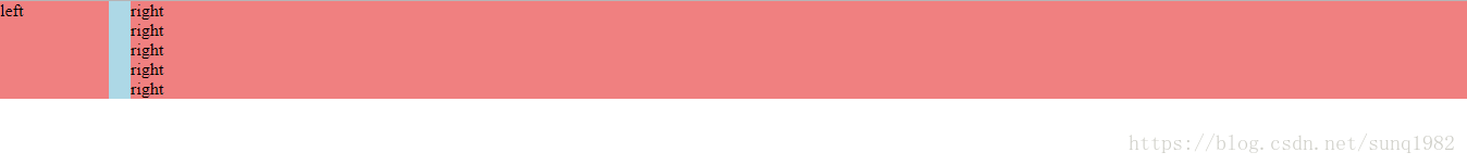
从图中可以看出,当.right的段落增多时,.left的高度也在增加,保持一致。
定宽+自适应+两块高度一样高:table
CSS:
    <style>
        html,
        body {
            height: 100%;
            width: 100%;
            font-size: 16px;
        }

        .parent {
            display: table;
            width:100%;
            table-layout: fixed;
            background: lightcyan;
        }

        .left {
            width:20%;
            padding-right:5%;

        }

        .right,.left {
            display: table-cell;
            background:lightcoral;
        }

    </style>
html:
 <div class="parent">
       <div class="left">
           <p>left</p>
       </div>
       <div class="right">
           <p>right</p>
           <p>right</p>
           <p>right</p>
       </div>
    </div>
浏览器显示:

定宽+自适应+两块高度一样高:flex
CSS:
    <style>
        html,
        body {
            height: 100%;
            width: 100%;
            font-size: 16px;
        }

        .parent {
            display:flex;
            background: lightcyan;
        }

        .left {
            width:20%;
            margin-right: 5%;
            background:lightcoral;
        }

        .right{
           flex:1;
           background:lightcoral;
        }

    </style>
html:
 <div class="parent">
       <div class="left">
           <p>left</p>
       </div>
       <div class="right">
           <p>right</p>
           <p>right</p>
           <p>right</p>
       </div>
    </div>
浏览器显示:

还是flex好用,代码少,灵活,好理解。
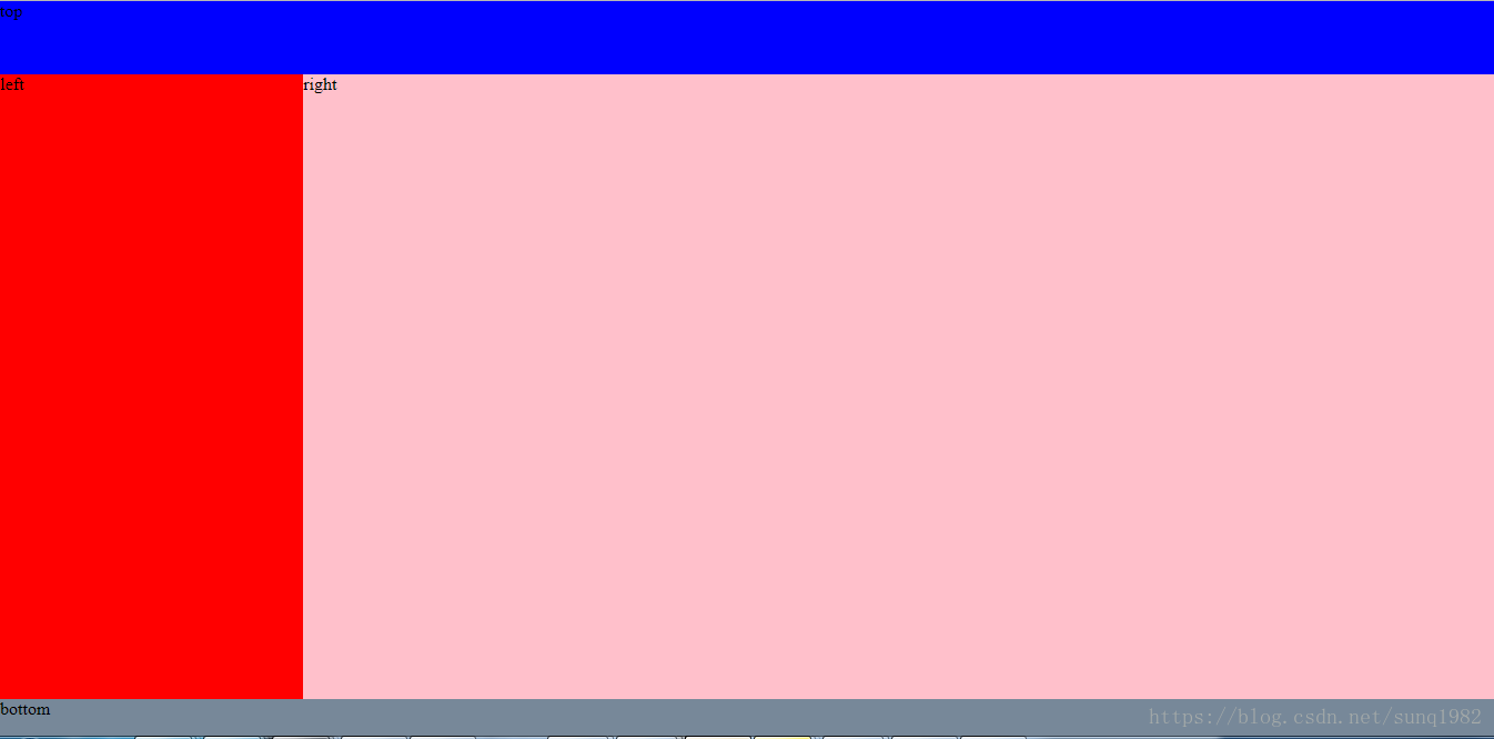
全屏布局:position
这种布局其实就是用简单粗暴的position :absolute的方法。
CSS:
    <style>
        * {
            padding: 0;
            margin: 0;
        }

        html,
        body {
            height: 100%;
            width: 100%;
            font-size: 16px;
            overflow:hidden;
        }

        .parent {
            background: lightcyan;
            overflow:hidden;
        }
        .top {
            position: absolute;
            height:10%;
            left:0;
            right:0;
            background:blue;
        }

        .left {
            position:absolute;
            top:10%;
            bottom:5%;
            width:20%;
            background: red;
        }

        .right{
           position: absolute;
           left:20%;
           top:10%;
           bottom:5%;
           right:0;
           background:pink;
           overflow:auto;
        }

        .right, .inner {
            min-height:1000px;
        }
        .bottom {
            position:absolute;
            left:0;
            right:0;
            bottom:0;
            height:5%;
            background:lightslategray;
        }

    </style>
html:
  <div class="parent">
       <div class="top">top</div>
       <div class="left">left</div>
       <div class="right">
           <div class="inner">right</div>
       </div>
       <div class="bottom">bottom</div>
   </div>
浏览器显示:

全屏布局:flex
这里多加一层.middle用于flex的垂直布局, 本身.middle也是一个容器来装.left, .right
CSS:
  <style>
        * {
            padding: 0;
            margin: 0;
        }

        html,
        body {
            height: 100%;
            width: 100%;
            font-size: 16px;
        }

        .parent {
            display:flex;
            height:100%;
            flex-direction: column;
            background: lightcyan;
        }

        .top {
            height: 10%;
            background: blue;
        }

        .bottom {
            height: 5%;
            background: lightslategray;
        }
        .middle {
            flex:1;
            display:flex;
        }

        .left {
            width: 20%;
            background: red;
        }

        .right {
            flex:1;
            background: pink;
            overflow: auto;
        }

    </style>
html:
<body>
    <div class="parent">
        <div class="top">top</div>
        <div class="middle">
            <div class="left">left</div>
            <div class="right">
                <div class="inner">right</div>
            </div>
        </div>
        <div class="bottom">bottom</div>
    </div>
</body>
浏览器显示:
用flex布局代码简单,结构清楚, 如果看到flex:1这就表示此空间自适应。
最后总结一下:主要的布局方式无非就是用 float, position, table, flex。 对比之后,发现flex是首选,虽然考虑到有兼容性问题,但是现在已经是2018年,老版本的IE用户基本上占有比例已经非常之少,所以可以忽略。


 扫一扫
扫一扫


 926
926

 被折叠的 条评论
为什么被折叠?
被折叠的 条评论
为什么被折叠?
 到【灌水乐园】发言


