


文章目录
🟢 Plotly.js

Plotly.js基于d3.js和stack.gl构建,是一个高级的声明式图表库。Plotly.js 提供超过 40 种图表类型,包括 3D 图表、统计图表和 SVG 地图。plotly.js 带来20种图表类型,包括 3D 图表,统计图表,和 SVG 地图。
plotly.js-dist-min
⭐️为什么要使用Plotly.js
- 可以使用Plotly.js轻松创建交互式图表。 您使用该库创建的任何图表都具有放大,缩小,平移,自动缩放等功能。当您要研究具有大量绘制点的图表时,这些功能非常有用。 所有这些事件都在API中公开,因此您可以编写自定义代码以在触发任何这些事件时执行自己的操作。
- 绘制大量点时的高性能使Plotly.js成为您必须绘制大量数据的理想选择。 由于大多数图表都是使用SVG创建的,因此您可以在各种浏览器中获得很好的兼容性,并可以导出任何图表的高质量图像。 但是,在DOM中绘制大量SVG元素可能会对性能产生不利影响。 该库使用stack.gl创建高性能2D和3D图表。
- 创建的任何3D图表都将在WebGL的帮助下呈现,以充分利用GPU必须提供的所有功能。
- 所有的Plotly.js图表都是完全可定制的。 可以使用一组JSON属性来自定义颜色,标签,网格线和图例等所有内容。 您将在本系列的下三个部分中学习如何自定义不同的图表类型。
⭐️安装
# NPM 安装(推荐)
npm install plotly.js-dist  # 完整版
# 或
npm install plotly.js-dist-min  # 压缩版

# CDN 引入(无需构建工具)
<script src="https://cdn.plot.ly/plotly-latest.min.js"></script>
# 或指定版本
<script src="https://cdn.plot.ly/plotly-1.9.0.min.js"></script>
⭐️ 模块引入
// ES6 模块(Vue/React 等)
import Plotly from 'plotly.js-dist';

// CommonJS(Node.js 环境)
const Plotly = require('plotly.js-dist-min');
⭐️一、 配置选项
plotly.jsconfig参数用于设置图表的属性,例如模式栏按钮和交互性。
1、滚动和缩放(scrollZoom)
var trace1 = {
    x:['2020-10-04', '2021-11-04', '2023-12-04'],
    y: [90, 40, 60],
    type: 'scatter'
};

var data = [trace1];

var layout = {
    title: {
        text: 'Scroll and Zoom'
    },
    showlegend: false
};

Plotly.newPlot('myDiv', data, layout, {scrollZoom: true});

2、可编辑模式(editable)
在可编辑模式下,用户可以编辑图表标题、坐标轴标签和图例中的轨迹名称。
var trace1 = {
  x: [0, 1, 2, 3, 4],
  y: [1, 5, 3, 7, 5],
  mode: 'lines+markers',
  type: 'scatter'
};

var trace2 = {
  x: [1, 2, 3, 4, 5],
  y: [4, 0, 4, 6, 8],
  mode: 'lines+markers',
  type: 'scatter'
};

var data = [trace1, trace2];
var layout = {
  title: {
      text: 'Click Here<br>to Edit Chart Title'
  }
};

Plotly.newPlot('myDiv', data, layout, {editable: true});

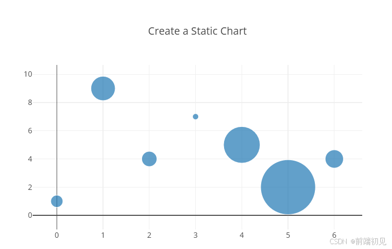
3、静态图表(staticPlot)
var trace1 = {
    x: [0, 1, 2, 3, 4, 5, 6],
    y: [1, 9, 4, 7, 5, 2, 4],
    mode: 'markers',
    marker: {
        size: [20, 40, 25, 10, 60, 90, 30],
    }
};

var data = [trace1];

var layout = {
    title: {
        text: 'Create a Static Chart'
    },
    showlegend: false
};

Plotly.newPlot('myDiv', data, layout, {staticPlot: true});
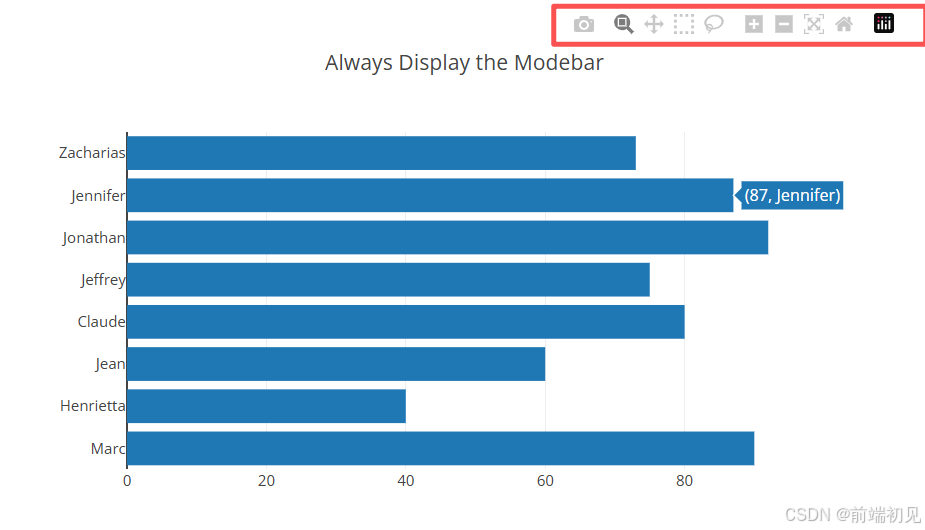
4、强制模式栏(displayModeBar)
将鼠标悬停在生成的图形上时plotly.js,modebar图形右上角会出现一个按钮。按钮为用户提供与图形交互的多种选项。
var data = [{
    y:['Marc', 'Henrietta', 'Jean', 'Claude', 'Jeffrey', 'Jonathan', 'Jennifer', 'Zacharias'],
      x: [90, 40, 60, 80, 75, 92, 87, 73],
      type: 'bar',
      orientation: 'h'}]

var layout = {
    title: {
        text: 'Always Display the Modebar'
    },
    showlegend: false
}

Plotly.newPlot('myDiv', data, layout, {displayModeBar: true})
5、双击延迟(doubleClickDelay)
设置两次连续点击之间的最大延迟时间(以毫秒为单位),该延迟时间会被判定为双击。此延迟时间是指第一次鼠标按下和第二次鼠标抬起之间的时间间隔。默认值为 300 毫秒(不到半秒)。此设置会影响所有子图上的双击操作(地理区域、地图和地图框除外)。
var data = [{
  type: "bar",
  y: [3, 5, 3, 2],
  x: ["2019-09-02", "2019-10-10", "2019-11-12", "2019-12-22"]
}];

var layout = {xaxis: {type: 'date'}};

var config = {doubleClickDelay: 1000}

Plotly.newPlot("myDiv", data, layout, config)
案例场景一
使用散点图探索数据中的趋势、模式和异常值。
- 随机生成 500 个数据点,用于 x 和 y 轴。
- 创建一个散点图,显示这些数据点。
- 添加一个自定义标记,包括颜色、大小和边框。
- 在图表中突出显示一个特定点([2, 4.5])。
1、数据准备
let x = Array.from({length: 500}, () => Math.random()*(6-3)+3);
let y = Array.from({length: 500}, () => Math.random()*(6-3)+3);
2、 创建散点图
创建一个 Plotly.js 数据对象,其中包含散点图的定义。它指定了 x 和 y 轴数据、图表类型(散点图)、标记样式(圆形标记)以及自定义标记样式(颜色、大小和边框)。
let data = [{
  x: x,
  y: y,
  type: 'scatter',
  mode: 'markers',
  marker: {
    color: 'rgb(17, 157, 255)',
    size: 20,
    line: {
      color: 'rgb(231, 99, 250)',
      width: 2
    }
  },
  showlegend: false
}];
3、 高亮特定点
为了突出显示特定点([2, 4.5]),添加了一个额外的数据对象到 data 数组中。它使用相同的标记样式,但具有更大的标记大小,以使其在图表中脱颖而出。
let data = [...data, {
  x: [2],
  y: [4.5],
  type: 'scatter',
  mode: 'markers',
  marker: {
    color: 'rgb(17, 157, 255)',
    size: 60,
    line: {
      color: 'rgb(231, 99, 250)',
      width: 6
    }
  },
  showlegend: false
}];
4、 绘制图表
Plotly.newPlot('myDiv', data);
案例场景二(大规模散点)
核心功能包括多组数据并行展示、hover 高亮交互、自定义样式配置,适用于时间序列相关的大数据量可视化场景
- 高性能渲染:使用 scattergl 类型(WebGL 加速),支持 10 万条数据无卡顿渲染
- 交互功能:hover 时高亮当前组数据、降低其他组透明度;支持响应式布局、自定义工具栏
- 日期轴适配:X 轴默认支持日期类型数据,自动适配时间范围展示
<template>
  <div id="myDiv" style="width: 800px; height: 800px"></div>
</template>

<script setup>
import Plotly from 'plotly.js-dist';
import { onMounted } from 'vue';

function getRandomDate(start, end) {
  // 在两个日期之间返回一个随机日期
  const date = new Date(start.getTime() + Math.random() * (end.getTime() - start.getTime()));
  return date;
}

function formatDate(date) {
  // 格式化日期为 YYYY-MM-DD HH:MM:SS
  const year = date.getFullYear();
  const month = String(date.getMonth() + 1).padStart(2, '0'); // 月份从0开始
  const day = String(date.getDate()).padStart(2, '0');
  const hours = String(date.getHours()).padStart(2, '0');
  const minutes = String(date.getMinutes()).padStart(2, '0');
  const seconds = String(date.getSeconds()).padStart(2, '0');

  return `${year}-${month}-${day} ${hours}:${minutes}:${seconds}`;
}

const randomDates = [];
const startDate = new Date('2020-01-01T00:00:00'); // 起始日期
const endDate = new Date('2023-12-31T23:59:59'); // 结束日期

for (let i = 0; i < 100000; i++) {
  const randomDate = getRandomDate(startDate, endDate);
  randomDates.push(formatDate(randomDate));
}

const randomNumbers1 = Array.from({ length: 100000 }, () => Math.floor(Math.random() * 100));
const randomNumbers2 = Array.from({ length: 100000 }, () => Math.floor(Math.random() * 100));
const randomNumbers3 = Array.from({ length: 100000 }, () => Math.floor(Math.random() * 100));
const randomNumbers4 = Array.from({ length: 100000 }, () => Math.floor(Math.random() * 100));
const randomNumbers5 = Array.from({ length: 100000 }, () => Math.floor(Math.random() * 100));
const randomNumbers6 = Array.from({ length: 100000 }, () => Math.floor(Math.random() * 100));

// 初始化颜色和符号数组
const colors = [];
const symbols = [];

// 条件设置颜色和形状
for (let i = 0; i < randomNumbers1.length; i++) {
  if (randomNumbers1[i] > 50) {
    colors.push('rgba(255, 0, 0, 0)'); // y > 5 为红色
    symbols.push('diamond'); // y > 5 为菱形
  } else {
    colors.push('blue'); // y <= 5 为蓝色
    symbols.push('circle'); // y <= 5 为圆形
  }
}

console.log('randomDates', randomNumbers2);

console.log('数据量级', randomNumbers1.length);
onMounted(() => {
  var trace1 = {
    x: randomDates,
    y: randomNumbers2,
    mode: 'markers',
    name: 'Jeff',
    text: ['United States', 'Canada'],
    showlegend: true, // 显示在图例中
    legendgroup: 'group1', // 使用相同的 legendgroup
    marker: {
      color: 'blue',
      size: 6,
      color: colors, // 根据条件设置颜色
      symbol: symbols, // 根据条件设置形状
      line: {
        color: 'blue', // 边框颜色
        width: 0.5 // 边框宽度
      }
    },
    type: 'scattergl'
  };

  var trace2 = {
    x: randomDates,
    y: randomNumbers4,
    mode: 'markers',
    name: 'Terren',
    legendgroup: 'group2', // 使用相同的 legendgroup
    text: ['United States', 'Canada'],
    marker: {
      color: 'black',
      size: 6,
      line: {
        color: 'white',
        width: 0.5
      }
    },
    type: 'scattergl'
  };

  var trace3 = {
    x: randomDates,
    y: randomNumbers4,
    mode: 'markers',
    name: 'Terren1',
    legendgroup: 'group3', // 使用相同的 legendgroup
    text: ['United States', 'Canada'],
    marker: {
      color: 'black',
      size: 6,
      line: {
        color: 'white',
        width: 0.5
      }
    },
    type: 'scattergl'
  };

  var trace4 = {
    x: randomDates,
    y: randomNumbers4,
    mode: 'markers',
    name: 'Terren2',
    legendgroup: 'group4', // 使用相同的 legendgroup
    text: ['United States', 'Canada'],
    marker: {
      color: 'black',
      size: 6,
      line: {
        color: 'white',
        width: 0.5
      }
    },
    type: 'scattergl'
  };

  var trace5 = {
    x: randomDates,
    y: randomNumbers4,
    mode: 'markers',
    name: 'Terren3',
    legendgroup: 'group5', // 使用相同的 legendgroup
    text: ['United States', 'Canada'],
    marker: {
      color: 'black',
      size: 6,
      line: {
        color: 'white',
        width: 0.5
      }
    },
    type: 'scattergl'
  };

  var trace6 = {
    x: randomDates,
    y: randomNumbers4,
    mode: 'markers',
    name: 'Terren6',
    legendgroup: 'group6', // 使用相同的 legendgroup
    text: ['United States', 'Canada'],
    marker: {
      color: 'black',
      size: 6,
      line: {
        color: 'white',
        width: 0.5
      }
    },
    type: 'scattergl'
  };

  var trace7 = {
    x: randomDates,
    y: randomNumbers4,
    mode: 'markers',
    name: 'Terren7',
    legendgroup: 'group7', // 使用相同的 legendgroup
    text: ['United States', 'Canada'],
    marker: {
      color: 'black',
      size: 6,
      line: {
        color: 'white',
        width: 0.5
      }
    },
    type: 'scattergl'
  };

  var trace8 = {
    x: randomDates,
    y: randomNumbers4,
    mode: 'markers',
    name: 'Terren8Terren8',
    legendgroup: 'group8', // 使用相同的 legendgroup
    text: ['United States', 'Canada'],
    marker: {
      color: 'black',
      size: 6,
      line: {
        color: 'white',
        width: 0.5
      }
    },
    type: 'scattergl'
  };

  //   var trace2 = {
  //     x: [1, 2, 3, 4, 5, 6, 7, 8, 9],
  //     y: [33, 20, 13, 19, 27, 19, 49, 44, 38],
  //     mode: 'markers',
  //     name: 'Europe',
  //     text: ['Germany', 'Britain', 'France', 'Spain', 'Italy', 'Czech Rep.', 'Greece', 'Poland'],
  //     marker: {
  //       color: 'rgb(255, 217, 102)',
  //       size: 12
  //     },
  //     type: 'scattergl'
  //   };

  // var trace3 = {
  //   x: [1, 10, 100],
  //   y: [1, 10, 100],
  //   type: 'scatter',
  //   mode: 'lines',
  //   name: 'Jeff',
  //   legendgroup: 'group1', // 使用相同的 legendgroup
  //   showlegend: false,
  //   marker: {
  //     color: 'blue'
  //   }
  // };

  var traceData = [trace1, trace2, trace3];

  var layout = {
    title: {
      text: 'My Awesome Plot Title', // 设置图表的标题
      font: {
        // 定制标题字体
        family: 'Arial, sans-serif',
        size: 24,
        color: 'black'
      },
      x: 0.5, // 水平居中
      xanchor: 'center', // 标题锚点
      y: 0.92 // 垂直位置
    },
    legend: {
      orientation: 'v', // 水平排列图例
      x: 1, // X轴位置
      y: 0.5 // Y轴位置 (可以根据需要调整)
    },
    xaxis: {
      title: {
        text: 'X Axis Title', // 设置 x 轴的标题
        font: {
          // 可选:定制标题字体
          family: 'Arial, sans-serif',
          size: 18,
          color: 'black'
        },
        standoff: 20 // 标题与 x 轴的距离
      },
      type: 'date', // 设置x轴为日期类型
      // tickformat: '%Y年 %m月 %d日', // 设置日期格式为中文
      showgrid: true, // 显示网格线
      gridcolor: 'lightgray', // 网格线颜色
      zeroline: true, // 是否显示零线
      zerolinecolor: 'black', // 零线颜色
      zerolinewidth: 1 // 零线宽度
    },
    yaxis: {
      title: {
        text: 'This is a Very LongLongLongLongY    <br>Wrap to the Next Linethe NextNex', // 用 <br> 实现换行
        font: {
          // 可选:定制标题字体
          family: 'Arial, sans-serif',
          size: 18,
          color: 'black'
        },
        standoff: 20 // 标题与 x 轴的距离
      },
      showgrid: true, // 显示网格线
      gridcolor: 'lightgray', // 网格线颜色
      zeroline: true,
      zerolinecolor: 'black',
      zerolinewidth: 1
    }
  };

  const config = {
    displayModeBar: 'hover', // 设置为 'hover',仅在鼠标悬停时显示模式栏
    modeBarButtonsToRemove: ['zoom', 'pan', 'select2d', 'lasso2d', 'toImage'], // 移除默认的 zoom 和 pan 按钮
    // modeBarButtonsToAdd: [
    //   {
    //     name: 'My Custom Button', // 自定义按钮名称
    //     icon: Plotly.Icons.zoom, // 使用 Plotly 内置图标
    //     click: function (gd) {
    //       alert('Custom button clicked!'); // 点击按钮时执行的操作
    //     }
    //   }
    // ],
    displaylogo: false, // 隐藏 Plotly logo
    responsive: true // 响应式设计
  };

  const startTime = performance.now();
  Plotly.newPlot('myDiv', traceData, layout, config).then(function () {
    console.log('Plotly scattergl has been rendered.');
    const endTime = performance.now();
    console.log(`Render time: ${endTime - startTime} ms`);
  });

  // 添加 hover 事件
  const myDiv = document.getElementById('myDiv');
  myDiv
    .on('plotly_hover', function (data) {
      const groupName = data.points[0].fullData.legendgroup;
      console.log('groupName', groupName);
      // 高亮目标组并降低其他组的透明度

      const opacityArray = traceData.map((trace) => {
        return trace.legendgroup === groupName ? 1 : 0.1; // 高亮当前组,降低其他组透明度
      });

      console.log('opacityArray', opacityArray);
      Plotly.restyle(myDiv, 'opacity', opacityArray); // 根据 index 显示
    })
    .on('plotly_unhover', function () {
      const originalOpacity = traceData.map(() => 1); // 恢复到完全不透明
      // 恢复透明度为 1
      Plotly.restyle(myDiv, 'opacity', originalOpacity);
    });
});
</script>
<style></style>

✒️总结
如果这篇【文章】有帮助到你💖,希望可以给我点个赞👍,创作不易,如果有对前端端或者对python感兴趣的朋友,请多多关注💖💖💖,咱们一起探讨和努力!!!
👨🔧 个人主页 : 前端初见


 149
149

 被折叠的 条评论
为什么被折叠?
被折叠的 条评论
为什么被折叠?
 到【灌水乐园】发言


