


 本文详细介绍了一种模仿iOS手机弹窗效果的实现方案,利用React Native中的Animated API完成动画效果,包括弹出框的透明度及缩放动画,并提供了完整的代码示例。
类似于苹果手机的弹出效果,动画很流畅,效果如图所示:http://www.jianshu.com/p/36ec413f7098
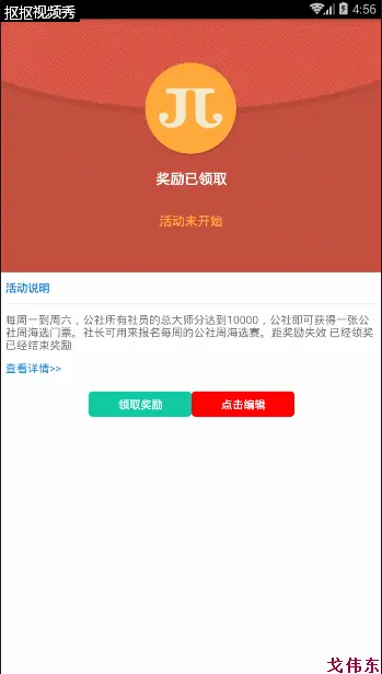
效果图
分析实现过程
1.设置应用到的组件状态
this.state = {
    isShow: false,
    inputText: '',
    opacityAnimationValue: new Animated.Value(0),
    scaleAnimationValue: new Animated.Value(0)
}
opacityAnimationValue:表示弹出框的透明度;
scaleAnimationValue:表示弹出框的缩放倍数,模拟它从小变大的动画;
2.设置打开对话框的动画效果
// 打开对话框
show() {
    this.setState({
        isShow: true,
        inputText: this.props.inputText
    });

    //Animated.parallel == 同时执行多个动画
    Animated.parallel([
        //Animated.timing == 推动一个值按照一个过渡曲线而随时间变化
        Animated.timing(this.state.opacityAnimationValue, {
            toValue: 1,
            duration: 200 + 100
        }),
        //Animated.spring == 产生一个基于Rebound和Origami实现的Spring动画。它会在toValue值更新的同时跟踪当前的速度状态,以确保动画连贯,比timing动画连贯流畅
        Animated.spring(this.state.scaleAnimationValue, {
            toValue: 1,
            duration: 200,
            friction: 5
        })
    ]).start();
}
注意:Animated.parallel表示辅助函数,可以同时执行多个动画;
Animated.timing和Animated.spring有一些动画效果上的区别,其中Animated.spring动画效果更连贯漂亮;
3.设置关闭对话框的方法
// 关闭对话框
_close() {
    this.setState({isShow: false});
    this.state.opacityAnimationValue.setValue(0);
    this.state.scaleAnimationValue.setValue(0);
}
4.重点看一下render方法
render() {
    // 如果消失,返回null 用于控制显示隐藏
    if (!this.state.isShow) return null;
    // 向父组件开放两个接口,自定义标题文字和点击确定后发送的事件
    const {ensureCallback,titleTxt} = this.props;

    return (
        // 最外层是一个半透明的黑色蒙版背景,点击的时候对话框也会消失
        <Animated.View style={[styles.container, {opacity: this.state.opacityAnimationValue}]}>
            <TouchableOpacity
                activeOpacity={1}
                style={{flex: 1, alignItems: 'center', paddingTop: 100}}
                // 点击外层的黑色蒙版,对话框也会消失
                onPress={this._close}
            >
                <Animated.View
                    style={[styles.contentContainer, {transform: [{scale: this.state.scaleAnimationValue}]}]}
                >
                    <TouchableOpacity
                        activeOpacity={1}
                        style={styles.promptContainer}
                    >
                        <Text style={{fontSize: 15, color: 'black'}}>{titleTxt}</Text>
                        <View style={{flexDirection: 'row', margin: 15}}>
                            <View style={[styles.center, {width: 230}]}>
                                <TextInput
                                    style={{fontSize: 16, color: '#999',width:150,padding:0}}
                                    value={this.state.inputText}
                                    autoFocus={true}
                                    underlineColorAndroid="transparent"
                                    onChangeText={text => this.setState({inputText:text})}
                                />
                            </View>
                            <TouchableOpacity
                                onPress={() => this.setState({inputText: ''})}
                                style={[styles.center, {width: 20}]}>
                                <Image
                                    source={require('../../../assets/img/close.png')}
                                    style={{width: 18, height: 18}}
                                />
                            </TouchableOpacity>
                        </View>
                    </TouchableOpacity>
                    <View style={styles.buttonContainer}>
                        <TouchableOpacity
                            activeOpacity={0.75}
                            style={[styles.center, {flex: 4.5}]}
                            onPress={this._close}
                        >
                            <Text style={{fontSize: 16, color: 'black'}}>取消</Text>
                        </TouchableOpacity>
                        <View style={[styles.line]}/>
                        <TouchableOpacity
                            activeOpacity={0.75}
                            style={[styles.center, {flex: 4.5}]}
                            onPress={() => {
                                this._close();
                                // 子组件传递数据到父组件
                                ensureCallback(this.state.inputText);
                            }}
                        >
                            <Text style={{fontSize: 16, color: 'black'}}>确定</Text>
                        </TouchableOpacity>
                    </View>
                </Animated.View>
            </TouchableOpacity>
        </Animated.View>
    )
}着重说一下transform样式的书写,这里用到了数组的形式:
transform [{perspective: number}, {rotate: string}, {rotateX: string}, {rotateY: string}, {rotateZ: string}, {scale: number}, {scaleX: number}, {scaleY: number}, {translateX: number}, {translateY: number}, {skewX: string}, {skewY: string}]
5.来看样式:
const styles = StyleSheet.create({
    container: {
        position: 'absolute',
        top: 0,
        left: 0,
        bottom: 0,
        right: 0,
        backgroundColor: 'rgba(1, 1, 1, 0.5)'
    },
    contentContainer: {
        justifyContent: 'center',
        alignItems: 'center',
        borderColor: '#d9d9d9',
        borderWidth: 1,
        height: 150,
        width: screenW * 0.75,
        backgroundColor: 'rgb(234, 234, 235)',
        borderRadius: 5,
    },
    promptContainer: {
        height: 100,
        width: screenW * 0.75,
        alignItems: 'center',
        justifyContent: 'center'
    },
    buttonContainer: {
        height: 50,
        width: screenW * 0.75,
        flexDirection: 'row',
        alignItems: 'center',
        justifyContent: 'space-between',
        borderTopWidth: 1,
        borderColor: '#d9d9d9'
    },
    line: {
        height: 46,
        width: 1,
        backgroundColor: '#d9d9d9'
    },
    center: {
        justifyContent: 'center',
        alignItems: 'center'
    }
})
5.如何引用到项目中
1.引入组件
import EditView from './EditView';2.把组件放到合适的位置,最好是最外层容器的里边
<EditView
        // 在组件中使用this.editView即可访拿到EditView组件
        ref={editView => this.editView = editView}
        inputText={this.state.name}
        titleTxt={'修改XXX'}
        ensureCallback={name => this.setState({name})}
    />
3.调用它出现的方法
...
<TouchableOpacity onPress={()=>this.editView.show()}     style={[styles.receiveViewStyle,{marginTop:20}]}>
    <View style={[styles.receiveViewStyle,{backgroundColor:'red'}]}>
      <Text style={styles.receiveTxtStyle}>点击编辑</Text>
    </View>
  </TouchableOpacity>
...
4.或者直接这样调用:
<EditView
        // 在组件中使用this.editView即可访拿到EditView组件
        ref="editView"
        inputText={this.state.name}
        titleTxt={'修改XXX'}
        ensureCallback={name => this.setState({name})}
    />

    ...


<TouchableOpacity onPress={()=>this.refs.editView.show()}     style={[styles.receiveViewStyle,{marginTop:20}]}>
    <View style={[styles.receiveViewStyle,{backgroundColor:'red'}]}>
      <Text style={styles.receiveTxtStyle}>点击编辑</Text>
    </View>
  </TouchableOpacity>
最后,贴出EditView.js的源码
/**
 * Created by gewd on 2017/5/2.
 */
import React, {Component} from 'react';
import {
    StyleSheet,
    View,
    Text,
    TouchableOpacity,
    Animated,
    Platform,
    TextInput,
    Image,
    Dimensions
} from 'react-native';
const screenW = Dimensions.get('window').width;

export default class EditView extends Component {
    constructor(props) {
        super(props);
        this.show = this.show.bind(this);
        this._close = this._close.bind(this);
        this.state = {
            isShow: false,
            inputText: '',
            opacityAnimationValue: new Animated.Value(0),
            scaleAnimationValue: new Animated.Value(0)
        }
    }

    // 打开对话框
    show() {
        this.setState({
            isShow: true,
            inputText: this.props.inputText
        });

        //Animated.parallel == 同时执行多个动画
        Animated.parallel([
            //Animated.timing == 推动一个值按照一个过渡曲线而随时间变化
            Animated.timing(this.state.opacityAnimationValue, {
                toValue: 1,
                duration: 200 + 100
            }),
            //Animated.spring == 产生一个基于Rebound和Origami实现的Spring动画。它会在toValue值更新的同时跟踪当前的速度状态,以确保动画连贯,比timing动画连贯流畅
            Animated.spring(this.state.scaleAnimationValue, {
                toValue: 1,
                duration: 200,
                friction: 5
            })
        ]).start();
    }

    // 关闭对话框
    _close() {
        this.setState({isShow: false});
        this.state.opacityAnimationValue.setValue(0);
        this.state.scaleAnimationValue.setValue(0);
    }

    render() {
        if (!this.state.isShow) return null;

        const {ensureCallback,titleTxt} = this.props;

        return (
            // 最外层是一个半透明的黑色蒙版背景,点击的时候对话框也会消失
            <Animated.View style={[styles.container, {opacity: this.state.opacityAnimationValue}]}>
                <TouchableOpacity
                    activeOpacity={1}
                    style={{flex: 1, alignItems: 'center', paddingTop: 100}}
                    onPress={this._close}
                >
                    <Animated.View
                        style={[styles.contentContainer, {transform: [{scale: this.state.scaleAnimationValue}]}]}
                    >
                        <TouchableOpacity
                            activeOpacity={1}
                            style={styles.promptContainer}
                        >
                            <Text style={{fontSize: 15, color: 'black'}}>{titleTxt}</Text>
                            <View style={{flexDirection: 'row', margin: 15}}>
                                <View style={[styles.center, {width: 230}]}>
                                    <TextInput
                                        style={{fontSize: 16, color: '#999',width:150,padding:0}}
                                        value={this.state.inputText}
                                        autoFocus={true}
                                        underlineColorAndroid="transparent"
                                        onChangeText={text => this.setState({inputText:text})}
                                    />
                                </View>
                                <TouchableOpacity
                                    onPress={() => this.setState({inputText: ''})}
                                    style={[styles.center, {width: 20}]}>
                                    <Image
                                        source={require('../../../assets/img/close.png')}
                                        style={{width: 18, height: 18}}
                                    />
                                </TouchableOpacity>
                            </View>
                        </TouchableOpacity>
                        <View style={styles.buttonContainer}>
                            <TouchableOpacity
                                activeOpacity={0.75}
                                style={[styles.center, {flex: 4.5}]}
                                onPress={this._close}
                            >
                                <Text style={{fontSize: 16, color: 'black'}}>取消</Text>
                            </TouchableOpacity>
                            <View style={[styles.line]}/>
                            <TouchableOpacity
                                activeOpacity={0.75}
                                style={[styles.center, {flex: 4.5}]}
                                onPress={() => {
                                    this._close();
                                    // 子组件传递数据到父组件
                                    ensureCallback(this.state.inputText);
                                }}
                            >
                                <Text style={{fontSize: 16, color: 'black'}}>确定</Text>
                            </TouchableOpacity>
                        </View>
                    </Animated.View>
                </TouchableOpacity>
            </Animated.View>
        )
    }
}

const styles = StyleSheet.create({
    container: {
        position: 'absolute',
        top: 0,
        left: 0,
        bottom: 0,
        right: 0,
        backgroundColor: 'rgba(1, 1, 1, 0.5)'
    },
    contentContainer: {
        justifyContent: 'center',
        alignItems: 'center',
        borderColor: '#d9d9d9',
        borderWidth: 1,
        height: 150,
        width: screenW * 0.75,
        backgroundColor: 'rgb(234, 234, 235)',
        borderRadius: 5,
    },
    promptContainer: {
        height: 100,
        width: screenW * 0.75,
        alignItems: 'center',
        justifyContent: 'center'
    },
    buttonContainer: {
        height: 50,
        width: screenW * 0.75,
        flexDirection: 'row',
        alignItems: 'center',
        justifyContent: 'space-between',
        borderTopWidth: 1,
        borderColor: '#d9d9d9'
    },
    line: {
        height: 46,
        width: 1,
        backgroundColor: '#d9d9d9'
    },
    center: {
        justifyContent: 'center',
        alignItems: 'center'
    }
})


 扫一扫
扫一扫


 1331
1331

 被折叠的 条评论
为什么被折叠?
被折叠的 条评论
为什么被折叠?
 到【灌水乐园】发言


