


文章目录
前言
手把手教你封装一个移动端 下拉菜单组件(DropdownMenu),以uniapp vue3为代码示例。

一、组件分析
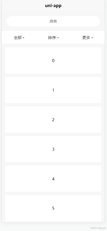
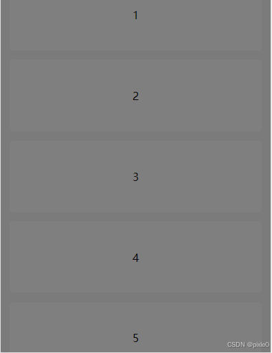
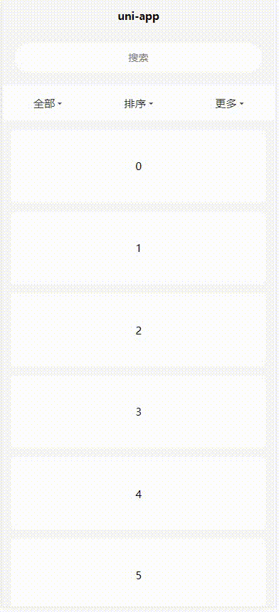
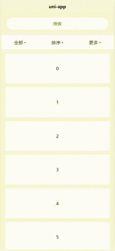
关闭状态:
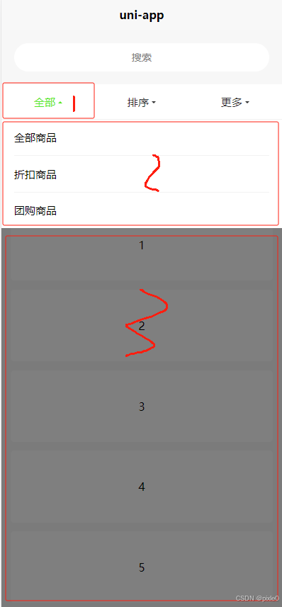
打开状态:
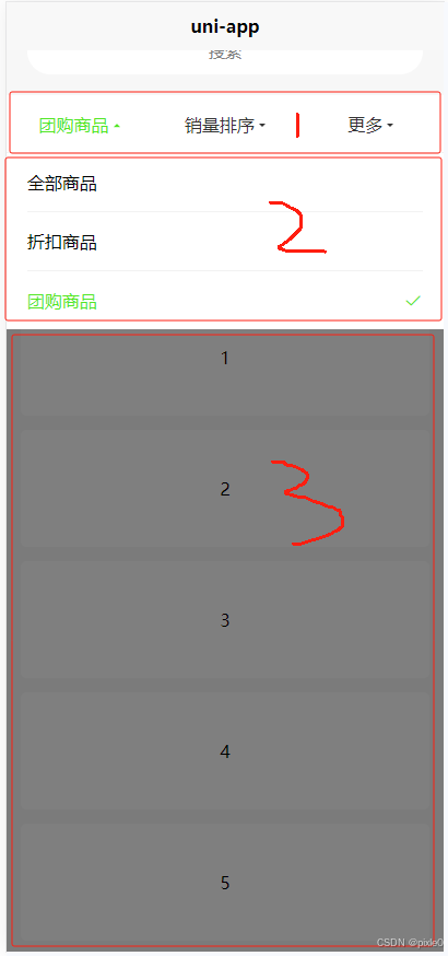
(1) 组件构成:
如上图所示下拉组件由3部分构成
序号1:操作栏
控制下拉菜单打开和关闭,固定显示
##################################################
序号2:下拉菜单
位于操作栏正下方,打开状态显示
###############################################
序号3:半透明遮罩层
从下拉菜单正下方到页面底部,打开状态显示。
(2)组件功能和操作逻辑设计:
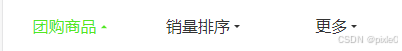
操作栏:
1、关闭状态箭头向下,打开向上,切换过程旋转带动画。
2、关闭状态文字箭头默认颜色,打开状态激活颜色。
3、点击标签打开下拉菜单,再次点击关闭下拉菜单
4、下拉菜单单选选中关闭菜单,对应文字更新显示到操作栏上
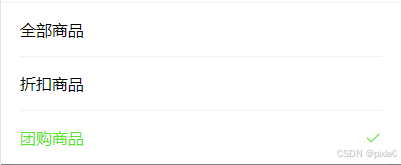
下拉菜单:
1、展开或关闭带弹出动画
2、默认单选模式、也可以通过插槽自定义内容
半透明遮罩层:
1、高度依据下拉菜单内容区域高度成反比,从下拉菜单底部到页面底部覆盖
2、点击遮罩层可关闭下拉菜单。
3、防止滑动穿透
二、实现分析
想要封装成一个好用的组件要求写法简洁、使用简单,功能扩展性强,能满足众多场景使用,写法简洁、使用简单和功能扩展性强在某种程度上是两个对立面,所以在设计组件的时候需要很好把握两者平衡。
开发前可以先写下预设的调用方式,在以此去封装改进。
先看看流行框架vant是怎么使用下拉菜单组件的:
<van-dropdown-menu>
  <van-dropdown-item v-model="value1" :options="option1" />
  <van-dropdown-item v-model="value2" :options="option2" />
</van-dropdown-menu>
export default {
  data() {
    return {
      value1: 0,
      value2: 'a',
      option1: [
        { text: '全部商品', value: 0 },
        { text: '新款商品', value: 1 },
        { text: '活动商品', value: 2 }
      ],
      option2: [
        { text: '默认排序', value: 'a' },
        { text: '好评排序', value: 'b' },
        { text: '销量排序', value: 'c' }
      ]
    };
  }
};
通过上面示例可以看出vant的下拉菜单组件使用的是父子标签嵌套方式进行引用,每个菜单由子组件van-dropdown-item单独维护,菜单选项通过options属性配置并支持每个菜单选中值双向绑定,父子嵌套标签方式也是很多由相同子组件构成复杂大组件常用设计方式。比如radio-group和raido,checkbox-group和checkbox,el-menu和el-menu-item等
我们这边也仿造vant调用方式来实现组件。
期望调用方式:
         <dropdown-menu >
			<dropdown-item title="全部" :options="options1" v-model="value1" >
			</dropdown-item>
			<dropdown-item title="排序" :options="options2" v-model="value2">
			</dropdown-item>
	     </dropdown-menu>
这样父组件实现就很简单,每个子组件当成默认插槽即可,子组件通过flex布局横向排列
例如:
dropdown-menu:
<template>
	<view class="dropdown-menu">
		<slot></slot>
	</view>
</template>
<style lang="scss" scoped>
	.dropdown-menu {
		width: 100%;
		display: flex;
		align-items: center;
		background-color: #fff;
		box-sizing: border-box;
	}
/**
 * 兼容小程序端
 */
 	:deep(dropdown-item) {
		flex: 1;
		width: 0;
	}
</style>
ps:嵌套标签组合型组件中父组件的主要作用就是作为组件数据管理中心,既能缓存全局数据,也能当做桥梁实现子组件之间数据传递。另一方面也是组件属性配置入口和事件监听入口,可以通过在父组件上添加prop属性进行整体个性化设置,比如激活颜色自定义等,再把这些属性配置值传给各个子组件去渲染执行,就不需要在每个子组件进行重复设置,事件监听回调也一样,可以集中处理。
dropdown-item
重点关注子组件dropdown-item的实现:
子组件包含3个部分,下拉弹窗和遮罩层每个子组件单独维护。
其中如图序号1(标签)单独容器布局,序号2(下拉菜单)、3(遮罩层)有一个相同的父容器A通过fixed定位,left、right、bottom都为0,其中top值通过query.select().boundingClientRect动态计算序号1容器底部到页面顶部距离确定。遮罩层在父容器内绝对布局占满父容器空间,下拉菜单绝对布局从上往下高度自动层级在遮罩层之上,下拉菜单和遮罩层通过开关标识动态控制显示和隐藏。其中遮罩层无动画通过v-show或v-if控制即可,下拉菜单有弹出和收起的动画可以通过动态改变class插入帧动画实现,父容器A设置overflow: hidden,通过改变下拉菜菜单top值:-100% ->0%,移出可视区域和进入可视区域产生动画。
序号1(标签)实现
<!-- 标题栏 -->
	<view class="dropdown-item" :class="{open:isOpen}"  @click="handleClick"
		@touchmove.prevent>
		<text class="title">{{currentTitle}}</text>
	</view>
<script setup>
import {
		computed,
		inject,
		ref,
		onMounted,
		watch,
		useSlots,
		getCurrentInstance
	} from 'vue'
  const props = defineProps({
		//默认标题
		title: {
			type: String,
			default: '标题'
		},
		//下拉菜单选项
		options: {
			type: Array,
			default: () => []
		},
		//选中值
		modelValue: {
			type: [String, Number],
			default: ''
		}

	})
    const emits = defineEmits(['update:modelValue', 'change'])

    //根据双向绑定值动态设置下拉选中项索引
	watch(() => props.modelValue, v => {
		currentIndex.value = props.options.findIndex(item => item.value === v)
	}, {
		immediate: true
	})
	//是否打开
	const isOpen = ref(null)
  	//下拉选项当前选中的索引
	const currentIndex = ref(-1)
  	//当前标题,如有选中显示选中项文字否则默认标题
	const currentTitle = computed(() => {
		return currentIndex.value > -1 ? props.options[currentIndex.value].label : props.title
	})
		//当前文字/箭头颜色
	const curretnColor = computed(() => {
		return isOpen.value ? '#3395DC': '#333'
	})

    	//打开或关闭
	const handleClick = () => {
		isOpen.value = !isOpen.value
		if (isOpen.value) {
			getDropPopupTop()
		}
	}

	//下拉弹窗距离页面顶部距离
	const dropPopupTop = ref(0)
	const instance = getCurrentInstance()
    //计算下拉弹窗区域距离页面顶部距离
	const getDropPopupTop = () => {
		let query = uni.createSelectorQuery().in(instance)
		query.select('.dropdown-item').boundingClientRect(data => {
			// #ifdef H5
			//H5需要加上导航栏高度,固定44px
			dropPopupTop.value = data.bottom + 44
			// #endif
			//  #ifndef H5
			dropPopupTop.value = data.bottom
			// #endif
		}).exec()
	}

</script>
<style lang="scss" scoped>
	.dropdown-item {
		width: 100%;
		padding: 30rpx;
		box-sizing: border-box;
		display: flex;
		justify-content: center;
		align-items: center;
		font-size: 30rpx;
		white-space: nowrap;
		text-align: center;
		position: relative;
		z-index: 10;

		&::after {
			display: block;
			content: '';
			border: 6rpx solid;
			border-color: v-bind(curretnColor) transparent transparent transparent;
			margin-bottom: -10rpx;
			margin-left: 8rpx;
			transition: all 0.2s;
			transform-origin: center 3rpx;
		}

		&.open {
			&::after {
				transform: rotate(180deg);
			}
		}
	}
说明:考虑到最外层页面可能会滚动组件位置会变动,每次打开下拉菜单需重新计算(getDropPopupTop 方法)组件距离顶部位置从而确定下拉菜单弹出位置(dropPopupTop )。
标签旁边的三角型通过伪类配合border实现,v-bind(curretnColor)动态改变打开时候的颜色,关闭或打开添加了旋转180度动画。
注意各端的兼容性,fixed布局在h5端top:0是从导航栏顶部开始的,而小程序端或者app端不包括,所以h5端计算top时候要加上导航栏固定高度44px
下拉菜单+遮罩层实现
核心代码:
<!-- 下拉弹窗 -->
	<view class="dropdown-popup" :style="{top:`${dropPopupTop}px`,zIndex,height:dropHeight}" @touchmove.prevent>
		<view class="content" :class="customClass">
			<!-- 插槽 -->
			<slot v-if="hasSlot"></slot>
			<!-- 选项 -->
			<view class="list" v-else>
				<view :class="['item',{active:currentIndex===index}]" v-for="(item,index) in options"
					:key="item.label||index" @click="onSelect(item,index)">
					<view class="label">{{item.label}}</view>
					<!-- 勾选图标 -->
					<i v-show="currentIndex===index" class="iconfont icon-gouxuan icon"></i>
				</view>
			</view>
		</view>
		<!-- 底部遮罩层 -->
		<view class="overly-footer" v-show="isOpen" @click="onClose" @touchmove.prevent></view>
	</view>
<script setup>
	const slots = useSlots()
	//是否有插槽
	const hasSlot = computed(() => {
		return Object.keys(slots).length > 0
	})
		//动态class
	const customClass = computed(() => {
		return isOpen.value === true ? 'visible' : isOpen.value === false ? 'hidden' : null
	})
	//关闭回调
	const onClose = () => {
		isOpen.value = false
	}

	//选中监听
	const onSelect = (item, index) => {
		isOpen.value = false
		if (index !== currentIndex.value) {
			currentIndex.value = index
			emits('update:modelValue', item.value)
			emits('change', item.value)
		}
	}
	//下拉菜单父容高度
    const dropHeight = ref(0)
    //下拉菜单父容器层级
	const zIndex = ref(-1)
   //动态改变下拉菜单层级和高度
	watch(isOpen, v => {
		if (v) {
			zIndex.value = 999
			dropHeight.value='auto'
		} else {
			//延迟改变使得关闭动画能完整呈现
			setTimeout(() => {
				zIndex.value = -1
				dropHeight.value=0
			}, 200)
		}
	})

   let timeout = null
   //打开或关闭
	const handleClick = () => {
		//节流处理,防止点击过快动画未结束又切换导致显示bug
		if (timeout) return
		isOpen.value = !isOpen.value
		if (isOpen.value) {
			currentDropItem.value = props.title
			getDropPopupTop()
		}

		timeout = setTimeout(() => {
			timeout = null
		}, 200)

	}
</script>
.dropdown-popup {
		position: fixed;
		left: 0;
		right: 0;
		bottom: 0;
		z-index: 999;
		overflow: hidden;
		box-sizing: border-box;
		background-color: rgba(0, 0, 0, 0);

		.content {
			background-color: #fff;
			min-height: 200rpx;
			position: absolute;
			top: -100%;
			left: 0;
			right: 0;
			z-index: 1000;
			box-sizing: border-box;

			&.visible {
				animation: visibleAnimaFrames 0.2s forwards;
			}

			&.hidden {
				animation: hiddenAnimaFrames 0.5s forwards;
			}

			.list {
				width: 100%;
				padding: 0 35rpx;
				box-sizing: border-box;

				.item {
					width: 100%;
					padding: 30rpx 0;
					box-sizing: border-box;
					display: flex;
					align-items: center;

					&:not(:last-of-type) {
						border-bottom: 1px solid #f2f2f2;
					}

					.label {
						font-size: 30rpx;
						flex: 1;
						width: 0;
						margin-right: 40rpx;
						overflow: hidden;
						text-overflow: ellipsis;
						white-space: nowrap;

					}

					.icon {
						font-size: 36rpx;
						color: v-bind(activeColor);
					}

					&.active {
						.label {
							color: v-bind(activeColor);
						}
					}
				}
			}

		}
	}
/**
 * 打开动画
 */
	@keyframes visibleAnimaFrames {
		0% {
			top: -100%;
		}

		100% {
			top: 0;
		}
	}
/**
 * 关闭动画
 */
	@keyframes hiddenAnimaFrames {
		0% {
			top: 0;
		}

		100% {
			top: -100%;
		}
	}

	.overly-footer {
		position: absolute;
		top: 0;
		right: 0;
		left: 0;
		bottom: 0;
		background-color: rgba(0, 0, 0, 0.5);
		z-index: 999;
	}
说明:
1、为了兼容小程序端,没有选择< transition >加v-show/v-if作为下拉菜单弹出动画方案,而是采用css @keyframes帧动画实现,
这意味着不管是关闭还是打开状态下拉菜单父容器(透明)都固定在那里,多个堆叠在一起有几个dropdown-item就有几个父容器,这会导致一些列问题,当打开状态下如果打开的是前面的dropdown-item,由于后面的dropdown-item父容器层级比较高,导致无法点击选择,关闭状态下页面也无法拖动,所以上述代码在父容器上绑定了动态高度值dropHeight和层级zIndex,当打开非当前下拉菜单高度值设为0,层级设为-1。这样就不会有遮挡问题。
2、由于引入动画,打开或关闭动画有个过渡时间,打开点击事件(handleClick)需要做节流处理防止快速切换造成显示bug。
3、内置默认插槽可自定义下拉菜单内容,如果没有插槽默认显示单选模式,这边可以自由扩展,增加多选,树形选择等类型
4、为了使得能自定义颜色和激活颜色一致,勾选图标使用字体库图标
上述代码还遗漏一个环节未处理,那就是当前打开的dropdown-item是哪一个未做记录。只有知道当前打开的是哪个dropdown-item,才能关闭剩余菜单父容器。这个标识可以记录在父组件dropdown-menu上,通过provide+inject下发到子组件。以及组件自定义激活颜色也一样定义在父组件后通过provide+inject下发。
完善后的dropdown-menu:
import {
		provide,
		ref,
		watch,
		computed
	} from 'vue'
	const props = defineProps({
		//激活颜色
		activeColor: {
			type: String,
			default: '#3395DC'
		},
	})
	//当前打开的项(以初始标题标识)
	const currentDropItem = ref('')
	provide('activeColor', props.activeColor)
	provide('currentDropItem', currentDropItem)
dropdown-item添加/修改:
	//激活颜色
	const activeColor = inject('activeColor')
	//当前打开的dropItem项(标签名)
	const currentDropItem = inject('currentDropItem')

	//当前文字/箭头颜色
	const curretnColor = computed(() => {
		return isOpen.value ? activeColor : '#333'
	})
	let timeout = null
	//打开或关闭
	const handleClick = () => {
		//节流处理,防止点击过快动画未结束又切换导致显示bug
		if (timeout) return
		isOpen.value = !isOpen.value
		if (isOpen.value) {
		//记录当前打开子组件
			currentDropItem.value = props.title
			getDropPopupTop()
		}

		timeout = setTimeout(() => {
			timeout = null
		}, 200)

	}
	//动态改变父容器高度和层级
	watch(isOpen, v => {
	  //打开状态显示父容器
		if (v) {
			zIndex.value = 999
			dropHeight.value='auto'
		} else {
		   //关闭状态隐藏父容器
			//延迟改变使得关闭动画能完整呈现
			setTimeout(() => {
				zIndex.value = -1
				dropHeight.value=0
			}, 200)
		}
	})
继续优化
通过上面动态图可以看到如果最外层页面可以滚动,当下拉菜单打开状态下,拖动组件上面区域依然可以拖动底层页面,造成偏移。解决办法是在打开状态下,顶部区域覆盖一层透明遮罩层禁止触摸穿透,如下图画框区域所示
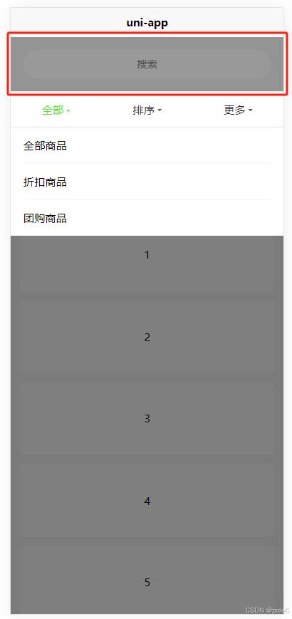
dropdown-item改进:
<!-- 下拉弹窗 -->
	<view class="dropdown-popup" :style="{top:`${dropPopupTop}px`,zIndex,height:dropHeight}" @touchmove.prevent>
		<view class="content" :class="customClass">
			<!-- 插槽 -->
			<slot v-if="hasSlot"></slot>
			<!-- 选项 -->
			<view class="list" v-else>
				<view :class="['item',{active:currentIndex===index}]" v-for="(item,index) in options"
					:key="item.label||index" @click="onSelect(item,index)">
					<view class="label">{{item.label}}</view>
					<!-- 勾选图标 -->
					<i v-show="currentIndex===index" class="iconfont icon-gouxuan icon"></i>
				</view>
			</view>
		</view>
		<!-- 顶部遮罩层 -->
		<view class="overly-header" v-show="isOpen" :style="{height:`${overlyHeight}px`}" @touchmove.prevent></view>
		<!-- 底部遮罩层 -->
		<view class="overly-footer" v-show="isOpen" @click="onClose" @touchmove.prevent></view>
	</view>
//顶部透明遮罩层高度
	const overlyHeight = ref(0)
	//计算下拉弹窗区域距离页面顶部距离
	const getDropPopupTop = () => {
		let query = uni.createSelectorQuery().in(instance)
		query.select('.dropdown-item').boundingClientRect(data => {
			// #ifdef H5
			//H5需要加上导航栏高度,固定44px
			dropPopupTop.value = data.bottom + 44
			overlyHeight.value = data.top + 44
			// #endif
			//  #ifndef H5
			dropPopupTop.value = data.bottom
			overlyHeight.value = data.top

			// #endif
		}).exec()
	}
	.overly-header {
		position: fixed;
		top: 0;
		right: 0;
		left: 0;
		width: 100%;
		background-color: rgba(0, 0, 0, 0);
		z-index: 999;

	}
运行效果:
优化增加吸顶功能
由上个动态图可以看出如果页面最外层可以滚动操作栏会跟着滚出可视区域体验不太好,如果能吸顶将更加完美,为此我们添加下吸顶功能,在父组件新增一个是否吸顶属性。
dropdown-menu.vue改进:
<template>
	<view class="dropdown-menu" :style="customStyle">
		<slot></slot>
	</view>
</template>
	const props = defineProps({
		//激活颜色
		activeColor: {
			type: String,
			default: '#3395DC'
		},
		//是否吸顶
		sticky: {
			type: Boolean,
			default: false
		}
	})

	//样式设置
	const customStyle = computed(() => {
	//设置吸顶
		return props.sticky ? {
			position: "sticky",
			// #ifdef H5
			top: '44px',
			// #endif
			// #ifndef H5
			top: 0,
			// #endif
		} : null
	})
页面引用:
index.vue
<template>
	<view class="container">
		<view class="header">
			<input class="input" placeholder="搜索" />
		</view>
		<dropdown-menu activeColor="#52E725" sticky>
			<dropdown-item title="全部" :options="options1" v-model="value1" @change="handleChange">
			</dropdown-item>
			<dropdown-item title="排序" :options="options2" v-model="value2" @change="handleChange2">
			</dropdown-item>
			<dropdown-item title="更多"   >
				自定义内容
			</dropdown-item>
		</dropdown-menu>
		<view class=" list">
			<view class="item" v-for="(item,index) in 10">{{index}}</view>
		</view>
	</view>
</template>
<script setup>
	import {
		ref
	} from 'vue'
	import dropdownMenu from './dropdownMenu.vue'
	import dropdownItem from './dropdownItem.vue'
	const options1 = ref([{
		label: '全部商品',
		value: 1
	}, {
		label: '折扣商品',
		value: 2
	}, {
		label: '团购商品',
		value: 3
	}])


	const options2 = ref([{
		label: '热门排序',
		value: 1
	}, {
		label: '销量排序',
		value: 2
	}, {
		label: '好评排序',
		value: 3
	}])

	const value1 = ref()
	const value2 = ref()

	const handleChange = (e) => {
		console.log(e, 'e')
	}
	const handleChange2 = (e) => {
		console.log(e, 'e')
	}
</script>

<style lang="scss" scoped>
	.container {
		width: 100%;
		min-height: 100vh;
		background-color: #f7f7f7;

	}

	.header {
		width: 100%;
		padding: 35rpx;
		box-sizing: border-box;

		.input {
			width: 100%;
			border-radius: 40rpx;
			height: 80rpx;
			background-color: #fff;
			font-size: 28rpx;
			padding: 0 20rpx;
			box-sizing: border-box;

			text-align: center;
		}

	}

	.list {
		padding: 25rpx;
		box-sizing: border-box;

		.item {
			background-color: #fff;
			height: 200rpx;
			border-radius: 10rpx;
			margin-bottom: 25rpx;
			color: #000;
			display: flex;
			justify-content: center;
			align-items: center;
		}
	}
	.cust{
		width: 100%;
		height: 80rpx;
		border-bottom: 1px solid #eee;
	}
</style>
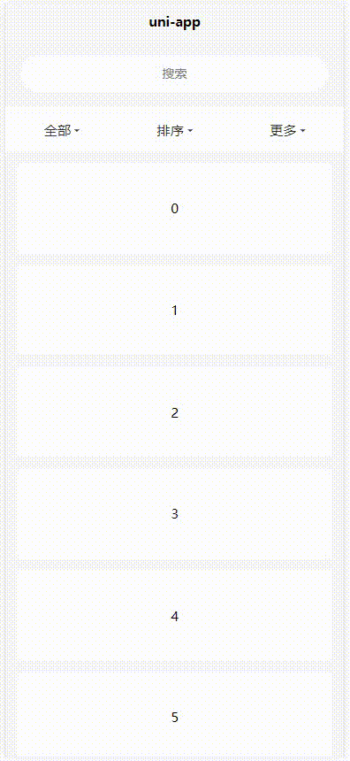
运行效果:
完整代码:
dropdown-menu.vue
<template>
	<view class="dropdown-menu" :style="customStyle">
		<slot></slot>
	</view>
</template>

<script setup>
	import {
		provide,
		ref,
		watch,
		computed
	} from 'vue'
	const props = defineProps({
		//激活颜色
		activeColor: {
			type: String,
			default: '#3395DC'
		},
		//是否吸顶
		sticky: {
			type: Boolean,
			default: false
		}
	})

	//样式设置
	const customStyle = computed(() => {
		return props.sticky ? {
			position: "sticky",
			// #ifdef H5
			top: '44px',
			// #endif
			// #ifndef H5
			top: 0,
			// #endif
		} : null
	})

	//当前打开的项(以标题标识)
	const currentDropItem = ref('')
	provide('activeColor', props.activeColor)
	provide('currentDropItem', currentDropItem)
</script>

<style lang="scss" scoped>
	.dropdown-menu {
		width: 100%;
		display: flex;
		align-items: center;
		background-color: #fff;
		box-sizing: border-box;

		&::after {
			display: block;
			content: '';
			position: absolute;
			bottom: 0;
			width: 100%;
			height: 1px;
			background-color: #f2f2f2;
		}
	}

	/**
 * 兼容小程序端
 */
	:deep(dropdown-item) {
		flex: 1;
		width: 0;
	}
</style>
dropdown-item.vue
<template>
	<!-- 标题栏 -->
	<view class="dropdown-item" :class="{open:isOpen}" :style="{color:curretnColor}" @click="handleClick"
		@touchmove.prevent>
		<text class="title">{{currentTitle}}</text>
	</view>
	<!-- 下拉弹窗 -->
	<view class="dropdown-popup" :style="{top:`${dropPopupTop}px`,zIndex,height:dropHeight}" @touchmove.prevent>
		<view class="content" :class="customClass">
			<!-- 插槽 -->
			<slot v-if="hasSlot"></slot>
			<!-- 选项 -->
			<view class="list" v-else>
				<view :class="['item',{active:currentIndex===index}]" v-for="(item,index) in options"
					:key="item.label||index" @click="onSelect(item,index)">
					<view class="label">{{item.label}}</view>
					<!-- 勾选图标 -->
					<i v-show="currentIndex===index" class="iconfont icon-gouxuan icon"></i>
				</view>
			</view>
		</view>
		<!-- 顶部遮罩层 -->
		<view class="overly-header" v-show="isOpen" :style="{height:`${overlyHeight}px`}" @touchmove.prevent></view>
		<!-- 底部遮罩层 -->
		<view class="overly-footer" v-show="isOpen" @click="onClose" @touchmove.prevent></view>
	</view>

</template>

<script setup>
	import {
		computed,
		inject,
		ref,
		onMounted,
		watch,
		useSlots,
		getCurrentInstance
	} from 'vue'
	const props = defineProps({
		//标题
		title: {
			type: String,
			default: '标题'
		},
		options: {
			type: Array,
			default: () => []
		},
		modelValue: {
			type: [String, Number],
			default: ''
		}

	})

	const emits = defineEmits(['update:modelValue', 'change'])
	const slots = useSlots()
	//是否有插槽
	const hasSlot = computed(() => {
		return Object.keys(slots).length > 0
	})

	//激活颜色
	const activeColor = inject('activeColor')
	//当前打开的dropItem项(标签名)
	const currentDropItem = inject('currentDropItem')

	//当前文字/箭头颜色
	const curretnColor = computed(() => {
		return isOpen.value ? activeColor : '#333'
	})

	//当前标题
	const currentTitle = computed(() => {
		return currentIndex.value > -1 ? props.options[currentIndex.value].label : props.title
	})
	//是否打开
	const isOpen = ref(null)
	//动态class
	const customClass = computed(() => {
		return isOpen.value === true ? 'visible' : isOpen.value === false ? 'hidden' : null
	})


	let timeout = null
	//打开或关闭
	const handleClick = () => {
		//节流处理,防止点击过快动画未结束又切换导致显示bug
		if (timeout) return
		isOpen.value = !isOpen.value
		if (isOpen.value) {
			currentDropItem.value = props.title
			getDropPopupTop()
		}

		timeout = setTimeout(() => {
			timeout = null
		}, 200)

	}

	onMounted(() => {
		getDropPopupTop()

	})

	//下拉弹窗距离页面顶部距离
	const dropPopupTop = ref(0)
	//顶部透明遮罩层高度
	const overlyHeight = ref(0)
	//下拉弹窗高度
	const dropHeight = ref(0)
	const instance = getCurrentInstance()
	//计算下拉弹窗区域距离页面顶部距离
	const getDropPopupTop = () => {
		let query = uni.createSelectorQuery().in(instance)
		query.select('.dropdown-item').boundingClientRect(data => {
			// #ifdef H5
			//H5需要加上导航栏高度,固定44px
			dropPopupTop.value = data.bottom + 44
			overlyHeight.value = data.top + 44
			// #endif
			//  #ifndef H5
			dropPopupTop.value = data.bottom
			overlyHeight.value = data.top

			// #endif
		}).exec()
	}

	//关闭回调
	const onClose = () => {
		isOpen.value = false

	}
	//动态控制开关
	watch(currentDropItem, v => {
		//关闭其他条件的下拉弹窗
		if (v !== props.title) {
			isOpen.value = false
		}
	})
	//弹窗层级
	const zIndex = ref(-1)
	watch(isOpen, v => {
		//打开状态显示父容器
		if (v) {
			zIndex.value = 999
			dropHeight.value = 'auto'
		} else {
			//关闭状态隐藏父容器
			//延迟改变使得关闭动画能完整呈现
			setTimeout(() => {
				zIndex.value = -1
				dropHeight.value = 0
			}, 200)
		}
	})

	//下拉选项当前选中的索引
	const currentIndex = ref(-1)

	//根据双向绑定值动态设置下拉选中项索引
	watch(() => props.modelValue, v => {
		currentIndex.value = props.options.findIndex(item => item.value === v)
	}, {
		immediate: true
	})

	//选中监听
	const onSelect = (item, index) => {
		isOpen.value = false
		if (index !== currentIndex.value) {
			currentIndex.value = index
			emits('update:modelValue', item.value)
			emits('change', item.value)
		}

	}
</script>

<style lang="scss" scoped>
	.dropdown-item {
		width: 100%;
		padding: 30rpx;
		box-sizing: border-box;
		display: flex;
		justify-content: center;
		align-items: center;
		font-size: 30rpx;
		white-space: nowrap;
		text-align: center;
		position: relative;
		z-index: 10;

		&::after {
			display: block;
			content: '';
			border: 6rpx solid;
			border-color: v-bind(curretnColor) transparent transparent transparent;
			margin-bottom: -10rpx;
			margin-left: 8rpx;
			transition: all 0.2s;
			transform-origin: center 3rpx;
		}

		&.open {
			&::after {
				transform: rotate(180deg);
			}
		}
	}

	.dropdown-popup {
		position: fixed;
		left: 0;
		right: 0;
		bottom: 0;
		z-index: 999;
		overflow: hidden;
		box-sizing: border-box;
		background-color: rgba(0, 0, 0, 0);

		.content {
			background-color: #fff;
			min-height: 200rpx;
			position: absolute;
			top: -100%;
			left: 0;
			right: 0;
			z-index: 1000;
			box-sizing: border-box;

			&.visible {
				animation: visibleAnimaFrames 0.2s forwards;
			}

			&.hidden {
				animation: hiddenAnimaFrames 0.5s forwards;
			}

			.list {
				width: 100%;
				padding: 0 35rpx;
				box-sizing: border-box;

				.item {
					width: 100%;
					padding: 30rpx 0;
					box-sizing: border-box;
					display: flex;
					align-items: center;

					&:not(:last-of-type) {
						border-bottom: 1px solid #f2f2f2;
					}

					.label {
						font-size: 30rpx;
						flex: 1;
						width: 0;
						margin-right: 40rpx;
						overflow: hidden;
						text-overflow: ellipsis;
						white-space: nowrap;

					}

					.icon {
						font-size: 36rpx;
						color: v-bind(activeColor);
					}

					&.active {
						.label {
							color: v-bind(activeColor);
						}
					}
				}
			}

		}
	}

	/**
 * 打开动画
 */
	@keyframes visibleAnimaFrames {
		0% {
			top: -100%;
		}

		100% {
			top: 0;
		}
	}

	/**
 * 关闭动画
 */
	@keyframes hiddenAnimaFrames {
		0% {
			top: 0;
		}

		100% {
			top: -100%;
		}
	}

	.overly-footer {
		position: absolute;
		top: 0;
		right: 0;
		left: 0;
		bottom: 0;
		background-color: rgba(0, 0, 0, 0.5);

		z-index: 999;
	}

	.overly-header {
		position: fixed;
		top: 0;
		right: 0;
		left: 0;
		width: 100%;
		background-color: rgba(0, 0, 0, 0);
		z-index: 999;

	}
</style>
页面使用
index.vue
<template>
	<view class="container">
		<view class="header">
			<input class="input" placeholder="搜索" />
		</view>
		<dropdown-menu activeColor="#52E725" sticky>
			<dropdown-item title="全部" :options="options1" v-model="value1" @change="handleChange">
			</dropdown-item>
			<dropdown-item title="排序" :options="options2" v-model="value2" @change="handleChange2">
			</dropdown-item>
			<dropdown-item title="更多"   >
				自定义内容
			</dropdown-item>
		</dropdown-menu>
		<view class=" list">
			<view class="item" v-for="(item,index) in 10">{{index}}</view>
		</view>
	</view>
</template>
<script setup>
	import {
		ref
	} from 'vue'
	import dropdownMenu from './dropdownMenu.vue'
	import dropdownItem from './dropdownItem.vue'
	const options1 = ref([{
		label: '全部商品',
		value: 1
	}, {
		label: '折扣商品',
		value: 2
	}, {
		label: '团购商品',
		value: 3
	}])


	const options2 = ref([{
		label: '热门排序',
		value: 1
	}, {
		label: '销量排序',
		value: 2
	}, {
		label: '好评排序',
		value: 3
	}])

	const value1 = ref()
	const value2 = ref()

	const handleChange = (e) => {
		console.log(e, 'e')
	}
	const handleChange2 = (e) => {
		console.log(e, 'e')
	}
</script>

<style lang="scss" scoped>
	.container {
		width: 100%;
		min-height: 100vh;
		background-color: #f7f7f7;

	}

	.header {
		width: 100%;
		padding: 35rpx;
		box-sizing: border-box;

		.input {
			width: 100%;
			border-radius: 40rpx;
			height: 80rpx;
			background-color: #fff;
			font-size: 28rpx;
			padding: 0 20rpx;
			box-sizing: border-box;

			text-align: center;
		}

	}

	.list {
		padding: 25rpx;
		box-sizing: border-box;

		.item {
			background-color: #fff;
			height: 200rpx;
			border-radius: 10rpx;
			margin-bottom: 25rpx;
			color: #000;
			display: flex;
			justify-content: center;
			align-items: center;
		}
	}
	.cust{
		width: 100%;
		height: 80rpx;
		border-bottom: 1px solid #eee;
	}
</style>
结束语
上诉示例只是抛砖引玉,教你如何封装一个基础版下拉菜单组件,只有简单的单选功能,可以根据业务需要自己扩展组件功能,添加多选、树形选择等其他模式来丰富组件功能。


 扫一扫
扫一扫


 4621
4621

 被折叠的 条评论
为什么被折叠?
被折叠的 条评论
为什么被折叠?
 到【灌水乐园】发言


