


文章目录
一、复习之前的概念
这里要讨论之前的概念,是为了更好的理解为什么会有bfc,bfc被研究出来的目的是什么。
1. 元素的显示方式
块级元素
块级元素(默认)生成一个填满父级元素内容区域的框,旁边不能有其他元素。HTML中最常见的块级元素是p和div。置换元素可以是块级元素,但往往不是。
行内元素
行内元素在一行文本内生成元素框,不打断所在行。HTML中最常见的行内元素是a,还有strong和em等。这类元素不在自身所在元素框的前后“断行”,因此可以出现在另一个元素的内容中,且不影响所在的元素。
注意:BFC研究的是普通文档流下的块级元素的排布规则。
2. 普通流块级元素的排布规则
水平方向上,撑满整个包含块宽度,垂直方向上,未设置高度时,高度由内容撑开,依次向下摆放。
这种排布规则的问题:
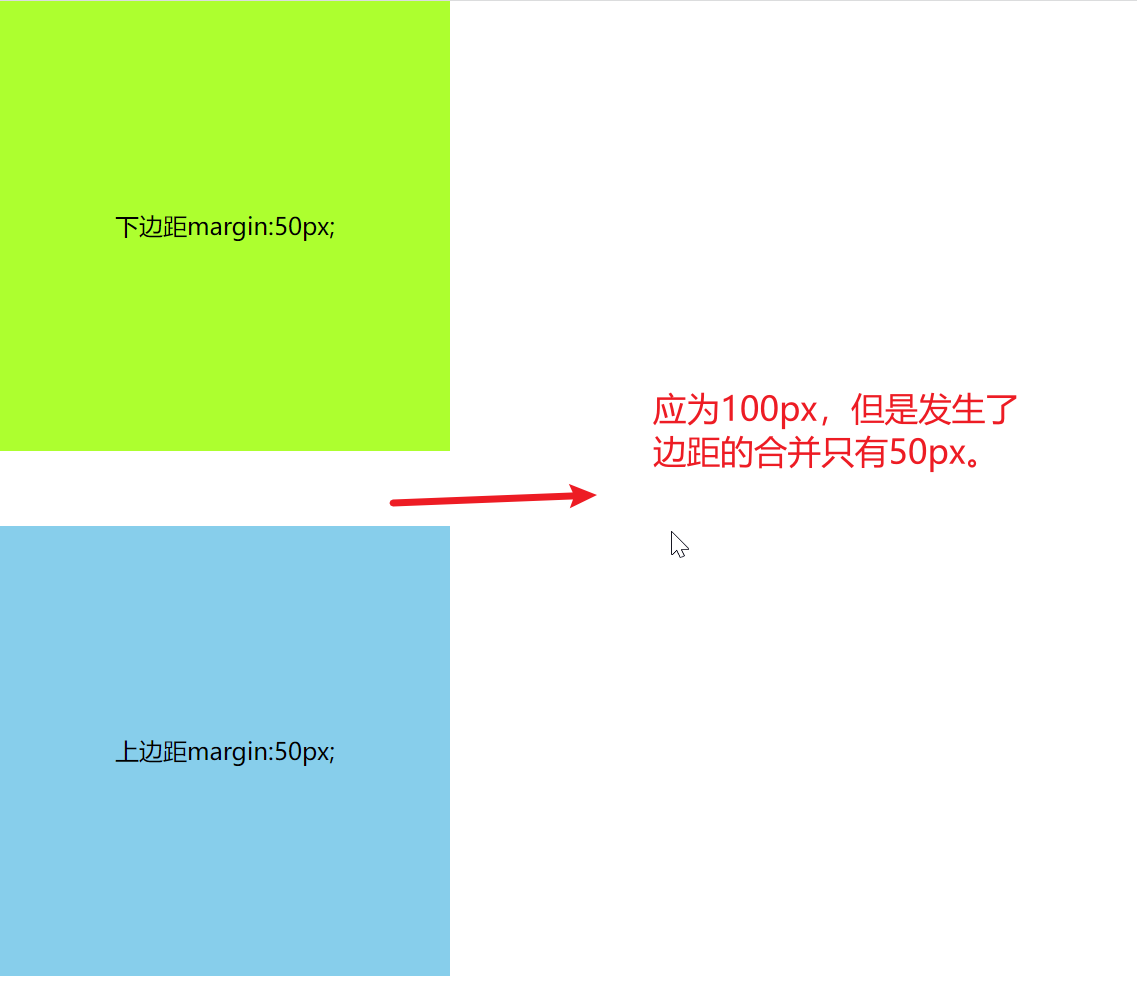
- 垂直方向上相邻的元素,margin会合并
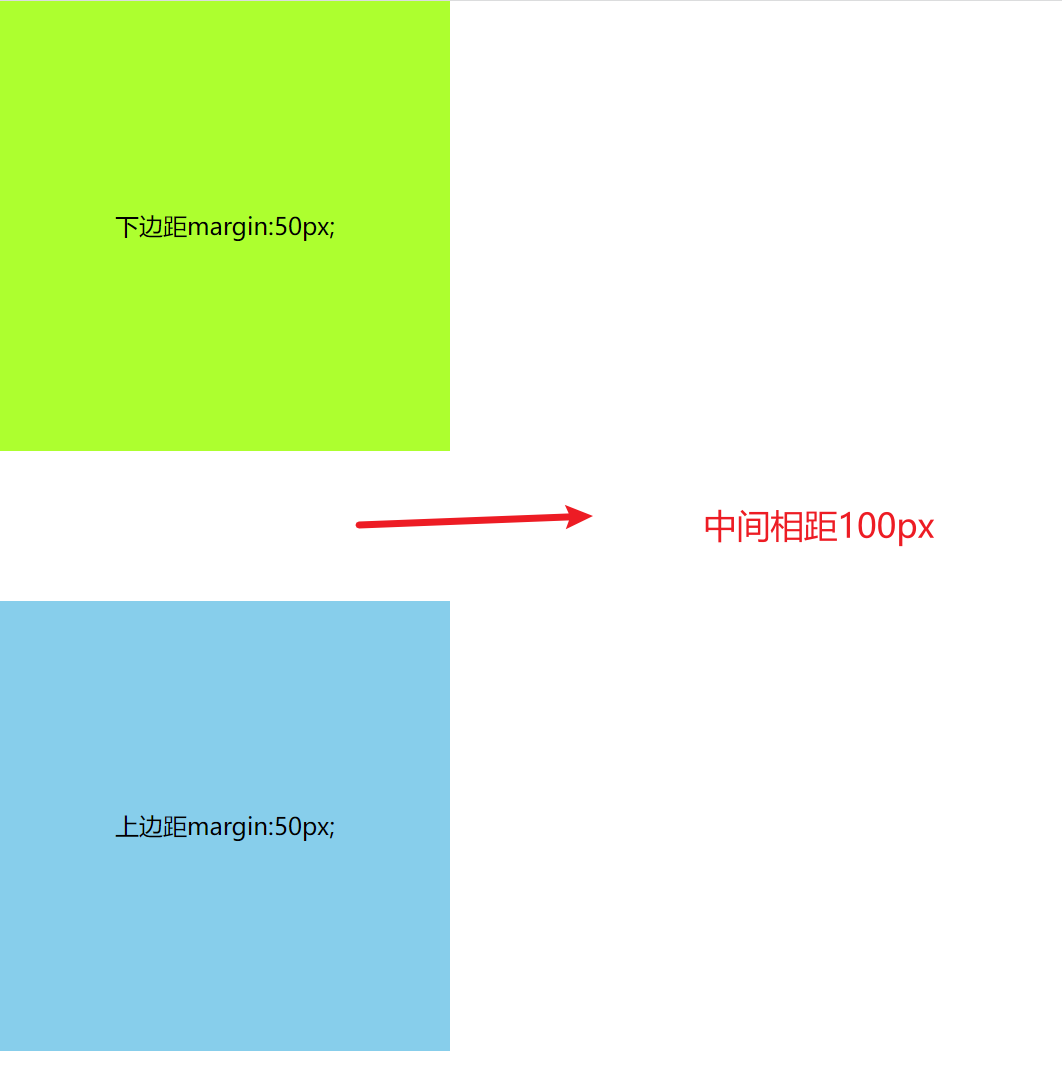
问题:两个兄弟块元素,一个设置下外边距50px,一个设置上外边距50px,此时它们不应该是相距100px才对嘛?为什么只相距了50px?
原因:兄弟之间的元素,垂直方向的margin-bottom和margin-top会合并为单个边距,其大小为单个边距的最大值,如果值一样则值仅为其中一个。这就是外边距重叠现象。
    <style>
      * {
        /* 去除内外边距 */
        margin: 0;
        padding: 0;
      }
         /* 两个盒子 第一个给下边距50px ,第二个给上边距50px。正常情况下中边距应为100px,但是产生了合并的问题只有50px */
      div {
        width: 300px;
        height: 300px;
        text-align: center;
        line-height: 300px;
      }
      .box1 {
        background-color: greenyellow;
        margin-bottom: 50px;
      }
      .box2 {
        background-color: skyblue;
        margin-top: 50px;
      }
    </style>
  <body>
    <div class="box1">下边距margin:50px;</div>
    <div class="box2">上边距margin:50px;</div>
  </body>
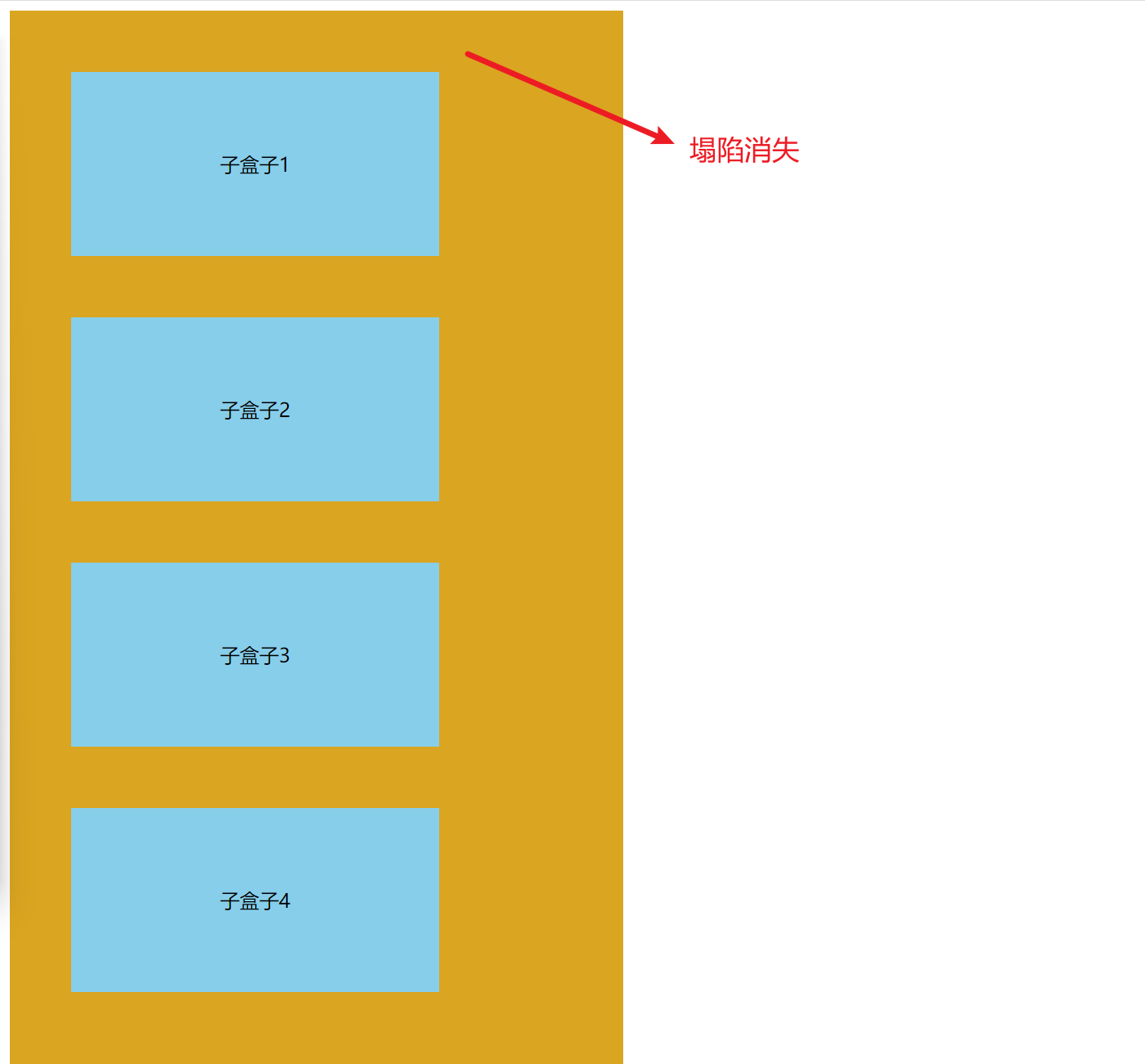
- 父子关系的情况下,可能会产生margin塌陷。
    <style>
      .outer {
        width: 500px;
        height: 800px;
        background-color: goldenrod;
      }
      .inner {
        width: 300px;
        height: 150px;
        text-align: center;
        line-height: 150px;
        background-color: skyblue;
        margin: 50px;
      }
    </style>
  <body>
    <div class="outer">
      <div class="inner">子盒子1</div>
      <div class="inner">子盒子2</div>
      <div class="inner">子盒子3</div>
      <div class="inner">子盒子4</div>
    </div>
  </body>
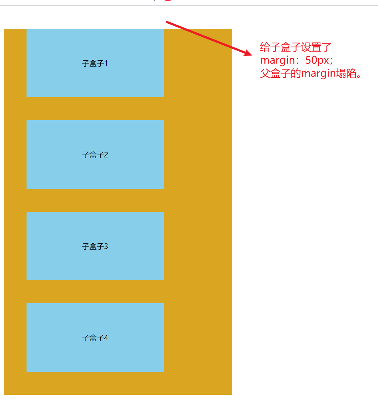
此时正常情况应该是子盒子里父盒子上边框有50px,但是父盒子产生了塌陷,没有展示出对应的效果。
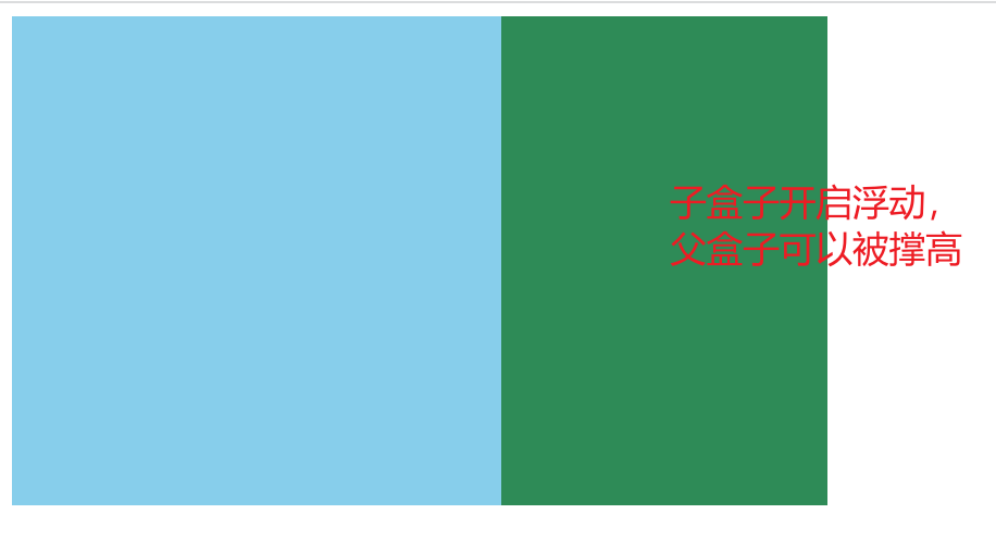
- 父子关系的情况下,父元素没有设置高度时,父元素无视浮动元素产生高度坍塌。
 	<style>
      .fa {
        width: 500px;
        /* height: 500px; */
        background-color: seagreen;
      }
      .son {
        float: left;
        width: 300px;
        height: 300px;
        background-color: skyblue;
      }
    </style>
  <body>
    <div class="fa">
      <div class="son"></div>
    </div>
  </body>

正常情况下,图片应展示的效果如下:

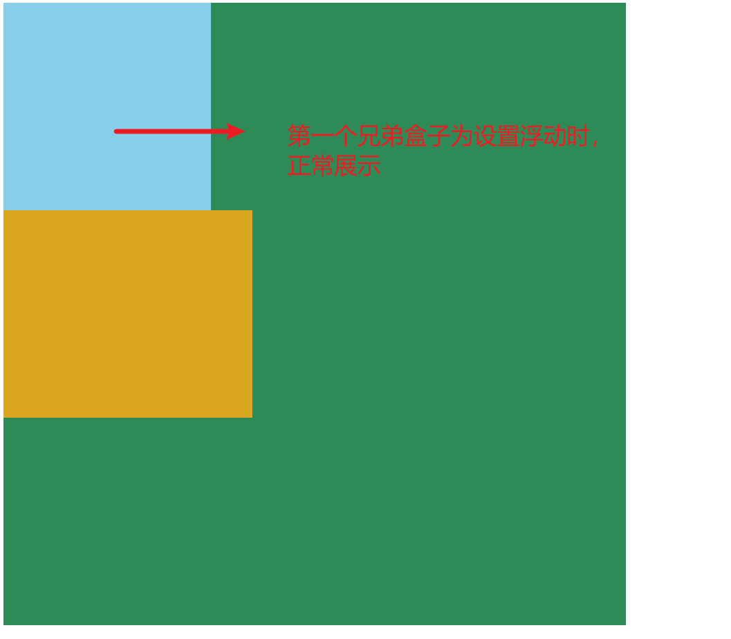
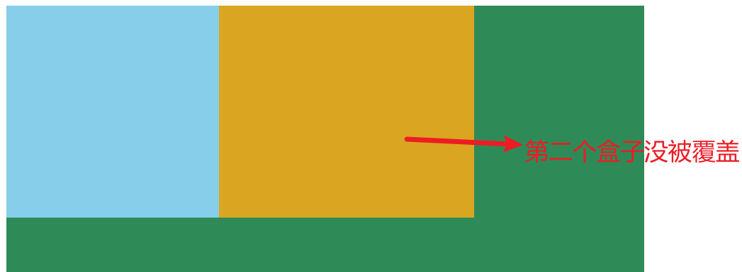
- 兄弟关系的情况下,正常元素可能会被浮动元素覆盖(正常元素在浮动元素之后)
    <style>
      .fa {
        width: 600px;
        height: 600px;
        background-color: seagreen;
      }
      .fa > div {
        width: 200px;
        height: 200px;
      }
      .son1 {
        float: left;
        background-color: skyblue;
      }
      .fa .son2 {
        width: 240px;
        background-color: goldenrod;
      }
    </style>
  <body>
    <div class="fa">
      <div class="son1"></div>
      <div class="son2"></div>
    </div>
  </body>
开启浮动后,效果如下:

注意:产生问题的原因是因为浏览器本身的渲染规则就是这样去渲染的
二、什么是BFC?
BFC的全称为Block formatting Context,意思是块级格式化上下文。
是 Web 页面的可视 CSS 渲染的一部分,是块级盒子的布局过程发生的区域,也是浮动元素与其他元素交互的区域。
可以理解为是一个元素的属性,当开启这个属性后,这个元素就可以看作是被隔离的独立容器,容器里面的元素不会影响到外面的元素。
1. 特点
- 开启BFC的区域,是一块独立的渲染区域(有独立的渲染规则)。
- 隔绝了内部与外部的联系,内部渲染不会影响到外部。
- 不同的BFC区域,渲染时也互不干扰。
2. BFC开启方式
- html根元素;
- float(不为none即可):left、right;
- position:absolute、fixed;
- display:inline-block、flex、inline-flex、grid、inline-grid、flow-root;
- overflow(除了 visible 以外的值): hidden、auto、scroll
- 多列容器:设置column-count
- 表格元素:table、thead、tbody、tfoot、tr、th、td、caption
- column-span为all的元素(表格第一行横跨所有列)
以下为常用的:
/* 1、对溢出元素进行隐藏 */
overflow:hidden;
/* 2、将容器变为弹性的容器,进行相关设置,根据弹性布局拉伸和排列 */
display:flex;
/* 3、内联的弹性盒子,不会占据整行 */
display:inline-flex;
/* 4、内联块级元素,可以在同一行内显示,同时保持块级元素的特性 */
display:inline-block;
/* 5、绝对定位,根据父类或者body确定位置,不再占用位置 */
position:absolute;
/* 6、某个窗口中的固定定位 */
position:fixed;
**提醒:**display:flow-root; 该元素生成一个块级元素盒,其会建立一个新的块级格式化上下文,定义格式化上下文的根元素。所以它不会产生任何副作用,所以用display:flow-root; 创建BFC也是一个很好的选择
三、BFC能解决什么问题?
主要解决上述所说的普通流块级元素的排布规则所产生的问题。问题效果图见上方。
1. 给垂直方向上相邻的两个块级元素分别开启BFC,两边距不再合并。
    <style>
      * {
        /* 去除内外边距 */
        margin: 0;
        padding: 0;
      }
      .outer div {
        width: 300px;
        height: 300px;
        text-align: center;
        line-height: 300px;
      }
      .outer {
          /* 开启BFC */
        overflow: hidden;
      }
      .box1 {
        background-color: greenyellow;
        margin-bottom: 50px;
      }
      .box2 {
        background-color: skyblue;
        margin-top: 50px;
      }
    </style>
  <body>
    <div class="outer">
      <div class="box1">下边距margin:50px;</div>
    </div>
    <div class="outer">
      <div class="box2">上边距margin:50px;</div>
    </div>
  </body>
2. 开启BFC,其子元素不会再产生margin塌陷问题(不会和它的子元素产生margin合并)
    <style>
      .outer {
        width: 500px;
        height: 1000px;
        background-color: goldenrod;
          /*给父元素开启BFC*/
        overflow: hidden;
      }
      .inner {
        width: 300px;
        height: 150px;
        text-align: center;
        line-height: 150px;
        background-color: skyblue;
        margin: 50px;
      }
    </style>
  <body>
    <div class="outer">
      <div class="inner">子盒子1</div>
      <div class="inner">子盒子2</div>
      <div class="inner">子盒子3</div>
      <div class="inner">子盒子4</div>
    </div>
  </body>
3. 开启BFC,就算子元素浮动,自身高度也不会坍塌(高度计算不在无视浮动元素)
    <style>
      .fa {
        width: 500px;
        /* height: 500px; */
        background-color: seagreen;
        /* 开启BFC */
        overflow: hidden;
      }
      .son {
        float: left;
        width: 300px;
        height: 300px;
        background-color: skyblue;
      }
    </style>
  <body>
    <div class="fa">
      <div class="son"></div>
    </div>
  </body>
4. 开启BFC,自己不会被其他浮动元素所覆盖(不会与浮动元素重叠,会避开浮动元素排布)
这个效果可以用来实现两栏布局
    <style>
      .fa {
        width: 600px;
        height: 600px;
        background-color: seagreen;
      }
      .fa > div {
        width: 200px;
        height: 200px;
      }
      .fa .son1 {
        float: left;
        background-color: skyblue;
      }
      .fa .son2 {
        width: 240px;
          /*第二个兄弟盒子开启BFC,不会被第一个兄弟覆盖*/
        overflow: hidden;
        background-color: goldenrod;
      }
    </style>
  <body>
    <div class="fa">
      <div class="son1"></div>
      <div class="son2"></div>
    </div>
  </body>
: left;
background-color: skyblue;
}
.fa .son2 {
width: 240px;
/第二个兄弟盒子开启BFC,不会被第一个兄弟覆盖/
overflow: hidden;
background-color: goldenrod;
}


 扫一扫
扫一扫


 406
406

 被折叠的 条评论
为什么被折叠?
被折叠的 条评论
为什么被折叠?
 到【灌水乐园】发言


