


 该文总结了CSS中实现文本水平居中、垂直居中以及水平垂直居中的多种方法,包括使用text-align、display:flex、display:table-cell和position/transform属性的组合技巧。
在CSS布局时经常会需要实现水平居中,垂直居中,水平垂直居中这样的要求但是却又不是非常的在意,所以总结一下。
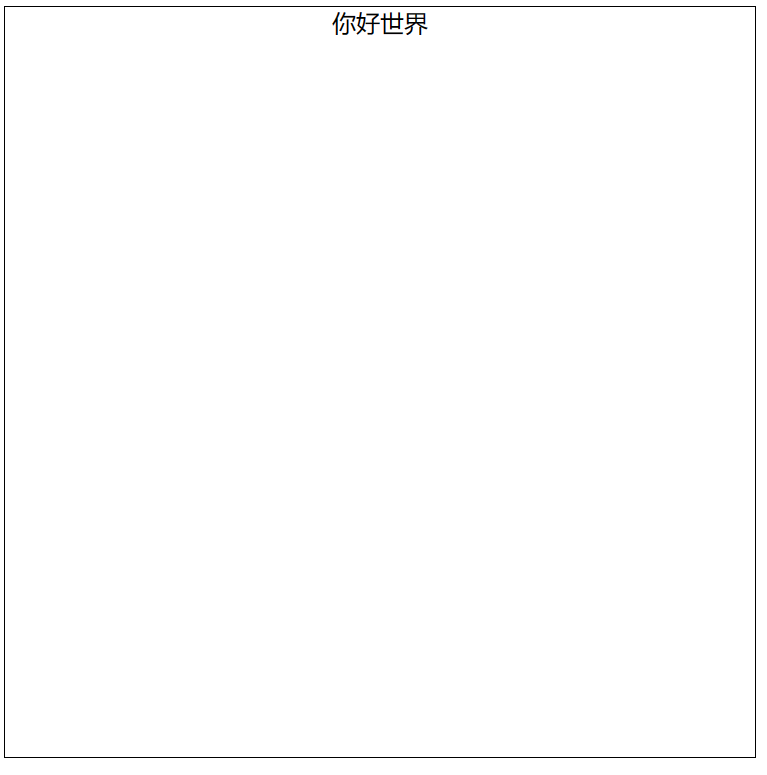
文本水平居中
1.使用text-align属性:将容器的text-align属性设置为"center",可以使文本在容器中水平居中。
<style>
        .container {
            width: 500px;
            height: 500px;
            border: solid 1px black;

            text-align: center; /*将文本水平居中*/
        }
        </style>
<body>
    <div class="container">你好世界</div>
</body>
2.使用display: flex和justify-content属性将容器内的内容水平居中。
<style>
      .container {
          width: 500px;
          height: 500px;
          border: solid 1px black;

          display: flex; /* 将容器设置为弹性盒子 */
          justify-content: center; /* 将弹性盒子内的内容水平居中 */
      }
</style>

<body>
    <div class="container">你好世界</div>
</body>
3.使用display: table和margin属性将容器内的内容水平居中。
<style>
      .container {
        width: 500px;
        height: 500px;
        border: solid 1px black;

        display: table-cell; /* 将容器设置为表格单元格 */
        text-align: center; /* 将文本水平居中 */
     }
</style>

<body>
    <div class="container">你好世界</div>
</body>
4.使用transform属性将文本水平垂直居中。
<style>
      .container {
          width: 500px;
          height: 500px;
          border: solid 1px black;

          position: relative; /* 将容器设置为相对定位 */
      }

      .container p {
          position: absolute; /* 将文本设置为绝对定位 */
          left: 50%; /* 将文本的左侧距离容器宽度的一半对齐 */
          transform: translateX(-50%); /* 将文本水平垂直居中 */
      }
    </style>

<body>
    <div class="container">
        <p>你好世界</p>
    </div>
</body>
最终效果:
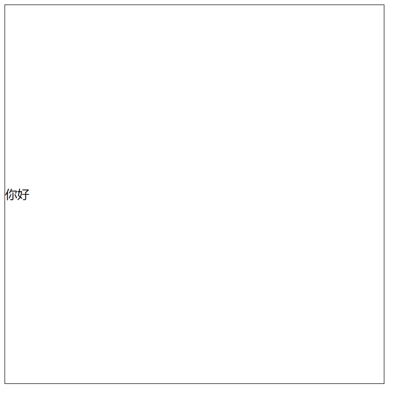
文本垂直居中
1.使用line-height属性将单行文本垂直居中。
<style>
    .container {
      width: 500px;
      height: 500px;
      border: solid 1px black;

      line-height: 500px;
    }
</style>

<body>
    <div class="container">
        你好
    </div>
</body>
2.使用display: flex和align-items属性将容器内的内容垂直居中。
<style>
    .container {
      width: 500px;
      height: 500px;
      border: solid 1px black;

      display: flex; /* 将容器设置为弹性盒子 */
      align-items: center; /* 将弹性盒子内的内容垂直居中 */
    }
</style>

<body>
    <div class="container">
        你好
    </div>
</body>
3.使用position和transform属性将文本垂直居中。
<style>
    .container {
        width: 500px;
        height: 500px;
        border: solid 1px black;

        position: relative; /* 将容器设置为相对定位 */
    }

    .container p {
        position: absolute; /* 将文本设置为绝对定位 */
        top: 50%; /* 将文本的顶部与容器高度的一半对齐 */
        transform: translateY(-50%); /* 将文本垂直居中 */
    }
</style>

<body>
    <div class="container">
        <p>你好</p>
    </div>
</body>
4.使用display: table-cell和vertical-align属性将文本垂直居中。
<style>
      .container {
        width: 500px;
        height: 500px;
        border: solid 1px black;

        display: table-cell; /* 将容器设置为表格单元格 */
        vertical-align: middle; /* 将文本垂直居中 */
      }
</style>

<body>
    <div class="container">
        你好
    </div>
</body>
最终效果:
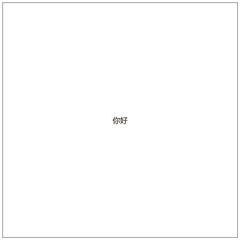
文本水平垂直居中
1.使用display: flex和justify-content、align-items属性将容器内的内容水平垂直居中。
<style>
      .container {
        width: 500px;
        height: 500px;
        border: solid 1px black;

        display: flex; /* 将容器设置为弹性盒子 */
        justify-content: center; /* 将弹性盒子内的内容水平居中 */
        align-items: center; /* 将弹性盒子内的内容垂直居中 */
    }
</style>

<body>
    <div class="container">
        你好
    </div>
</body>
2.使用position和transform属性将文本水平垂直居中。
<style>
      .container {
        width: 500px;
        height: 500px;
        border: solid 1px black;

        position: relative; /* 将容器设置为相对定位 */
      }

      .container p {

        position: absolute; /* 将文本设置为绝对定位 */
        top: 50%; /* 将文本的顶部与容器高度的一半对齐 */
        left: 50%; /* 将文本的左侧与容器宽度的一半对齐 */
        transform: translate(-50%, -50%); /* 将文本水平垂直居中 */
        text-align: center; /* 将文本水平居中 */

      }
</style>

<body>
    <div class="container">
        <p>你好</p>
    </div>
</body>
3.使用display: table和vertical-align属性将文本水平垂直居中。
<style>
      .container {
        width: 500px;
        height: 500px;
        border: solid 1px black;

        display: table; /* 将容器设置为表格 */
      }

      .container p {

        display: table-cell; /* 将文本设置为表格单元格 */
        text-align: center; /* 将文本水平居中 */
        vertical-align: middle; /* 将文本垂直居中 */

      }
</style>

<body>
    <div class="container">
        <p>你好</p>
    </div>
</body>
最终效果:


 扫一扫
扫一扫


 142
142

 被折叠的 条评论
为什么被折叠?
被折叠的 条评论
为什么被折叠?
 到【灌水乐园】发言


