


输入框组件
ArkUI开发框架提供了 2 种类型的输入框: TextInput 和 TextArea ,前者只支持单行输入,后者支持多行输入,下面我们分别做下介绍。
TextInput
子组件
无
接口
TextInput(value?:{placeholder?: ResourceStr, text?: ResourceStr, controller?: TextInputController})
TextInput定义介绍
interface TextInputInterface {
  (value?: TextInputOptions): TextInputAttribute;
}

declare interface TextInputOptions {
  placeholder?: ResourceStr;
  text?: ResourceStr;
  controller?: TextInputController;
}
-
value:输入框的提示样式设置,
TextInputOptions参数类型说明如下:-
text:设置输入框的初始显示文本,不设置时显示
placeholder的内容。 -
placeholder:占位提示文本,当不设置 text 是,显示该文本。
-
controller:光标控制器,设置光标的下标位置。
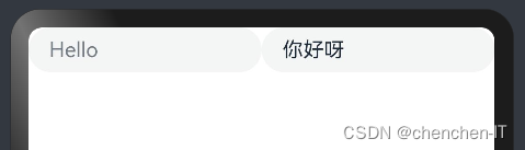
简单样例如下所示:
 TextInput({
 placeholder: "Hello"
 })

 TextInput({
   placeholder: "Hello",
   text: "你好呀"
 })
样例运行结果如下图所示:
-
TextInput属性介绍
declare class TextInputAttribute extends CommonMethod<TextInputAttribute> {
  type(value: InputType): TextInputAttribute;

  placeholderColor(value: ResourceColor): TextInputAttribute;

  placeholderFont(value?: Font): TextInputAttribute;

  enterKeyType(value: EnterKeyType): TextInputAttribute;

  caretColor(value: ResourceColor): TextInputAttribute;

  onEditChanged(callback: (isEditing: boolean) => void): TextInputAttribute;

  onEditChange(callback: (isEditing: boolean) => void): TextInputAttribute;

  onSubmit(callback: (enterKey: EnterKeyType) => void): TextInputAttribute;

  onChange(callback: (value: string) => void): TextInputAttribute;

  maxLength(value: number): TextInputAttribute;

  fontColor(value: ResourceColor): TextInputAttribute;

  fontSize(value: Length): TextInputAttribute;

  fontStyle(value: FontStyle): TextInputAttribute;

  fontWeight(value: number | FontWeight | string): TextInputAttribute;

  fontFamily(value: ResourceStr): TextInputAttribute;

  inputFilter(value: ResourceStr, error?: (value: string) => void): TextInputAttribute;

  onCopy(callback: (value: string) => void): TextInputAttribute;

  onCut(callback: (value: string) => void): TextInputAttribute;

  onPaste(callback: (value: string) => void): TextInputAttribute;
}
TextInput 组件用于文本输入,它只能单行文本输入,若文本超出自身长度则使用 ... 在末尾替代。 TextInput 组件除了公共属性外,它还提供了很多常用的属性:
-
type:表示输入框的类型,比如设置为
Number,则表示输入框只能输入数字。 -
enterKeyType:表示设置输入法回车键类型,主要用来控制回车键的显示样式。
例如设置
enterKeyType为Search,type为Number时,(控制手机键盘上搜索按钮) -
maxLength:设置输入框允许输入多少字符。
-
caretColor:设置光标的颜色。
TextInput事件介绍
declare class TextInputAttribute extends CommonMethod<TextInputAttribute> {
  onEditChanged(callback: (isEditing: boolean) => void): TextInputAttribute;
  onEditChange(callback: (isEditing: boolean) => void): TextInputAttribute;
  onSubmit(callback: (enterKey: EnterKeyType) => void): TextInputAttribute;
  onChange(callback: (value: string) => void): TextInputAttribute;
  onCopy(callback: (value: string) => void): TextInputAttribute;
  onCut(callback: (value: string) => void): TextInputAttribute;
  onPaste(callback: (value: string) => void): TextInputAttribute;
}
TextInput 除了具有公共事件外,它还提供了自己独有的事件回调。
- onChange:当输入框的内容变化时,触发该回调并把输入框的值回调出来
- onSubmit:回车键或者软键盘回车键触发该回调,参数为当前软键盘回车键类型。
- onEditChanged:输入状态变化时,触发回调。
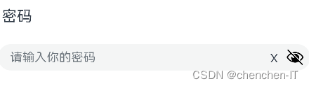
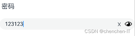
TextInput 的一个简单示例如下:
@Entry @Component struct ComponentTest {

  @State value: string = "";

  build() {
    Column() {
      TextInput({ placeholder: "请输入密码"})
        .width('100%')
        .height(45)
        .type(InputType.Password)
        .enterKeyType(EnterKeyType.Done)
        .caretColor(Color.Red)
        .placeholderColor(Color.Green)
        .placeholderFont({
          size: 20,
          style: FontStyle.Italic,
          weight: FontWeight.Bold
        })
        .onChange((value) => {
          this.value = value;
        })

      Text("输入内容为:" + this.value)
        .fontSize(20)
        .width('100%')
        .margin({top: 5})

    }
    .alignItems(HorizontalAlign.Center)
    .width('100%')
    .height(('100%'))
    .padding(10)
  }
}
样例运行结果如下图所示:
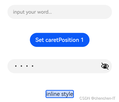
Textinput示例:
// xxx.ets
@Entry
@Component
struct TextInputExample {
  @State text: string = ''
  controller: TextInputController = new TextInputController()

  build() {
    Column() {
      TextInput({ text: this.text, placeholder: 'input your word...', controller: this.controller })
        .placeholderColor(Color.Grey)
        .placeholderFont({ size: 14, weight: 400 })
        .caretColor(Color.Blue)
        .width(400)
        .height(40)
        .margin(20)
        .fontSize(14)
        .fontColor(Color.Black)
        .inputFilter('[a-z]', (e) => {
          console.log(JSON.stringify(e))
        })
        .onChange((value: string) => {
          this.text = value
        })
      Text(this.text)
      Button('Set caretPosition 1')
        .margin(15)
        .onClick(() => {
          // 将光标移动至第一个字符后
          this.controller.caretPosition(1)
        })
      // 密码输入框
      TextInput({ placeholder: 'input your password...' })
        .width(400)
        .height(40)
        .margin(20)
        .type(InputType.Password)
        .maxLength(9)
        .showPasswordIcon(true)
      // 内联风格输入框
      TextInput({ placeholder: 'inline style' })
        .width(400)
        .height(50)
        .margin(20)
        .borderRadius(0)
        .style(TextInputStyle.Inline)
    }.width('100%')
  }
} 
TextArea
TextArea 和 TextInput 都属于输入框,只是 TextArea 允许多行输入,它们的属性也都大致是一样的,只是目前 TextArea 还不支持 maxLength 属性
多行文本输入框组件,当输入的文本内容超过组件宽度时会自动换行显示。高度未设置时,组件无默认高度,自适应内容高度。宽度未设置时,默认撑满最大宽度。
子组件
无
接口
TextArea(value?:{placeholder?: ResourceStr, text?: ResourceStr, controller?: TextAreaController})
事件
除支持通用事件外,还支持以下事件:
| 名称 | 功能描述 |
|---|---|
| onChange(callback: (value: string) => void) | 输入内容发生变化时,触发该回调。 - value:当前输入的文本内容。 |
| onCopy8+(callback:(value: string) => void) | 长按输入框内部区域弹出剪贴板后,点击剪切板复制按钮,触发该回调。 - value:复制的文本内容。 |
| onCut8+(callback:(value: string) => void) | 长按输入框内部区域弹出剪贴板后,点击剪切板剪切按钮,触发该回调。 - value:剪切的文本内容。 |
| onPaste8+(callback:(value: string) => void) | 长按输入框内部区域弹出剪贴板后,点击剪切板粘贴按钮,触发该回调。 - value:粘贴的文本内容。 |
TextAreaController8+
TextArea组件的控制器,目前可通过它设置TextArea组件的光标位置。
导入对象
- controller: TextAreaController = new TextAreaController()
caretPosition8+
caretPosition(value: number): void
设置输入光标的位置。
参数:
| 参数名 | 参数类型 | 必填 | 参数描述 |
|---|---|---|---|
| value | number | 是 | 从字符串开始到光标所在位置的字符长度。 |
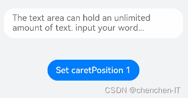
官方示例:
// xxx.ets
@Entry
@Component
struct TextAreaExample {
  @State text: string = ''
  controller: TextAreaController = new TextAreaController()

  build() {
    Column() {
      TextArea({
        placeholder: 'The text area can hold an unlimited amount of text. input your word...',
        controller: this.controller
      })
        .placeholderFont({ size: 16, weight: 400 })
        .width(336)
        .height(56)
        .margin(20)
        .fontSize(16)
        .fontColor('#182431')
        .backgroundColor('#FFFFFF')
        .onChange((value: string) => {
          this.text = value
        })
      Text(this.text)
      Button('Set caretPosition 1')
        .backgroundColor('#007DFF')
        .margin(15)
        .onClick(() => {
          // 设置光标位置到第一个字符后
          this.controller.caretPosition(1)
        })
    }.width('100%').height('100%').backgroundColor('#F1F3F5')
  }
}
开关组件
Toggle定义介绍
interface ToggleInterface {
  (options: { type: ToggleType; isOn?: boolean }): ToggleAttribute;
}-
isOn:设置开关状态组件初始化状态。
-
type:设置相应的开关状态组件。
ToggleType定义了以下三种样式:-
Switch:设置组件为开关样式。
简单样例如下所示:
-
@Entry @Component struct ToggleTest {
  build() {
    Column() {
      Toggle({type: ToggleType.Switch})
    }
    .width('100%')
    .height('100%')
  }
}- 样例运行结果如下图所示:

-
Checkbox:设置开关样式为单选框样式。
简单样例如下所示:
@Entry @Component struct ToggleTest {
  build() {
    Column() {
      Toggle({type: ToggleType.Checkbox})
    }
    .width('100%')
    .height('100%')
  }
}- 样例运行结果如下图所示:
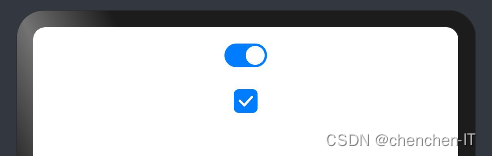
-
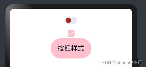
Button:设置开关为按钮样式,如果有文本设置,则相应的文本内容会显示在按钮内部。
简单样例如下所示:
@Entry @Component struct ToggleTest {
  build() {
    Column() {
      Toggle({type: ToggleType.Button}) {
        Text('按钮样式')// 添加一个子组件
          .fontSize(20)
      }
      .size({width: 120, height: 60})
    }
    .width('100%')
    .height('100%')
    .padding(10)
  }
}- 样例运行结果如下图所示:

Toggle属性介绍
declare class ToggleAttribute extends CommonMethod<ToggleAttribute> {
  selectedColor(value: ResourceColor): ToggleAttribute;
  switchPointColor(color: ResourceColor): ToggleAttribute;
}- selectedColor:设置组件打开状态的背景颜色。
- switchPointColor:设置
type类型为Switch时的圆形滑块颜色。
简单样例如下所示:
@Entry @Component struct ToggleTest {
  build() {
    Column() {
      Toggle({type: ToggleType.Switch})
        .selectedColor(Color.Pink)
        .switchPointColor(Color.Brown)

      Toggle({type: ToggleType.Checkbox})
        .selectedColor(Color.Pink)
        .switchPointColor(Color.Brown)

      Toggle({type: ToggleType.Button}) {
        Text('按钮样式')// 添加一个子组件
          .fontSize(20)
      }
      .size({width: 120, height: 60})
      .selectedColor(Color.Pink)
      .switchPointColor(Color.Brown)
    }
    .width('100%')
    .height('100%')
    .padding(10)
  }
}
样例运行结果如下图所示:
Toggle事件介绍
declare class ToggleAttribute extends CommonMethod<ToggleAttribute> {
  onChange(callback: (isOn: boolean) => void): ToggleAttribute;
}- onChange:开关状态切换时触发该事件。
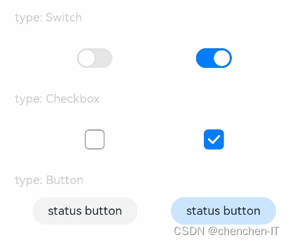
官方示例:
// xxx.ets
@Entry
@Component
struct ToggleExample {
  build() {
    Column({ space: 10 }) {
      Text('type: Switch').fontSize(12).fontColor(0xcccccc).width('90%')
      Flex({ justifyContent: FlexAlign.SpaceEvenly, alignItems: ItemAlign.Center }) {
        Toggle({ type: ToggleType.Switch, isOn: false })
          .selectedColor('#007DFF')
          .switchPointColor('#FFFFFF')
          .onChange((isOn: boolean) => {
            console.info('Component status:' + isOn)
          })

        Toggle({ type: ToggleType.Switch, isOn: true })
          .selectedColor('#007DFF')
          .switchPointColor('#FFFFFF')
          .onChange((isOn: boolean) => {
            console.info('Component status:' + isOn)
          })
      }

      Text('type: Checkbox').fontSize(12).fontColor(0xcccccc).width('90%')
      Flex({ justifyContent: FlexAlign.SpaceEvenly, alignItems: ItemAlign.Center }) {
        Toggle({ type: ToggleType.Checkbox, isOn: false })
          .size({ width: 20, height: 20 })
          .selectedColor('#007DFF')
          .onChange((isOn: boolean) => {
            console.info('Component status:' + isOn)
          })

        Toggle({ type: ToggleType.Checkbox, isOn: true })
          .size({ width: 20, height: 20 })
          .selectedColor('#007DFF')
          .onChange((isOn: boolean) => {
            console.info('Component status:' + isOn)
          })
      }

      Text('type: Button').fontSize(12).fontColor(0xcccccc).width('90%')
      Flex({ justifyContent: FlexAlign.SpaceEvenly, alignItems: ItemAlign.Center }) {
        Toggle({ type: ToggleType.Button, isOn: false }) {
          Text('status button').fontColor('#182431').fontSize(12)
        }.width(106)
        .selectedColor('rgba(0,125,255,0.20)')
        .onChange((isOn: boolean) => {
          console.info('Component status:' + isOn)
        })

        Toggle({ type: ToggleType.Button, isOn: true }) {
          Text('status button').fontColor('#182431').fontSize(12)
        }.width(106)
        .selectedColor('rgba(0,125,255,0.20)')
        .onChange((isOn: boolean) => {
          console.info('Component status:' + isOn)
        })
      }
    }.width('100%').padding(24)
  }
}
评分组件:
Rating
子组件
无
接口
Rating(options?: { rating: number, indicator?: boolean })
从API version 9开始,该接口支持在ArkTS卡片中使用。
这里直接引用官方资料,我们直接进行组件引用即可不再过多介绍
参数:
| 参数名 | 参数类型 | 必填 | 参数描述 |
|---|---|---|---|
| rating | number | 是 | 设置并接收评分值。 默认值:0 取值范围: [0, stars] 小于0取0,大于stars取最大值stars。 |
| indicator | boolean | 否 | 设置评分组件作为指示器使用,不可改变评分。 默认值:false, 可进行评分 说明: indicator=true时,默认组件高度height=12.0vp,组件width=height * stars。 indicator=false时,默认组件高度height=28.0vp,组件width=height * stars。 |
属性
| 名称 | 参数类型 | 描述 |
|---|---|---|
| stars | number | 设置评分总数。 默认值:5 从API version 9开始,该接口支持在ArkTS卡片中使用。 说明: 设置为小于0的值时,按默认值显示。 |
| stepSize | number | 操作评级的步长。 默认值:0.5 从API version 9开始,该接口支持在ArkTS卡片中使用。 说明: 设置为小于0.1的值时,按默认值显示。 取值范围为[0.1, stars]。 |
| starStyle | { backgroundUri: string, foregroundUri: string, secondaryUri?: string } | backgroundUri:未选中的星级的图片链接,可由用户自定义或使用系统默认图片。 foregroundUri:选中的星级的图片路径,可由用户自定义或使用系统默认图片。 secondaryUri:部分选中的星级的图片路径,可由用户自定义或使用系统默认图片。 从API version 9开始,该接口支持在ArkTS卡片中使用。 说明: starStyle属性所支持的图片类型能力参考Image组件。 支持加载本地图片和网络图片,暂不支持PixelMap类型和Resource资源。 默认图片加载方式为异步,暂不支持同步加载。 设置值为undefined或者空字符串时,rating会选择加载系统默认星型图源。 |
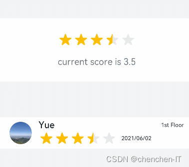
官方示例:
// xxx.ets
@Entry
@Component
struct RatingExample {
  @State rating: number = 3.5

  build() {
    Column() {
      Column() {
        Rating({ rating: this.rating, indicator: false })
          .stars(5)
          .stepSize(0.5)
          .margin({ top: 24 })
          .onChange((value: number) => {
            this.rating = value
          })
        Text('current score is ' + this.rating)
          .fontSize(16)
          .fontColor('rgba(24,36,49,0.60)')
          .margin({ top: 16 })
      }.width(360).height(113).backgroundColor('#FFFFFF').margin({ top: 68 })

      Row() {
        Image('common/testImage.jpg')
          .width(40)
          .height(40)
          .borderRadius(20)
          .margin({ left: 24 })
        Column() {
          Text('Yue')
            .fontSize(16)
            .fontColor('#182431')
            .fontWeight(500)
          Row() {
            Rating({ rating: 3.5, indicator: false }).margin({ top: 1, right: 8 })
            Text('2021/06/02')
              .fontSize(10)
              .fontColor('#182431')
          }
        }.margin({ left: 12 }).alignItems(HorizontalAlign.Start)

        Text('1st Floor')
          .fontSize(10)
          .fontColor('#182431')
          .position({ x: 295, y: 8 })
      }.width(360).height(56).backgroundColor('#FFFFFF').margin({ top: 64 })
    }.width('100%').height('100%').backgroundColor('#F1F3F5')
  }
}
示例2
// xxx.ets
@Entry
@Component
struct RatingExample {
  @State rating: number = 3.5

  build() {
    Column() {
      Rating({ rating: this.rating, indicator: false })
        .stars(5)
        .stepSize(0.5)
        .starStyle({
          backgroundUri: '/common/imag1.png', // common目录与pages同级
          foregroundUri: '/common/imag2.png',
          secondaryUri: '/common/imag3.png'
        })
        .margin({ top: 24 })
        .onChange((value: number) => {
          this.rating = value
        })
      Text('current score is ' + this.rating)
        .fontSize(16)
        .fontColor('rgba(24,36,49,0.60)')
        .margin({ top: 16 })
    }.width('100%').height('100%').backgroundColor('#F1F3F5')
  }
}
大家按自己所需引用即可,当然也可以换成自己所需的样式。


 扫一扫
扫一扫


 3388
3388

 被折叠的 条评论
为什么被折叠?
被折叠的 条评论
为什么被折叠?
 到【灌水乐园】发言


