


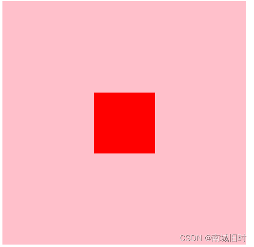
效果图如下:
初始代码:
    <div class="father">
        <div class="son"></div>
    </div>
方法一:定位+margin边距挤到中中间
<!DOCTYPE html>
<html lang="en">

<head>
    <meta charset="UTF-8">
    <meta http-equiv="X-UA-Compatible" content="IE=edge">
    <meta name="viewport" content="width=device-width, initial-scale=1.0">
    <title>Document</title>
    <style>
        /* 1.定位+margin边距挤到中中间 */
        .father {
            position: relative;
            width: 400px;
            height: 400px;
            background-color: pink;
        }
        .son {
            position: absolute;
            left: 150px;
            top: 150px;
            width: 100px;
            height: 100px;
            background-color: red;
        }
    </style>
</head>

<body>
    <div class="father">
        <div class="son"></div>
    </div>
</body>
</html>
方法二:定位+transform
<!DOCTYPE html>
<html lang="en">

<head>
    <meta charset="UTF-8">
    <meta http-equiv="X-UA-Compatible" content="IE=edge">
    <meta name="viewport" content="width=device-width, initial-scale=1.0">
    <title>Document</title>
    <style>
        /* 2.定位+transfrom */
        .father {
            position: relative;
            width: 400px;
            height: 400px;
            background-color: pink;
        }
        .son {
            position: absolute;
            left: 50%;
            top: 50%;
            transform: translate(-50%,-50%);
            width: 100px;
            height: 100px;
            background-color: red;
        }
    </style>
</head>

<body>
    <div class="father">
        <div class="son"></div>
    </div>
</body>
</html>
方法三:定位+方位名词
注意:
第一步:先要通过自绝父相让盒子脱离标准流
第二步:让子盒子的上下左右定位值为0
第三步:让子盒子的上下左右边距自适应
<!DOCTYPE html>
<html lang="en">

<head>
    <meta charset="UTF-8">
    <meta http-equiv="X-UA-Compatible" content="IE=edge">
    <meta name="viewport" content="width=device-width, initial-scale=1.0">
    <title>Document</title>
    <style>
        /* 3.定位+方位名词。*/
        .father {
            position: relative;
            width: 400px;
            height: 400px;
            background-color: pink;
        }
        .son {
            position: absolute;
            left: 0;
            top: 0;
            bottom: 0;
            right: 0;
            margin: auto;
            width: 100px;
            height: 100px;
            background-color: red;
        }
    </style>
</head>

<body>
    <div class="father">
        <div class="son"></div>
    </div>
</body>
</html>
方法四:flex布局
最简的一种做法,比较推荐
<!DOCTYPE html>
<html lang="en">

<head>
    <meta charset="UTF-8">
    <meta http-equiv="X-UA-Compatible" content="IE=edge">
    <meta name="viewport" content="width=device-width, initial-scale=1.0">
    <title>Document</title>
    <style>

        /* 4.flex 布局 */
        .father {
            display: flex;
            justify-content: center;
            align-items: center;
            width: 400px;
            height: 400px;
            background-color: pink;
        }
        .son {
            width: 100px;
            height: 100px;
            background-color: red;
        }
    </style>
</head>

<body>
    <div class="father">
        <div class="son"></div>
    </div>
</body>
</html>


 扫一扫
扫一扫


 被折叠的 条评论
为什么被折叠?
被折叠的 条评论
为什么被折叠?
 到【灌水乐园】发言


