


主要利用了CSS中的伪元素::before 完成的一个小案例
<!DOCTYPE html>
<html lang="en">
<head>
    <meta charset="UTF-8">
    <meta http-equiv="X-UA-Compatible" content="IE=edge">
    <meta name="viewport" content="width=device-width, initial-scale=1.0">
    <title>Document</title>
</head>
<style>
    .switch{
        margin: 20px auto;
        width: 100px;
        height: 40px;
        border-radius: 35px;
        /* 去掉浏览器默认边框 */
        outline: none;
        background-color: red;
        /* 去掉浏览器默认样式 */
        -webkit-appearance: none;
        position: relative;
        line-height: 40px;
        cursor: pointer;
    }

    .switch::before{
        content: "ON";
        color: rgb(234, 234, 234);
        position: absolute;
        width: 40px;
        left: 0;
        background-color: rgb(252, 252, 252);
        text-align: center;
        border-radius: 50%;
        transition: all 0.3s linear;
        /* 给容器添加阴影 四个值  水平阴影距离  垂直阴影距离 整体模糊距离  颜色 */
        box-shadow: 0px 0px 3px black;
    }
    .switch:checked{
        background-color: rgb(62, 244, 42);
    }
    .switch:checked::before{
        content: "OFF";
        left: 60px;
        transition: all 0.3s linear;
    }
</style>
<body>
    <input type="checkbox" class="switch">
</body>
</html>
效果图:
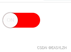
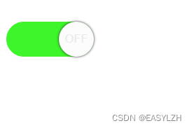
关 开


 扫一扫
扫一扫


 6188
6188

 被折叠的 条评论
为什么被折叠?
被折叠的 条评论
为什么被折叠?
 到【灌水乐园】发言


