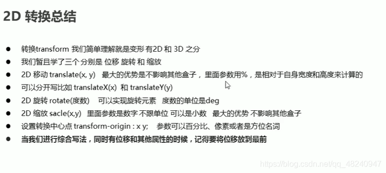
transform: translate让盒子水平垂直居中
<style>
div {
position: relative;
width: 500px;
height: 500px;
background-color: pink;
}
p {
position: absolute;
top: 50%;
left: 50%;
width: 200px;
height: 200px;
background-color: purple;
transform: translate(-50%, -50%);
}
</style>
</head>
<body>
<div>
<p></p>
</div>
</body>
transform: rotate(360deg);旋转
<style>
img {
width: 150px;
border: 5px solid pink;
border-radius: 50%;
transition: all 2s;
}
img:hover {
transform: rotate(360deg);
}
</style>
</head>
<body>
<img src="media/pic.jpg" alt="">
</body>
三角制作
     div {
            position: relative;
            width: 249px;
            height: 35px;
            border: 1px solid #000;
        }

        div::after {
            position: absolute;
            content: "";
            top: 10px;
            right: 15px;
            width: 10px;
            height: 10px;
            border-right: 1px solid #000;
            border-bottom: 1px solid #000;
            transform: rotate(45deg);
            transition: all 0.2s;
        }

        /*鼠标经过盒子,里面的三角旋转*/
        div:hover::after {
            transform: rotate(225deg);
        }
    </style>
</head>

<body>
    <div></div>
</body>

</html>
转换中心点
<style>
div {
width: 200px;
height: 200px;
background-color: pink;
margin: 100px auto;
transition: all 1s;
transform-origin: 50px 50px;
}
div:hover {
transform: rotate(360deg);
}
</style>
</head>
<body>
<div></div>
</body>
transform: scale(x,y);图片缩放
<style>
div {
width: 200px;
height: 200px;
background-color: pink;
margin: 100px auto;
transform-origin: bottom left;
}
div:hover {
transform: scale(2);
}
</style>
</head>
<body>
<div></div>
</body>
</html>


 扫一扫
扫一扫


 1759
1759

 被折叠的 条评论
为什么被折叠?
被折叠的 条评论
为什么被折叠?
 到【灌水乐园】发言


