


 本文详细介绍了Matplotlib库中plot()函数用于绘制折线图的基础用法,包括直接和间接传入数据、常用关键字参数如颜色、线型和标记的设定,以及折线图的实用命令,如堆积折线图、折线图间填充等。此外,还探讨了如何处理多坐标轴的情况,展示了如何通过twinx()创建双Y轴坐标系统,确保不同量级数据在同一图表上的清晰展示。
目录
一、简要谈谈折线图
折线图是图表中最为基础的一种,主要展示时间序列的变化情况,能够使读者了然数据的大小、升降、正负关系,还能展示各种折线数据的相对关系,但对整体——局部的表现力较差,参与有地图的绘制也比较困难。
matplotlib提供了丰富的关键字指令用以美化、修饰图表。下面就让我们来一睹plot绘图函数的风采吧!
二、plot( )绘图函数的基础操作
使用过excel的小伙伴应该能理解折线图的绘制原理,其本质是针对横轴和纵轴坐标点的链接,实际上这些点和scatter命令是一致的,只是plot命令能够使其连接成线。
不管你在前面是否划分了子图,plt.plot()都是可以使用的,进一步的,库包提供了ax.plot()在子图内部调用。
plot()命令是在内部传入x轴、y轴数据,两者的数据不能长度不一,然后电脑自动在笛卡尔坐标系中按顺序连接这些点。
1、横纵轴数据直接的传入
import numpy as np
import matplotlib.pyplot as plt
fig=plt.figure(figsize=(4,4),dpi=500)#添加画布
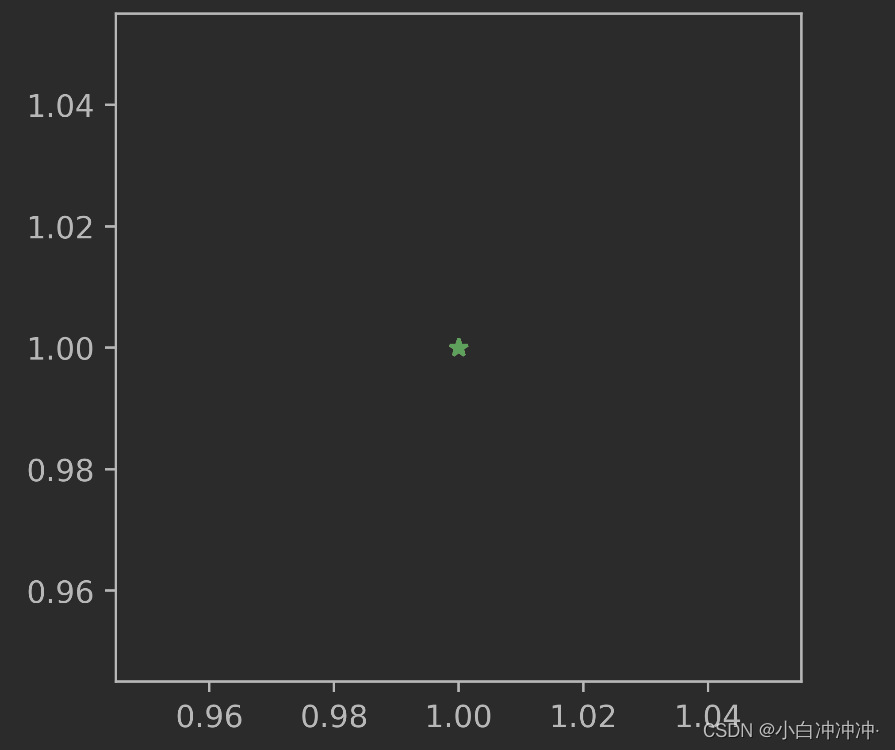
plt.plot([1],[1],marker='*')#列表单独一个点
plt.plot(1,1,marker='*')#数值单独一个点
plt.plot((1),(1),marker='*')#元组单独一个点
plt.show()
 可以看出,
可以看出,列表、元组、数值都可以直接传入plot并成功绘制,原则上是没有问题的。
这种传入方式只能用来做实验讲明原理,在上手实际数据时完全受到限制。
2、横纵轴数据间接的传入
这种数据传入方式才是实用的,通过一个参数符号,连接plot与外部数据:
import numpy as np
import matplotlib.pyplot as plt
fig=plt.figure(figsize=(3,3),dpi=500)#添加画布
x=[1,2,3,4,5]
y=[1,2,3,4,5]
plt.plot(x,y)
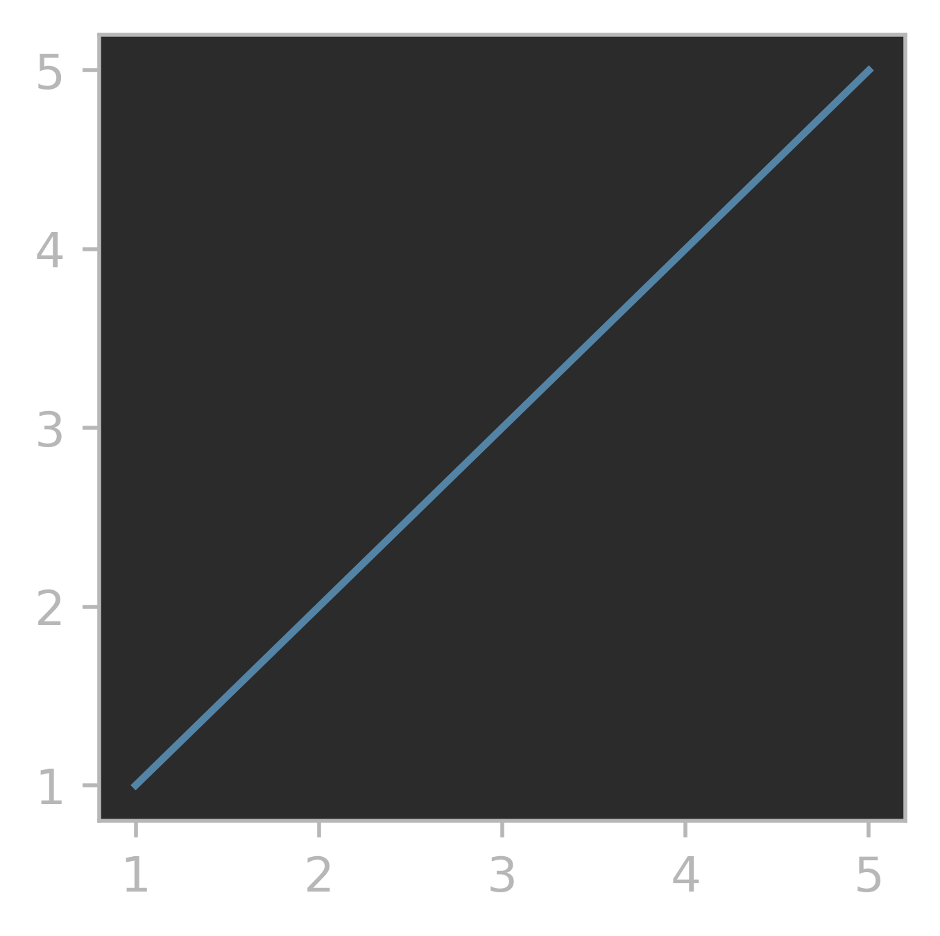
通过参数x和y,我们实现了内外数据的连接。当然,在这种方式下,元组数据也能传入并正常绘图。
3、横轴纵轴数据必须长度一致
x、y在传入时,长度必须一致,否则报错。
import numpy as np
import matplotlib.pyplot as plt
fig=plt.figure(figsize=(3,3),dpi=500)#添加画布
x=[1,2,3,4,5]
y=[1,2,3,4]
plt.plot(x,y)
ValueError: x and y must have same first dimension, but have shapes (5,) and (4,)
三、plot( )函数的常用关键字参数
接下来,就是plot函数的最重要部分了——关键字参数。关键字参数相当于战士的武器、巫师的拐杖、道士的法宝,没有关键字参与,plot()函数和咸鱼没什么区别。
plot( )函数常用关键字参数
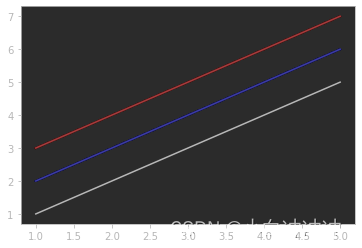
x y:x,y即最为关键的数据部分,请注意顺序。color或c:指定折线的颜色
x=[1,2,3,4,5]
y1=[1,2,3,4,5]
y2=[2,3,4,5,6]
y3=[3,4,5,6,7]
plt.plot(x,y1,color='k')
plt.plot(x,y2,color='b')
plt.plot(x,y3,color='r')
| character | color |
|---|---|
'b' | blue 蓝 |
'g' | green 绿 |
'r' | red 红 |
'c' | cyan 蓝绿 |
'm' | magenta 洋红 |
'y' | yellow 黄 |
'k' | black 黑 |
'w' | white 白 |
linestyle或ls:指定折线的样式
x=[1,2,3,4,5]
y1=[1,2,3,4,5]
y2=[2,3,4,5,6]
y3=[3,4,5,6,7]
plt.plot(x,y1,linestyle=':')
plt.plot(x,y2,linestyle='--')
plt.plot(x,y3,linestyle='-.')
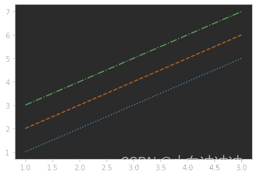
| character | description |
|---|---|
'-' | solid line style 实线 |
'--' | dashed line style 虚线 |
'-.' | dash-dot line style 点画线 |
':' | dotted line style 点线 |
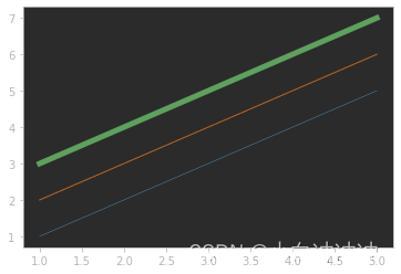
linewidth或lw:指定折线宽度
x=[1,2,3,4,5]
y1=[1,2,3,4,5]
y2=[2,3,4,5,6]
y3=[3,4,5,6,7]
plt.plot(x,y1,linewidth=0.5)
plt.plot(x,y2,linewidth=1)
plt.plot(x,y3,linewidth=5)
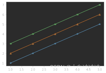
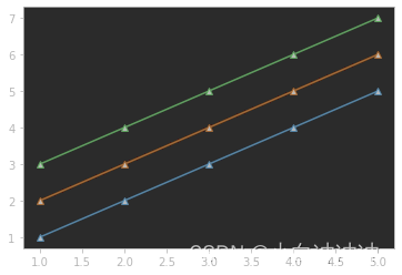
marker:指定折线图的标记样式
x=[1,2,3,4,5]
y1=[1,2,3,4,5]
y2=[2,3,4,5,6]
y3=[3,4,5,6,7]
plt.plot(x,y1,marker='*')
plt.plot(x,y2,marker='^')
plt.plot(x,y3,marker='$10$')
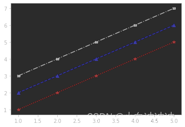
fmt:混合命令,同时指定线条颜色和样式
plt.plot(x,y1,'r:',
         marker='*')
plt.plot(x,y2,'b--',
         marker='^')
plt.plot(x,y3,'k-.',
         marker='$10$')
#注意,plot(x,y,fmt='r:')
#这种方式是错的,不要带上fmt=
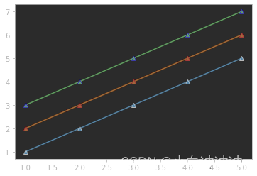
markeredgecolor:指定标记的边缘颜色
plt.plot(x,y1,marker='^',
         markeredgecolor='k')
plt.plot(x,y2,marker='^',
         markeredgecolor='r')
plt.plot(x,y3,marker='^',
         markeredgecolor='b')
markerfacecolor:指定标记内部填充颜色
plt.plot(x,y1,marker='^',
         markerfacecolor='k')
plt.plot(x,y2,marker='^',
         markerfacecolor='k')
plt.plot(x,y3,marker='^',
         markerfacecolor='k')
markeredgewidth:指定标记边缘宽度
plt.plot(x,y1,marker='^',
         markerfacecolor='none',
         markeredgewidth=0.5)
plt.plot(x,y2,marker='^',
         markerfacecolor='none',
         markeredgewidth=1)
plt.plot(x,y3,marker='^',
         markerfacecolor='none',
         markeredgewidth=5)
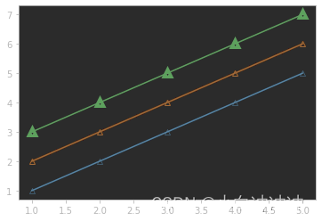
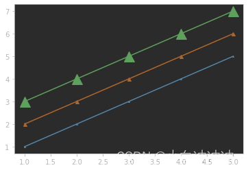
markersize:指定标记直径大小
plt.plot(x,y1,marker='^',
         markersize=2)
plt.plot(x,y2,marker='^',
         markersize=5)
plt.plot(x,y3,marker='^',
         markersize=15)
fillstyle:指定标记内部的填充方式
plt.plot(x,y1,marker='o',
         markersize=10,
        fillstyle='none')
plt.plot(x,y2,marker='o',
         markersize=10,
        fillstyle='top')
plt.plot(x,y3,marker='^',
         markersize=10,
        fillstyle='left')

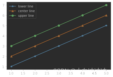
label:指定折线的图例名称
plt.plot(x,y1,marker='*',
        label='lower line')
plt.plot(x,y2,marker='^',
        label='center line')
plt.plot(x,y3,marker='o',
        label='upper line')
plt.legend()
zorder:指定绘图层次(高层次会盖住低层次)
x=[1,2,3,4,5]
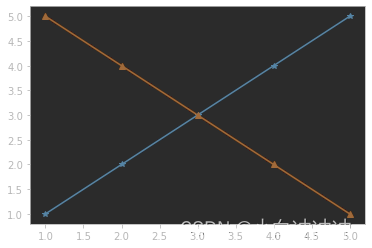
y1=[1,2,3,4,5]
y2=[5,4,3,2,1]
y3=[2,3,2,3,2]
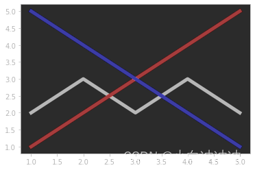
plt.plot(x,y1,c='r',lw=5,zorder=1)
plt.plot(x,y2,c='b',lw=5,zorder=5)
plt.plot(x,y3,c='k',lw=5,zorder=0)
- visible:是否显示该线条(True or False)
plt.plot(x,y1,marker='*')
plt.plot(x,y2,marker='^')
plt.plot(x,y3,marker='$10$',
         visible=False)
#第三根线条不显示
四、折线图实用命令
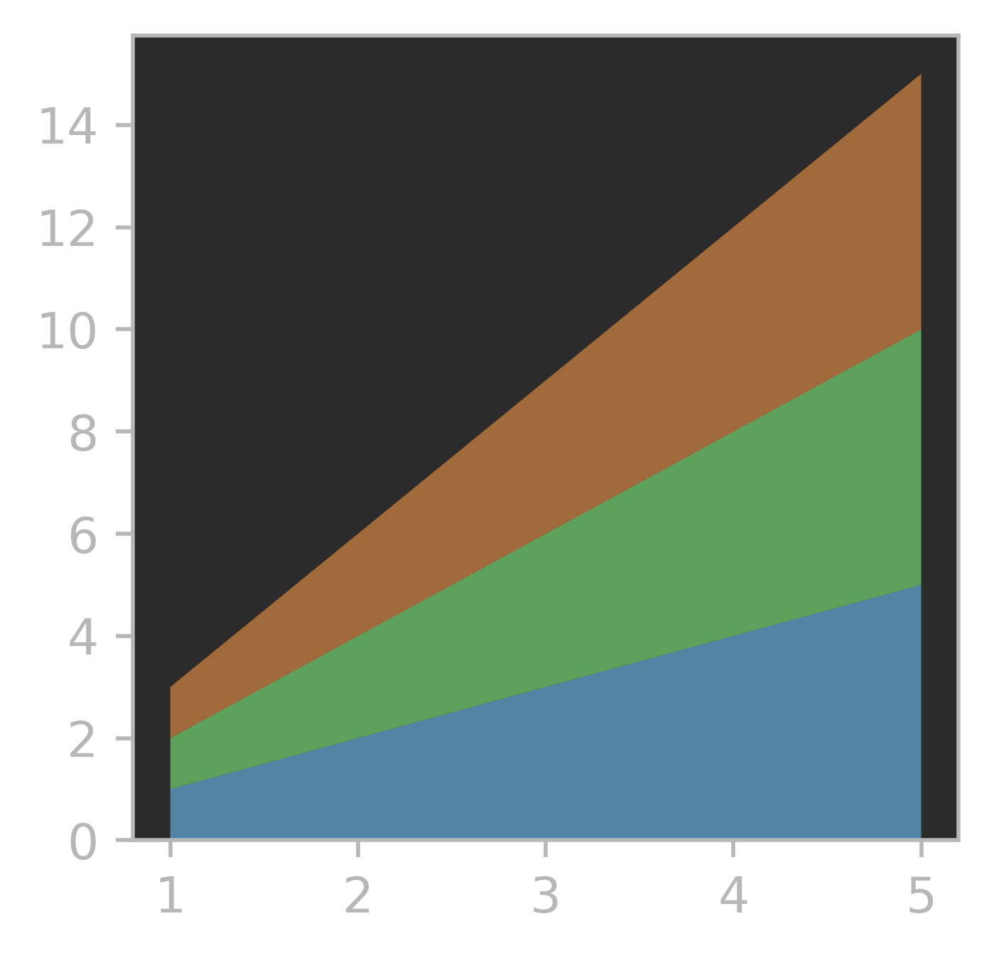
1、堆积折线图
严格来说这个函数不属于plot( ),但是为了方便,也放在这里讲,堆积折线图可以实现不同折线之间的填色样式,该图主要依赖stackplot( )命令。
import matplotlib.pyplot as plt
fig=plt.figure(figsize=(3,3),dpi=500)#添加画布
x=[1,2,3,4,5]
y1=[1,2,3,4,5]
y2=[1,2,3,4,5]
y3=[1,2,3,4,5]
colors=['tab:blue','tab:green','tab:orange']#指定填充颜色,从低到高
plt.stackplot(x,y1,y2,y3,colors=colors)
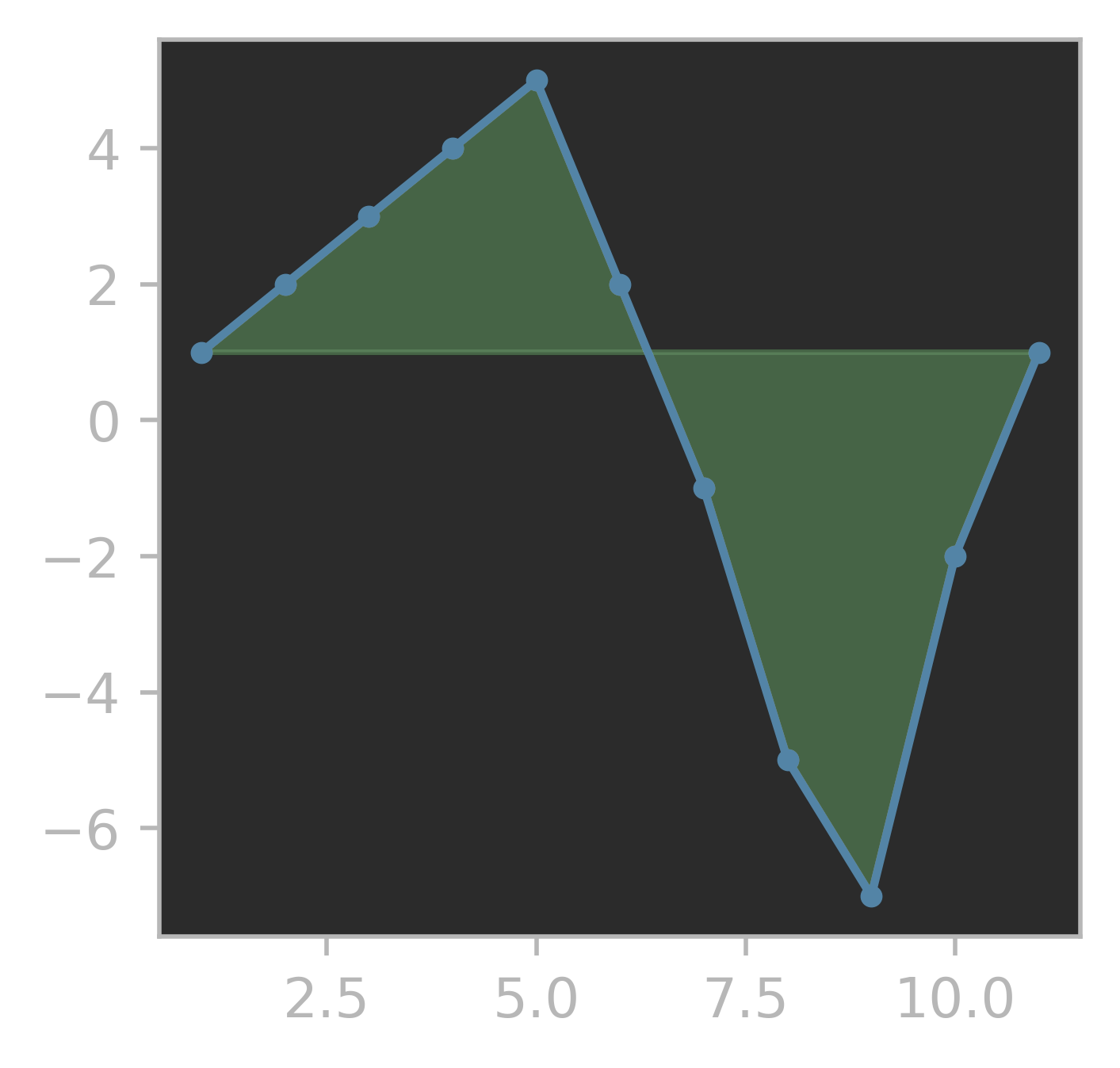
2、折线图与坐标轴之间进行填色
这也是一种常规的折线数值比较方式,通过plt.fill( )命令绘制:
import numpy as np
import matplotlib.pyplot as plt
fig=plt.figure(figsize=(3,3),dpi=500)
x=[1,2,3,4,5,6,7,8,9,10,11]
y=[1,2,3,4,5,2,-1,-5,-7,-2,1]
plt.plot(x,y,c='tab:blue',marker='o',markersize=3)
plt.fill(x,y,color='tab:green',alpha=0.5)
3、使用fill_between( )命令完成 2 类型填充
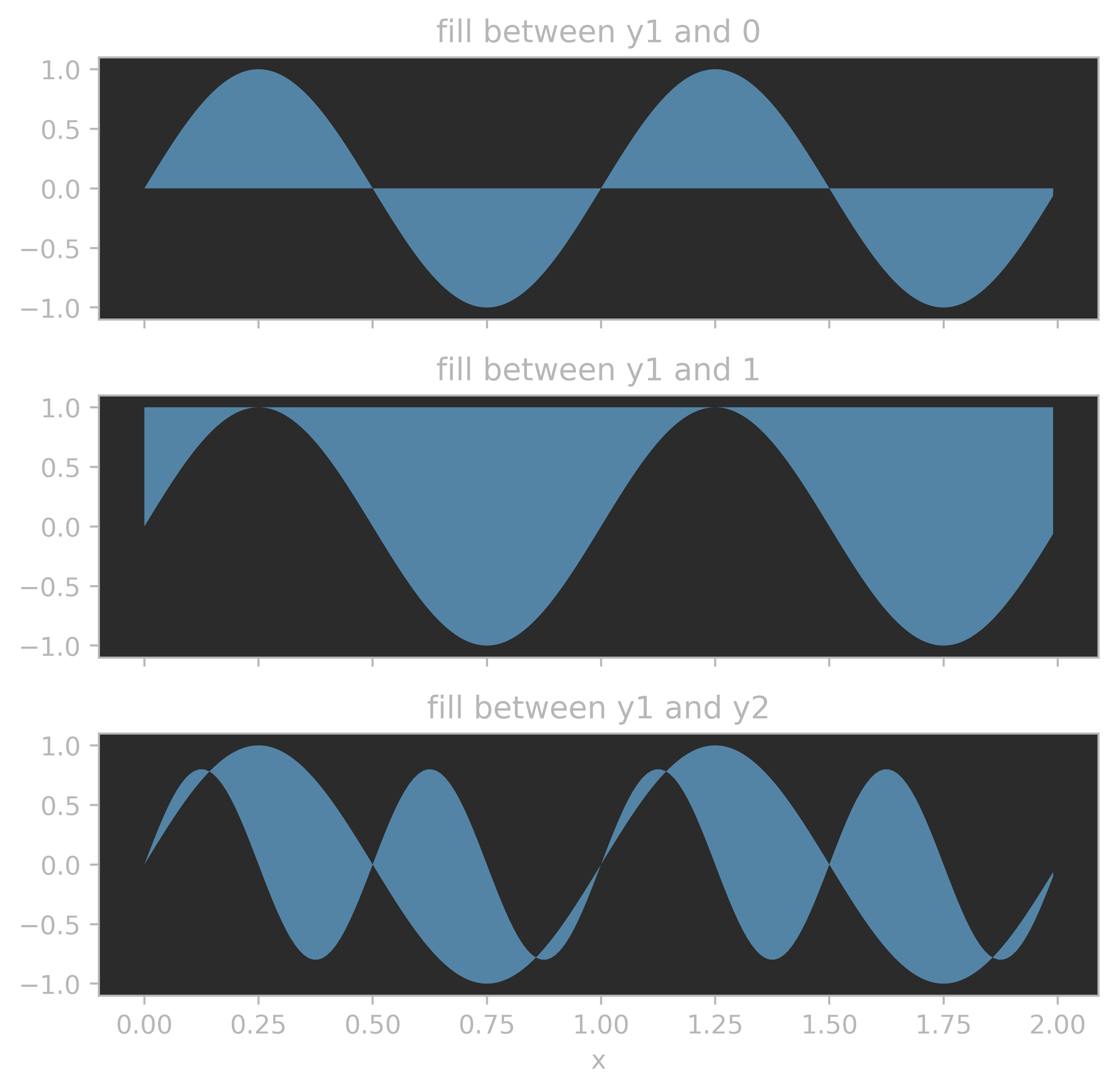
fill_between( )表示填充传递进去的的列表相夹的部分,比如下面子图1,仅传入(x,y1)那么就会将x与y1的相夹部分填充;子图2,传入(x,y1,1),多了一个限定值1,那么就会绘制y1与x=1相夹部分;子图3,传入(x,y1,y2),就会绘制y1与y2相夹部分。
import numpy as np
import matplotlib.pyplot as plt
import pandas as pd
x = np.arange(0.0, 2, 0.01)
y1 = np.sin(2 * np.pi * x)
y2 = 0.8 * np.sin(4 * np.pi * x)

fig, (ax1, ax2, ax3) = plt.subplots(3, 1, sharex=True, figsize=(6, 6),dpi=500)

ax1.fill_between(x, y1)
ax1.set_title('fill between y1 and 0')

ax2.fill_between(x, y1, 1)
ax2.set_title('fill between y1 and 1')

ax3.fill_between(x, y1, y2)
ax3.set_title('fill between y1 and y2')
ax3.set_xlabel('x')
fig.tight_layout()
plt.show()
4、折线图之间分类填色
某些时候,需要比较两根折线的相对大小,或者比较其大小的差值,可以使用在折线图之间填色的方法,该方法仍然用到4中的fill_between( )函数。
import numpy as np
import matplotlib.pyplot as plt
fig=plt.figure(figsize=(3,3),dpi=500)
ax=fig.add_axes([0,0,1,1])
x=np.array([1,2,3,4,5,6,7,8,9,10,11])
y1=np.array([1,2,3,4,5,2,-1,-5,-7,-2,1])
y2=np.array([3,4,5,3,1,-1,-4,-6,-3,2,1])
ax.plot(x,y1,ls=':',c='k',marker='o',fillstyle='none')
ax.plot(x,y2,ls='-.',c='k')
ax.fill_between(x,y1,y2,where=(y1>y2),interpolate=True,
               facecolor='tab:orange',alpha=0.8)
ax.fill_between(x,y1,y2,where=(y2>y1),interpolate=True,
               facecolor='tab:blue',alpha=0.8)
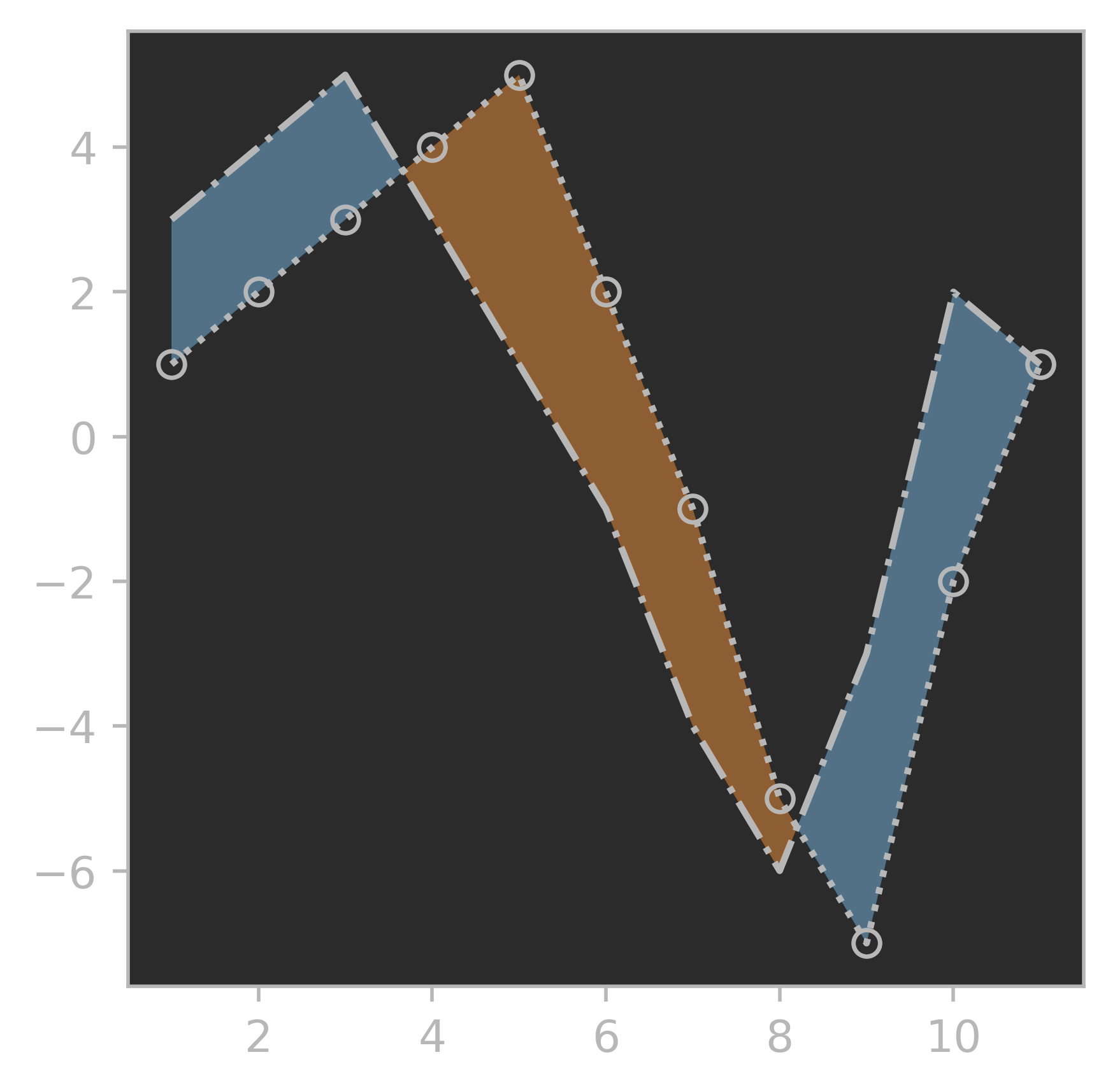
在fill_between( )中多了一个where命令,判定填充条件。
5、interpolate=True 或者False
这个参数是干什么的呢?官网给出了解释:
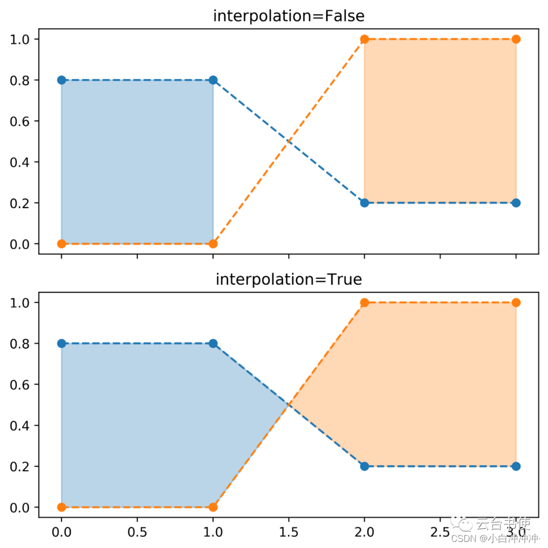
以上图为例,蓝线和橙线在x=1.5这个地方是有交点,如果不开启interpolate,则填色时默认不填充这个交叉区域。一般来说,建议将其设置为True。
五、折线图的多坐标轴
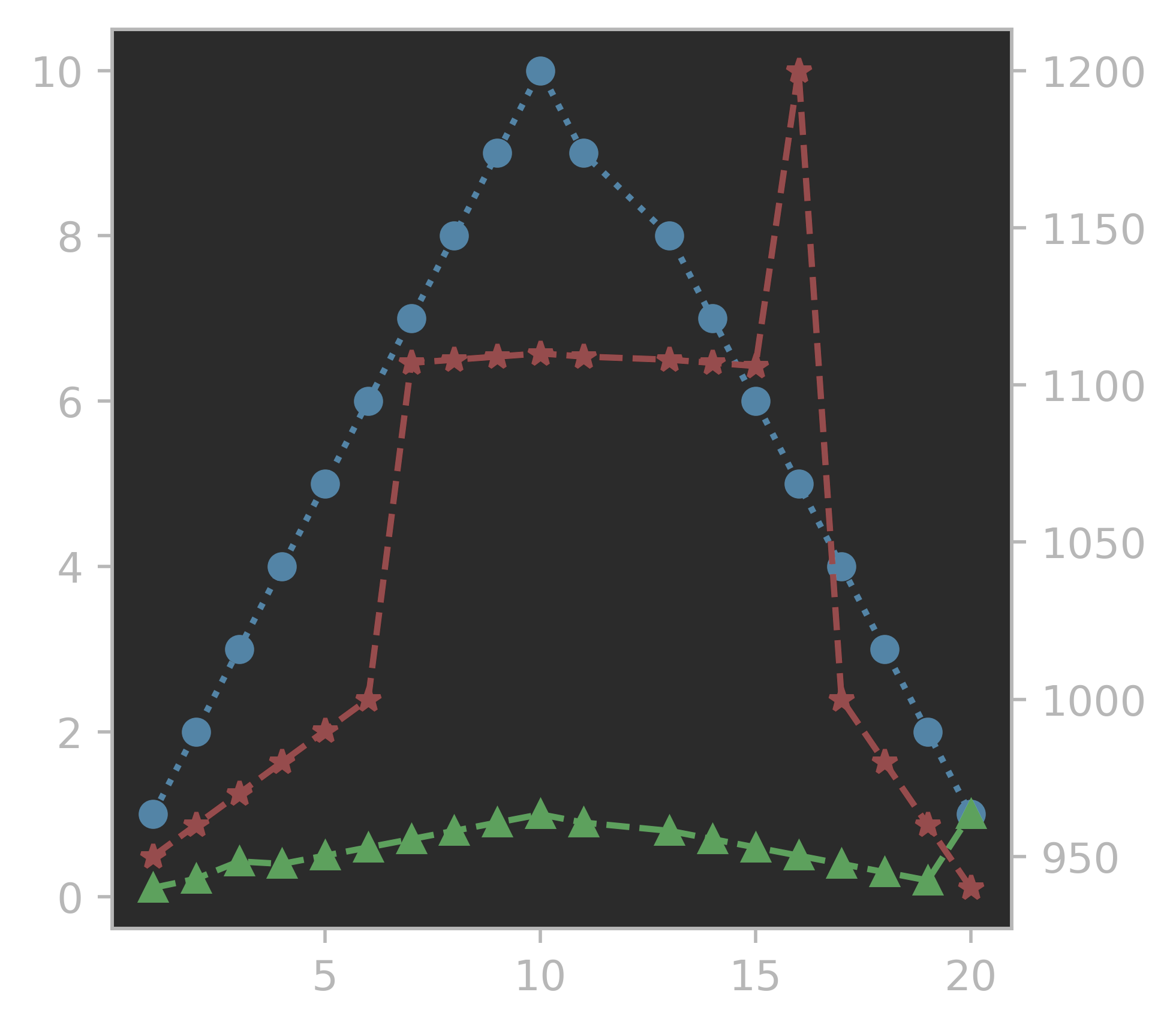
在进行科研分析时,时常遇到两个值的量级相差悬殊,如果直接在一张表上绘制,量级小的值将会被压缩,失去图示意义,在这个时候,一般引入多坐标轴解决问题。
以下面三个值为例,他们之间相差2-3个量级。
fig=plt.figure(figsize=(3,3),dpi=500)
ax=fig.add_axes([0,0,1,1])
x=np.array([1,2,3,4,5,6,7,8,9,10,11,13,14,15,16,17,18,19,20])
y1=np.array([1,2,3,4,5,6,7,8,9,10,9,8,7,6,5,4,3,2,1])
y2=np.array([950,960,970,980,990,1000,1107,1108,1109,
             1110,1109,1108,1107,1106,1200,1000,980,960,940])
y3=np.array([0.11,0.22,0.43,0.4,0.5,0.6,0.7,0.8,0.9,1.0,0.9,
             0.8,0.7,0.6,0.5,0.4,0.3,0.2,1])
ax.plot(x,y1,ls=':')
ax.plot(x,y2,ls='-.')
ax.plot(x,y3,ls='--')
如果直接在同一张子图的同一个y坐标轴进行绘图,那么就会出现下面这种情况:
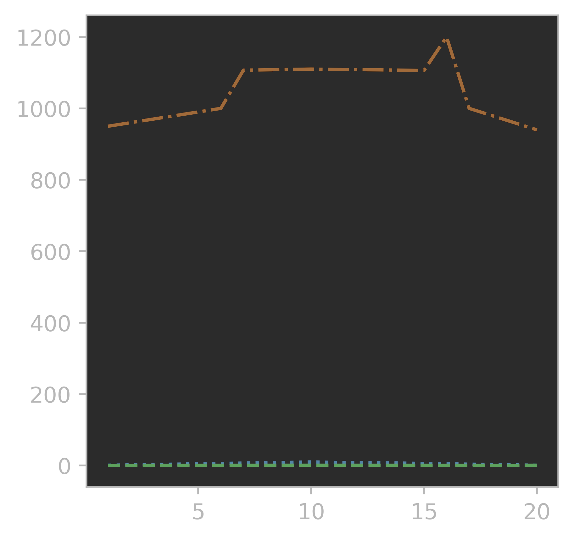
除了橙线量级较大勉强能看出发展形势,另外两个量级小的被压在地平线上了。这时,就需要引入第二个坐标轴给量值差异最大的橙线,以将另外两根线从地板解放出来。
fig=plt.figure(figsize=(3,3),dpi=500)
ax=fig.add_axes([0,0,1,1])
ax.plot(x,y1,c='tab:blue',ls=':',marker='o')
ax.plot(x,y3,c='tab:green',ls='--',marker='^')
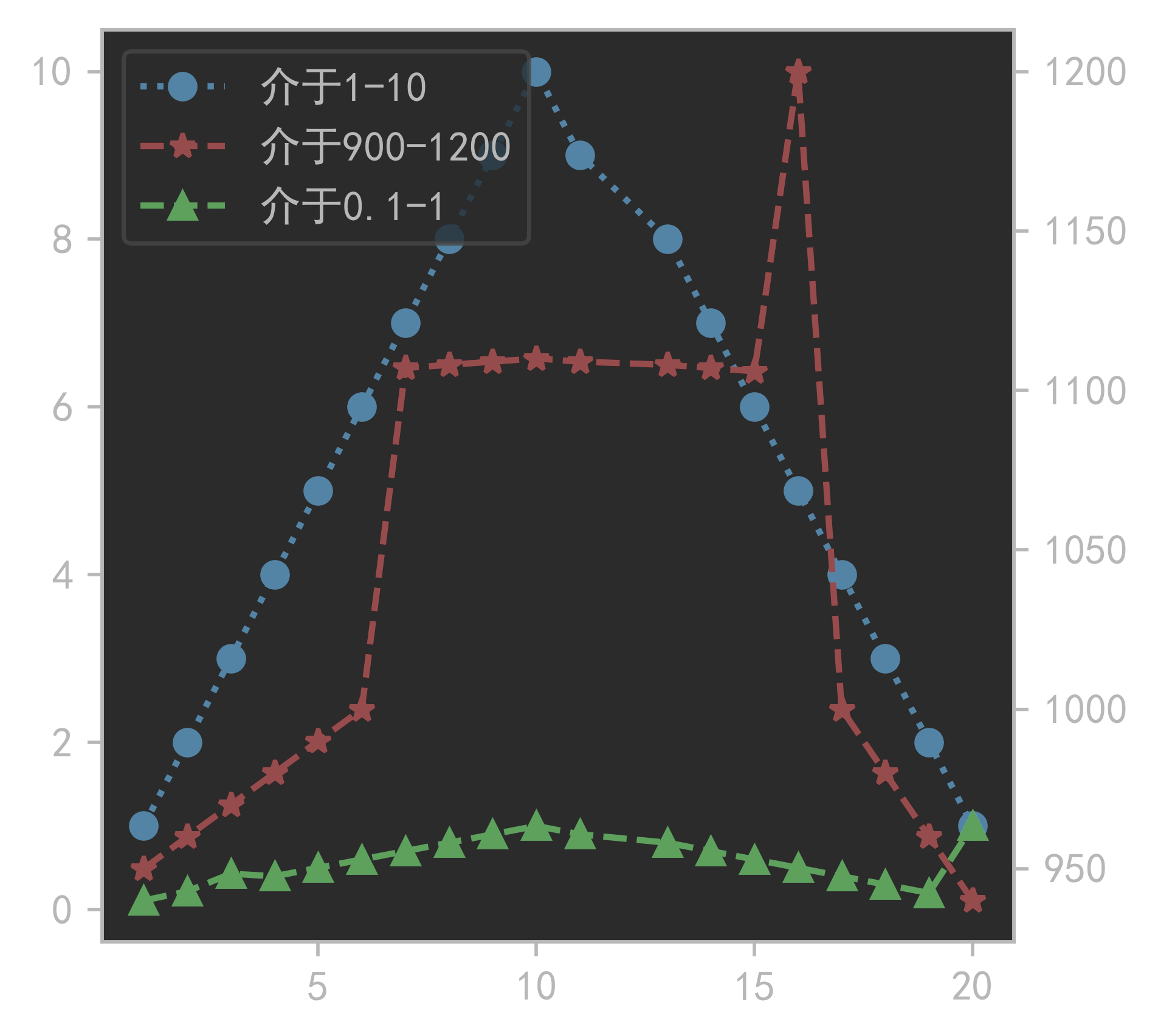
ax2=ax.twinx()
ax2.plot(x,y2,c='tab:red',ls='--',marker='*')
这时,三根线都能在图上比较正常的显示出来了,我们可以添加一个图例,来分清楚哪根线用哪边的y轴:
plt.rcParams['font.sans-serif'] =["SimHei"]#解决中文乱码问题
fig=plt.figure(figsize=(3,3),dpi=500)
ax=fig.add_axes([0,0,1,1])
line1,=ax.plot(x,y1,c='tab:blue',ls=':',marker='o')
line3,=ax.plot(x,y3,c='tab:green',ls='--',marker='^')
ax2=ax.twinx()
line2,=ax2.plot(x,y2,c='tab:red',ls='--',marker='*')
ax.legend([line1,line2,line3],['介于1-10','介于900-1200','介于0.1-1'],loc='upper left')
当然,如果需要更多的坐标轴,就需要参考官网的例子了(这仅是其中一种方法,更多的方式可以参考下面的官网实例链接):
from mpl_toolkits.axes_grid1 import host_subplot
import mpl_toolkits.axisartist as AA
fig=plt.figure(figsize=(3,3),dpi=500)
host = host_subplot(111, axes_class=AA.Axes)
plt.subplots_adjust(right=0.75)

par1 = host.twinx()
par2 = host.twinx()

offset = 60
new_fixed_axis = par2.get_grid_helper().new_fixed_axis
par2.axis["right"] = new_fixed_axis(loc="right",
                                    axes=par2,
                                    offset=(offset, 0))

par1.axis["right"].toggle(all=True)
par2.axis["right"].toggle(all=True)

host.set_xlim(0, 2)
host.set_ylim(0, 2)

host.set_xlabel("Distance")
host.set_ylabel("Density")
par1.set_ylabel("Temperature")
par2.set_ylabel("Velocity")

p1, = host.plot([0, 1, 2], [0, 1, 2], label="Density")
p2, = par1.plot([0, 1, 2], [0, 3, 2], label="Temperature")
p3, = par2.plot([0, 1, 2], [50, 30, 15], label="Velocity")

par1.set_ylim(0, 4)
par2.set_ylim(1, 65)

host.legend()

host.axis["left"].label.set_color(p1.get_color())
par1.axis["right"].label.set_color(p2.get_color())
par2.axis["right"].label.set_color(p3.get_color())
plt.show()
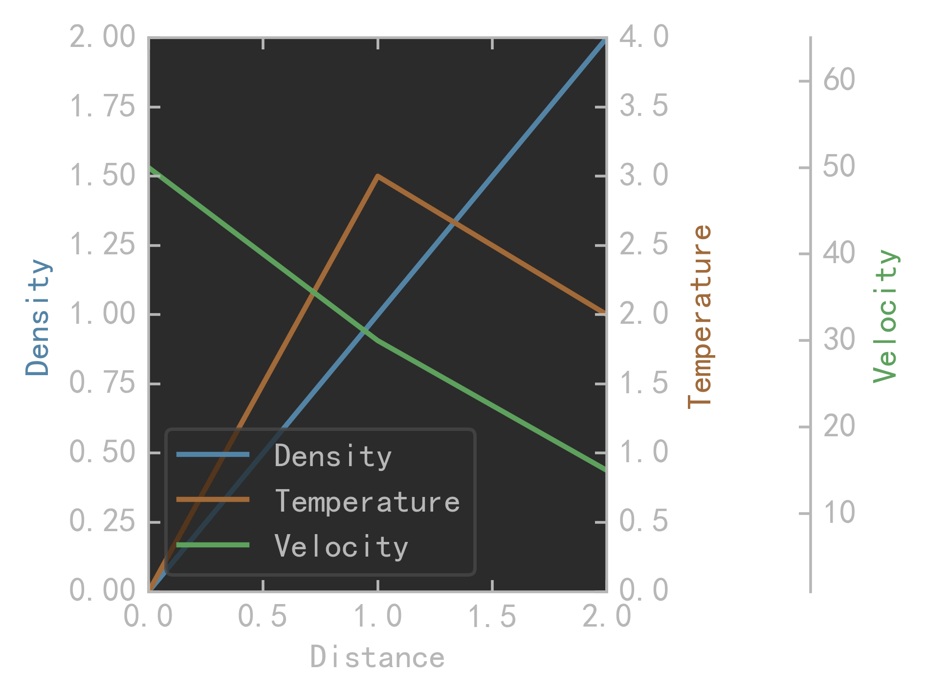
建议是共享坐标轴不要超过4根,再多的话就看不清楚图了。
参考链接:云台书使


 被折叠的 条评论
为什么被折叠?
被折叠的 条评论
为什么被折叠?
 到【灌水乐园】发言


