


分组+条形图
#所有的数据以及代码已经放到“我的资源”里面了
import pandas as pd
import numpy as np
import matplotlib.pyplot as plt
df = pd.read_csv("sales4.csv",encoding = "GBK")
Step1:分组
df_group = df.groupby("产品")['第1季度','第2季度','第3季度','第4季度'].agg(np.sum)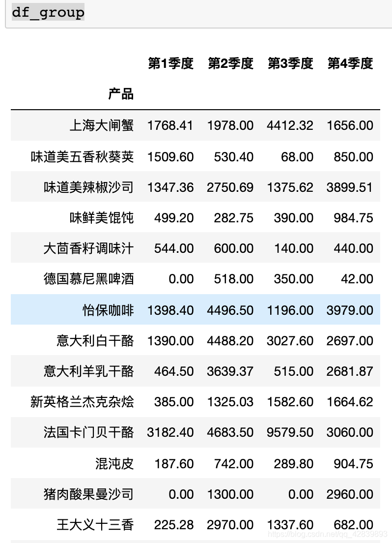
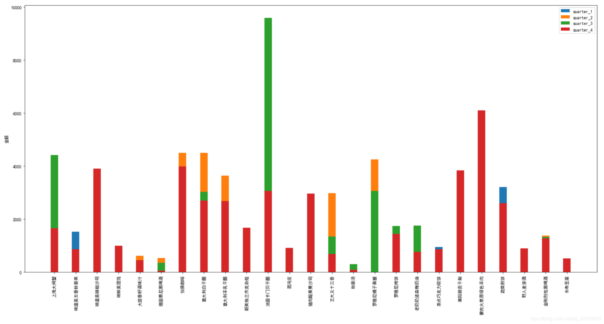
step2:画条形图
import matplotlib
import matplotlib.pyplot as plt
import numpy as np

plt.rcParams['figure.figsize'] = (19, 9)
labels = list(df_group.index)
quarter_1 = list(df_group['第1季度'].values)
quarter_2 = list(df_group['第2季度'].values)
quarter_3 = list(df_group['第3季度'].values)
quarter_4 = list(df_group['第4季度'].values)

women_means = [25, 32, 34, 20, 25]

x = np.arange(len(labels))  # the label locations
width = 0.35  # the width of the bars

fig, ax = plt.subplots()
rects1 = ax.bar(x, quarter_1, width, label='quarter_1')
rects2 = ax.bar(x, quarter_2, width, label='quarter_2')
rects3 = ax.bar(x, quarter_3, width, label='quarter_3')
rects4 = ax.bar(x, quarter_4, width, label='quarter_4')

# Add some text for labels, title and custom x-axis tick labels, etc.
ax.set_ylabel('金额')
# ax.set_title('Scores by group and gender')
ax.set_xticks(x)
ax.set_xticklabels(labels)
ax.legend()

# ax.bar_label(rects1, padding=3)
# ax.bar_label(rects2, padding=3)

fig.tight_layout()
plt.xticks(rotation=90) # 旋转90度

plt.show()


 被折叠的 条评论
为什么被折叠?
被折叠的 条评论
为什么被折叠?
 到【灌水乐园】发言


