


父元素属性之 justify-content
justify-content:设置主轴上子元素的排列方式
justify-content 的属性值如下:
| 属性值 | 含义 |
|---|---|
| flex-start | 从主轴的头部开始排,主轴:x轴 左对齐;y轴 顶部对齐(默 认值) |
| flex-end | 从主轴的尾部开始排,主轴:x轴 右对齐;y轴 底部对齐 |
| center | 在主轴上居中对齐 |
| space-around | 平分主轴上的剩余空间 |
| space-between | 先占据主轴的两边,再平分剩余的空间 |
下面用具体实列来解释这几个属性值
主轴是x轴的情况下:
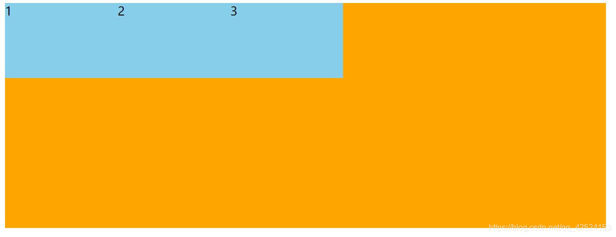
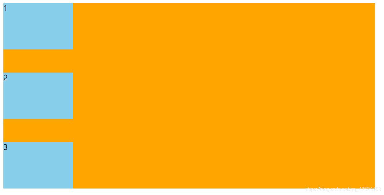
flex-start:
<div>
	<span>1</span>
	<span>2</span>
	<span>3</span>
</div>

<style type="text/css">
			div{
				display: flex;
				width: 800px;
				height: 300px;
				background-color: orange;
				justify-content: flex-start;
			}
			div span{
				width: 150px;
				height: 100px;
				background: skyblue;
			}
		</style>
运行结果:主轴是x轴,这种情况下子元素在主轴上表现为左对齐(默认值,可不写)
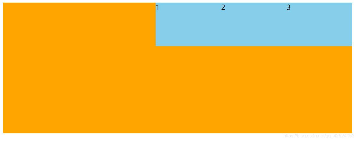
flex-end:
<div>
	<span>1</span>
	<span>2</span>
	<span>3</span>
</div>

<style type="text/css">
			div{
				display: flex;
				width: 800px;
				height: 300px;
				background-color: orange;
				justify-content: flex-end;
			}
			div span{
				width: 150px;
				height: 100px;
				background: skyblue;
			}
		</style>
运行结果:主轴是x轴,这种情况下子元素在主轴上表现为右对齐
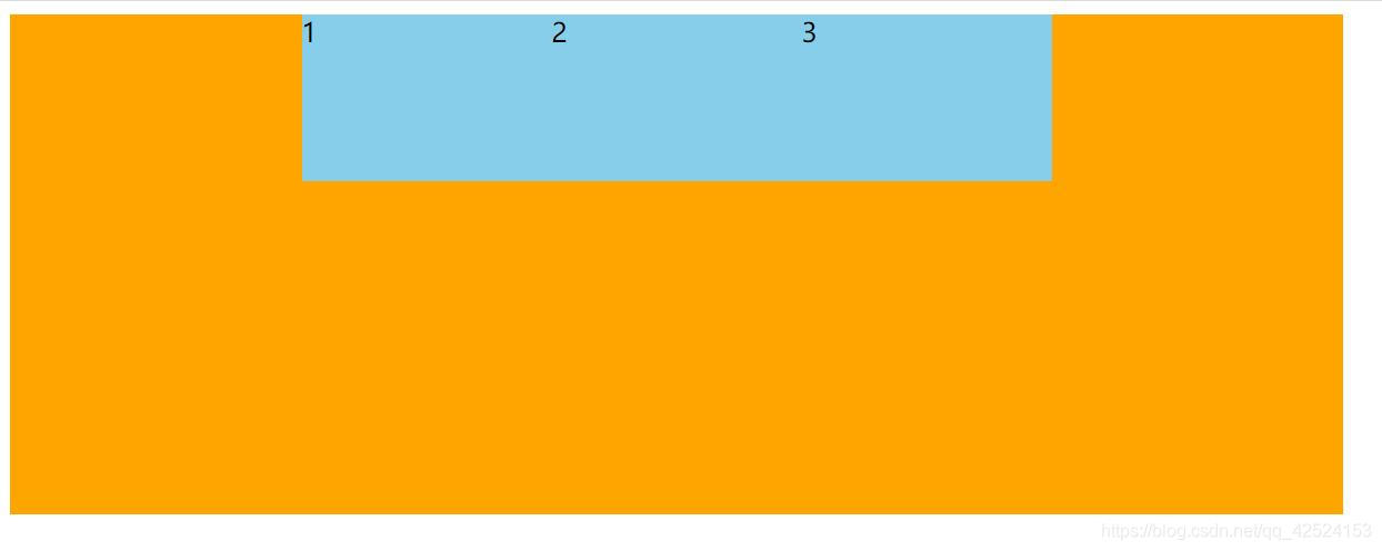
center:
<div>
	<span>1</span>
	<span>2</span>
	<span>3</span>
</div>

<style type="text/css">
			div{
				display: flex;
				width: 800px;
				height: 300px;
				background-color: orange;
				justify-content: center;
			}
			div span{
				width: 150px;
				height: 100px;
				background: skyblue;
			}
		</style>
运行结果:主轴是x轴,这种情况下子元素在主轴上表现为居中对齐
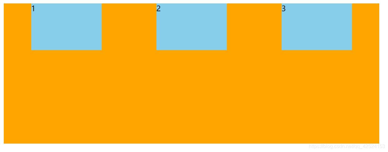
space-around:
<div>
	<span>1</span>
	<span>2</span>
	<span>3</span>
</div>

<style type="text/css">
			div{
				display: flex;
				width: 800px;
				height: 300px;
				background-color: orange;
				justify-content: space-around;
			}
			div span{
				width: 150px;
				height: 100px;
				background: skyblue;
			}
		</style>
运行结果:主轴是x轴,这种情况下子元素在主轴上平均分配了主轴剩余的空间,即每个子元素都分配了相同的外边距(左右)
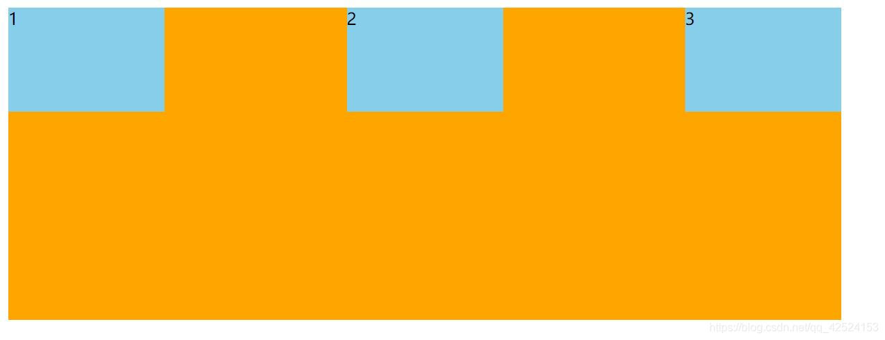
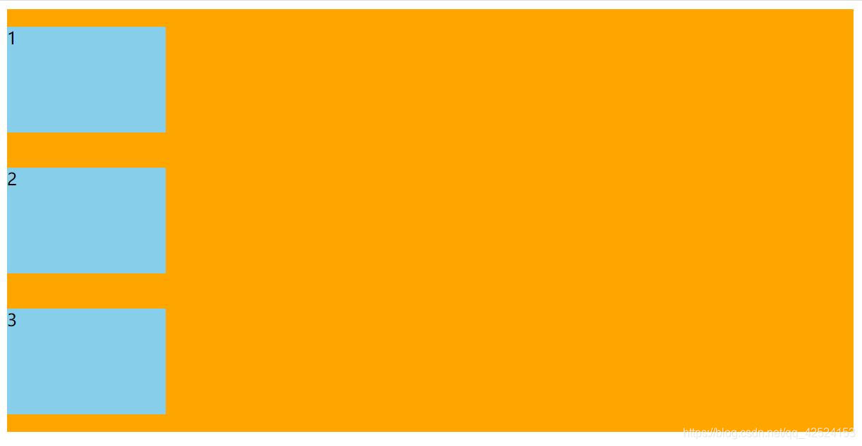
space-between:
<div>
	<span>1</span>
	<span>2</span>
	<span>3</span>
</div>

<style type="text/css">
			div{
				display: flex;
				width: 800px;
				height: 300px;
				background-color: orange;
				justify-content: space-between;
			}
			div span{
				width: 150px;
				height: 100px;
				background: skyblue;
			}
		</style>
运行结果:主轴是x轴,这种情况下子元素首先贴住主轴(父元素)的两边,再平分主轴剩余空间
现在分析主轴是y轴的情况:
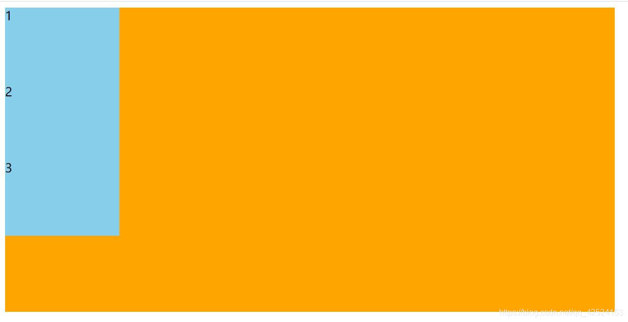
flex-start:
<div>
	<span>1</span>
	<span>2</span>
	<span>3</span>
</div>

<style type="text/css">
			div{
				display: flex;
				width: 800px;
				height: 400px;
				background-color: orange;
				flex-direction: column;	/*将主轴设为y轴*/
				justify-content: flex-start;
			}
			div span{
				width: 150px;
				height: 100px;
				background: skyblue;
			}
		</style>
运行结果:主轴是y轴,这种情况下子元素在主轴上表现为顶部对齐(默认值,可不写)
flex-end:
<div>
	<span>1</span>
	<span>2</span>
	<span>3</span>
</div>

<style type="text/css">
			div{
				display: flex;
				width: 800px;
				height: 400px;
				background-color: orange;
				flex-direction: column;	/*将主轴设为y轴*/
				justify-content: flex-end;
			}
			div span{
				width: 150px;
				height: 100px;
				background: skyblue;
			}
		</style>
运行结果:主轴是y轴,这种情况下子元素在主轴上表现为底部对齐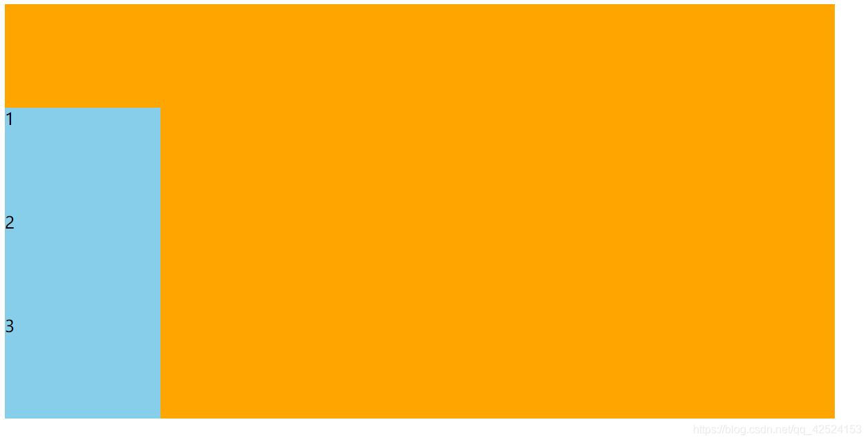
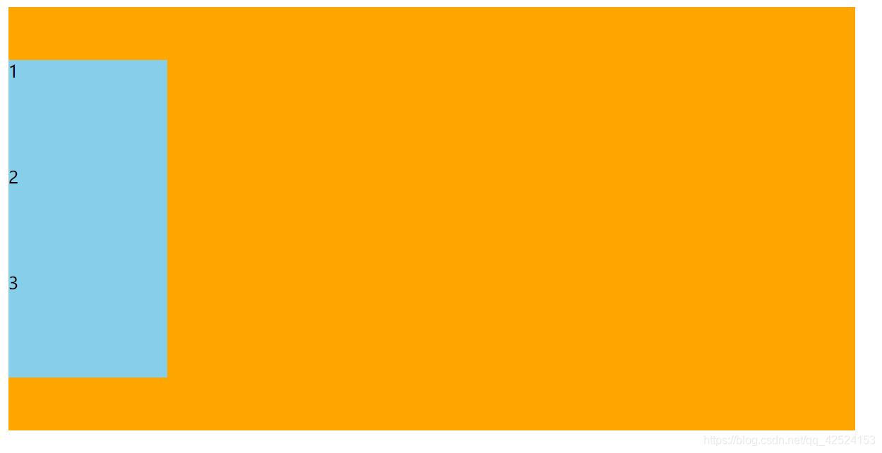
center:
<div>
	<span>1</span>
	<span>2</span>
	<span>3</span>
</div>

<style type="text/css">
			div{
				display: flex;
				width: 800px;
				height: 400px;
				background-color: orange;
				flex-direction: column;	/*将主轴设为y轴*/
				justify-content: center;
			}
			div span{
				width: 150px;
				height: 100px;
				background: skyblue;
			}
		</style>
运行结果:主轴是y轴,这种情况下子元素在主轴上表现为居中对齐
space-around:
<div>
	<span>1</span>
	<span>2</span>
	<span>3</span>
</div>

<style type="text/css">
			div{
				display: flex;
				width: 800px;
				height: 400px;
				background-color: orange;
				flex-direction: column;	/*将主轴设为y轴*/
				justify-content:  space-around;
			}
			div span{
				width: 150px;
				height: 100px;
				background: skyblue;
			}
		</style>
运行结果:主轴是y轴,这种情况下子元素在主轴上平均分配了主轴上剩余的空间,即每个子元素都分配了相同的外边距(上下)
space-between:
<div>
	<span>1</span>
	<span>2</span>
	<span>3</span>
</div>

<style type="text/css">
			div{
				display: flex;
				width: 800px;
				height: 400px;
				background-color: orange;
				flex-direction: column;	/*将主轴设为y轴*/
				justify-content:  space-between;
			}
			div span{
				width: 150px;
				height: 100px;
				background: skyblue;
			}
		</style>
运行结果:主轴是y轴,这种情况下子元素首先贴住主轴(父元素)的两边,再平分主轴剩余空间
注意:justify-content只会改变的是整个子元素在主轴上的排列方式,或左对齐,或右对齐,或顶部对齐,或底部对齐,或居中对齐等等,并不会改变子元素之间的排列顺序。


 扫一扫
扫一扫


 392
392

 被折叠的 条评论
为什么被折叠?
被折叠的 条评论
为什么被折叠?
 到【灌水乐园】发言


