


Python读取csv,并生成图像
# -*- coding: utf-8 -*-

import csv
from datetime import datetime
from matplotlib import pyplot as plt

filename = 'F:\\工作表.csv'
with open(filename) as f:
    reader = csv.reader(f)
    # 读取第一行  表头数据
    header_now = next(reader)
    print(header_now)
    # 读取第二行
    # first_now = next(reader)
    # print(first_now)
    # 读取起始日期
    start_date = datetime(2018, 3, 9)
    end_date = datetime(2018, 5, 5)  # 结束日期
    dates, highs, lows = [], [], []  # 三个列表存放数据
    for row in reader:
        # 将第一列的值格式化为日期
        d = datetime.strptime(row[0], '%Y-%m-%d')
        # datetime.strptime(字符串,fmt)  按照特定时间格式将字符串转换(解析)为时间类型。  datetime.strftime(fmt,时间) 将时间格式化
        if start_date < d < end_date:
            dates.append(d)
            # highs.append(int(row[1])) 错误
            # lows.append(int(row[2]))
            highs.append(int(float(row[1])))
            lows.append(int(float(row[2])))

# 配置图形
fig = plt.figure(dpi=80, figsize=(10, 6))   # dpi 指定图像分辨率,figsize 指定图像的宽和高
plt.rcParams['font.sans-serif'] = ['SimHei']    # 用来正常显示中文标签
plt.rcParams['axes.unicode_minus'] = False           # 解决保存图像是负号'-'显示为方块的问题

# 绘制最高气温的折线
plt.plot(dates, highs, c='red', label='最高',
         alpha=0.5, linewidth=2.0, linestyle='-', marker='v')
# 再绘制一条折线
plt.plot(dates, lows, c='blue', label='最低',
         alpha=0.5, linewidth=3.0, linestyle='-.', marker='o')
# 为两个数据的绘图区域填充颜色
plt.fill_between(dates, highs, lows, facecolor='blue', alpha=0.1)
# 设置标题
plt.title("2018.03-2018.05最高数据和最低数据")
# 为两条坐标轴设置名称
plt.xlabel("日期")
# 该方法绘制斜着的日期标签
fig.autofmt_xdate()
plt.ylabel("单位/万")
# 显示图例
plt.legend()
ax = plt.gca()
# 设置右边坐标轴线的颜色(设置为none表示不显示)
ax.spines['right'].set_color('none')
# 设置顶部坐标轴线的颜色(设置为none表示不显示)
ax.spines['top'].set_color('none')
plt.show()
一开始python 读取csv文件时,提示invalid literal for int() with base 10: '50.8'
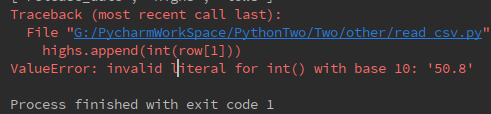
highs.append(int(row[1]))
lows.append(int(row[2]))读取的列中存在小数,然后程序中直接用int进行转换出错。因为使用 int 对一个字符类型的数据进行强制类型转换,要求改字符类型只能为整数,不能为浮点数。
解决办法,先将其由字符串类型转换为浮点型,再进行整型转换.
highs.append(int(float(row[1])))
lows.append(int(float(row[2])))


 被折叠的 条评论
为什么被折叠?
被折叠的 条评论
为什么被折叠?
 到【灌水乐园】发言


