


 本文是DataWhale组队学习Matplotlib的总结,介绍了子图的绘制方法。包括使用plt.subplots绘制均匀状态下的子图,可指定画布大小、共享刻度等;使用GridSpec绘制非均匀子图,能设置比例和实现跨图功能。还提及子图上的常用方法,如绘图、加网格、设置坐标轴等。
本文章是DataWhale组队学习Matplotlib的总结
DataWhale原文地址
import numpy as np
import pandas as pd
import matplotlib.pyplot as plt
plt.rcParams['font.sans-serif'] = ['SimHei']
plt.rcParams['axes.unicode_minus'] = False
一.子图
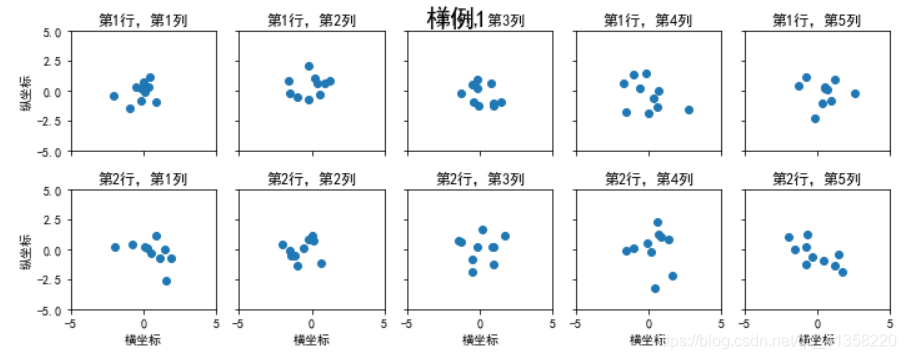
1.使用 plt.subplots 绘制均匀状态下的子图
返回元素分别是画布和子图构成的列表,第一个数字为行,第二个为列
figsize 参数可以指定整个画布的大小
sharex 和 sharey 分别表示是否共享横轴和纵轴刻度
tight_layout 函数可以调整子图的相对大小使字符不会重叠
fig, axs = plt.subplots(2, 5, figsize=(10, 4), sharex=True, sharey=True)
fig.suptitle('样例1', size=20)
for i in range(2):
    for j in range(5):
        axs[i][j].scatter(np.random.randn(10), np.random.randn(10))
        axs[i][j].set_title('第%d行,第%d列'%(i+1,j+1))
        axs[i][j].set_xlim(-5,5)
        axs[i][j].set_ylim(-5,5)
        if i==1: axs[i][j].set_xlabel('横坐标')
        if j==0: axs[i][j].set_ylabel('纵坐标')
fig.tight_layout()
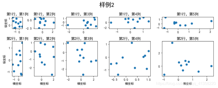
2. 使用 GridSpec 绘制非均匀子图
所谓非均匀包含两层含义,第一是指图的比例大小不同但没有跨行或跨列,第二是指图为跨列或跨行状态
利用 add_gridspec 可以指定相对宽度比例 width_ratios 和相对高度比例参数 height_ratios
fig = plt.figure(figsize=(10, 4))
spec = fig.add_gridspec(nrows=2, ncols=5, width_ratios=[1,2,3,4,5], height_ratios=[1,3])
fig.suptitle('样例2', size=20)
for i in range(2):
    for j in range(5):
        ax = fig.add_subplot(spec[i, j])
        ax.scatter(np.random.randn(10), np.random.randn(10))
        ax.set_title('第%d行,第%d列'%(i+1,j+1))
        if i==1: ax.set_xlabel('横坐标')
        if j==0: ax.set_ylabel('纵坐标')
fig.tight_layout()
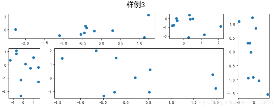
在上面的例子中出现了 spec[i, j] 的用法,事实上通过切片就可以实现子图的合并而达到跨图的功能:
fig = plt.figure(figsize=(10, 4))
spec = fig.add_gridspec(nrows=2, ncols=6, width_ratios=[2,2.5,3,1,1.5,2], height_ratios=[1,2])
fig.suptitle('样例3', size=20)
# sub1
ax = fig.add_subplot(spec[0, :3])
ax.scatter(np.random.randn(10), np.random.randn(10))
# sub2
ax = fig.add_subplot(spec[0, 3:5])
ax.scatter(np.random.randn(10), np.random.randn(10))
# sub3
ax = fig.add_subplot(spec[:, 5])
ax.scatter(np.random.randn(10), np.random.randn(10))
# sub4
ax = fig.add_subplot(spec[1, 0])
ax.scatter(np.random.randn(10), np.random.randn(10))
# sub5
ax = fig.add_subplot(spec[1, 1:5])
ax.scatter(np.random.randn(10), np.random.randn(10))
fig.tight_layout()
二、子图上的方法
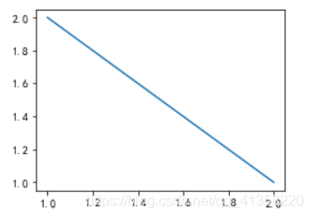
在 ax 对象上定义了和 plt 类似的图形绘制函数,常用的有: plot, hist, scatter, bar, barh, pie
fig, ax = plt.subplots(figsize=(4,3))
ax.plot([1,2],[2,1])
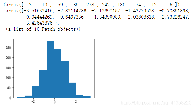
fig, ax = plt.subplots(figsize=(4,3))
ax.hist(np.random.randn(1000))
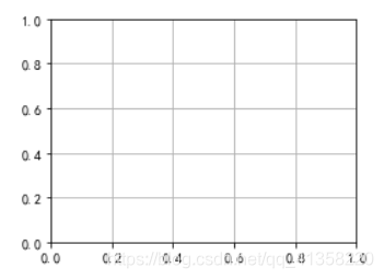
使用 grid 可以加灰色网格
fig, ax = plt.subplots(figsize=(4,3))
ax.grid(True)
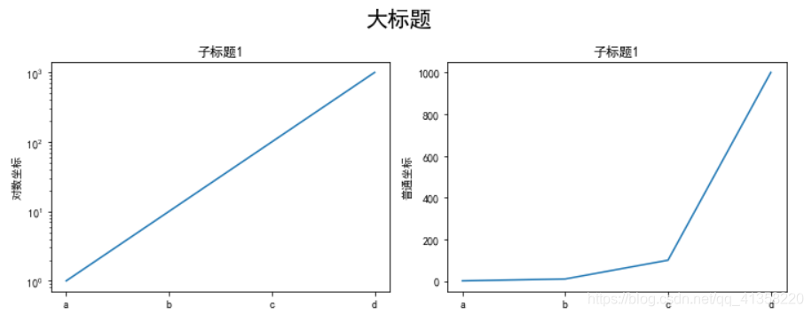
使用 set_xscale, set_title, set_xlabel 分别可以设置坐标轴的规度(指对数坐标等)、标题、轴名
fig, axs = plt.subplots(1, 2, figsize=(10, 4))
fig.suptitle('大标题', size=20)
for j in range(2):
    axs[j].plot(list('abcd'), [10**i for i in range(4)])
    if j==0:
        axs[j].set_yscale('log')
        axs[j].set_title('子标题1')
        axs[j].set_ylabel('对数坐标')
    else:
        axs[j].set_title('子标题1')
        axs[j].set_ylabel('普通坐标')
fig.tight_layout()
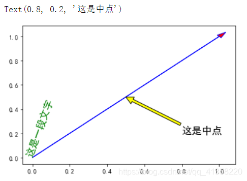
与一般的 plt 方法类似, legend, annotate, arrow, text 对象也可以进行相应的绘制
fig, ax = plt.subplots()
ax.arrow(0, 0, 1, 1, head_width=0.03, head_length=0.05, facecolor='red', edgecolor='blue')
ax.text(x=0, y=0,s='这是一段文字', fontsize=16, rotation=70, rotation_mode='anchor', color='green')
ax.annotate('这是中点', xy=(0.5, 0.5), xytext=(0.8, 0.2), arrowprops=dict(facecolor='yellow', edgecolor='black'), fontsize=16)
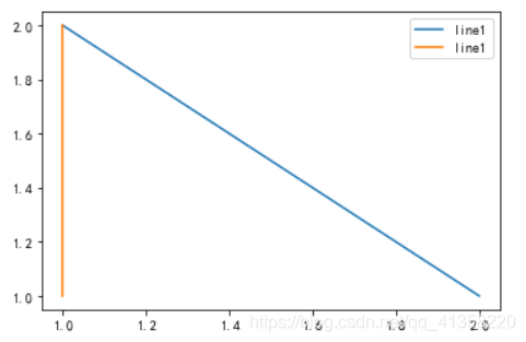
fig, ax = plt.subplots()
ax.plot([1,2],[2,1],label="line1")
ax.plot([1,1],[1,2],label="line1")
ax.legend(loc=1)


 被折叠的 条评论
为什么被折叠?
被折叠的 条评论
为什么被折叠?
 到【灌水乐园】发言


