


这个方法是使用margin-left来实现的,通过设置展示导航栏固定的宽度,使用margin-left来实现展示的区域,如下图所示:
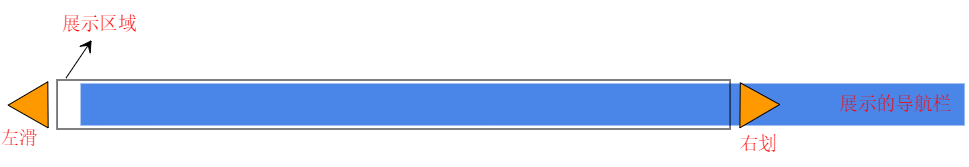
我这里使用按钮来作为导航,导航按钮固定宽度为130px;导航栏展示宽度1170px,即最多展示9个导航按钮,多出来后会出现左滑右滑按钮,然后根据左边距来展示:
<div style="display:flex">
    <i
    v-show="briefingList.length>9"//我这边设置最多显示9个按钮,多于9个才出现左滑右滑按钮
    class="el-icon-arrow-left"
    @click="leftMove()"
    ></i>
    <div style="display:flex;max-width:1170px;overflow:hidden">
        <div :style="{'margin-left':showCount*130+'px'}">//根据距离左边边距来展示导航栏
            <div v-for="item in briefingList" :key="item.id">
                <el-button
                    class="button"
                    v-bind:class="{activeStyle:item.id == activeBriefingRoomId}"
                    @click="selectBriefingRoom(item.id)"
                >{{item.name}}</el-button>
            </div>
        </div>
    </div>
    <i
    v-show="briefingList.length>9"
    class="el-icon-arrow-right"
    @click="rightMove()"
    ></i>
</div>
定义一个变量showCount:0初始值为0:
briefingList:[],//我要展示的导航标题信息...
showCount: 0
左滑、右滑按钮则用来控制距离左边距的距离,showCount 值始终不会大于1,当导航栏宽度不够用于展示时,showCount 为-1,则向右滑多展示一个,以此类推:
    leftMove() {
      if (this.showCount < 0) {
        this.showCount += 1;
      }
    },
    rightMove() {
      if (this.showCount > 9 - this.briefingList.length) {//我这边最长显示9个导航按钮
        this.showCount -= 1;
      }
    },
最终得到的效果:
导航按钮数量小于等于9时:
导航按钮数量大于9时:
发的代码样式不够完整,但整个实现的方法就是这样,样式根据自己做调整,这种方法的缺点就是要求导航栏宽度固定。


 扫一扫
扫一扫


 162
162

 被折叠的 条评论
为什么被折叠?
被折叠的 条评论
为什么被折叠?
 到【灌水乐园】发言


