


 本文介绍如何使用Leaflet.js自定义地图Marker,并通过CSS动画实现动态缩放效果。包括两种模式(卫星模式和飞机模式)的动画切换,及其实现方式。
实现动态效果主要依靠css动画
定义maker
marker = L.marker([d.latitude, d.longitude], {
	title: d.name,
	icon: L.divIcon({
	className: "dIcon",
		html: `<div class="live"><img src="static/images/xzc.png"><span></span><span></span></div><p id="adminVil" class="adminVil">${d.name}</p>`,
		iconSize: [90, 36]
	})
});
CSS
.live {
  position: relative;
  left: 40%;
  width: 18px;
  height: 18px;
}

/*s模式下动画状态*/
@keyframes s-living {
  0% {
    transform: scale(1);
  }

  25% {
    transform: scale(1.5);
    border-color: rgba(255, 255, 255, 0.9);
  }

  50% {
    transform: scale(2);
    border-color: rgba(255, 255, 255, 0.75);
  }

  75% {
    transform: scale(2.5);
    border-color: rgba(255, 255, 255, 0.5);
  }

  100% {
    transform: scale(3);
    border-color: rgba(255, 255, 255, 0.1);
  }
}
/*p模式下动画状态*/
@keyframes p-living {
  0% {
    transform: scale(1);
  }

  25% {
    transform: scale(1.5);
    border-color: rgba(41, 129, 202, 0.9);
  }

  50% {
    transform: scale(2);
    border-color: rgba(41, 129, 202, 0.75);
  }

  75% {
    transform: scale(2.5);
    border-color: rgba(41, 129, 202, 0.5);
  }

  100% {
    transform: scale(3);
    border-color: rgba(41, 129, 202, 0.1);
  }
}

.satellite .live span{
  position: absolute;
  width: 18px;
  height: 18px;
  left: 0;
  bottom: 0;
  border: 1px solid #fff;
  border-radius: 50%;
  -webkit-animation: s-living 3s linear infinite;
  z-index: 50;
}
.plane .live span{
  position: absolute;
  width: 18px;
  height: 18px;
  left: 0;
  bottom: 0;
  border: 1px solid #2981ca;
  border-radius: 50%;
  -webkit-animation: p-living 3s linear infinite;
  z-index: 50;
}

.live span:nth-child(2){
  -webkit-animation-delay: 1.5s;
}
模式切换
styleChange() {
	if (this.styleChanged) {
		$("#main").removeClass("satellite").addClass("plane");
	} else {
        $("#main").removeClass("plane").addClass("satellite");
	}
}
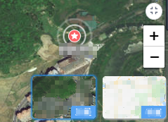
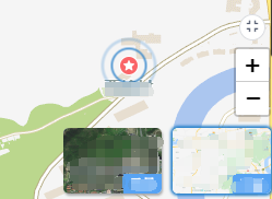
效果切换


 扫一扫
扫一扫


 3554
3554

 被折叠的 条评论
为什么被折叠?
被折叠的 条评论
为什么被折叠?
 到【灌水乐园】发言


