


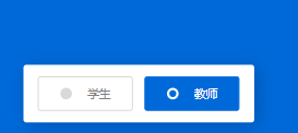
 这篇博客展示了如何使用CSS和HTML创建美观的Radio单选按钮。通过提供一个效果预览,作者详细介绍了实现这种样式的代码,包括定义圆点和文字的样式,以及如何用JavaScript交互操作。
效果预览
css样式私聊
<!DOCTYPE html>
<html>
<head>
<meta charset="UTF-8">
<link rel="stylesheet" href="css/styleredio.css">
</head>
<body>
<div class="wrapper">
<input type="radio" name="select" id="option-1" checked>
<input type="radio" name="select" id="option-2">
<label for="option-1" class="option option-1">
<div class="dot"></div>
<span>学生</span>
</label>
<label for="option-2" class="option option-2">
<div class="dot"></div>
<span>教师</span>
</label>
</div>
</body>
</html>
css样式
-----------------------------------------------------
@import url('https://fonts.googleapis.com/css?family=Lato:400,500,600,700&display=swap');
*{
  margin: 0;
  padding: 0;
  box-sizing: border-box;
  font-family: 'Lato', sans-serif;
}
html,body{
}
.wrapper{
  display: inline-flex;
  /*background: #fff;*/
  height: 70px;
  width: 300px;
  align-items: center;
  justify-content: space-evenly;
  border-radius: 5px;
  padding: 20px 15px;
  margin-left: -1.9rem;
    margin-top: -3rem;
  /*box-shadow: 5px 5px 30px rgba(0,0,0,0.2);*/
}
.wrapper .option{
  background: #fff;
  height: 40px;
  width: 80%;
  display: flex;
  align-items: center;
  justify-content: space-evenly;
  margin: 0 10px;
  border-radius: 5px;
  cursor: pointer;
  padding: 0 10px;
  border: 2px solid lightgrey;
  transition: all 0.3s ease;
}
.wrapper .option .dot{
  height: 20px;
  width: 20px;
  background: #d9d9d9;
  border-radius: 50%;
  position: relative;
}
.wrapper .option .dot::before{
  position: absolute;
  content: "";
  top: 4px;
  left: 4px;
  width: 12px;
  height: 12px;
  background: #0069d9;
  border-radius: 50%;
  opacity: 0;
  transform: scale(1.5);
  transition: all 0.3s ease;
}
input[type="radio"]{
  display: none;
}
#option-1:checked:checked ~ .option-1,
#option-2:checked:checked ~ .option-2{
  border-color: #0069d9;
  background: #0069d9;
}
#option-1:checked:checked ~ .option-1 .dot,
#option-2:checked:checked ~ .option-2 .dot{
  background: #fff;
}
#option-1:checked:checked ~ .option-1 .dot::before,
#option-2:checked:checked ~ .option-2 .dot::before{
  opacity: 1;
  transform: scale(1);
}
.wrapper .option span{
  font-size: 20px;
  color: #808080;
}
#option-1:checked:checked ~ .option-1 span,
#option-2:checked:checked ~ .option-2 span{
  color: #fff;
}


 扫一扫
扫一扫


 2214
2214

 被折叠的 条评论
为什么被折叠?
被折叠的 条评论
为什么被折叠?
 到【灌水乐园】发言


