


评价指标的补充
1 前言
关于分类模型的评价指标,之前的一篇博客已经涉及到,详情见 机器学习 | 评价指标 ,本篇博文将重点介绍ROC曲线和PR曲线以及KS。
2 数据及模型的准备
2.1 读入数据
import pandas as pd
df = pd.read_csv('data/accepts.csv')
df = df.fillna(0)
print(df.shape)
df.head()
(5845, 25)
| application_id | account_number | bad_ind | vehicle_year | vehicle_make | bankruptcy_ind | tot_derog | tot_tr | age_oldest_tr | tot_open_tr | ... | purch_price | msrp | down_pyt | loan_term | loan_amt | ltv | tot_income | veh_mileage | used_ind | weight | |
|---|---|---|---|---|---|---|---|---|---|---|---|---|---|---|---|---|---|---|---|---|---|
| 0 | 2314049 | 11613 | 1 | 1998.0 | FORD | N | 7.0 | 9.0 | 64.0 | 2.0 | ... | 17200.00 | 17350.0 | 0.00 | 36 | 17200.00 | 99.0 | 6550.00 | 24000.0 | 1 | 1.00 |
| 1 | 63539 | 13449 | 0 | 2000.0 | DAEWOO | N | 0.0 | 21.0 | 240.0 | 11.0 | ... | 19588.54 | 19788.0 | 683.54 | 60 | 19588.54 | 99.0 | 4666.67 | 22.0 | 0 | 4.75 |
| 2 | 7328510 | 14323 | 1 | 1998.0 | PLYMOUTH | N | 7.0 | 10.0 | 60.0 | 0.0 | ... | 13595.00 | 11450.0 | 0.00 | 60 | 10500.00 | 92.0 | 2000.00 | 19600.0 | 1 | 1.00 |
| 3 | 8725187 | 15359 | 1 | 1997.0 | FORD | N | 3.0 | 10.0 | 35.0 | 5.0 | ... | 12999.00 | 12100.0 | 3099.00 | 60 | 10800.00 | 118.0 | 1500.00 | 10000.0 | 1 | 1.00 |
| 4 | 4275127 | 15812 | 0 | 2000.0 | TOYOTA | N | 0.0 | 10.0 | 104.0 | 2.0 | ... | 26328.04 | 22024.0 | 0.00 | 60 | 26328.04 | 122.0 | 4144.00 | 14.0 | 0 | 4.75 |
5 rows × 25 columns
X = df.drop(['application_id', 'bad_ind', 'vehicle_make', 'bankruptcy_ind'], axis=1)
y = df['bad_ind'].values
2.2 切分训练集测试集
from sklearn.model_selection import train_test_split
X_train, X_test, y_train, y_test = train_test_split(X, y, test_size = 0.3, random_state = 23)
print(X_train.shape, X_test.shape, y_train.shape, y_test.shape)
(4091, 21) (1754, 21) (4091,) (1754,)
2.3 模型预测
from sklearn.linear_model import LogisticRegression
from sklearn.metrics import classification_report
lr = LogisticRegression()
lr.fit(X_train, y_train)
pre = lr.predict(X_test)
print(classification_report(y_test, pre))
              precision    recall  f1-score   support

           0       0.82      1.00      0.90      1430
           1       0.40      0.01      0.02       324

   micro avg       0.81      0.81      0.81      1754
   macro avg       0.61      0.50      0.46      1754
weighted avg       0.74      0.81      0.74      1754


/Users/apple/anaconda3/lib/python3.6/site-packages/sklearn/linear_model/logistic.py:433: FutureWarning: Default solver will be changed to 'lbfgs' in 0.22. Specify a solver to silence this warning.
  FutureWarning)
print(metrics.confusion_matrix(y_test, pre))
[[1424    6]
 [ 320    4]]
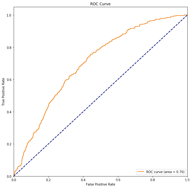
3 绘制ROC曲线
3.1 什么是ROC曲线?如何绘制的?
ROC曲线的绘制方法如下:
- 首先将数据集中预测结果的概率从高到低进行排序
- 然后选择不同的阈值,分别得到FPR(1-0类召回,实际为0预测为1的,横轴),TPR(1类召回,实际为1预测为1,纵轴)
- 将不同的阈值对应的FPR和TPR在图形上描出来,然后连接成一条曲线!即为ROC曲线
3.2 Python代码绘制ROC曲线
# roc_curve的输入为
# y: 样本标签
# scores: 模型对样本属于正例的概率输出
# pos_label: 标记为正例的标签,本例中标记为1的即为正例
scores = lr.predict_proba(X_test)[:,1]
fpr, tpr, thresholds = metrics.roc_curve(y_test, scores, pos_label=1)
auc = metrics.auc(fpr, tpr)
'''
fpr:假正率,其实就是1-0类的召回!越小越好,这样0类召回也就越大越好!对应横轴!
tpr:真正率,其实就是1类的召回率!越大越好!对应纵轴
thresholds:对应阈值!
'''

# 开始绘制ROC曲线
import matplotlib.pyplot as plt
# 开始绘图
plt.figure()
lw = 2
plt.figure(figsize=(10,10))
plt.plot(fpr, tpr, color='darkorange',
         lw=lw, label='ROC curve (area = %0.2f)' % auc) ###假正率为横坐标,真正率为纵坐标做曲线
plt.plot([0, 1], [0, 1], color='navy', lw=lw, linestyle='--')
plt.xlim([0.0, 1.0])
plt.ylim([0.0, 1.05])
plt.xlabel('False Positive Rate')
plt.ylabel('True Positive Rate')
plt.title('ROC Curve')
plt.legend(loc="lower right")
plt.show()
<Figure size 432x288 with 0 Axes>
3.3 封装函数绘制ROC曲线
def Plot_ROC(model, X_test, y_test):
    import matplotlib.pyplot as plt
    from sklearn import metrics

    '''
    函数作用:绘制模型在测试集上的ROC曲线
    model:模型
    X_test:测试集
    y_test:测试集的真实标签
    '''
    # roc_curve的输入为
    # y_test: 测试集的真实标签
    # scores: 模型对样本属于正例的概率输出
    # pos_label: 标记为正例的标签,本例中标记为1的即为正例
    scores = model.predict_proba(X_test)[:,1]
    fpr, tpr, thresholds = metrics.roc_curve(y_test, scores, pos_label=1)
    auc = metrics.auc(fpr, tpr) # 计算AUC
    '''
    fpr:假正率,其实就是1-0类的召回!越小越好,这样0类召回也就越大越好!对应横轴!
    tpr:真正率,其实就是1类的召回率!越大越好!对应纵轴
    thresholds:对应阈值!
    '''

    # 开始绘制ROC曲线
    plt.figure()
    lw = 2
    plt.figure(figsize=(10,10))
    plt.plot(fpr, tpr, color='darkorange',
             lw=lw, label='ROC curve (area = %0.2f)' % auc) ###假正率为横坐标,真正率为纵坐标做曲线
    plt.plot([0, 1], [0, 1], color='navy', lw=lw, linestyle='--')
    plt.xlim([0.0, 1.0])
    plt.ylim([0.0, 1.05])
    plt.xlabel('False Positive Rate')
    plt.ylabel('True Positive Rate')
    plt.title('ROC Curve')
    plt.legend(loc="lower right")
    plt.show()
Plot_ROC(lr, X_test, y_test)
<Figure size 432x288 with 0 Axes>

4 计算AUC的两种方式
4.1 什么是AUC?
- AUC是ROC曲线下方的面积
- 取值一般为0.5-1,越大表明分类性能越好!
4.2 直接使用封装好的API
from sklearn import metrics
scores = lr.predict_proba(X_test)[:,1]
metrics.roc_auc_score(y_test, scores) # y_test真实标签 scores为预测为1的概率
0.6989812656479323
- 有一个坑要注意,roc_auc_score中第一个参数是真实标签值,第二个是预测为1类的概率值!不要弄反了!
- roc_auc_score的官方文档:https://scikit-learn.org/stable/modules/generated/sklearn.metrics.roc_auc_score.html
4.3 使用定义
from sklearn import metrics
scores = lr.predict_proba(X_test)[:,1]
fpr, tpr, thresholds = metrics.roc_curve(y_test, scores, pos_label=1)
metrics.auc(fpr, tpr)
0.6989812656479323
总结:推荐使用第一种!比较简单!
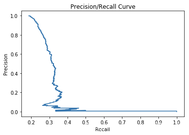
5 PR曲线
5.1 什么是PR曲线
- PR曲线的横轴是R:Recall,纵轴为P:Precision
- PR曲线的具体画法和ROC基本一致,也是将所有样本的预测的概率从高到低进行排序,然后选择不同的阈值,也即得到了不同的P和R 然后连接起来!
5.2 PR曲线和ROC曲线的对比
相同点:
- PR曲线展示的是Precision vs Recall的曲线,PR曲线与ROC曲线的相同点是都采用了TPR (Recall),都可以用AUC来衡量分类器的效果。
不同点:
- 不同点是ROC曲线使用了FPR,而PR曲线使用了Precision,因此PR曲线的两个指标都聚焦于正例。类别不平衡问题中由于主要关心正例,所以在此情况下PR曲线被广泛认为优于ROC曲线。
5.3 Python绘制PR曲线
import matplotlib.pyplot as plt
from sklearn.metrics import precision_recall_curve
scores = lr.predict_proba(X_test)[:,1]
precision, recall, thresholds = precision_recall_curve(y_test, scores)
plt.figure(1)
plt.plot(precision, recall)
plt.title('Precision/Recall Curve')# give plot a title
plt.xlabel('Recall')# make axis labels
plt.ylabel('Precision')
plt.show()
6 K-S曲线以及KS值
6.1 KS值的计算
scores = lr.predict_proba(X_test)[:,1]
fpr, tpr, thresholds = metrics.roc_curve(y_test, scores, pos_label=1)
ks = max(tpr-fpr)
print('lr的KS值为: %.4f' % ks)
lr的KS值为: 0.3135
6.2 K-S曲线
- K-S曲线是正样本洛伦兹曲线与负样本洛伦兹曲线的差值曲线,用来度量阳性与阴性分类区分程度的。K-S曲线的最高点(最大值)定义为KS值,KS值越大,模型的区分度越好。
- K-S值一般是很难达到0.6的,在0.2~0.6之间都不错。
7 参考
- https://www.jianshu.com/p/2ca96fce7e81
- https://blog.youkuaiyun.com/u014568921/article/details/53843311
- https://blog.youkuaiyun.com/teminusign/article/details/51982877
- https://www.jianshu.com/p/fec4105a60d7
- https://blog.youkuaiyun.com/cymy001/article/details/79613787
- 如何向门外汉讲解ks值(风控模型术语)?:https://www.zhihu.com/question/34820996
- https://blog.youkuaiyun.com/weixin_39750084/article/details/80558587


 9053
9053

 被折叠的 条评论
为什么被折叠?
被折叠的 条评论
为什么被折叠?
 到【灌水乐园】发言


