如题 利用python画柱状图 如何画高级柱状图 添加图例 横纵坐标名 柱状图高度 在一个柱状图上显示多个数据 画高级柱状图 添加图例 横纵坐标名 柱状图高度 画柱状对比图 【超简单教程】
代码
import matplotlib.pyplot as plt
import numpy as np
plt.figure(figsize=(6, 5))
name = ('name1','name2')
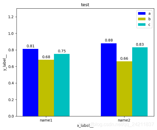
number_a = [0.81, 0.88]
number_b = [0.68, 0.66]
number_c = [0.75, 0.83]
bar_width = 0.2
index_a = np.arange(len(name))
index_b = index_a + bar_width
index_c = index_b + bar_width
y = [number_a,number_b,number_c]
x = [index_a, index_b, index_c]
plt.bar(index_a, height=number_a, width=bar_width, color='b', label='a')
plt.bar(index_b, height=number_b, width=bar_width, color='y', label='b')
plt.bar(index_c, height=number_c, width=bar_width, color='c', label='c')
plt.legend()
plt.xticks(index_a+bar_width, name)
plt.ylim([0, 1.3])
for x_ind,y_ind in zip(x,y):
xx1 = x_ind[0]
xx2 = x_ind[1]
yy1 = y_ind[0]
yy2 = y_ind[1]
plt.text(xx1, yy1+0.01, ('%.2f' % yy1), ha='center', va='bottom')
plt.text(xx2, yy2+0.01, ('%.2f' % yy2), ha='center', va='bottom')
plt.xlabel('x_label__')
plt.ylabel('y_label__')
plt.title('test')
plt.show()
结果


 本文介绍如何使用Python和Matplotlib库绘制包含多组数据的高级柱状图,并添加图例、横纵坐标名称及具体数值。通过示例代码演示了如何设置柱状图的宽度、位置和颜色等。


 750
750

 被折叠的 条评论
为什么被折叠?
被折叠的 条评论
为什么被折叠?
 到【灌水乐园】发言


