


分享一个Python可视化强力扩展包—plotastic。
极大弥补matplotlib、seaborn添加P-value等统计分析方面的弱点。
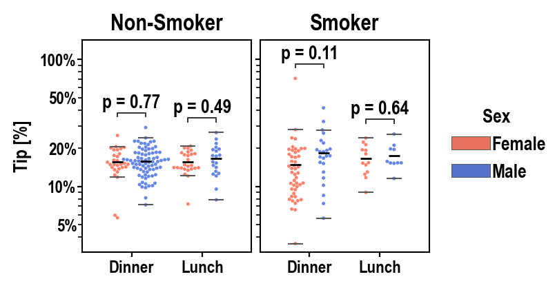
使用plotastic你可以轻松实现,例如,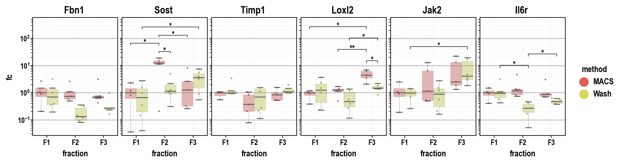
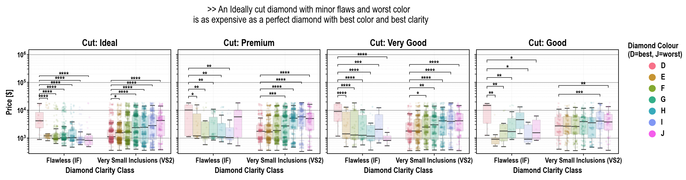
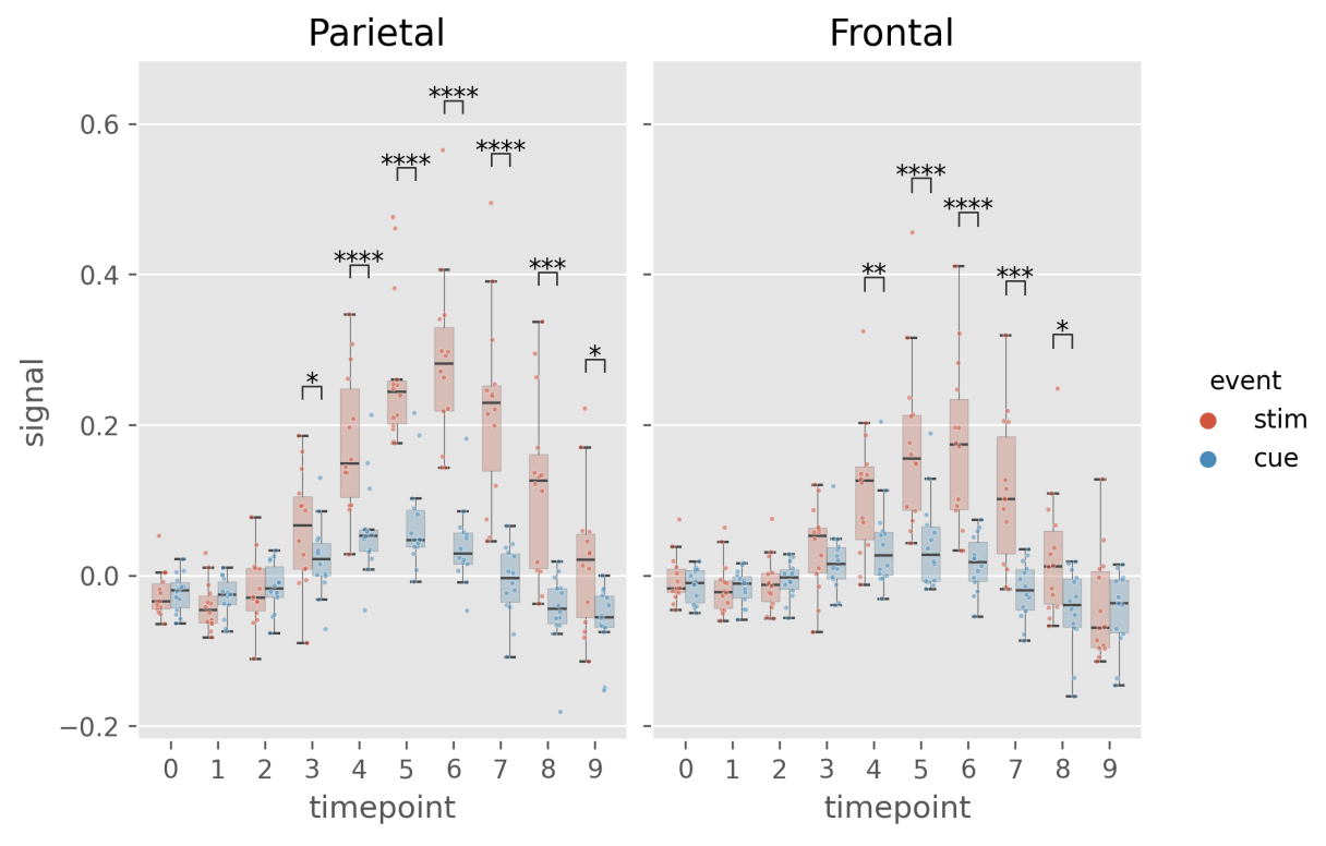
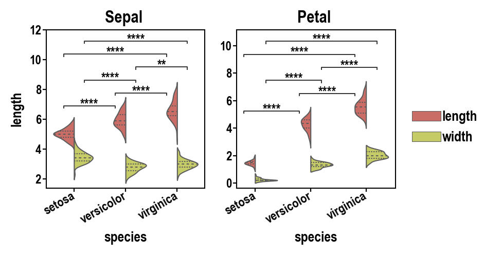
看一个简单的例子,
plst.set_palette(["tomato", "royalblue"], verbose=False)

(
    DA1.subplots(figsize=(3, 2))
    # 绘图
    .fillaxes(kind="swarm", dodge=True, size=1.8, alpha=0.8)  # 绘制散点图
    .fillaxes(
        kind="box",  # 绘制箱线图
        #散点图、箱线图美化
        whiskerprops=dict(linewidth=0),
        boxprops=dict(linewidth=0, fill=False),
        medianprops=dict(linewidth=0),
        showmeans=True,
        meanprops=dict(marker="_", markeredgecolor="black"),
        showfliers=False,
    )
    # 坐标轴、图例美化
    .edit_y_scale_log(10)
    .edit_y_ticklabels_log_minor(subs=[0, 1, 2, 5])
    .edit_y_ticklabel_percentage()
    .annotate_pairwise(only_sig="all", include="__hue")
    .edit_titles(axtitles=["Non-Smoker", "Smoker"])
    .edit_xy_axis_labels(y="Tip [%]", x="")
    .edit_legend(capitalize_title=True)
)

# 保存图片
plt.savefig("tips1.png", dpi=300, bbox_inches="tight")
使用方法有点类似新版的seaborn, 使用plotastic前需要安装Python >= 3.11、pandas == 1.5.3和seaborn <= 0.12.2。
进一步学习:matplotlib、seaborn又一个强力统计分析助手强力统计分析助手![]() https://mp.weixin.qq.com/s/mlITu2X9Qmt5P-enHwz5fg
https://mp.weixin.qq.com/s/mlITu2X9Qmt5P-enHwz5fg


 被折叠的 条评论
为什么被折叠?
被折叠的 条评论
为什么被折叠?
 到【灌水乐园】发言


